Art Class: Line and Colour by Bobby Clark
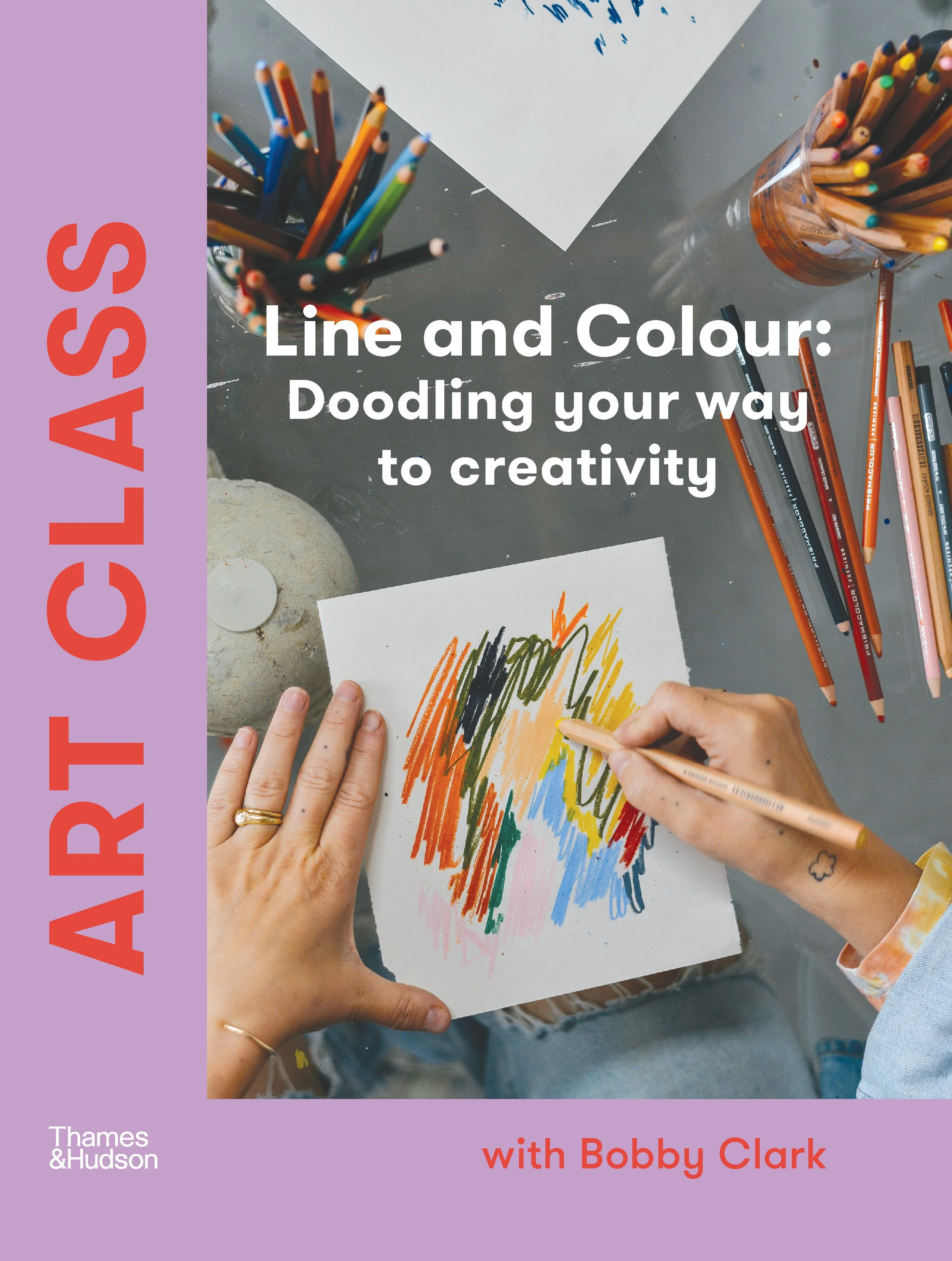
Melbourne-based multidisciplinary artist Bobby Clark’s new book, Art Class: Line and Colour, takes us through a guided art class to harness our artistic expression – exploring ways to ignite even the most analytical minds.
Words & Photography: Bobby Clark I Introduction: Hande Renshaw
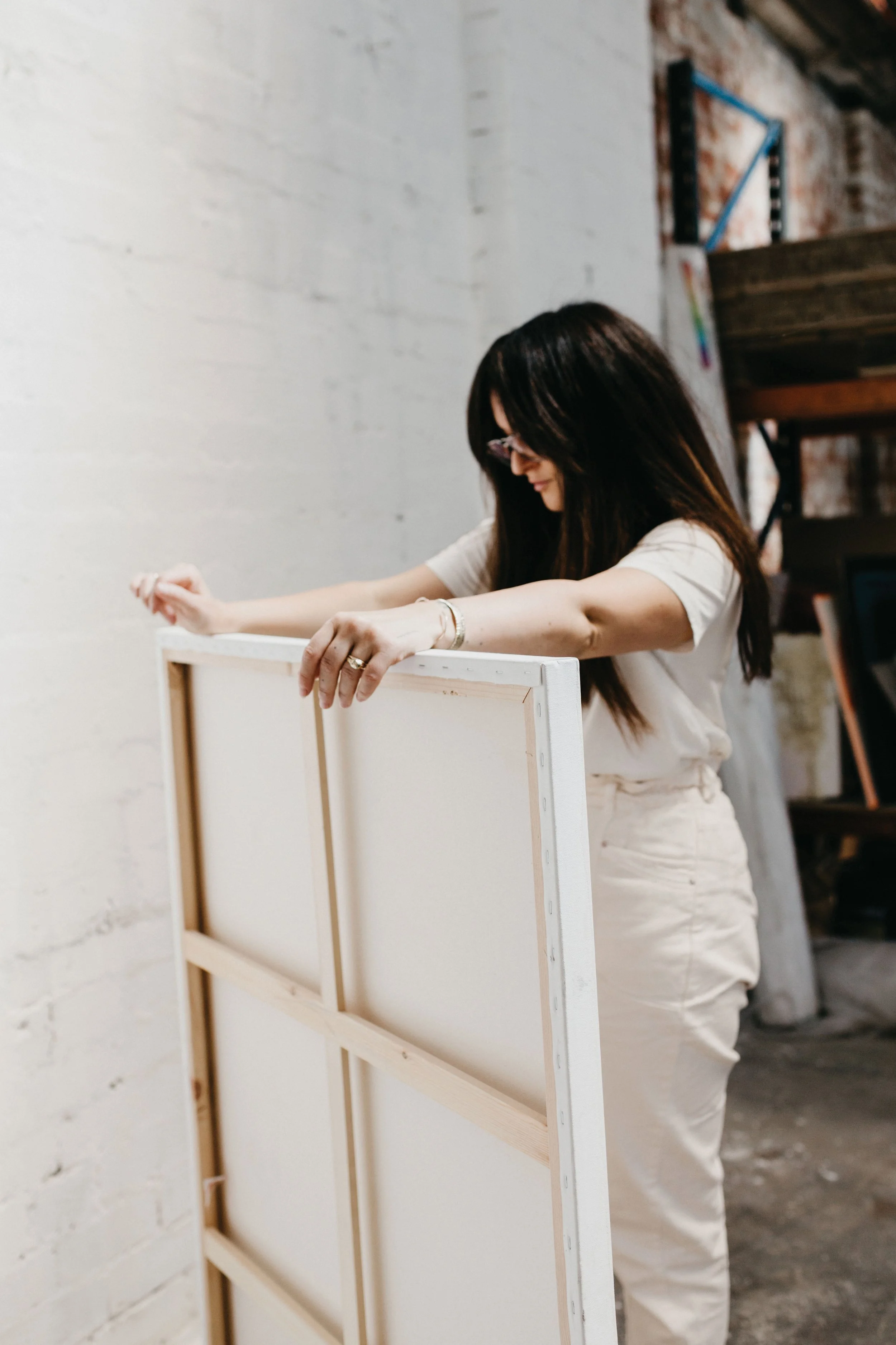
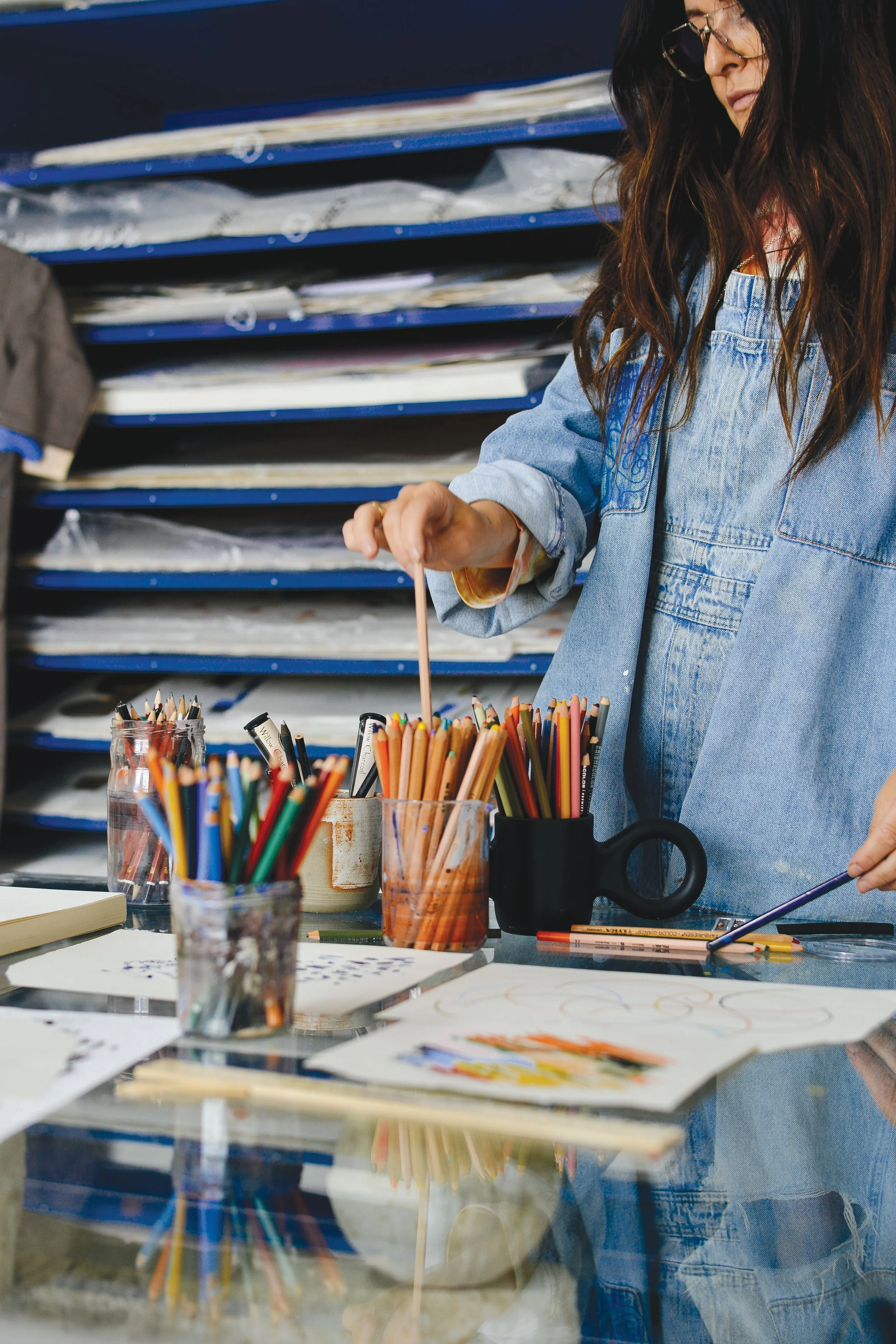
Bobby Clark in her Melbourne studio space. Photo: Bobby Clark
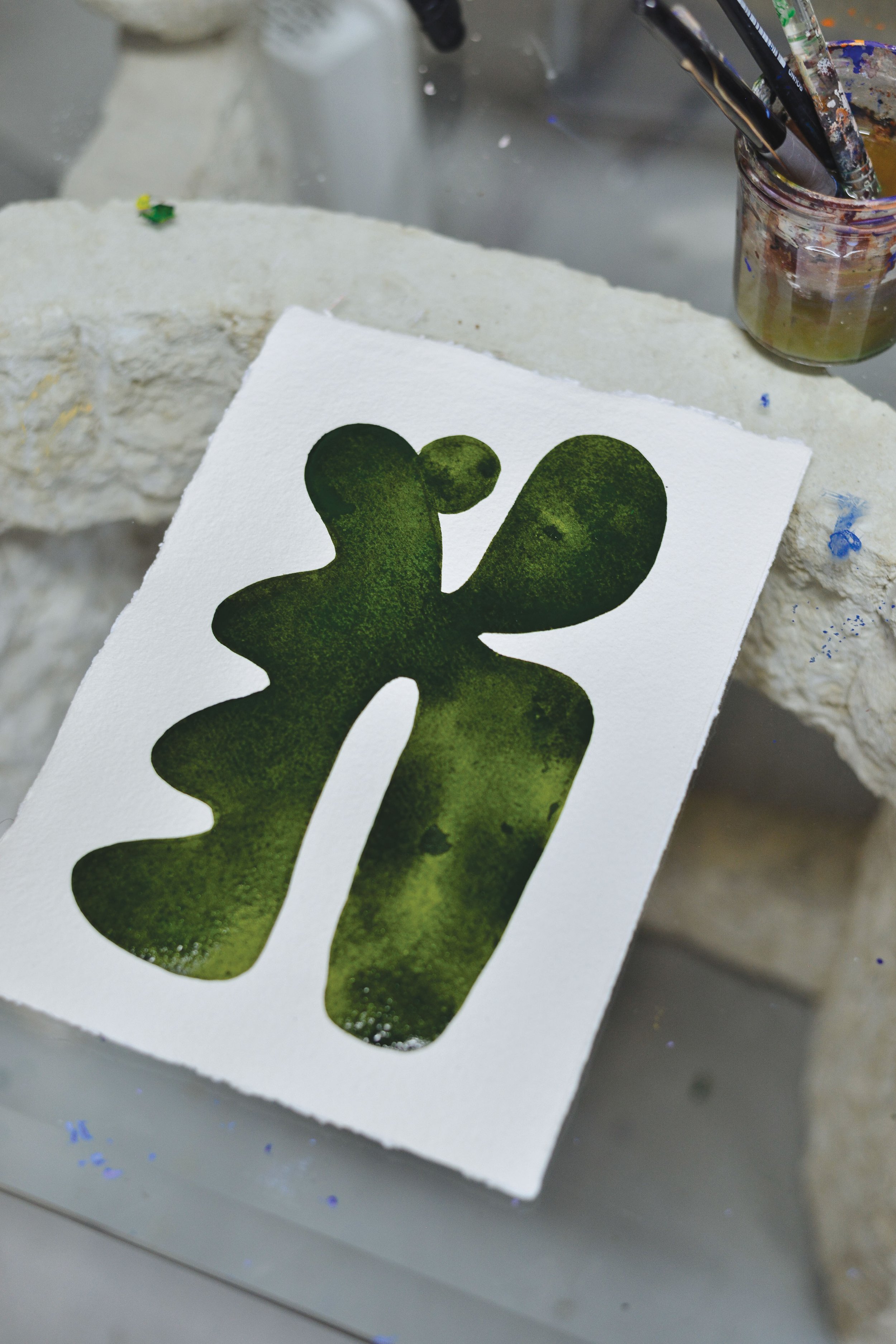
A fluid abstract painting by Bobby Clark. Photo: Bobby Clark
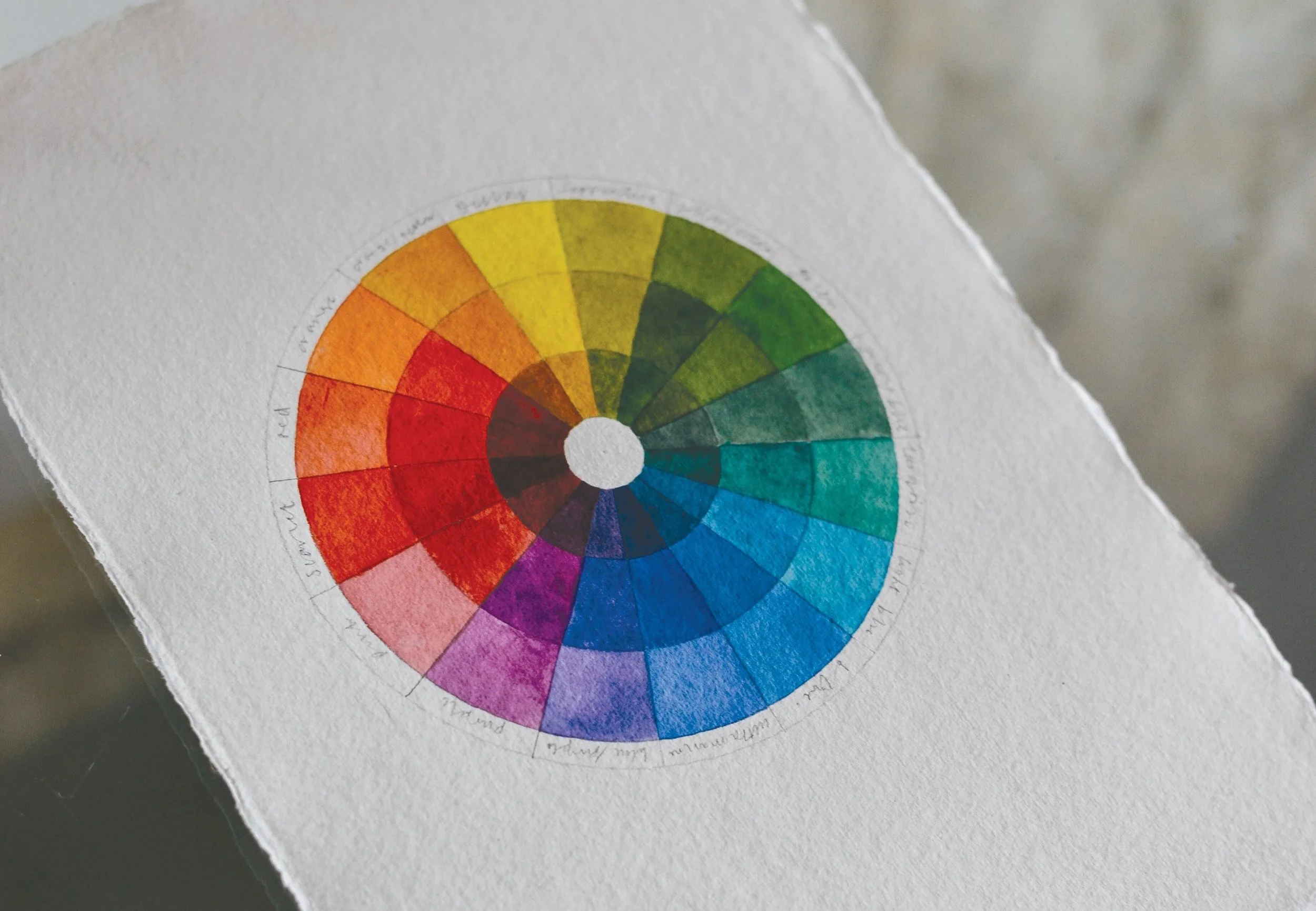
A colour wheel demonstrates the connection between primary, secondary and tertiary colours. Photo: Bobby Clark
Melbourne-based artist Bobby Clark created her new book, Art Class: Line & Colour, in response to many questions she’s received about how to harness creative expression. The book explores ways to ignite even the most analytical mind, offering a guide to cultivating a creative practice or breaking through creative blocks. We share below an extract from the new book on creating a colour wheel – an important tool to understand the connection between colours for any budding artist. ‘Knowledge of the colour wheel is fundamental to building a creative practice, as well as developing an understanding of the intersection of primary, secondary and tertiary colours,’ shares Bobby.
CREATING A COLOUR WHEEL
Creating a colour wheel is one of the best exercises for learning to understand colour balance, contrast, complementary colours and how to mix colours in variations of tone. Using watercolour paints is the best, easiest and, given the number of colours required, most cost-effective medium for making a colour wheel. A colour wheel can contain as few as twelve colours to more than sixty different shades, all created using black and the basic primary colours of red, yellow and blue. In its simplest form, the colour wheel shows the visual relationship between primary, secondary and tertiary colours in a spectrum of hues from light to dark.
MATERIALS
High absorbency paper/watercolour paper watercolour paints
A small brush
Pencil
Ruler
Water for diluting
STEPS
1 Find the centre of your paper using a ruler and draw a large circle using a compass or circle stencil with the centre of the paper in the middle of your circle. Draw another circle that is slightly smaller than your first. There should be enough space to write the names of colours in between them.
2 Draw a small circle in the centre of the paper. Within the empty space between your circles, draw two more circles at equal distance (as pictured above).
3 Divide your circles into sixteen even segments. To make it easier, start with dividing them into four quarters and then dividing them again until you reach sixteen.
4 Start preparing your colours and paint each section using the list on p. 94 as your colour guide. To dilute your colours, use water. To follow the example pictured, place lighter colours on the outside and darken the colours as you get closer to the middle of the colour wheel.
TIP Adding a little contrasting colour to a mix will add depth. For example, when mixing green, adding a little orange or red will give the colour an earthy tone and ground a bright luminous colour, making it softer and more appealing. I still refer to the colour wheel daily in my practice.
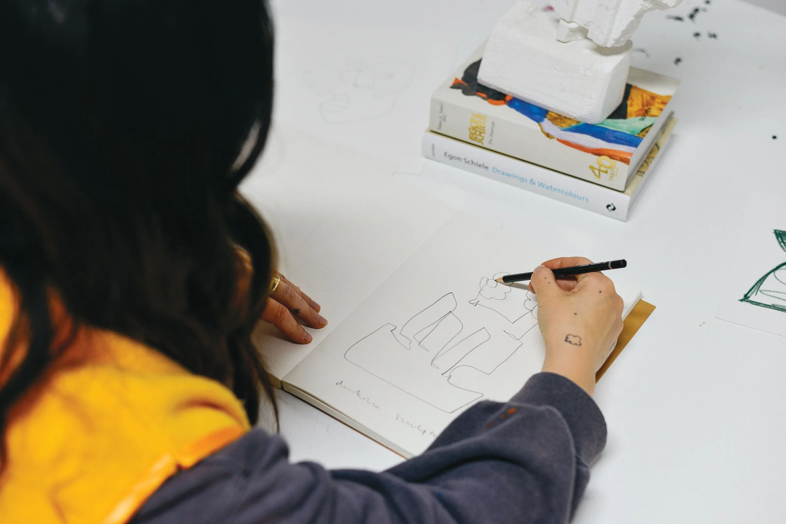
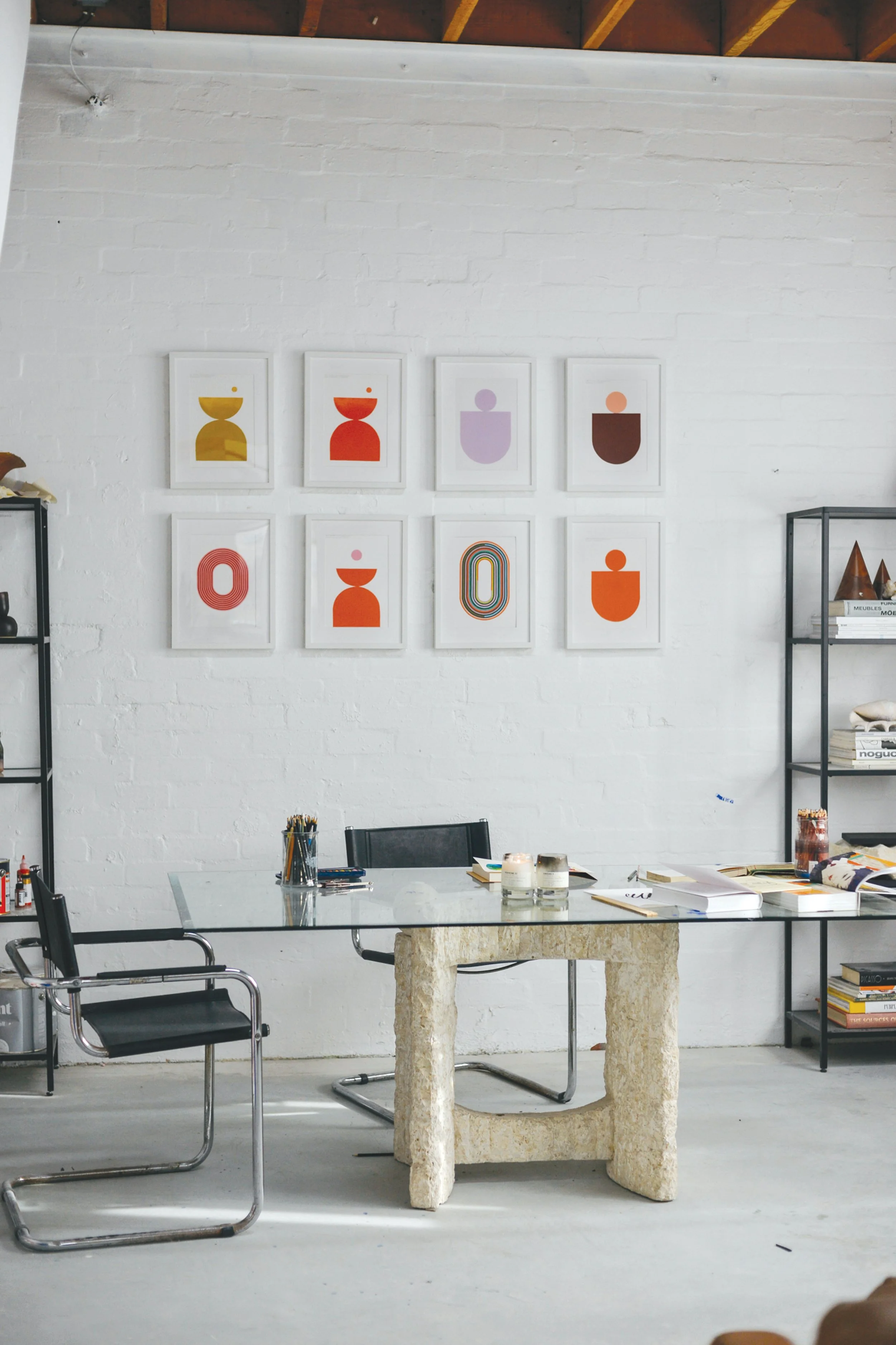
Inside Bobby Clark’s studio space in Melbourne. Photo: Bobby Clark
Art Class: Line & Colour by Bobby Clark is out now!
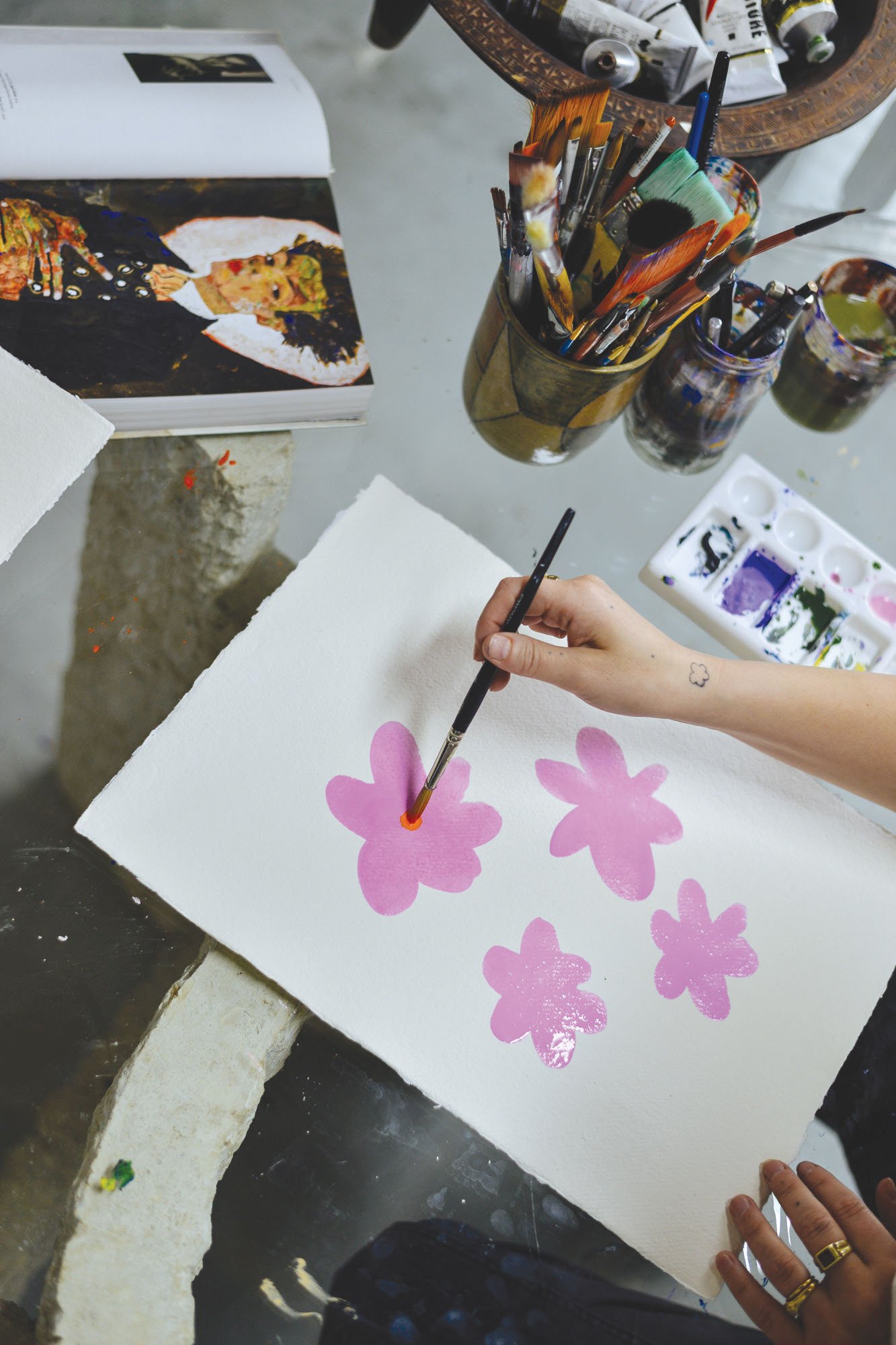
‘You don’t need to be a fine artist to paint. If you can hold a paintbrush, then you can create art. Painting in the simplest form can be enjoyed by anyone from children to adults,’ says Bobby Clark. Photo: Bobby Clark
‘Knowledge of the colour wheel is fundamental to building a creative practice, as well as developing an understanding of the intersection of primary, secondary and tertiary colours,’ shares Bobby Clark.Photo: Bobby Clark
The colours mentioned are specific names of watercolours that can be found in many pan or tube sets in your local art store. Alternatively, use colours you have access to and mix them to match my colour wheel or create your own variation.
YELLOW • light: yellow; mid: yellow mixed with ochre; dark: ochre.
SERPENTINE • light: ochre mixed with olive green; mid: add olive to your light mix; dark: add a little black to your mid mix.
LIME GREEN • light: diluted olive green; mid: pure olive green; dark: add a little black to pure olive green.
GREEN • light: diluted Hooker’s green; mid: pure Hooker’s green; dark: add a little black or dark brown to pure Hooker’s green.
GREEN–BLUE • light: mix blue and green then dilute; mid: undiluted blue and green mix; dark: add a little black to undiluted blue and green mix.
TURQUOISE • light: diluted Winsor green; mid: pure Winsor green;dark: add a little black to pure Winsor green.
LIGHT BLUE • light: diluted Winsor blue; mid: pure Winsor blue; dark: add a little black to pure Winsor blue.
BLUE • light: diluted cobalt blue; mid: pure cobalt blue; dark: add a little black to pure cobalt blue.
ULTRAMARINE • light: diluted ultramarine; mid: pure ultramarine; dark: add a little black to pure ultramarine.
BLUE–PURPLE • light: mix purple and ultramarine then dilute; mid: pure purple and ultramarine mix; dark: add a little black to purple and ultramarine mix.
PURPLE • light: diluted violet; mid: pure violet; dark: add a little black to pure violet.
PINK • light: heavily diluted magenta; mid: lightly diluted magenta; dark: add a little black to lightly diluted magenta.
SCARLET • light: mix crimson with a touch of magenta then dilute; mid: pure mix of crimson with a touch of magenta; dark: add a little black to crimson-magenta mix.
RED • light: diluted crimson; mid: pure crimson; dark: add a little black to pure crimson.
ORANGE • light: diluted cadmium orange; mid: pure cadmium orange; dark: add a little black to cadmium orange.
ORANGE–YELLOW • light: mix cadmium orange with yellow then dilute; mid: pure cadmium orange mixed with yellow; dark: add black to pure cadmium orange and yellow mix.
This in an edited extract from ‘Art Class’ by Bobby Clark, published by Thames & Hudson. Purchase the book online now here.


