Dolphin Sands Studio by Matt Williams Architects
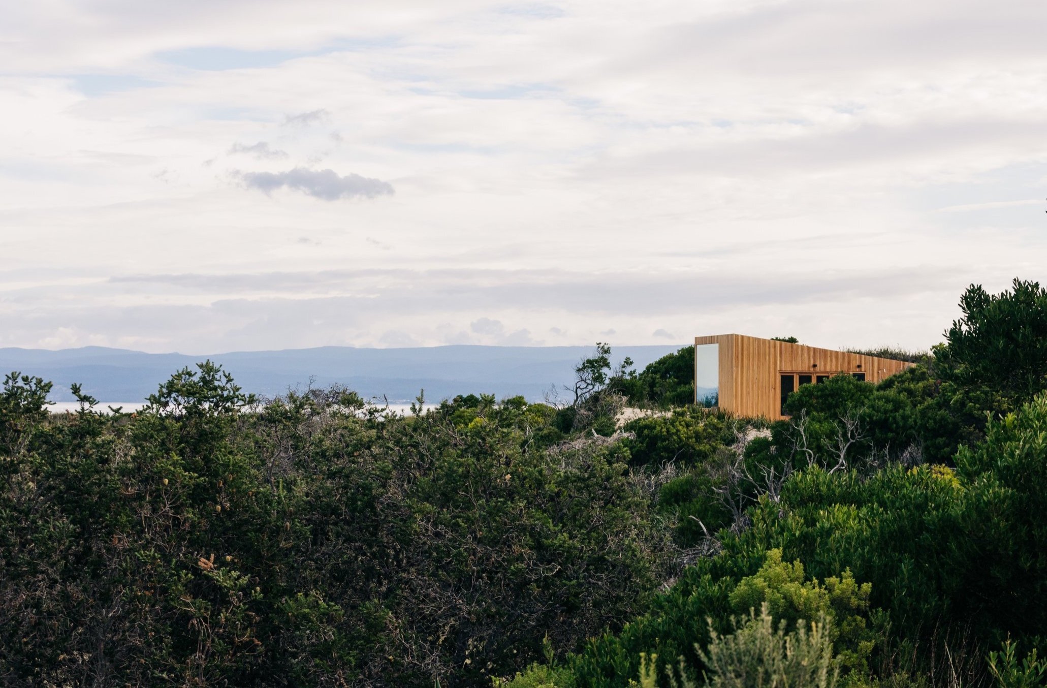
Nestled into the picturesque sand dunes along the Tasmanian coast, Dolphin Sands Studio, designed by Matt Williams Architects, immerses itself into the landscape.
Words: Hande Renshaw | Photography: Adam Gibson
‘As you arrive, you are greeted with the low curved end of the studio, with the form tapering away from you - it’s an intentionally soft introduction to the building,’ says Matt Williams. Photo: Adam Gibson
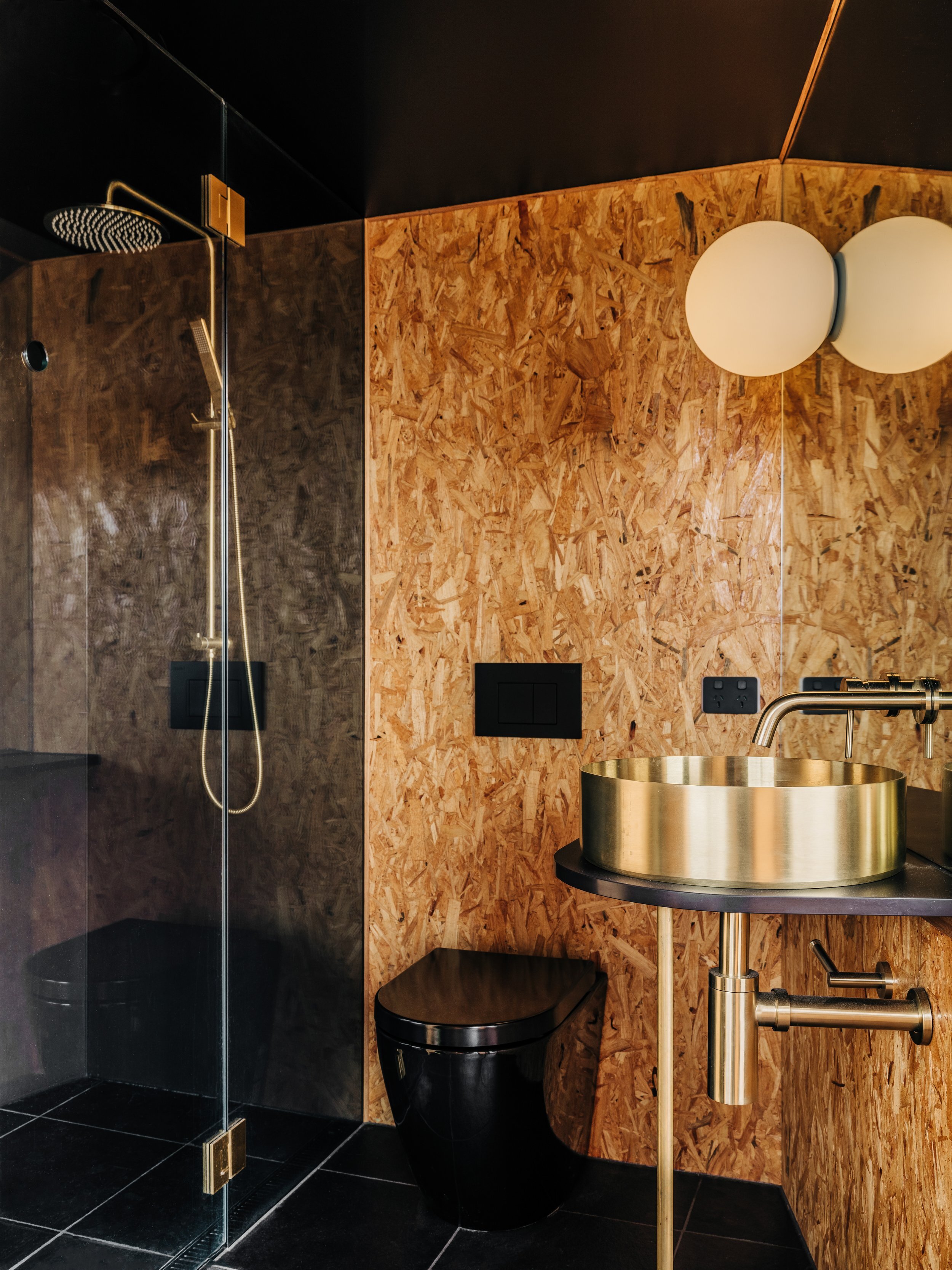
Dekton was used for the kitchen benchtop; splashback; vanity top; and shower walls – chosen for it’s durability and versatility, while fitting beautifully with the restrained but warm palette. Photo: Adam Gibson
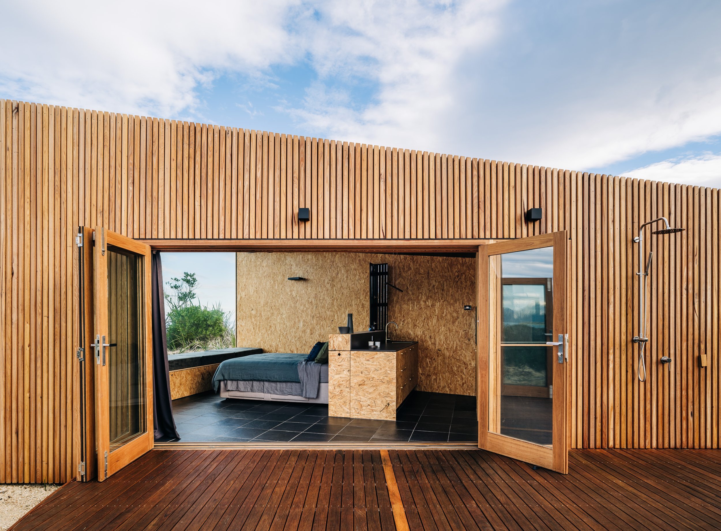
Encompassing a single room, a large deck, and a small kitchen and bathroom, the pavilion is a protective pod. Photo: Adam Gibson
Dolphin Sands is a small town set on an idyllic stretch along the east coast of Tasmania. The rugged coastline shines with crystal blue water and golden beaches that look back across the water towards Oyster Bay.
The location is the perfect spot to completely unplug and unwind, which is just what the Australian owners intended when they called on Hobart-based practice, Matt Williams Architects, to design the pavilion.
Working with the existing contours across the site, the 36-square-metre pavilion represented the manifestation of the client’s wishes to create a place to both contemplate and be at one with the landscape, while also minimising the impact to the surroundings.
Tiny in stature, the one-room pavilion is the first dwelling on the site, with plans to build a bigger home nearby in the future.
From the functional elements of the brief to the limited number of materials used, the studio is about restraint and repetition.
‘The carefully considered, minimal palette and detailing was important for the design - the limited palette merged all of the elements into one whole, while the choice of textured materials ensured that the interior was warm and welcoming,’ says Matt Williams.
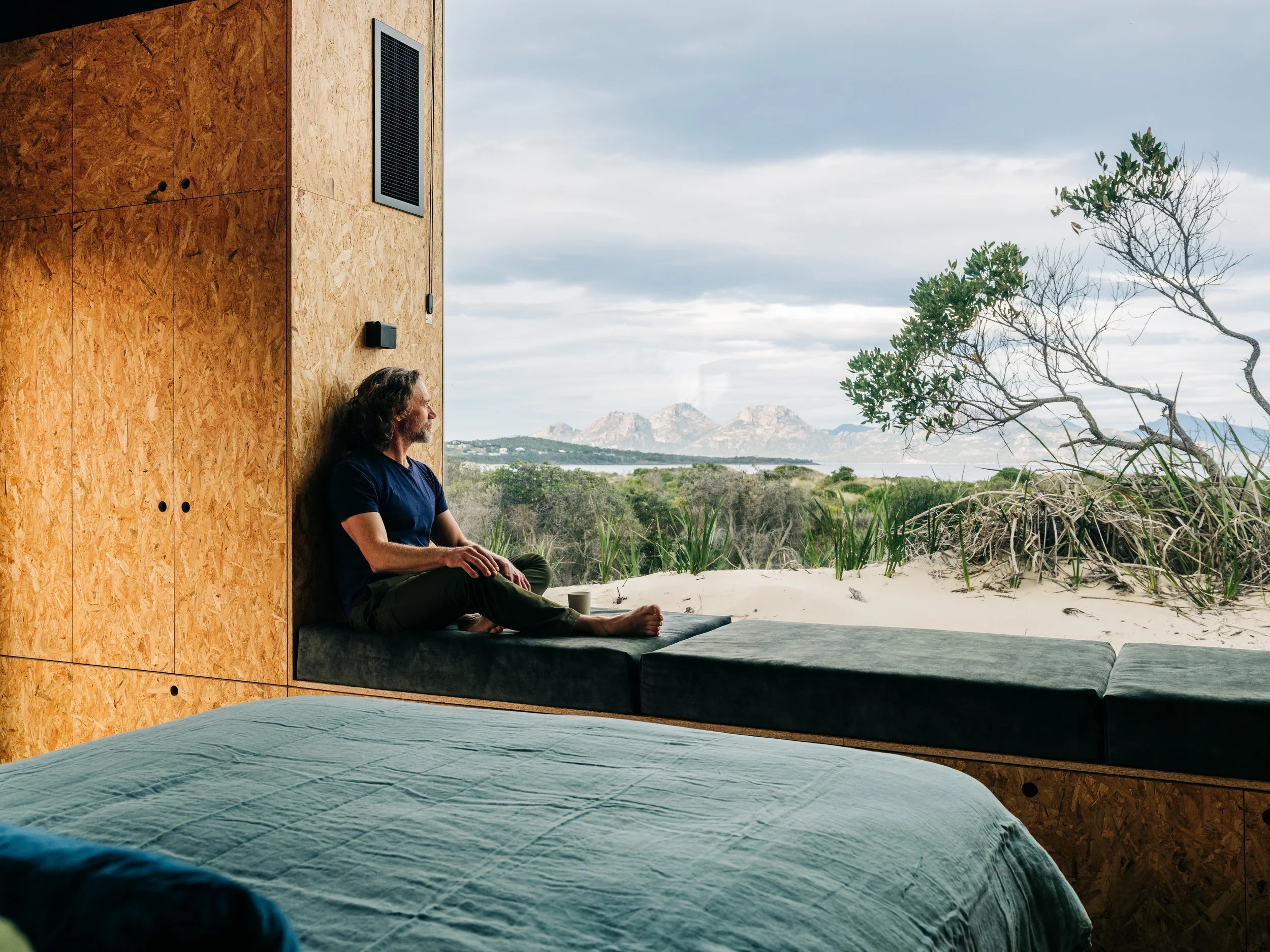
Encompassing a single room, a large deck, and a small kitchen and bathroom, the whole space is a protective pod. Hugging down low at the rear of the property, the roof line tapers up to a large, frameless window at the front.
‘The studio is intended to invoke calm – as you arrive, you’re greeted with the low curved end of the studio, with the form tapering away from you - it’s an intentionally soft introduction to the building.’
Dolphin Sands Studio floats above the sand dunes and burrows its owners into nature while providing protection from the natural elements, a space to evoke calm and truly disconnect.
Black limestone floor pavers were chosen to provide thermal mass inside a light-weight, well-insulated envelope; and create a gorgeous texture underfoot, while also being very durable. Photo: Adam Gibson
‘The overall palette was chosen to create a textured warmth in a minimal space,’ says Matt Williams. Photo: Adam Gibson
“The studio is intended to invoke calm – a retreat from the owners’ busy professional life.”
Through understanding and interrogation of the surrounds, the view from the site out toward Oyster Bay became a key focus in the design. Photo: Adam Gibson
Dekton was used for the kitchen benchtop; splashback; vanity top; and shower walls – chosen for it’s durability and versatility, while fitting beautifully with the restrained but warm palette. Photo: Adam Gibson
The 36-square-metre pavilion floats above the sand dunes, looking out towards Oyster Bay. Photo: Adam Gibson
Storage to allow the occupants to accommodate all they need while also allowing them to put away as much as possible, so the space is not cluttered, physically or visually was an important design element. Photo: Adam Gibson
Dolphin Sands Studio floats above the sand dunes and immerses the owners into the surrounding landscape. Photo: Adam Gibson


