Carlton North Terrace by eat.bathe.live
Designed by eat.bathe.live, Carlton North Terrace balances the home’s history with bold and contemporary design elements.
Words: Hande Renshaw I Photography: Stephanie Rooney Styling: Bea + Co I Building Designer: Themeski I Builder: Ashley Rowan
‘The clients and I have a passion for bold statement feature tiles and this became one of the starting points for the design concept,’ says Jenefer Gordon, director of eat.bathe.live.
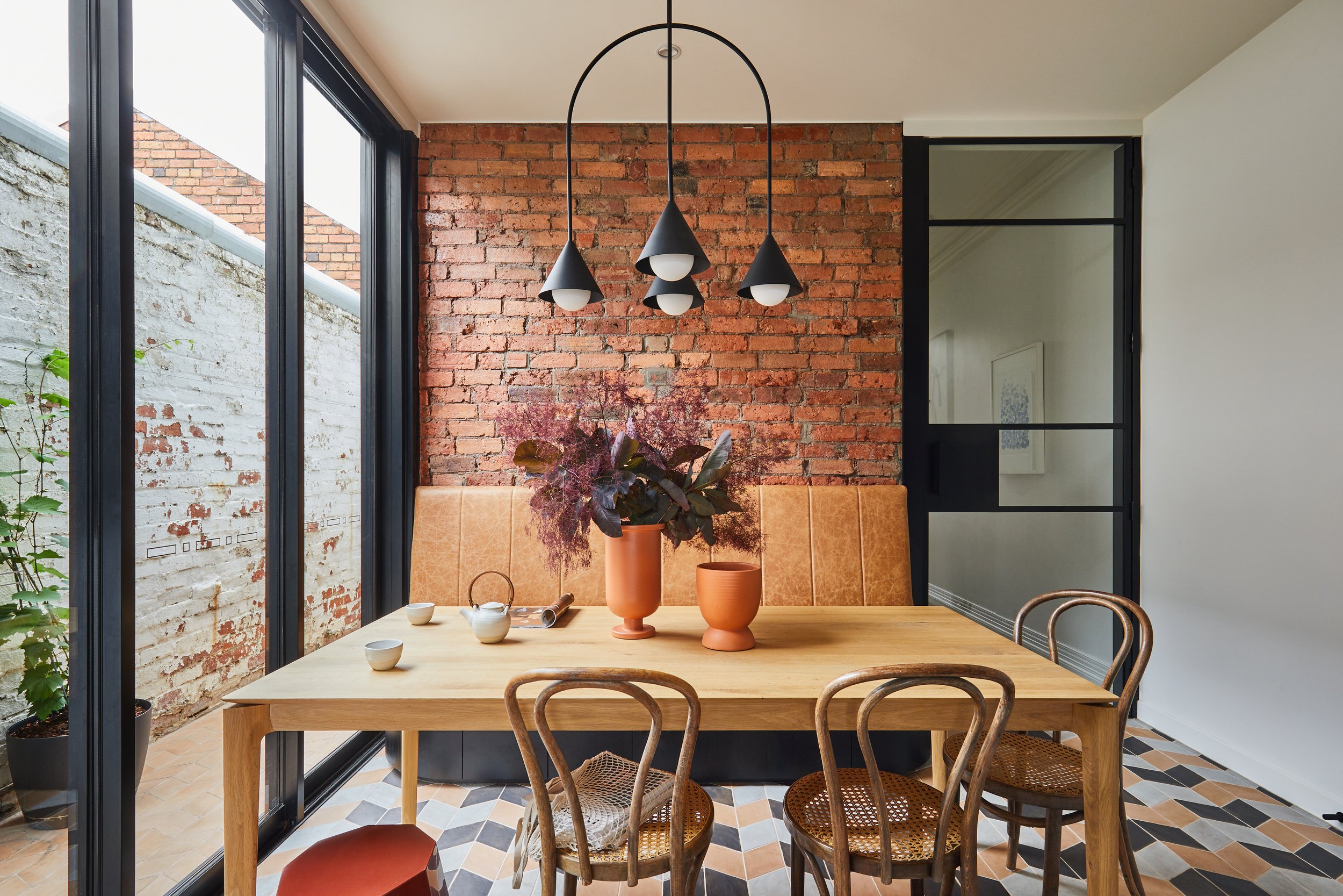
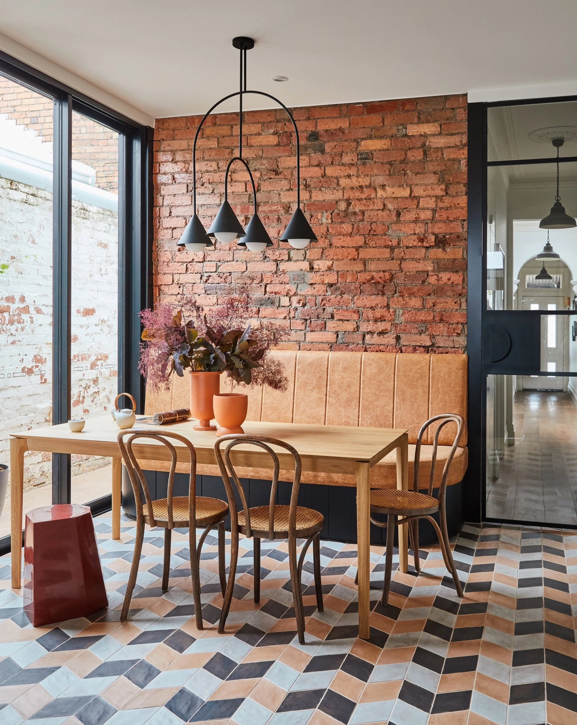
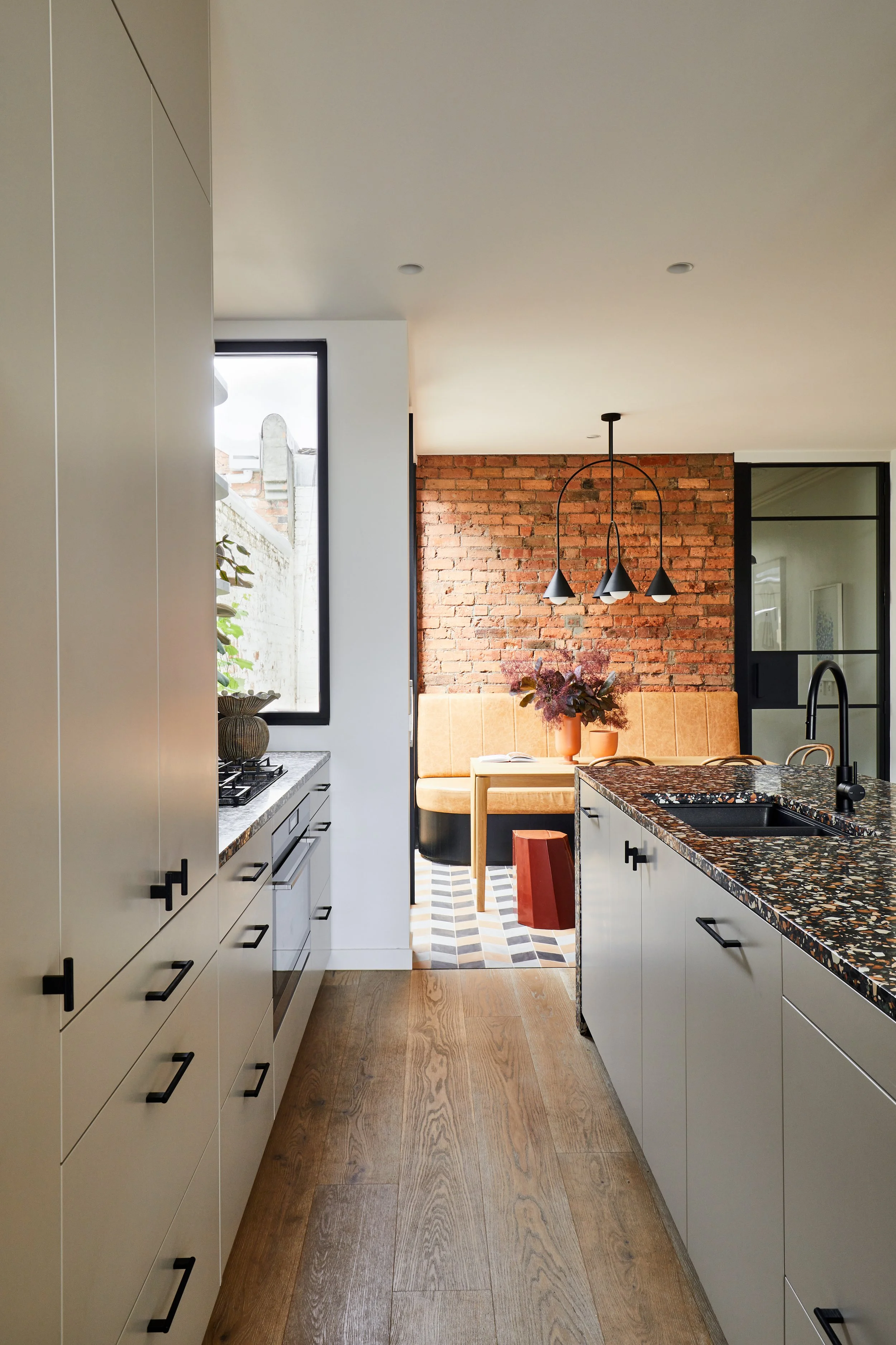
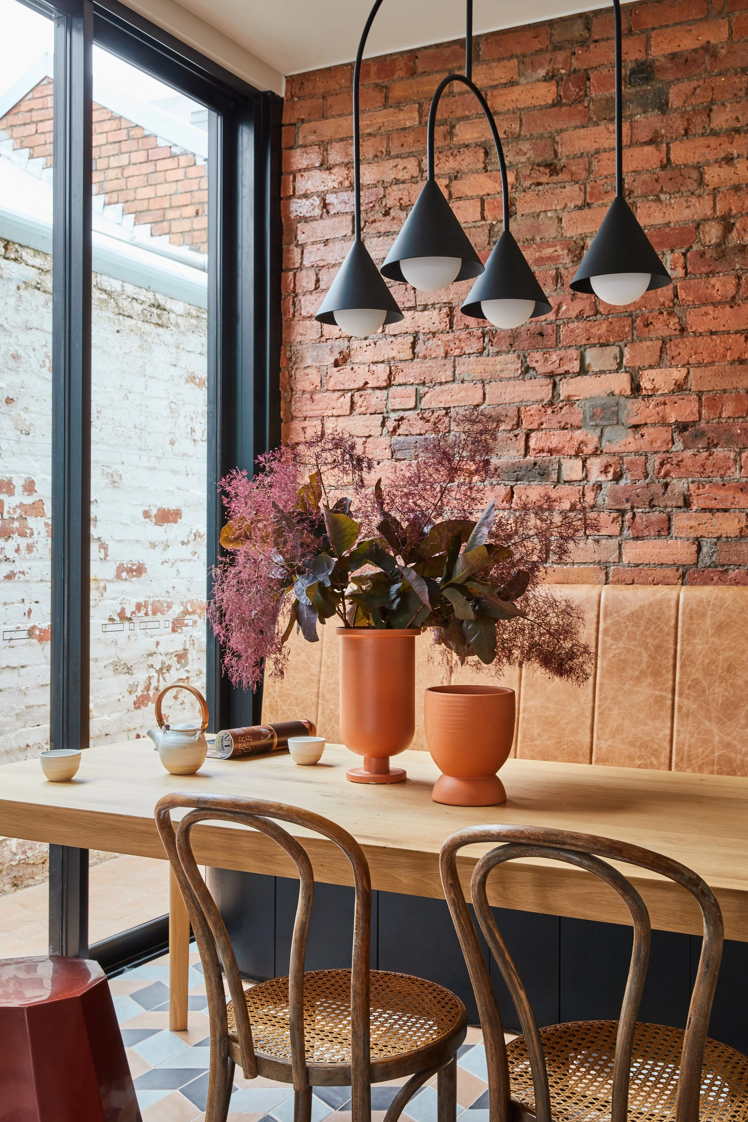
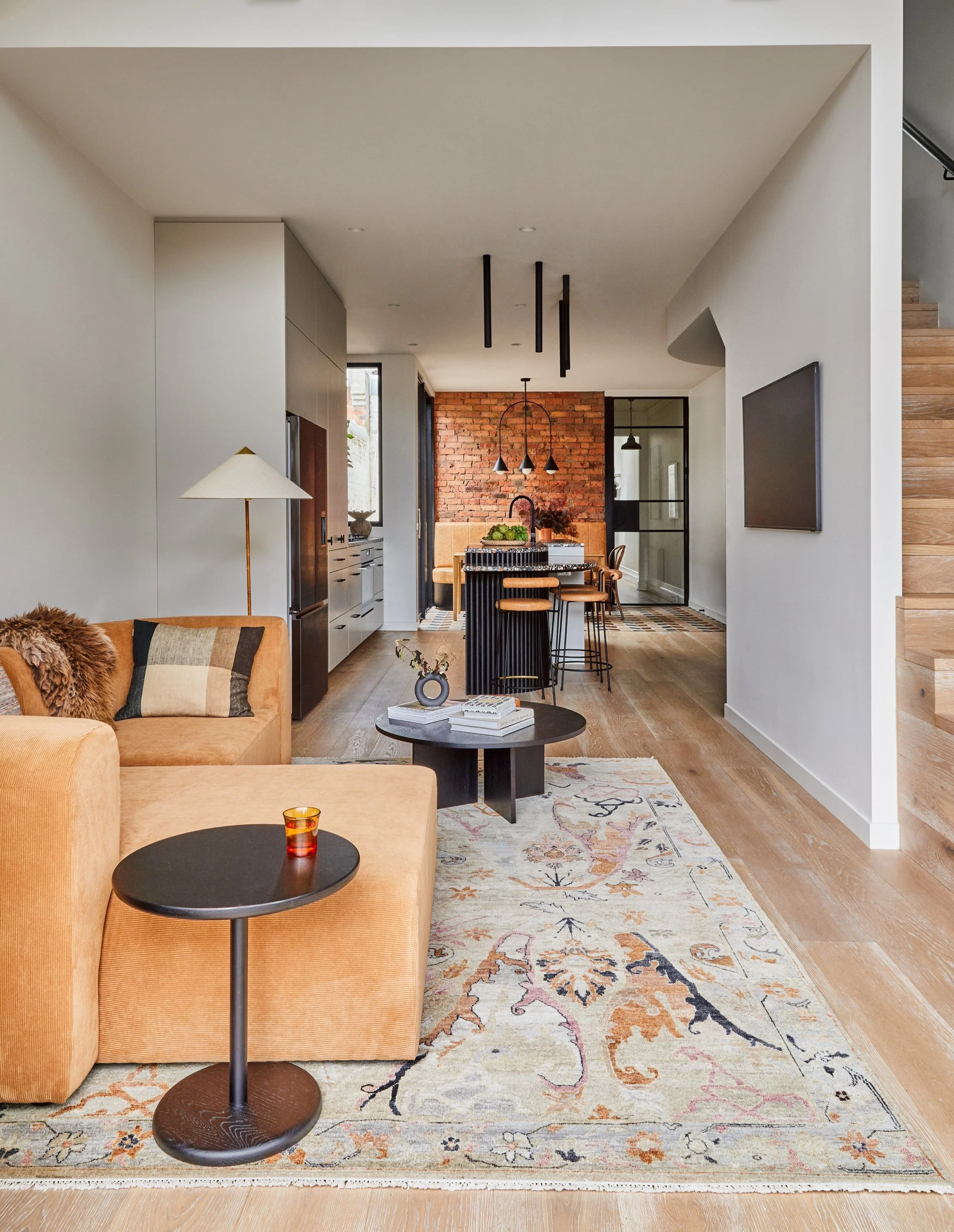
Traditional elements such as black steel doors, terrazzo and exposed bricks transition into the contemporary cabinetry design and styling on the upper level of the home.
The banquette seating in the dining space features a distressed finished leather.
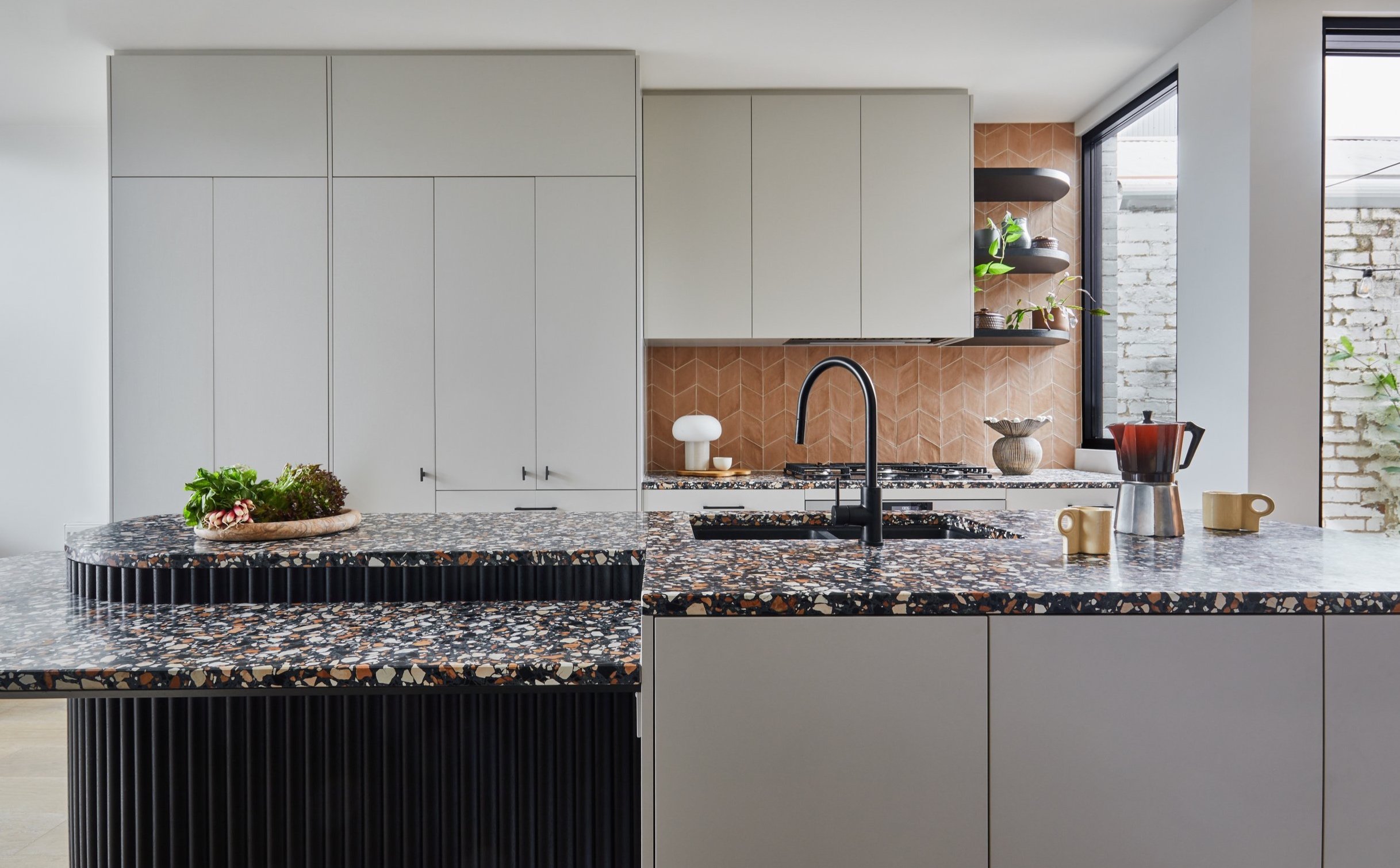
The bold terrazzo applied to the kitchen bench is a feature within the home.
‘The use of negative space in the design helps to create a balance with the bold elements, ensuring a cohesive aesthetic throughout the entire home.’
“I love the materiality of the design—the way the colours and finishes within both the new and traditional elements of the home really speak to each other.”
It was important that the design of the extension was complementary to the design of the existing part of the home, which was retained.
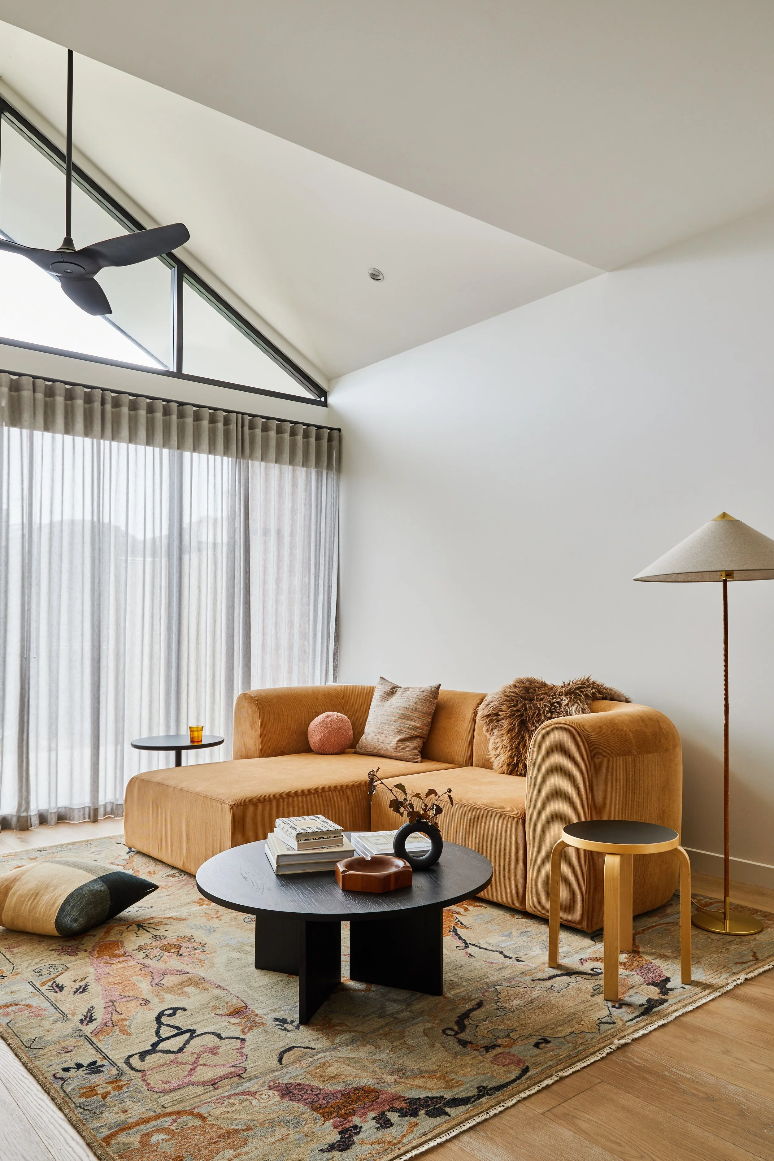
The downstairs living space is flooded with natural light.
Back in 2015, eat.bathe.live designed the front rooms of Cartlon North Terrace for a small renovation of the Victorian home in Carlton North/Wurundjeri Country, in Victoria.
The team were once again called upon for the home’s most recent renovation—to create a new and more functional kitchen, dining and living area, and the addition of a new upper level. ‘Similarly to the brief for the original part of the home, they wanted to create something special with unique and individual design elements,’ says Jenefer Gordon, director of eat.bathe.live.
One of the main priorities for the renovation was to honour the existing history of the home, and complement what was already there without overshadowing its rich heritage design elements.
‘One of my key passions is working on historic homes is creating a balance between the old and the new—accentuating and preserving period details, and then complementing them with the new design elements I bring into the space,’ says Jenefer.
‘The existing Victorian elements incorporate a sense of history, along with a story for the home, they are beautiful details that we can preserve and use as inspiration for the new part of the home. Some of these elements became the starting point for developing the colour palette and conceptual design for the interior,’ adds Jenefer.
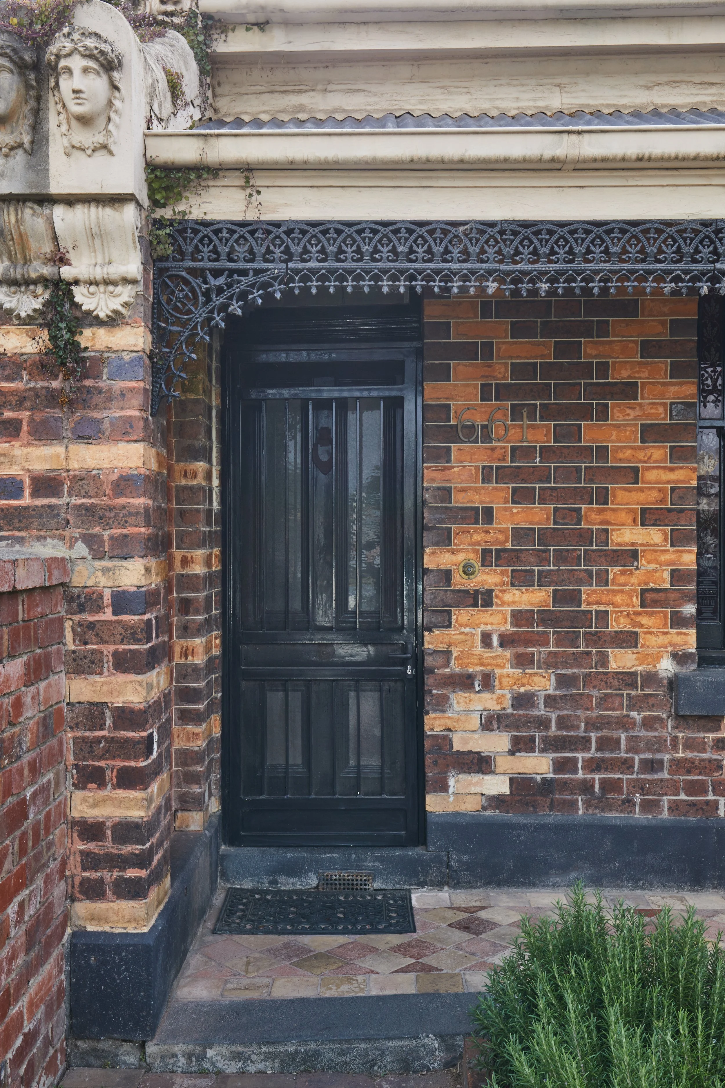
The design draws inspiration from the rich foundations of the home. ‘When designing within contemporary extensions on a traditional style of house, I really work to create a blended style within the space—elements of tradition, such as the black steel doors, terrazzo and exposed bricks transition into the contemporary cabinetry design and styling on the upper level,’ she says.
The striking graphic bold feature tile in the new dining area was a welcome addition for the clients and their passion for statement feature tiles. ‘This feature became one of the starting points for the design concept… for the dining area, I wanted to use beautiful tiles to create a transition between the old and the new parts of the home,’ says Jenefer. The inclusion of the new tile flooring was also a solution for the new timber flooring applied in the new area, ‘although it was the same engineered board, it wouldn’t have matched due to the seven years between installations,’ shares Jenefer.
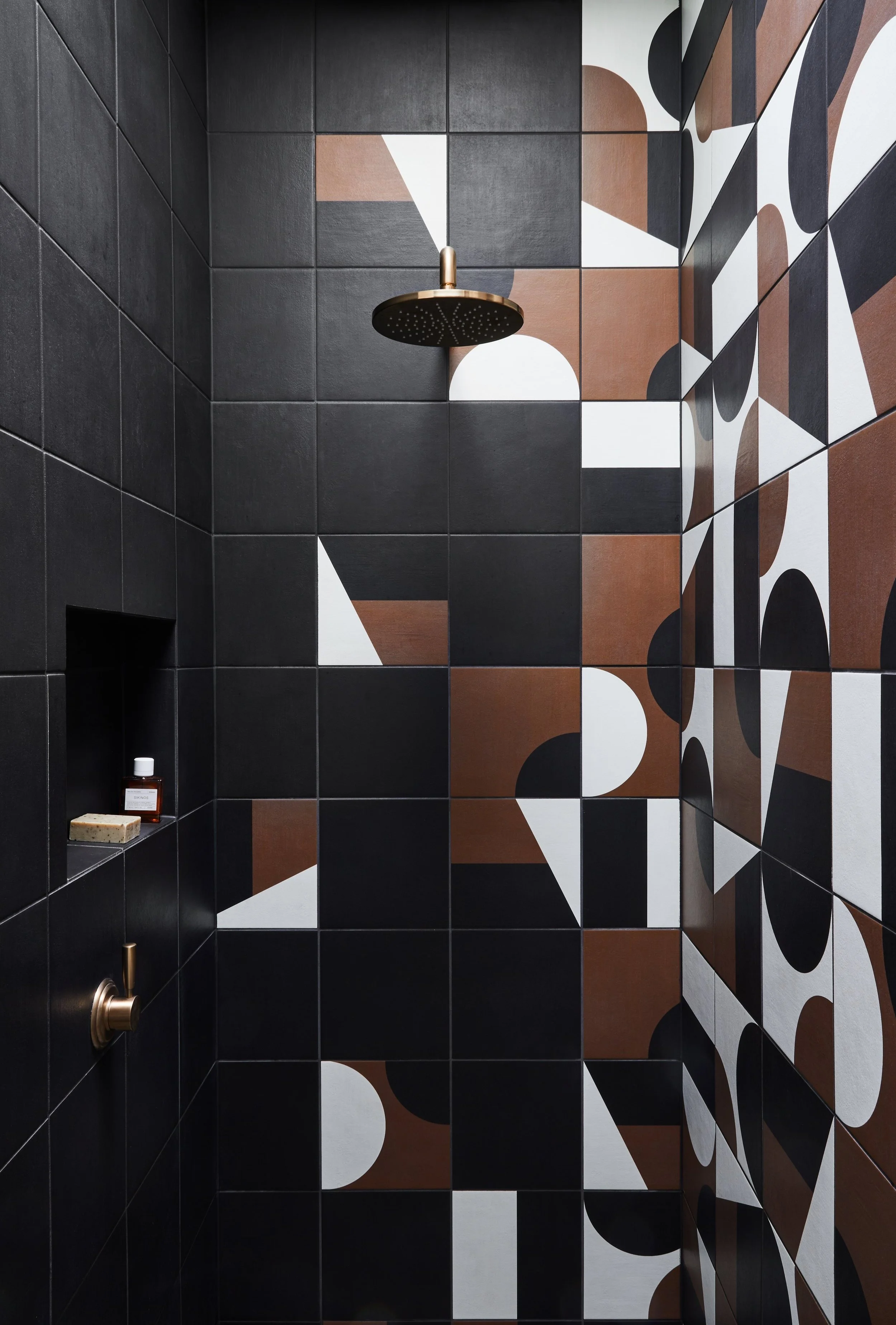
The bold and graphic design elements within enhance the spaces by utilising a simple colour palette of contrasting black and white, complemented by various tan hues. ‘The use of negative space in the design helps to create a balance with the bold elements, ensuring a cohesive aesthetic throughout the entire home.’
‘I love the materiality of the design—the way the colours and finishes within both the new and traditional elements of the home really speak to each other,’ adds Jenefer.
Cartlon North Terrace is a layered interior sympathetic its history, featuring black accents, exposed brick and patterned tiles, a vibrant and layered home the owner’s can enjoy for many years to come.
‘The clients wanted to create something special with unique and individual design elements.’
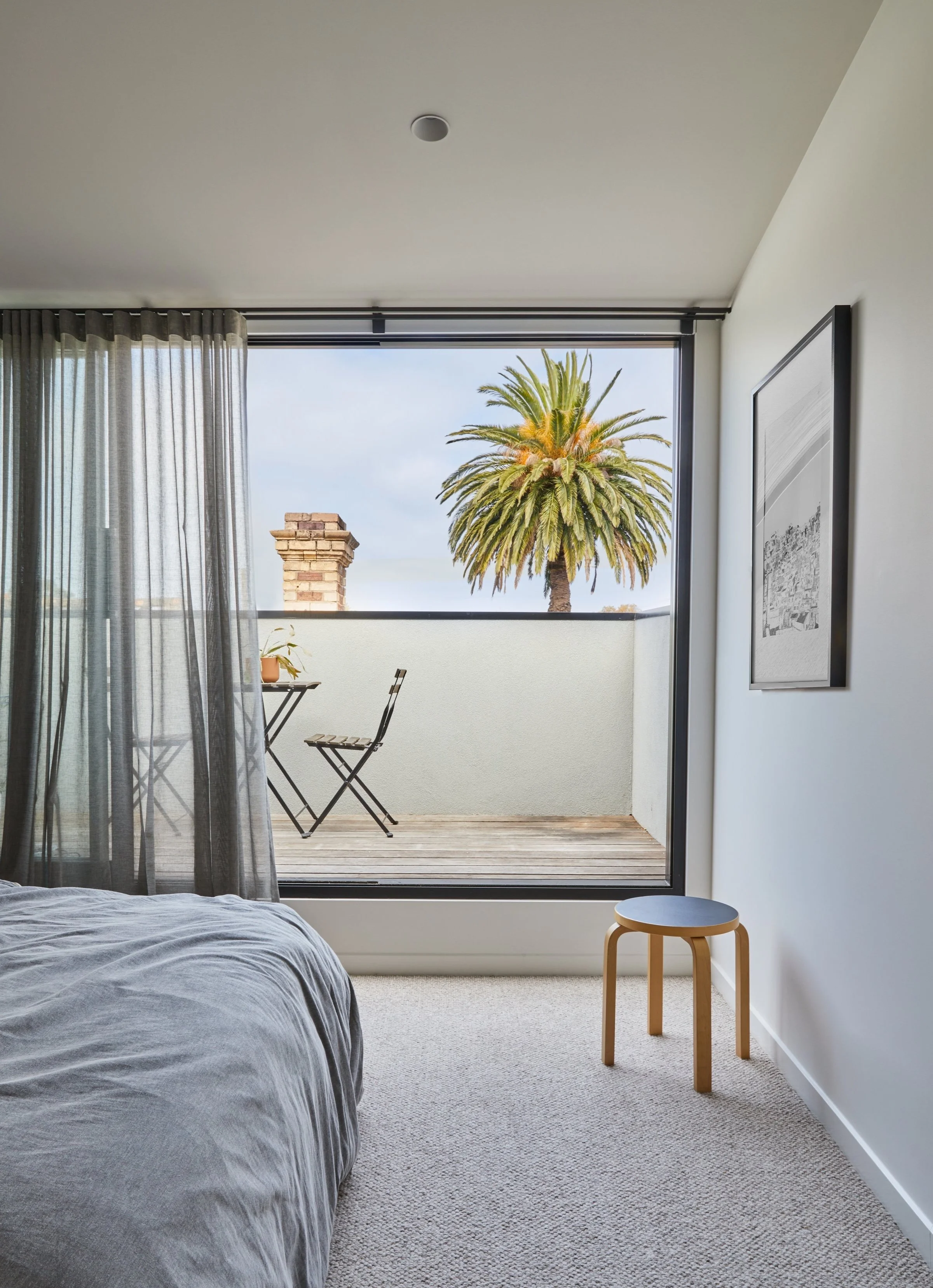
The main bedroom on the upper level opens to a private balcony.
Bold graphic feature tiles have also been applied to the bathroom space.
The exterior of the Victorian home.
‘One of my key passions is working on historic homes, creating a balance between the old and the new, accentuating and preserving period details, and then complementing them with the new design elements I bring into the space.’


