Frank Body Head Office by Made For
Designed by Made For, the new Melbourne head office for Australian cult beauty brand Frank Body is a combination of playfulness and sophistication.
Words: Hande Renshaw | Photography: Bobby Clark
‘We loved the idea of Frank Body being able to start their days with a coffee and a chat in a really fun setting,’ says Cara Stizza. Photo: Bobby Clark
Checkerboard details and playful elements can be found throughout the Frank Body workspace. Photo: Bobby Clark
‘Honestly, I think I’ve had dreams about the mistletoe green colour since Bottega Veneta dropped it in their collections. It made it to the moodboard once we came up with the concept for the project,’ says Cara Stizza, creative director at Made For.
The project is the new head office for Australian cult beauty brand, Frank Body. Located in Cremorne in Melbourne, the new workspace also houses Frank Body’s sister copywriting agency, Willow & Blake. Recent expansion and new global investment partners meant that a new, custom-built space was required to house rapidly-growing teams across both businesses.
The brief called for a space that had to be vibrant and fun, reflecting the brand’s direction and message.
‘Frank Body is cheeky and led the way with that bold tone of voice that feels so familiar in social media now; their office needed to have that same sass about it,’ says Cara, ‘there were so many fun things going on, with texture, shape and pattern, that we needed to ground the concept with some classic and timeless materials.’
The interior has the perfect balance of playfulness and sophistication for a work space, featuring a tonal palette of Frank Body’s signature ultra-pale pink and grey green, punctuated with rich burgundy, forest green and navy blue.
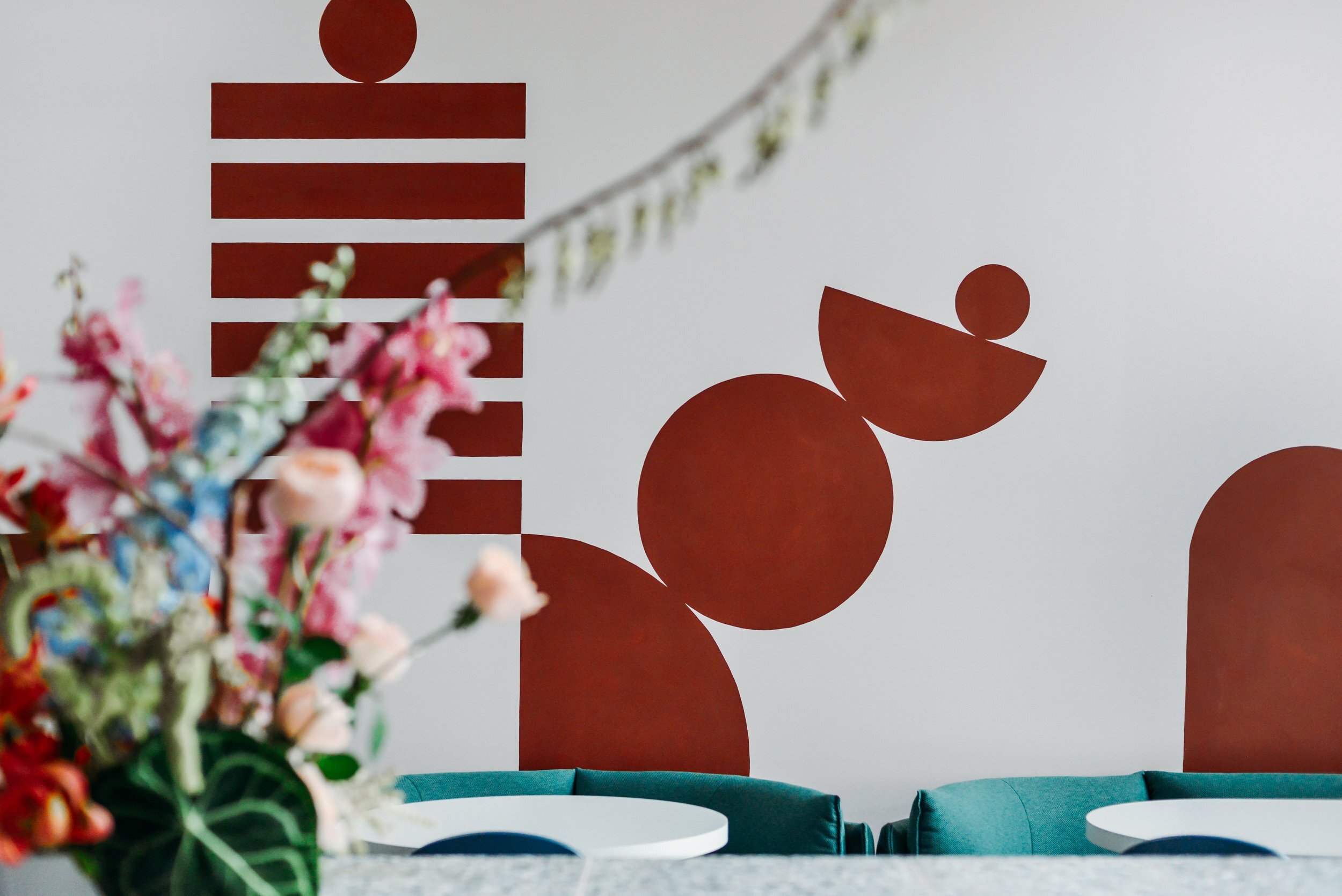
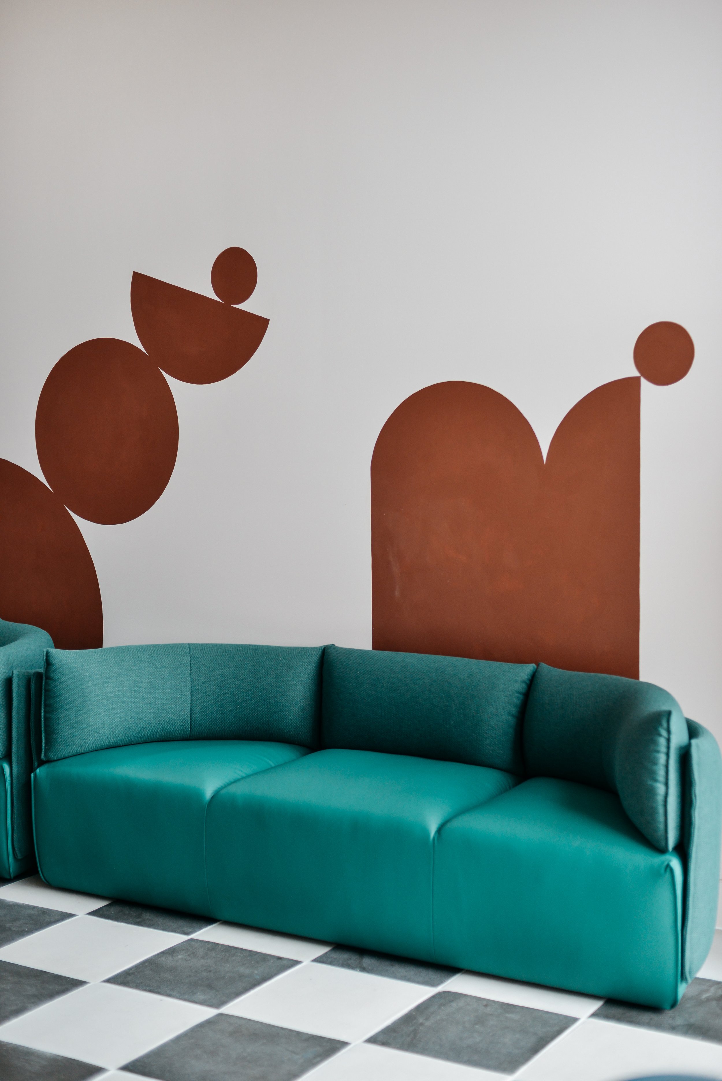
Materials such as black timber, stainless steel and terrazzo contrast against the bold use of colour. A bespoke large scale mural by local artist Bobby Clark dominates a breakout zone, where the team can rest and connect. This is a workspace that inspires creativity.
‘Frank Body gave us a lot of creative freedom, and it’s all at play here,’ says Cara.
Elements of playfulness and sophistication can be found throughout the space. Photo: Bobby Clark
‘We loved the idea of Frank Body being able to start their days with a coffee and a chat in a really fun setting,’ says Cara Stizza. Photo: Bobby Clark
“Frank Body gave us a lot of creative freedom and it’s all at play here.”
‘Distilled into a physical environment, the Frank Body identity plays out in the juxtaposition of vintage, playful influences with very sleek, highly-resolved elements,’ says Cara Stizza. Photo: Bobby Clark
Checkerboard details and playful elements can be found throughout the Frank Body workspace. Photo: Bobby Clark
Rich burgundy tones are a feature within the space. Photo: Bobby Clark
The new work space reflects the young and energetic Frank Body business. Photo: Bobby Clark
Accomodating the specific needs for a work space, Cara and the Made For team focused on functionality as a high priority when designing the space.
‘Residential contexts can be more straightforward simply because you’re designing a space to suit a smaller number of people – work spaces have to accommodate multiple people with various needs, while still embodying the essence of the client’s brand or business. Well designed work spaces enable function and form to work hand-in-glove.’
When designing for a brand, Cara’s design process starts with immersing herself in their story, followed closely with a workshop to visualise ideas and concepts.
‘For me, inspiration comes in all forms – once we start a project, it can consume me and I’ll find myself observing details all around me. Post workshop, I’ll spend a lot of time in the design library, bouncing around the drawers and cupboards, grabbing samples and sketching shapes and ideas,’ she says of the process.
By capturing the essence of the brand and combining it with more grown-up elements, Made For has created the ideal launchpad for Frank Body to expand and thrive.
A bespoke large scale mural by local artist Bobby Clark dominates a breakout zone, where the team can rest and connect. Photo: Bobby Clark
Design details within the Frank Body work space. Photo: Bobby Clark


