Kepler by Wowowa
Located in Melbourne’s north, Kepler by Wowowa invites hues from nature into its bright and unexpected design.
Words: Hande Renshaw | Photography: Martina Gemmola
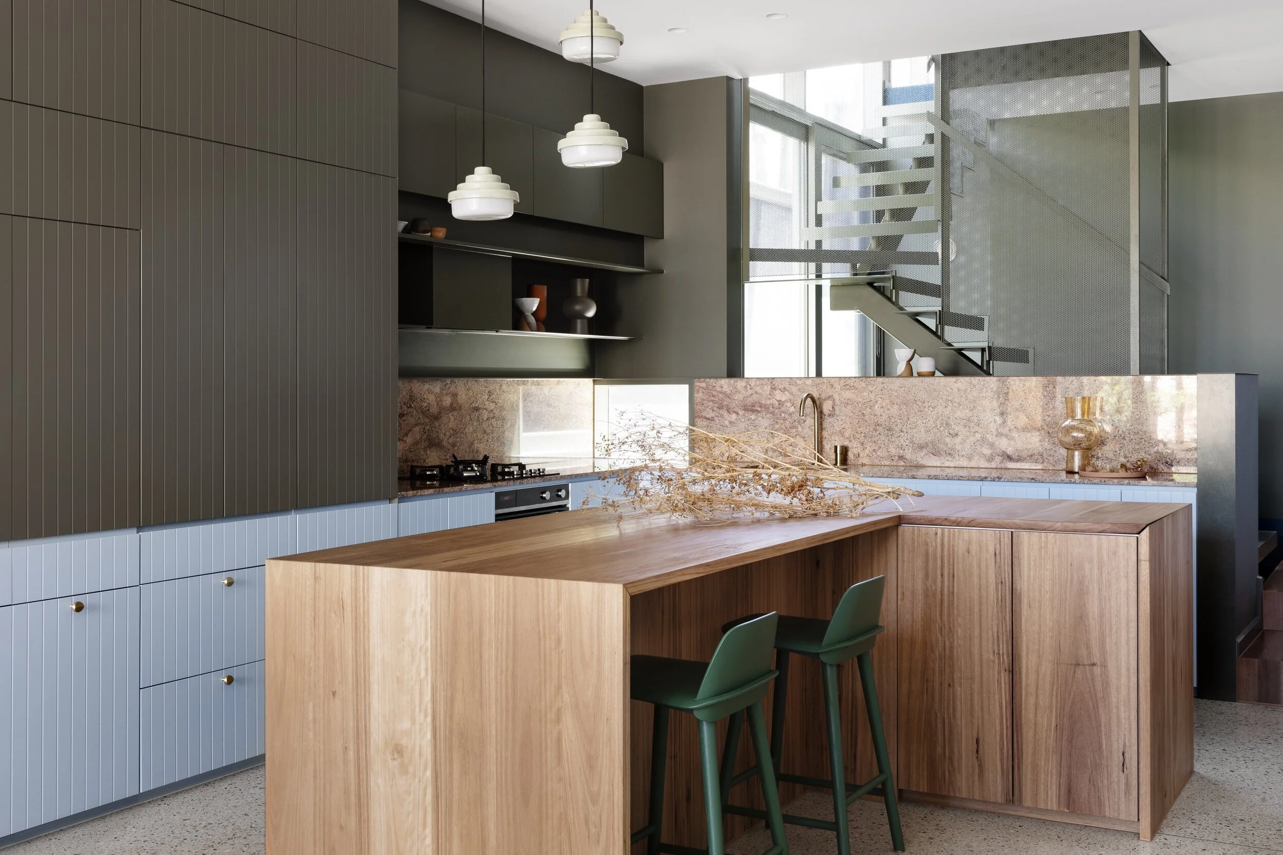
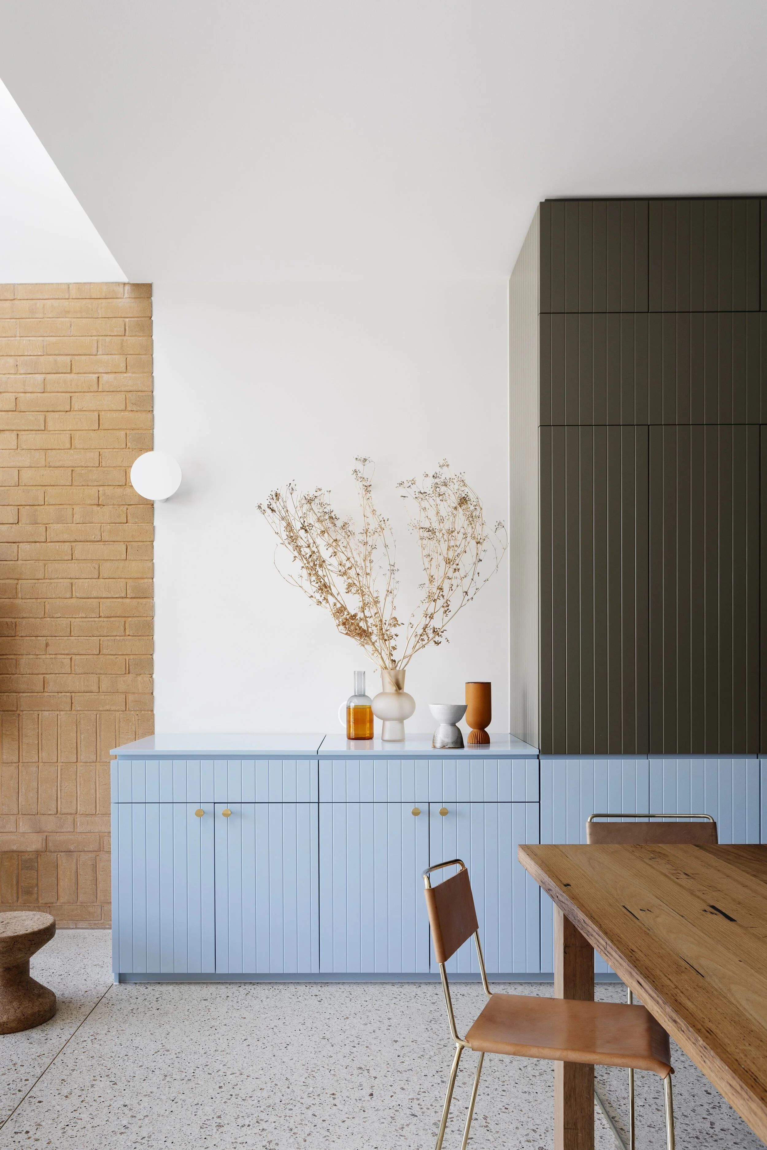
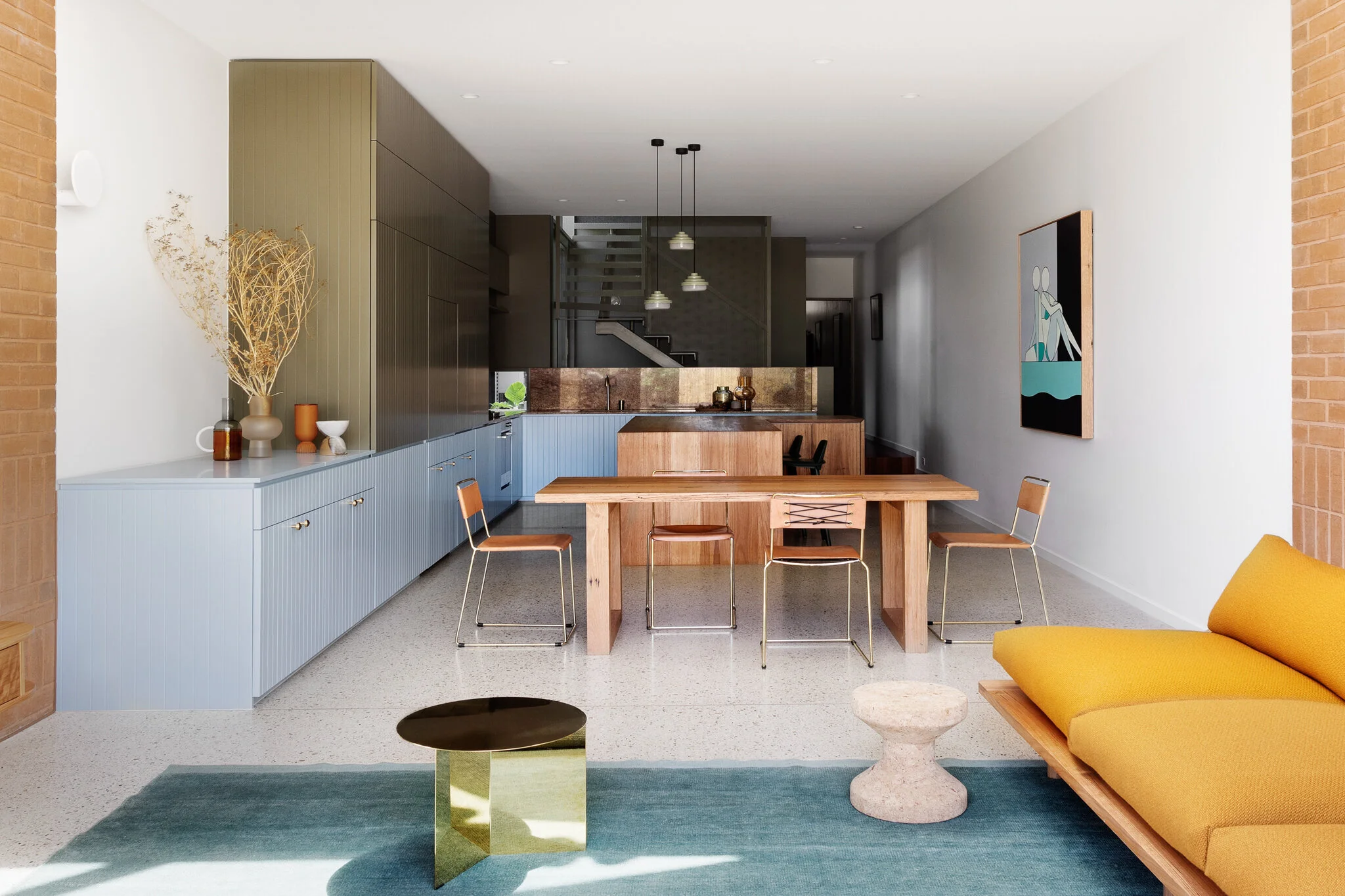
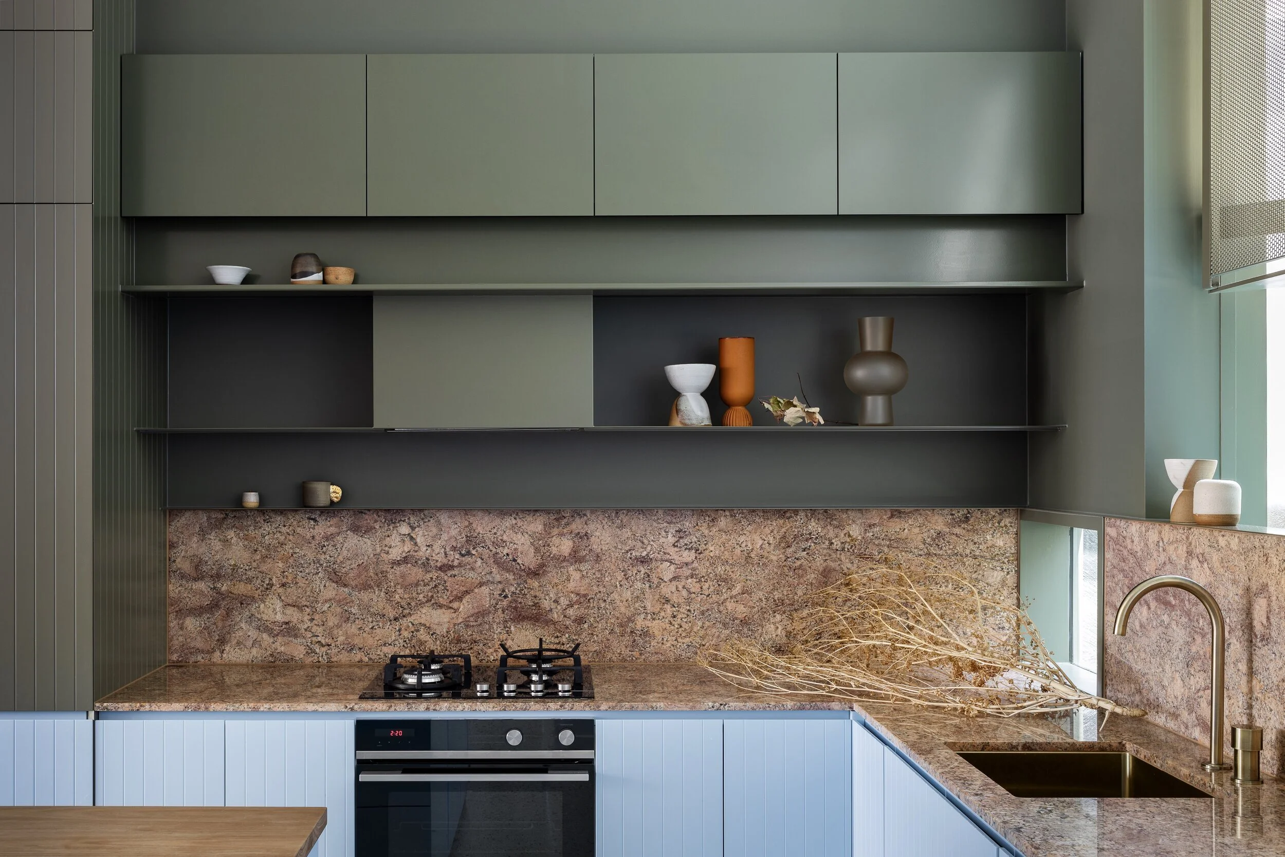
Dulux Blue Ice paint on cabinetry. Photo – Martina Gemmola. Styling – Ruth Welsby.
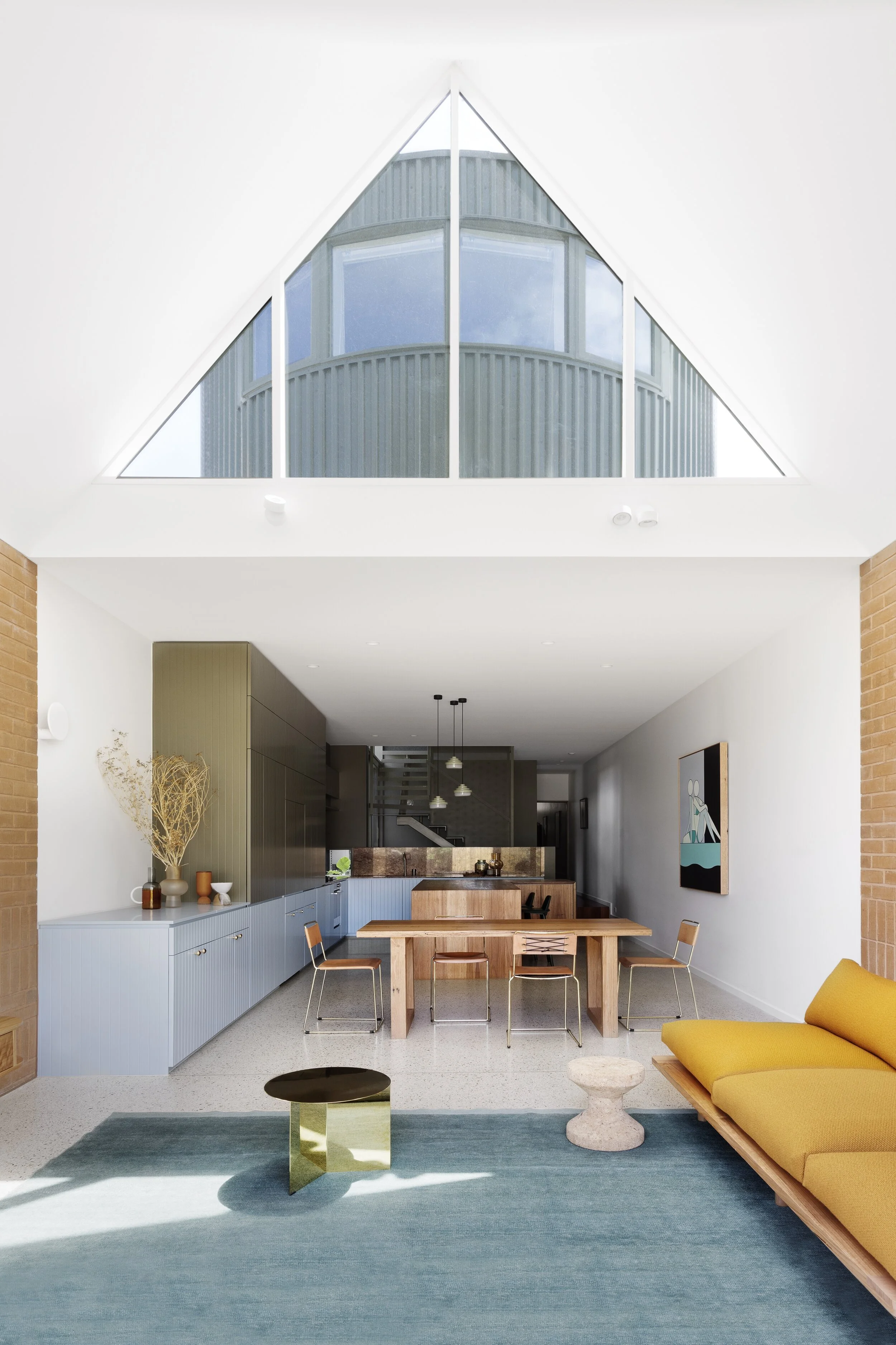
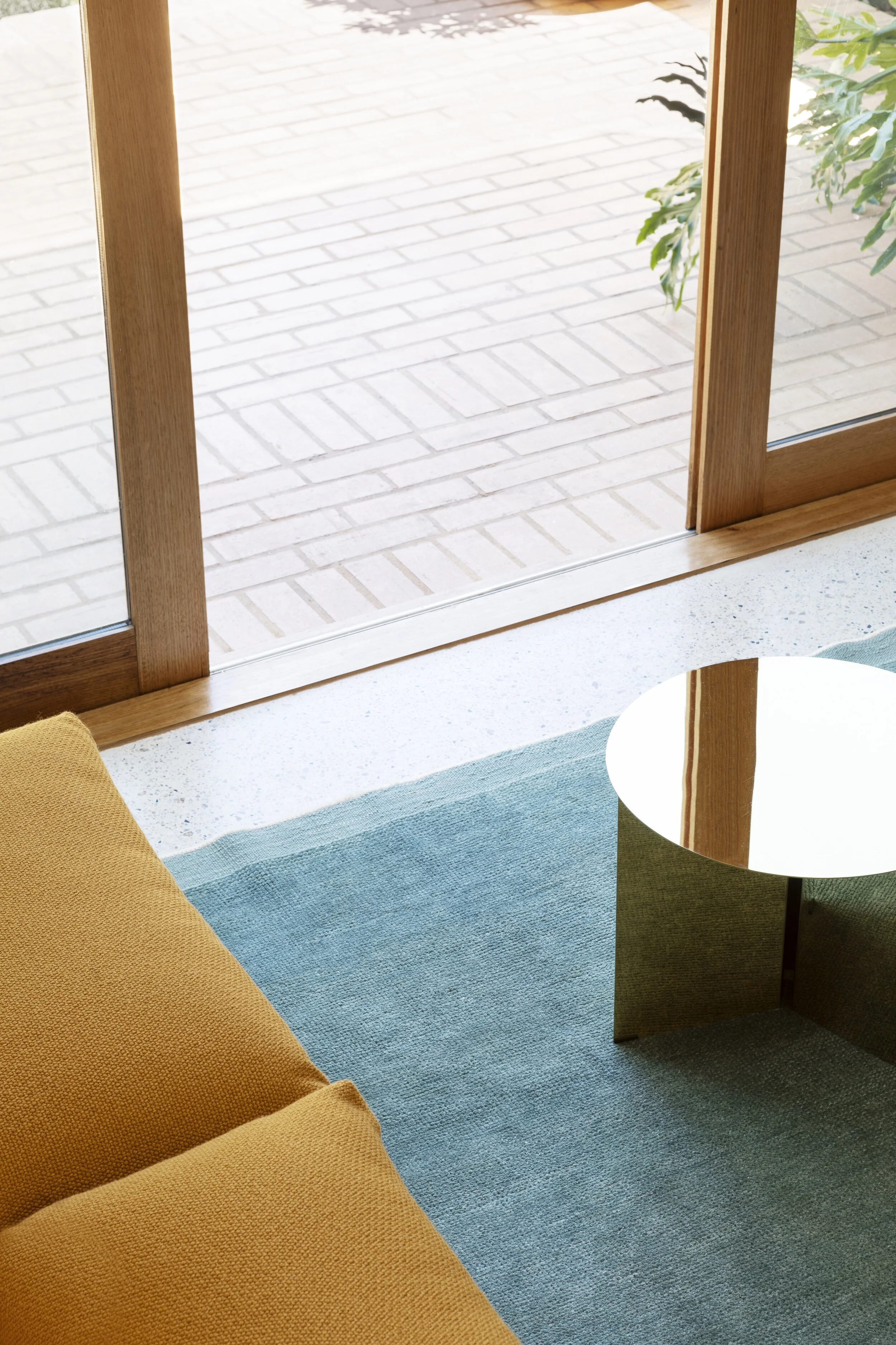
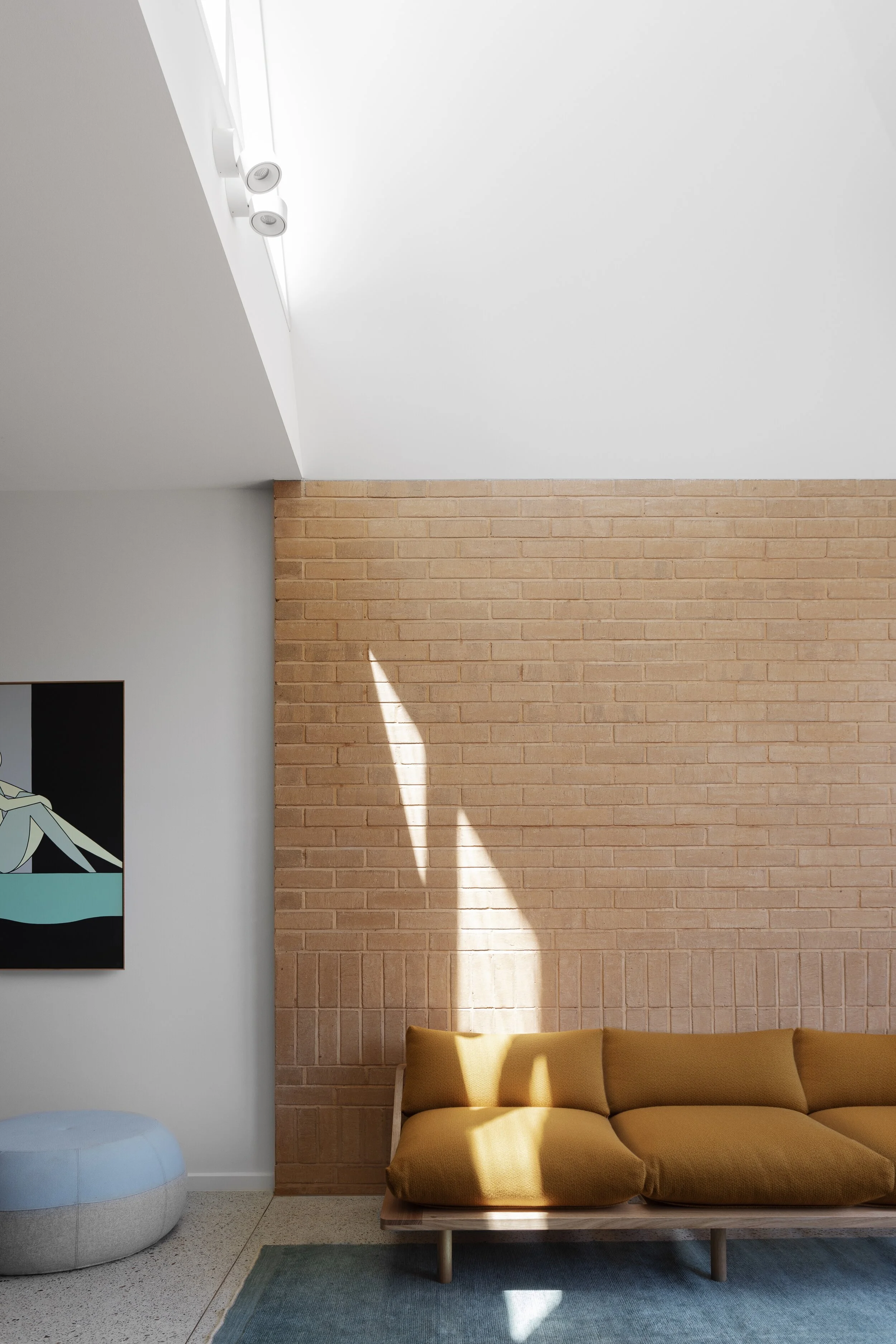
Brass slit table from Hay. Rug from Halcyon Lake. Pop & Scott Dreamer couch. Photo – Martina Gemmola. Styling – Ruth Welsby.
The gardens surrounding Kepler, a Brunswick East home designed by Wowowa, are lush with eucalyptus trees and bright coloured flowers, a palette that the architects mirrored inside the home.
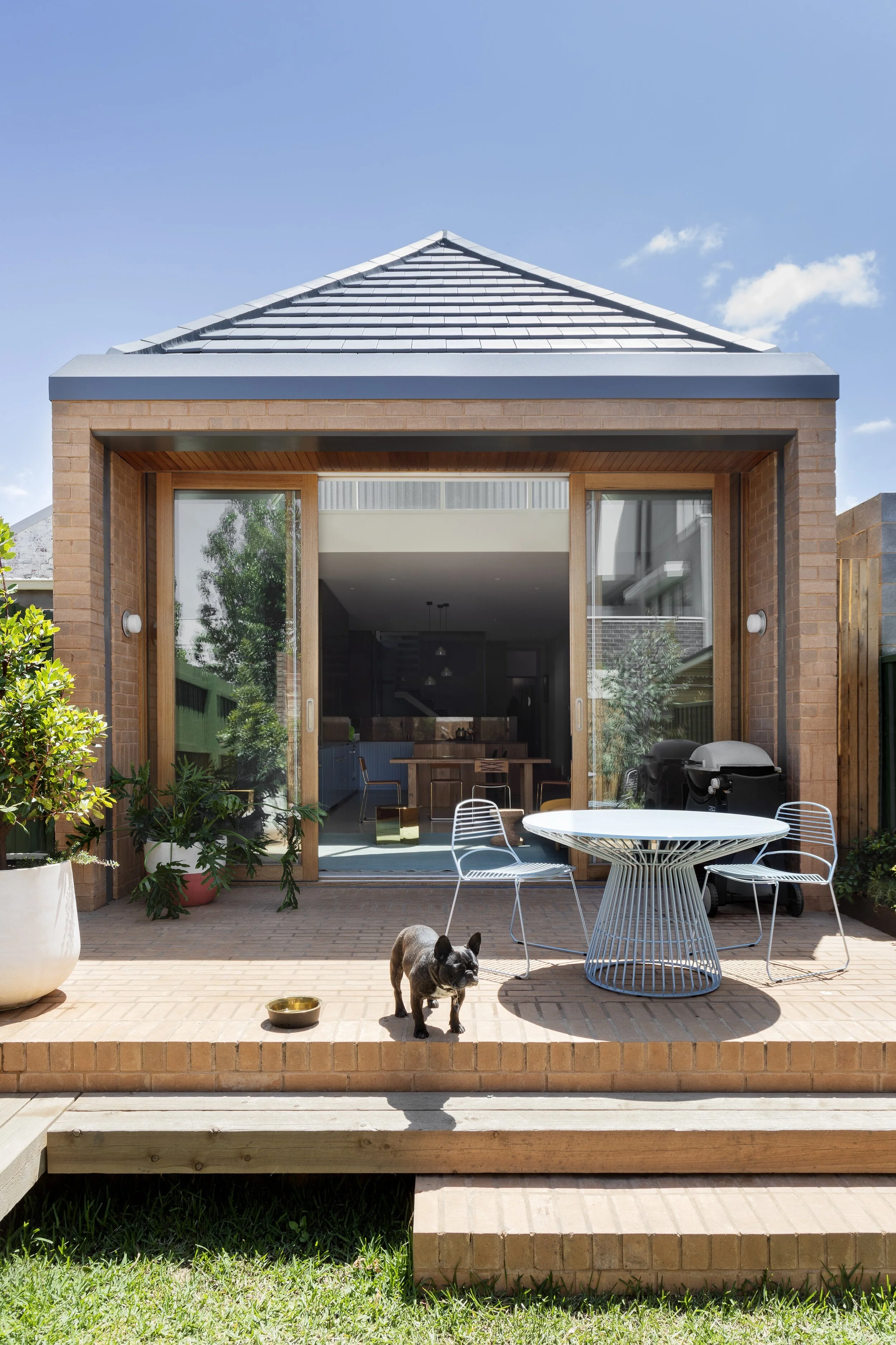
The bold colour palette of blues, greens and apricots creates a unique and joyful aesthetic. While the cream bricks, which are continued between the exterior and the internal spaces provide a neutral backdrop, the crisp white walls create a clean and contemporary aesthetic.
Owned by Rebecca Slater, Marc Slater, their two young boys, and pet pug, Kepler is a testament to living boldly and embracing connections to context through colour and light. The interior is a vibrant and personality-filled home for the young family.
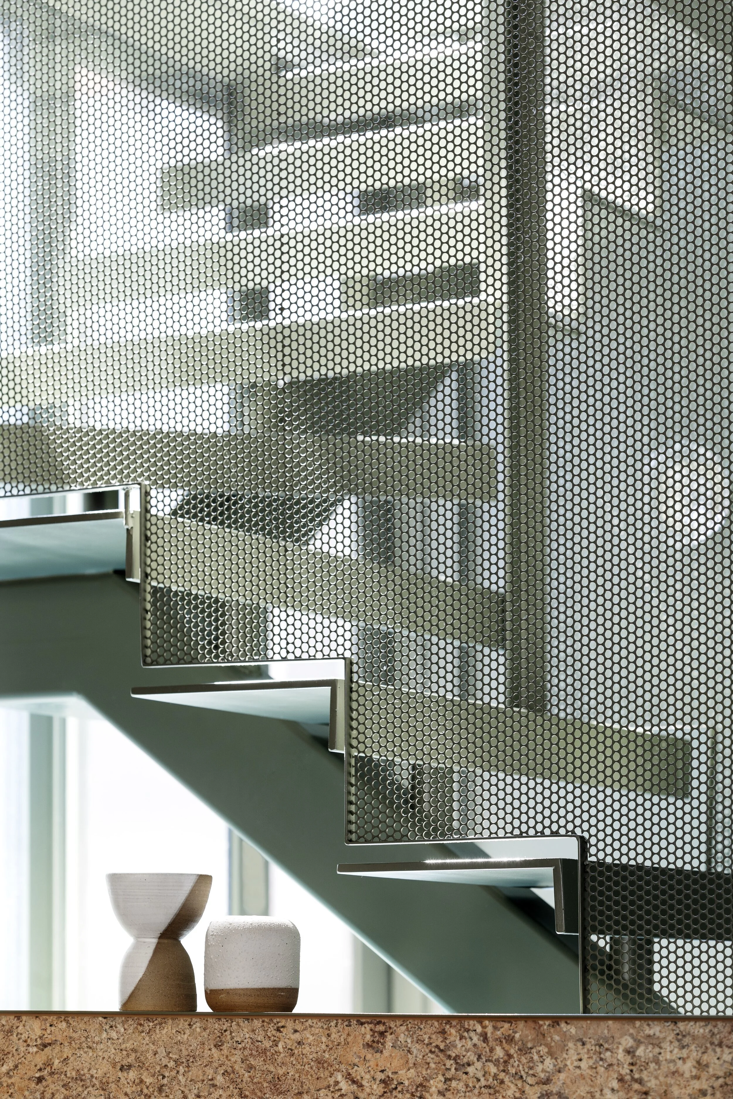
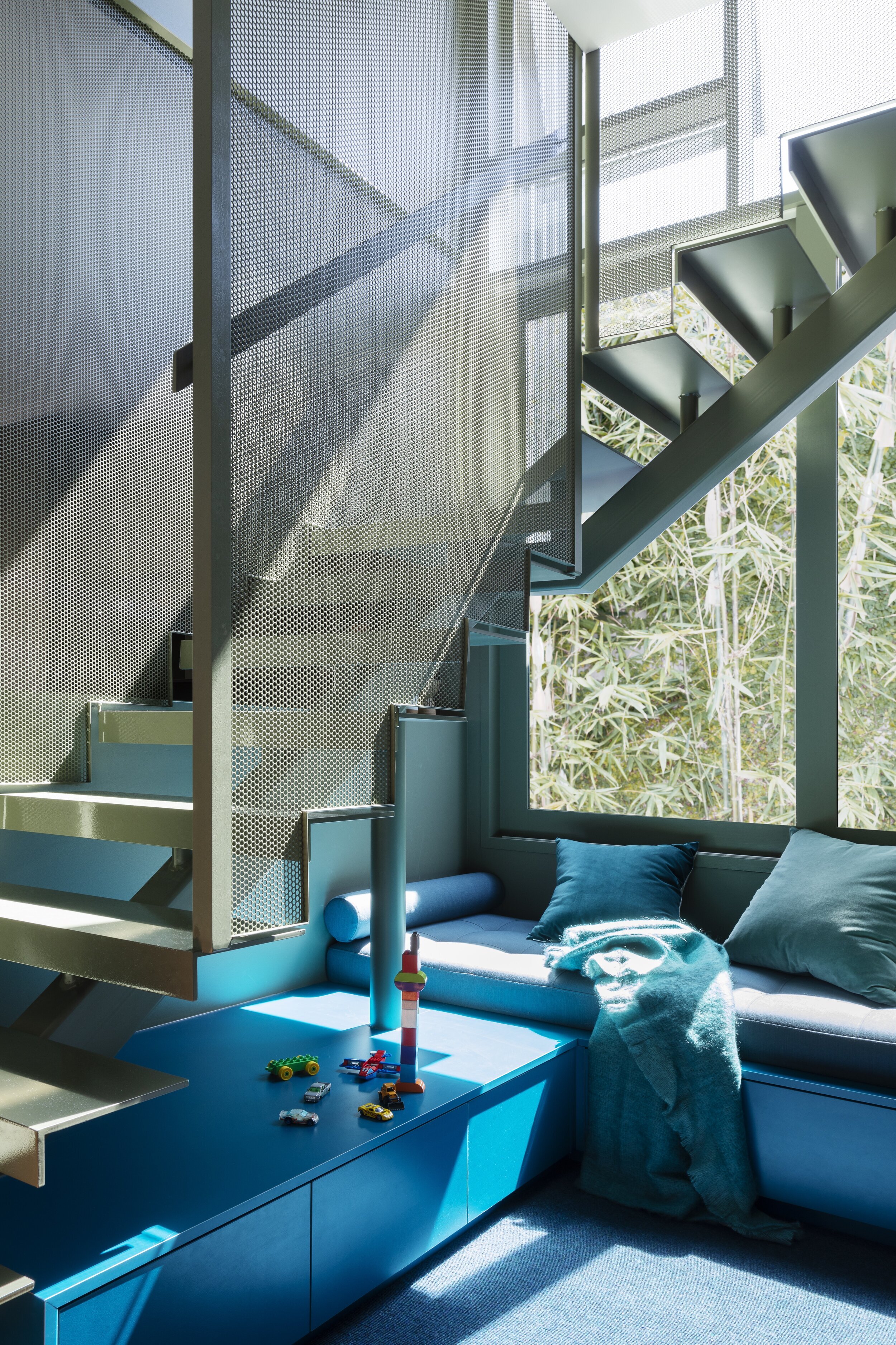
A stand-out feature of the home is the full height glazed stairwell, facing a fernery planted light well which brings natural daylight into the centre of the space, “We kept the staircase open so the kitchen could be basked in light and open to the space below — it also meant the whole house and family feel connected while in different parts of the home,” share Wowowa.
The prime renovation objectives were to create more space, and optimise the connection between indoors and out, “Narrow tight sites are always filled with their own challenges, and this was no different — from early on, we looked at a spacious interior, but a design that would be sympathetic to the neighbouring properties — from a bulk and light point of view,” say Wowowa.
With bursts of rainbow colour matched with a playful design, Wowowa has created a unique family home in a realm of its own.
“Early inspiration for the design was about ways to draw light in and draw the eye up, skywards,” say Wowowa. Photo - Martina Gemmola. Styling – Ruth Welsby.
“The new design wasn’t about taking up more space, but about how a better layout could create a more expansive and spacious interior experience. ”
The eucalyptus trees outside the home are reflected with the use of blues and greens. Dulux Blue Ice on lower cabinetry. Photo – Martina Gemmola. Styling – Ruth Welsby.
The daybed under the stairs acts as a retreat away from the upper level. Photo - Martina Gemmola. Styling – Ruth Welsby.
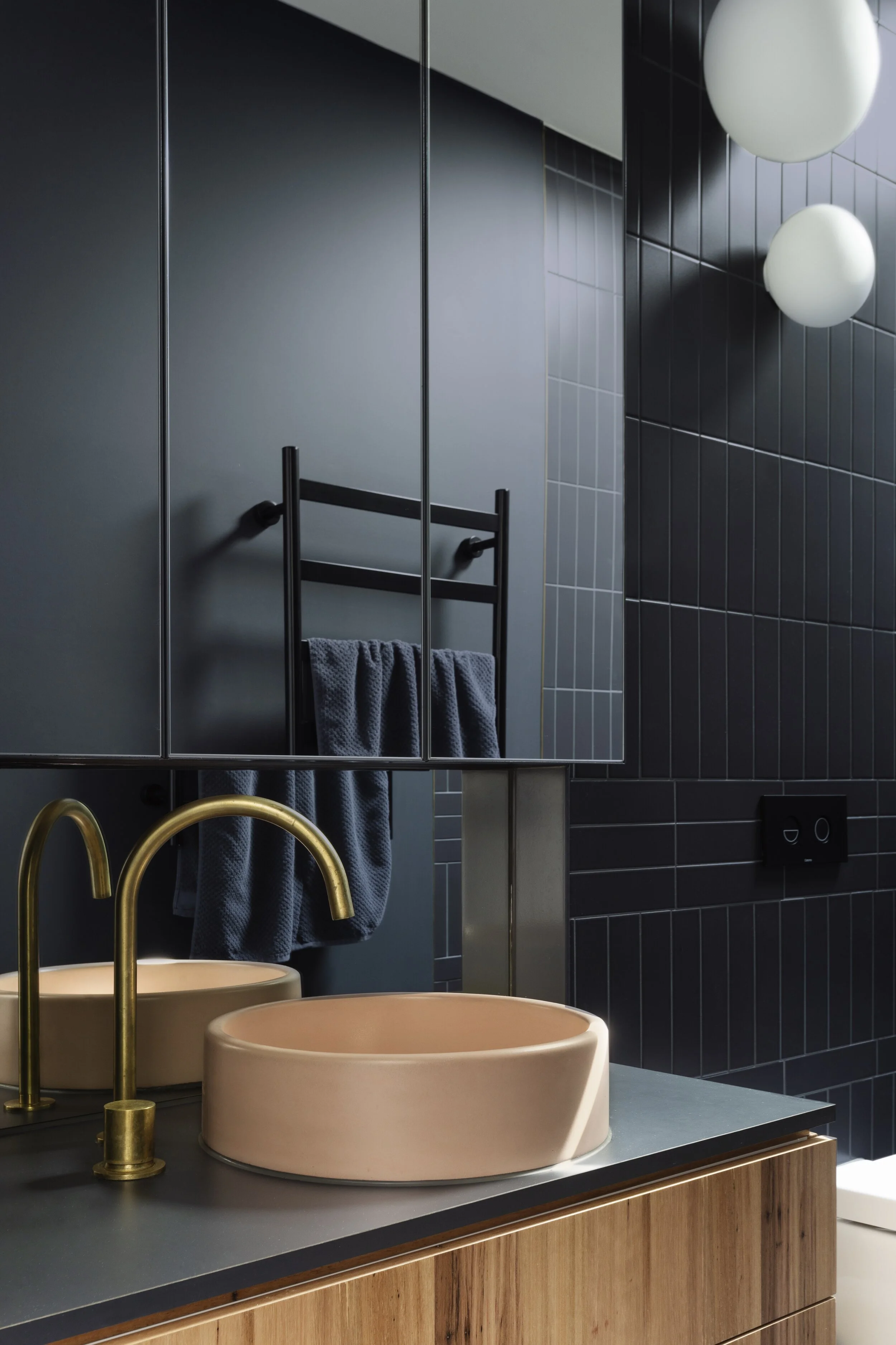
Nood Co concrete basin. Lucciola wall lights from Lights Lights Lights. Photo - Martina Gemmola. Styling – Ruth Welsby
Pop & Scott Dreamer couch. Puku Ottoman by Coco Flip. Rug from Halcyon Lake. Photo – Martina Gemmola. Styling – Ruth Welsby.
Bricks indoors and out connect the spaces together. Photo – Martina Gemmola. Styling – Ruth Welsby.


