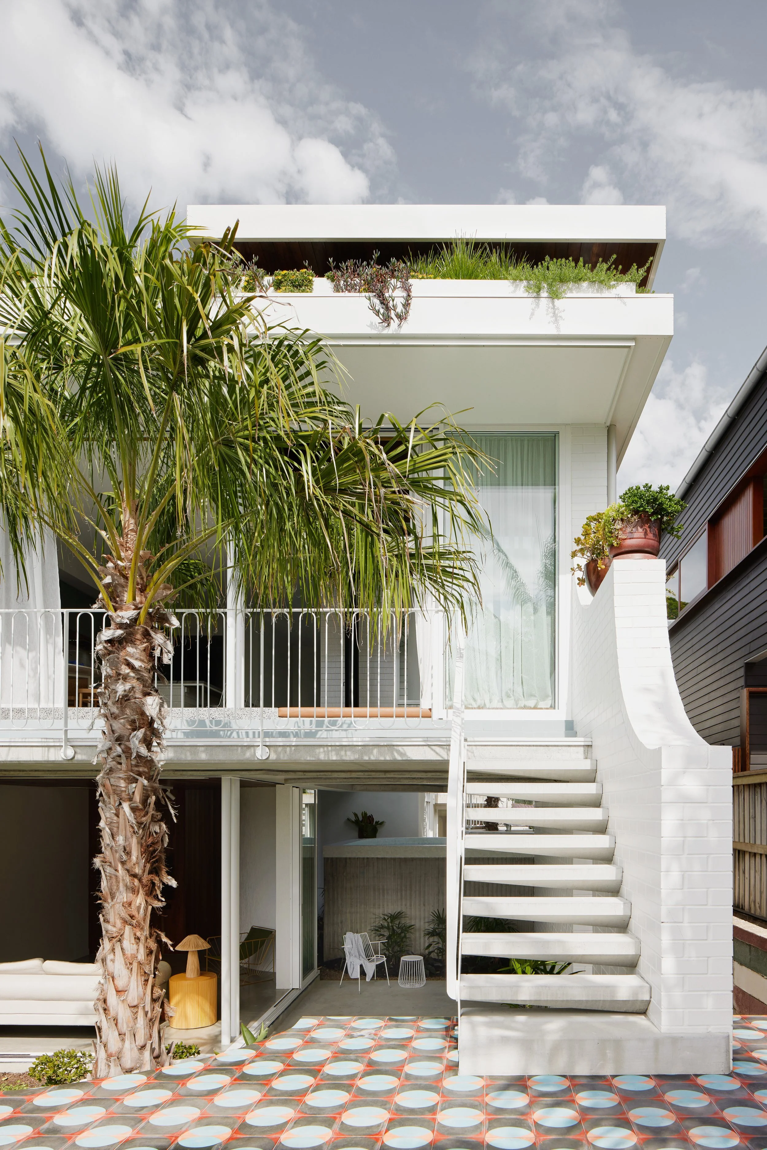
Paddington House by CG Design Studio
CG Design Studio's Paddington House strikes a harmonious balance between modern aesthetics and mid-century elements.
Words: Hande Renshaw I Photography: Brock Beazley
The clients wanted a home that showcased their admiration for mid-century design. Photo: Brock Beazley
Warm timber joinery is applied throughout the interior, including the kitchen. Photo: Brock Beazley
The dining nook featuring built-in seating. Photo: Brock Beazley
Functional spaces were made possible by the use of built-in elements. Photo: Brock Beazley
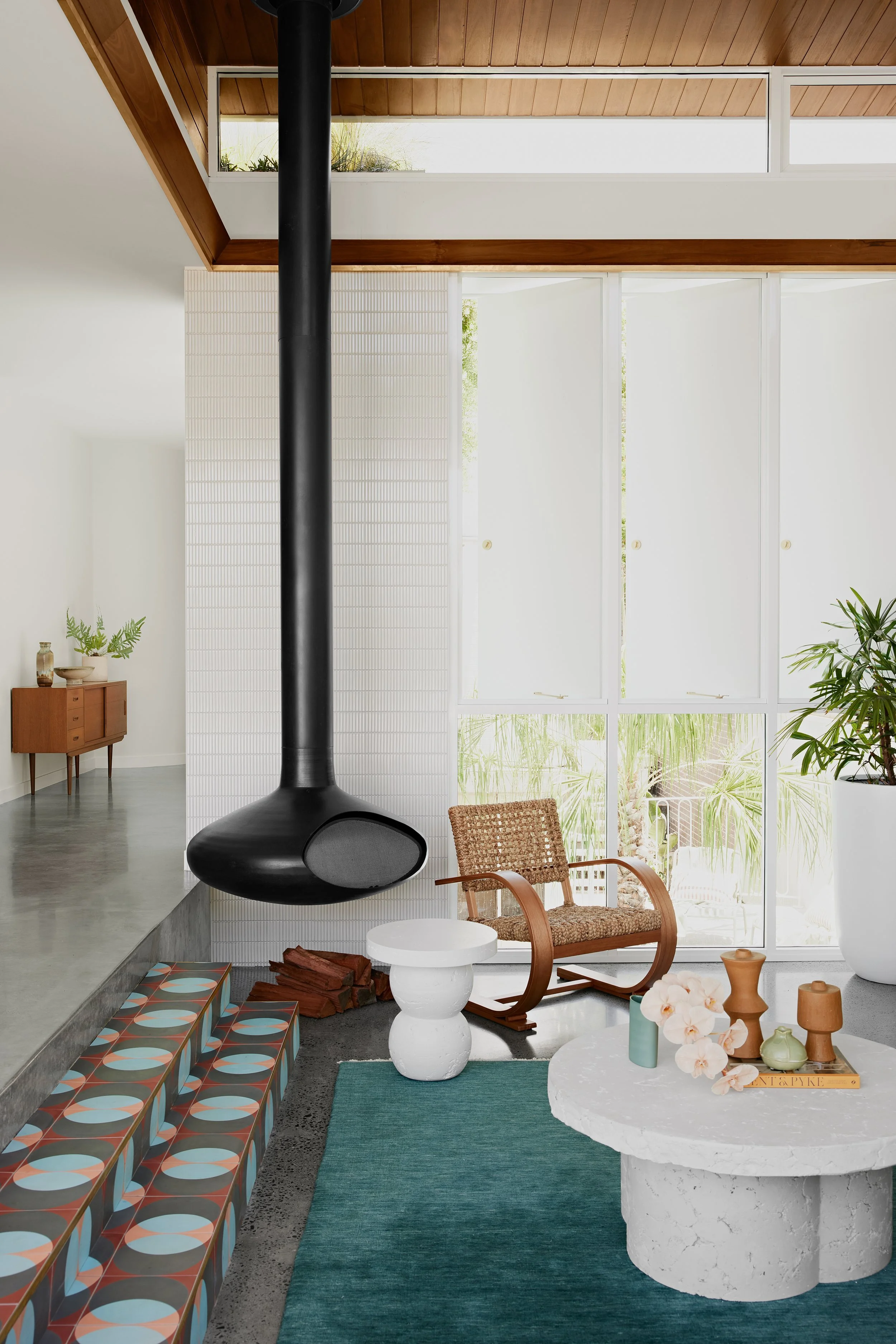
The colour scheme of the communal areas in the home is unified by the use of patterned tiles. Photo: Brock Beazley
CG Design Studio elevated the windows to the height of the roof to compensate for the lower ceilings, allowing more natural light to enter the space. Photo: Brock Beazley
It may come as a surprise that Paddington House, in Brisbane, was once a small and rundown two-room cottage. While some parts of the original structure remain, the cottage has been elevated and now sits at the front of the property.
CG Design Studio has transformed the site into a unique mid-century Queensland design. The clients, a couple with a young family, requested functional spaces with a unique and playful twist that would complement their love of mid-century design, vibrant patterns, and colour.
Christopher Gyzemyter, the director and head designer at CG Design Studio, aimed to strike a balance between contemporary and mid-century aesthetics, avoiding a kitschy reproduction. The steep and narrow site presented challenges, so the team focused on designing functional spaces rather than larger ones, incorporating mid-century design elements such as built-in furniture.
The communal areas of the house are adorned with vibrant, retro-style tiles that serve as the foundation of the colour scheme. The colours used in the tiles - blue, orange, and brown - are echoed in other areas of the house, such as the kitchen cabinets, rugs, and soft furnishings.
Additionally, cleverly painted details in the entryway and door complement the colour scheme. The combination of warm timber accents and subtle pops of color in these features provides a welcome break from the white walls and concrete surfaces that would otherwise dominate the home.
The building site presented several challenges, such as a sewer running through the property. However, these complications ultimately led to the placement of the central courtyard space, which enhanced the design by featuring the pool in the center of the home. Due to the sloping block and building heights, high ceilings were not feasible. Instead, the designers incorporated windows at ceiling height to maximise natural light and showcase the greenery in the roof garden.
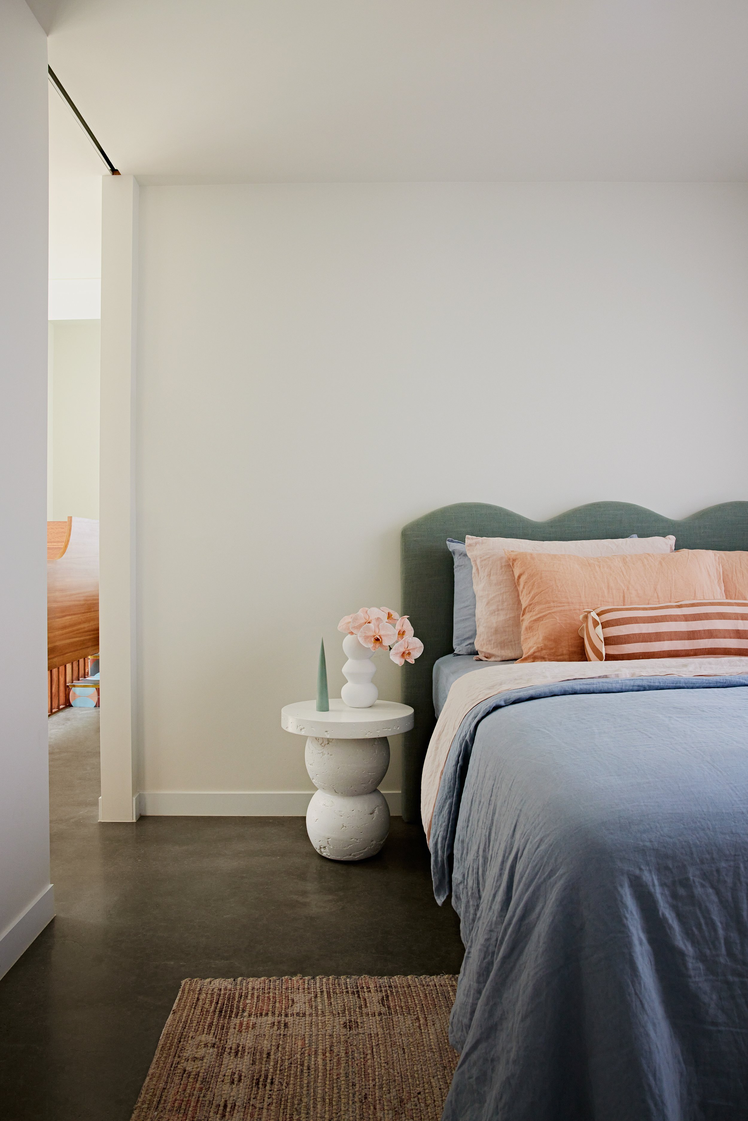
Even in the main bedroom, where the ceiling is the lowest, the eye is drawn towards the expansive roof garden and city skyline beyond. After two and a half years, CG Design Studio transformed the previously ‘unliveable’ cottage into a tropical, mid-century-inspired family home that blends in with its neighboring cottages.
The entryway, with its double-height ceiling, showcases whimsical lighting that complements the colour scheme of the rest of the house. Photo: Brock Beazley
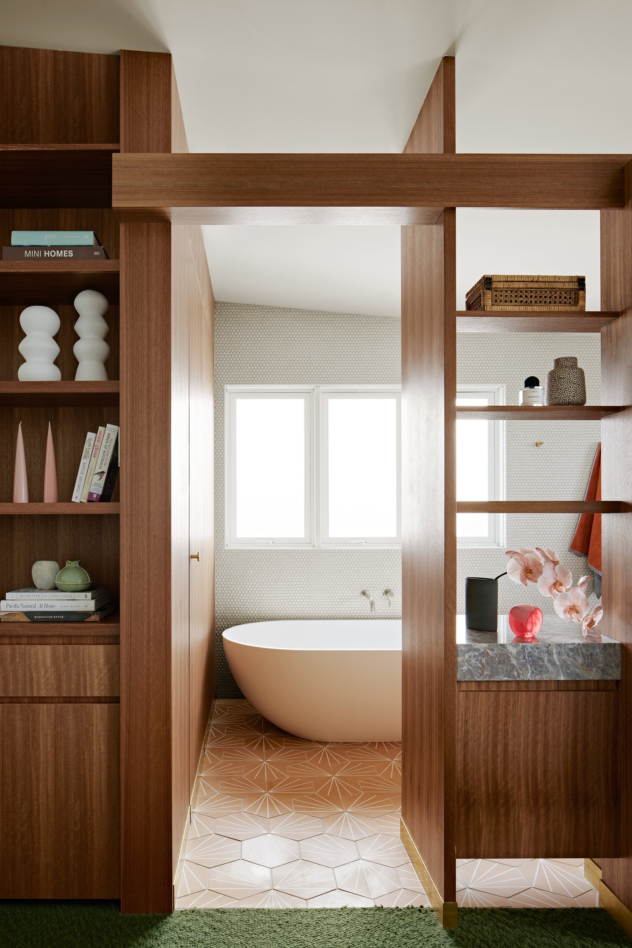
Warm timber joinery is a contrast against the simplicity of the white walls and concrete flooring. Photo: Brock Beazley
“The steep and narrow site presented challenges, so the team focused on designing functional spaces rather than larger ones, incorporating mid-century design elements, such as built-in furniture.”
The use of different materials on the walls enhances the overall aesthetic appeal. Photo: Brock Beazley
The ensuite of the main bedroom. Photo: Brock Beazley
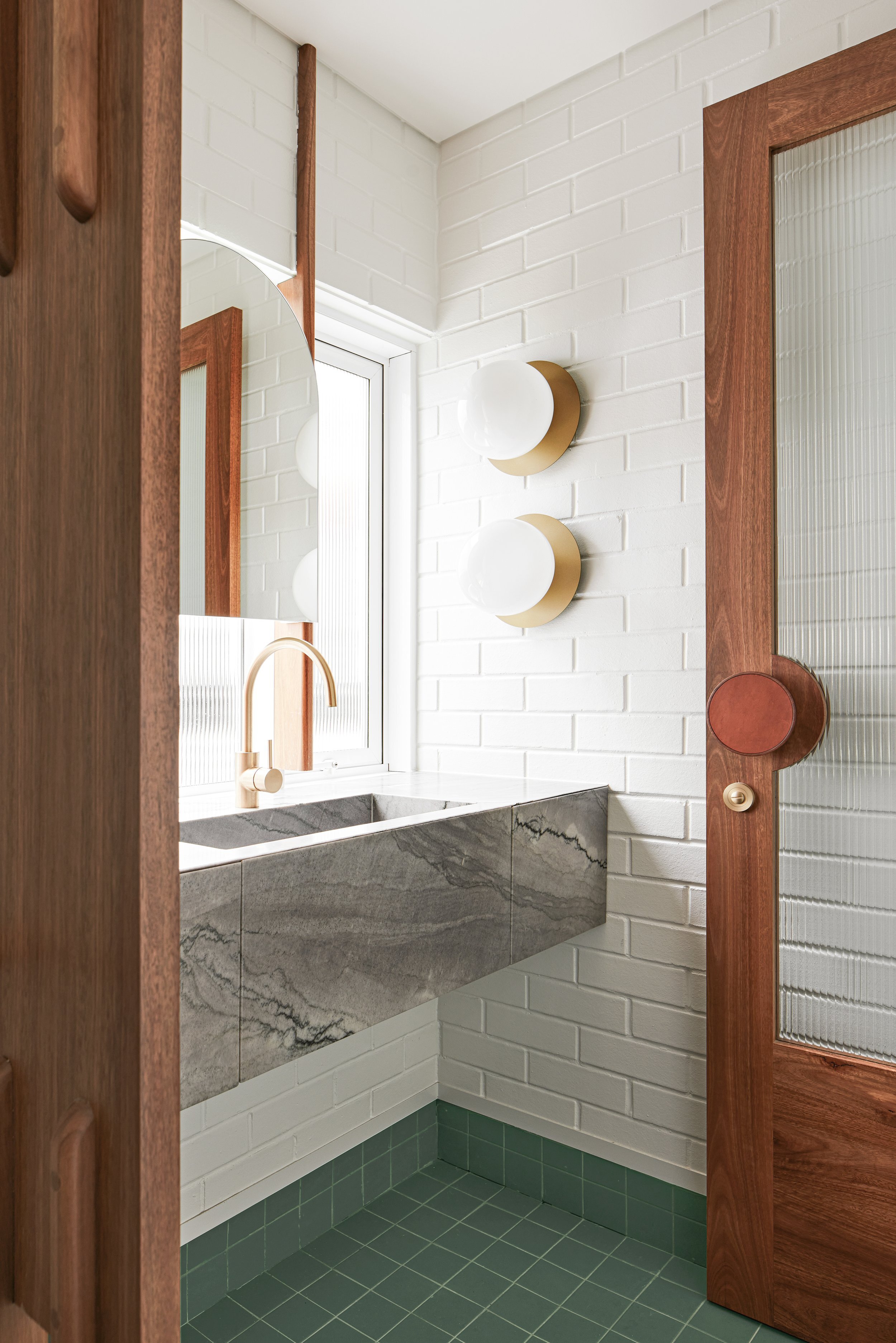
While the rest of the house boasts white walls and concrete, the bathrooms are adorned with vibrant colour. Photo: Brock Beazley
The back of the house opens up to the garden and bears a resemblance to the underside of a typical Queensland cottage. Photo: Brock Beazley
The balcony looks down on the lower gardens. Photo: Brock Beazley


