
Style: The Art of Creating a Beautiful Home by Natalie Walton

Natalie Walton’s latest (and now third!) book Style: The Art of Creating a Beautiful Home, takes us through the design process of transforming our spaces, using what we already own and love.
Words: Natalie Walton I Photography: Chris Warnes

‘To prevent an interior from looking flat, and to create a home that is visually captivating, introduce friction for energy and interest. Simple ways to add contrast include mixing up textures, colours and forms,’ says Natalie Walton. Photo: Chris Warnes

‘The arrangement of objects is another way to modulate the pace of a room. The greater the volume—both in the size of collections and the dimensions of individual pieces—the higher the energy levels within an interior,’ says Natalie Walton. Photo: Chris Warnes


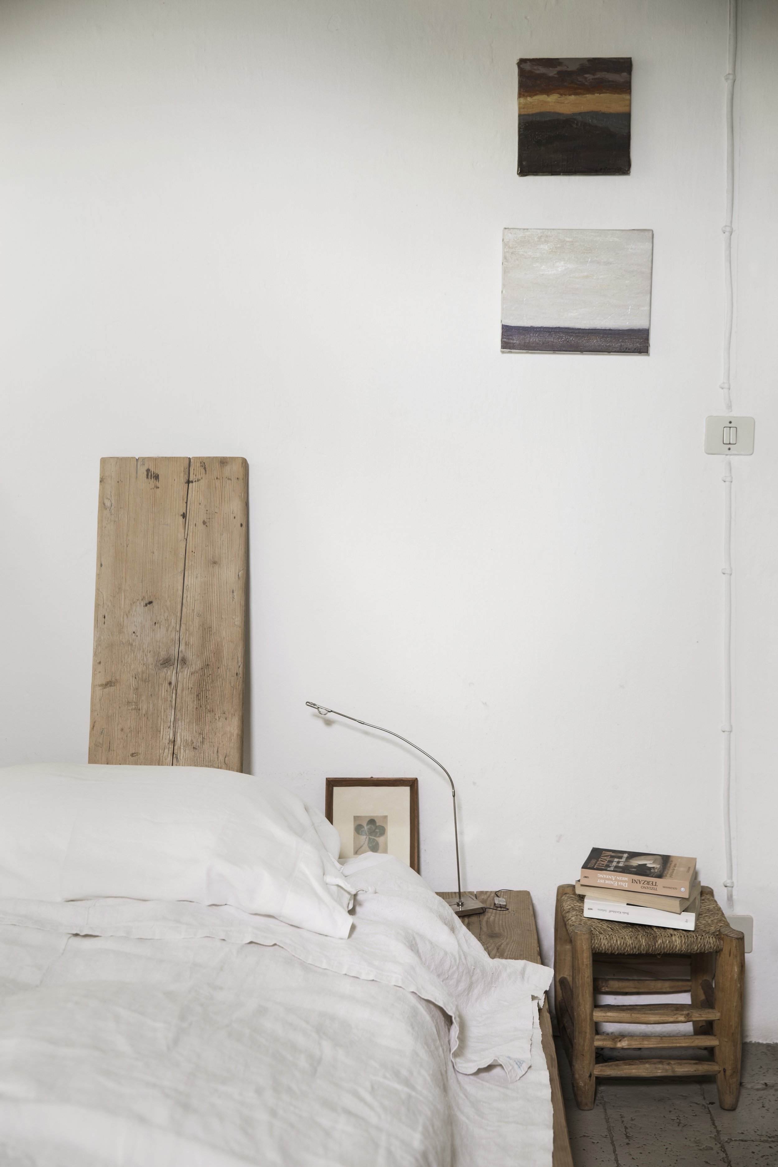
To create something of beauty, something that evokes the senses and appeals to your emotions, you need to start with the foundations. Photo: Chris Warnes
THE FOUNDATIONS
The process of creating beauty at home becomes easier when you know and understand the foundations of art and design. They help to remove the mystery that can often shroud creativity, and highlight why a space works or what’s missing and why. The foundations create a framework that you can apply to any project—from a vignette on a mantlepiece to an entire living room, and from the creation of a family home to a boutique hotel. You will also start to notice the foundations at play in the work of others, and how they are relevant to many aesthetic styles. When you consistently put the theory into practice, it helps the whole creative process to become more intuitive. Over time you will develop a type of muscle memory, knowing what to place where without too much thought. This is why some creatives can’t always articulate their process—it has become so ingrained.
The more you understand the ‘rules’, the more you can explore their limits. You can challenge them to push boundaries and supersize scale, amplify texture, play with pattern and create grand gestures. Or you can work in the other direction, intentionally turning down the volume to play quietly and embrace negative space, constrain colour and favour subtle touches. The foundations are part of your toolkit; it’s up to you what you choose to magnify or minimise.
An added bonus is that understanding the foundations of art and design can improve skills in many areas of life. Because of how we process information, our brains make sense of lines, shapes, space, colour, texture and pattern in specific ways. When we know and recognise these principles, we have the framework to compose any visual element to please the eye. We can apply these ideas to everything from graphic design to photography to garden plantings.
A common misconception when it comes to creating spaces is that your personal style determines the way you create. But it doesn’t matter whether you gravitate towards interiors that embrace simplicity or drama, the same principles apply. When you know and understand the foundations of styling, you can apply them to any space. Again, it is the same with the other visual arts—the principles that underscore what makes a good film can be applied to different genres, from arthouse to comedy to horror.

When all the design foundations are working in unison, cohesion is achieved. Tweak individual elements to fine-tune. The more you engage with the process, the more in tune you will be to beauty in your home. Photo: Chris Warnes

‘Negative space provides more time to absorb all the visual information and slows the viewing experience right down,’ ’ says Natalie Walton. Photo: Chris Warnes
“When all the elements work together, you’ve created harmony, something greater than the sum of its parts. But if you want to elevate or enhance the work, introduce contrast.”

Often what holds us back from making any decision, and taking a step towards the home and life we want, is fear. But when we experience fear it’s a sign that we are about to grow. Photo: Chris Warnes
Each mistake (when styling) provides a learning opportunity. You learn to attune your eye and appreciate the subtleties in difference. Photo: Chris Warnes

Play and experimentation are key. And making mistakes is part of the process, too—the more you make, the better the overall outcome will be. Photo: Chris Warnes
Similarly, a beautiful artwork can be created in any style (abstract, folk, postmodern … ) and with any medium (oil, watercolour, charcoal … ) while still using the core foundations.
The principles can adapt alongside the oeuvre of the creative, too. They apply to the body of work that evolves alongside an artist, author, musician or interior designer over their creative lifetime. Each project and piece of work can be different from the next. Consider the evolution of Picasso’s art—from classical through the Blue Period to Cubism. Each piece—although vastly different—is successful in its own right because it adheres to basic principles.
An artwork without movement will struggle to engage a viewer, no matter what its medium or style. The same is true for the work of interior designers, architects and photographers. Their body of work evolves, but the merit of each piece depends on how well it embraces the foundations. Similarly, the creatives whose work leaves an indelible imprint on the cultural conversation traverse a fine line—they push the boundaries within their field while creating within a recognisable genre. It is the ability of a creative to leverage the familiar into the realm of the unknown that sets their work apart and elevates them to the status of ‘avant-garde’, ‘capturing the zeitgeist’ or any other moniker that denotes creativity we don’t forget.
To create something of beauty, something that evokes the senses and appeals to your emotions, you need to start with the foundations. There are exceptions to every rule, but, in general, there should be a central idea or key concept and the elements should take the viewer on a journey through the medium (perhaps a canvas, musical score or room), creating interest and rhythm through various forms of colour, texture and pattern.
When all the elements work together, you’ve created harmony, something greater than the sum of its parts. But if you want to elevate or enhance the work, introduce contrast. It is always possible to amplify or subdue individual components. And it is how you do this that contributes to your own personal style. When you use these foundations through the filter of your own experience and interests, the result is an authentic work of art, whether that’s a table display or an entire home.
FOCAL POINT
What does your eye first notice when you enter a room? This is the focal point. What are you drawn to when you first look at a collection on a console? This is a focal point, too, just on a smaller scale. Each room and space should have a ‘hero’—an object or element that captivates. In most instances, it’s a focal point because of its size and scale—it commands your attention and deserves its top ranking. Make sure it’s beautiful, interesting or inspiring. All the better if it’s unique or unexpected in some way. Make the viewer want to take a closer look.
A focal point can be anything from a bedhead to a pendant light, an artwork (or grouping) or a chair. If it’s an architectural feature, such as a staircase, the way you style the space needs to guide the eye towards it and ensure the surrounding objects support it in form, texture, proportion and rhythm to help create balance and harmony. And this is key—when you arrange a space, always ensure that the rest of the scene works to guide your eye towards the focal point.
PROPORTION & SCALE
Proportion is one of the most common stumbling blocks to creating a well-resolved room. It is all too often overlooked or not quite right—pendant lights and rugs might be too small for the space, a sofa too big, or everything in general not big enough. When a stylist and photographer are analysing an image, there’s often talk about whether there is enough ‘weight’ in the space. A room needs to have a sense of gravitas and, if everything is too small, in relation to each other or the room, generally it’s because the proportion isn’t right.
One of the reasons that proportion can be a hurdle at the start of the process is a lack of confidence in playing on a big scale. That is not to say every object needs to be grand or oversized. When everything is centre stage, nothing stands out—instead, consider less but better. Conversely, smaller choices can often be apologetic and lack intentionality—avoid having too many bits and pieces on display. Ensure every object is there for a reason and adds to the overall intent.

