
Arcadia by Architecture architecture

Designed by Architecture architecture, this inner-city Melbourne home brings the outside in – drawing on light, texture and nature.
Words: Hande Renshaw I Photography: Tom Ross


Light and shadow dance through the interiors, filling each living space. Photo: Tom Ross

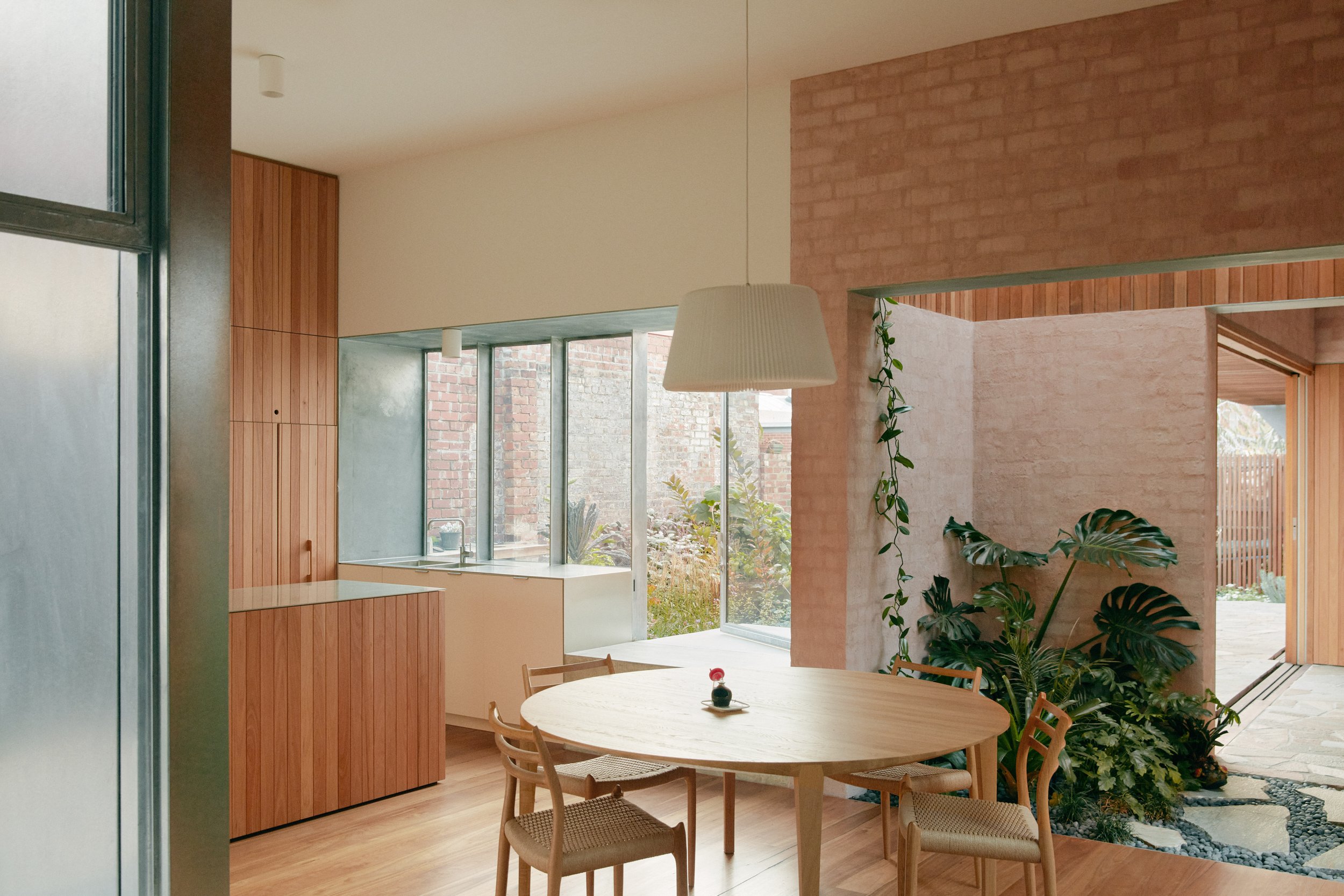
The selection of materials applied in the home includes oiled timber, unfinished concrete, galvanised steel and bagged brick with a delicate hint of pink pigment. Photo: Tom Ross

Blush pink bagged brick details soften the interior spaces. Photo: Tom Ross

‘Unlike paint, which can flatten, the pigmented mortar allows a variation of brick tones to shine through, while still lending it a blush of colour. It feels more natural, subtle and dreamy,’ says Michael Roper. Photo: Tom Ross
Architecture architecture has achieved an extraordinary feat by designing a home that resembles the mountain ranges of rural New Zealand or the captivating west coast beaches of South Australia, despite being located in the heart of Melbourne's urban landscape.
Taking inspiration from the expansive characteristics of these landscapes, the Victorian house in Brunswick has undergone a renovation and expansion to provide nuanced variations in light, form and texture, with blurred thresholds, distant views, intimate spaces, tactile materials and the play of light.
‘While our clients supplied the usual list of functional requirements, they understood that this was probably the easy part. Their brief focussed on the qualities they desired in a future home,’ says Architecture architecture director, Michael Roper.
The original home was in dire need of attention, a tired Victorian which had undergone many extensions – ‘The usual accretion of half-baked extensions and questionable fit-outs,’ says Michael.
The vision for the new design unfurled like a treasure map, creating a home which was more like a garden path, with shifts in texture and light as spaces reveal themselves along the journey.
The selection of materials applied in the home includes oiled timber, unfinished concrete, galvanised steel and bagged brick with a delicate hint of pink pigment – all applied based on their unpretentious nature, tactile qualities and capacity to evolve gracefully over time.
‘Unlike paint, which can flatten, the pigmented mortar allows a variation of brick tones to shine through, while still lending it a blush of colour,’ explains Michael. ‘It feels more natural, subtle and dreamy.’
Architecture architecture acknowledges the craftsmanship of Moon Building Group as the driving force behind the successful realisation of this seemingly effortless and uncomplicated home.
‘The house has a sense of natural ease – the subtle shifts in light and texture, the shifting views, the shady corners offering refuge. It’s a place to both explore and to rest within,’ says Micheal.


Bagged brick details in shaded blush pink. Photo: Tom Ross

In the kitchen, brushed metal wraps around the sink and window frame. Photo: Tom Ross

The bathroom palette is simple and neutral, a contrast to the rest the home. Photo: Tom Ross

Bagged brick details in shaded pink and grey. Photo: Tom Ross
“Our vision for the project drew primarily from our clients’ beautifully crafted brief, evocative enough that all we needed to do was follow it. Like a treasure map. ”

‘The clients wanted a home that was reminiscent of the landscapes they grew-up in – they had an interest in blurred thresholds, distant views, intimate spaces, tactile materials, and the play of light,’ says Michael Roper. Photo: Tom Ross

‘The house has a sense of natural ease – it unfolds like a stroll through the garden. The subtle shifts in light and texture, the shifting views, the shady corners offering refuge. It’s a place to both explore and to rest within,’ says Micheal Roper. Photo: Tom Ross

Inspiration was drawn from the clients’ upbringings – one in rural New Zealand, and the other in the west coast of South Australia. Photo: Tom Ross

The external forms offer contrast and encourage the effects of shadow play. Photo: Tom Ross

The front of the home is a complete contrast to the materials and design beyond the entry. Photo: Tom Ross