
Brighton Street Early Learning Centre by Danielle Brustman
The Brighton Street Early Learning Centre designed by Danielle Brustman pushes the colour palette to its limits, creating a soft, playful and stimulating space for young imaginations.
Words: Georgie Ward I Photography: Sean Fennessey
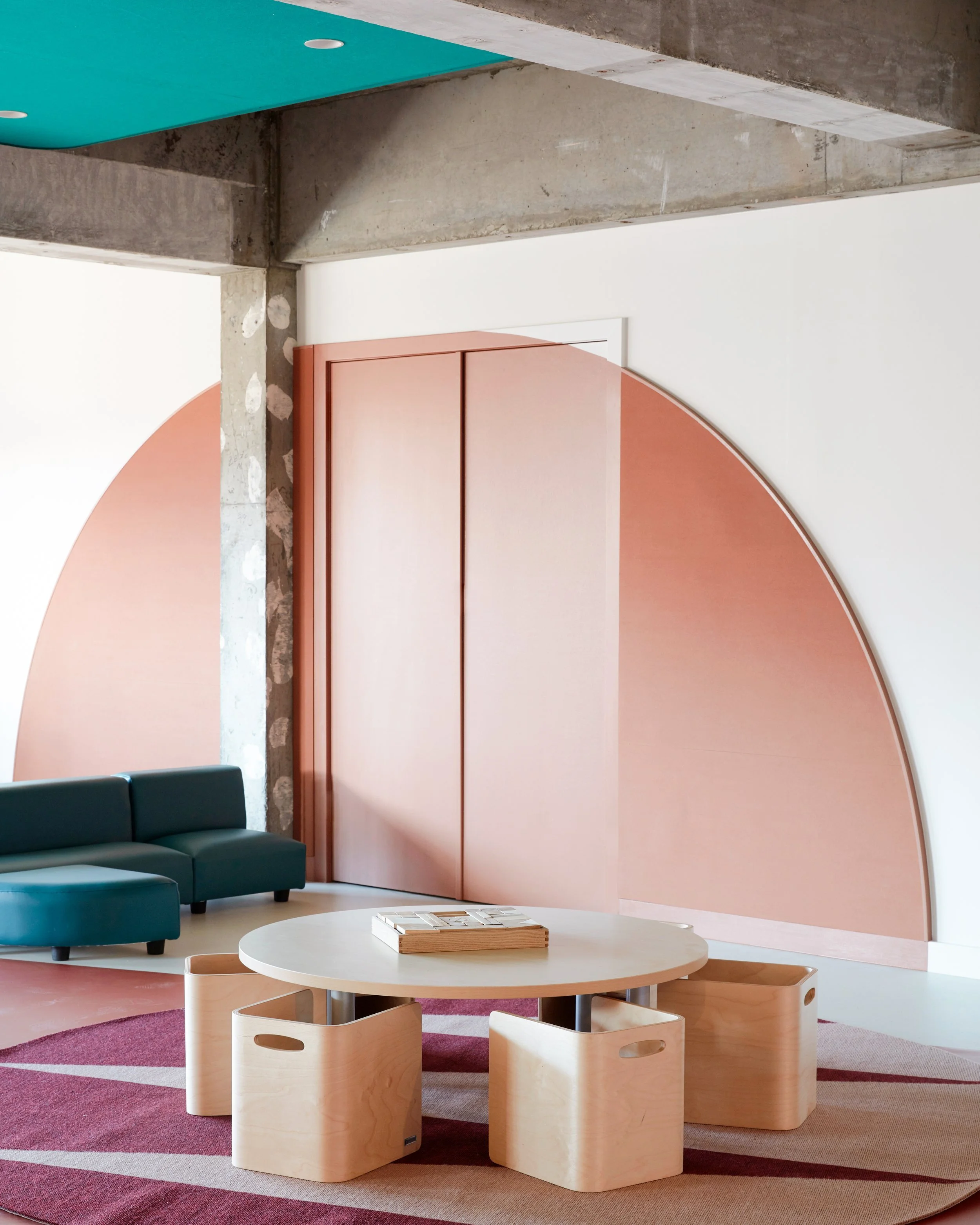
Concrete structures of the previously brutalist building have been left exposed to add character to its interiors. Photo: Sean Fennessey
‘I wanted to make every space to be nurturing and stimulating,’ says Danielle Brustman. Photo: Sean Fennessey

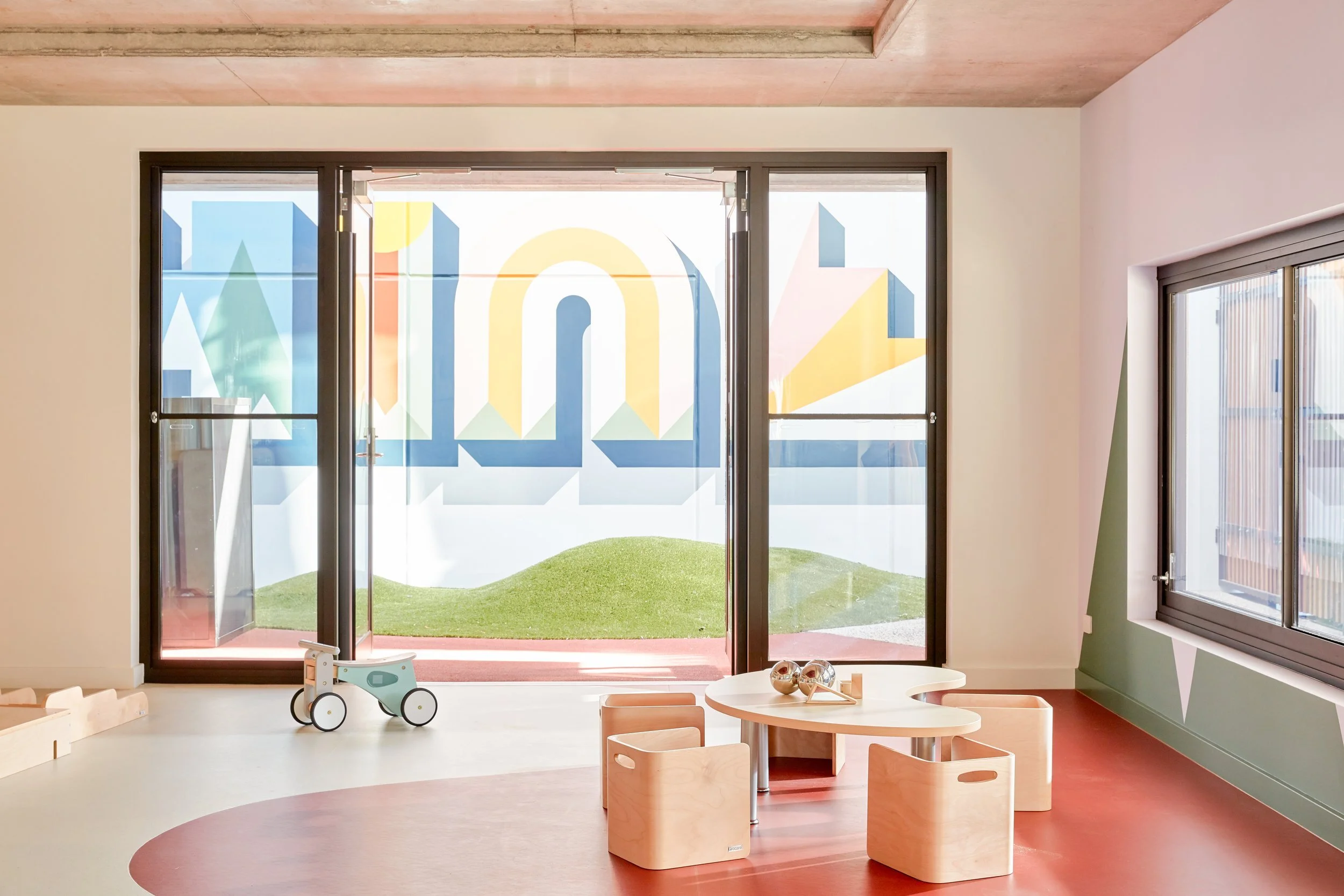
‘There is a large graphic mural in the outdoor play area that spells out the word ‘sunshine’ and is coloured in with all of the smaller murals that run through the space,’ says Danielle Brustman. Photo: Sean Fennessey
Located in Inner city Melbourne in the suburb of Cremorne, this previously brutalist building was repurposed by Perkins Architecture into an inspiring education centre for young children. Designer Danielle Brustman created a series of soft spaces painted in a defused rainbow palette, creating complex and colourful visuals that please the eye.
‘The brief and scope for this project was so exciting. I regularly use colour in my interior design work, but it is not often that I get the opportunity to be as bold!’ says Danielle Brustman.
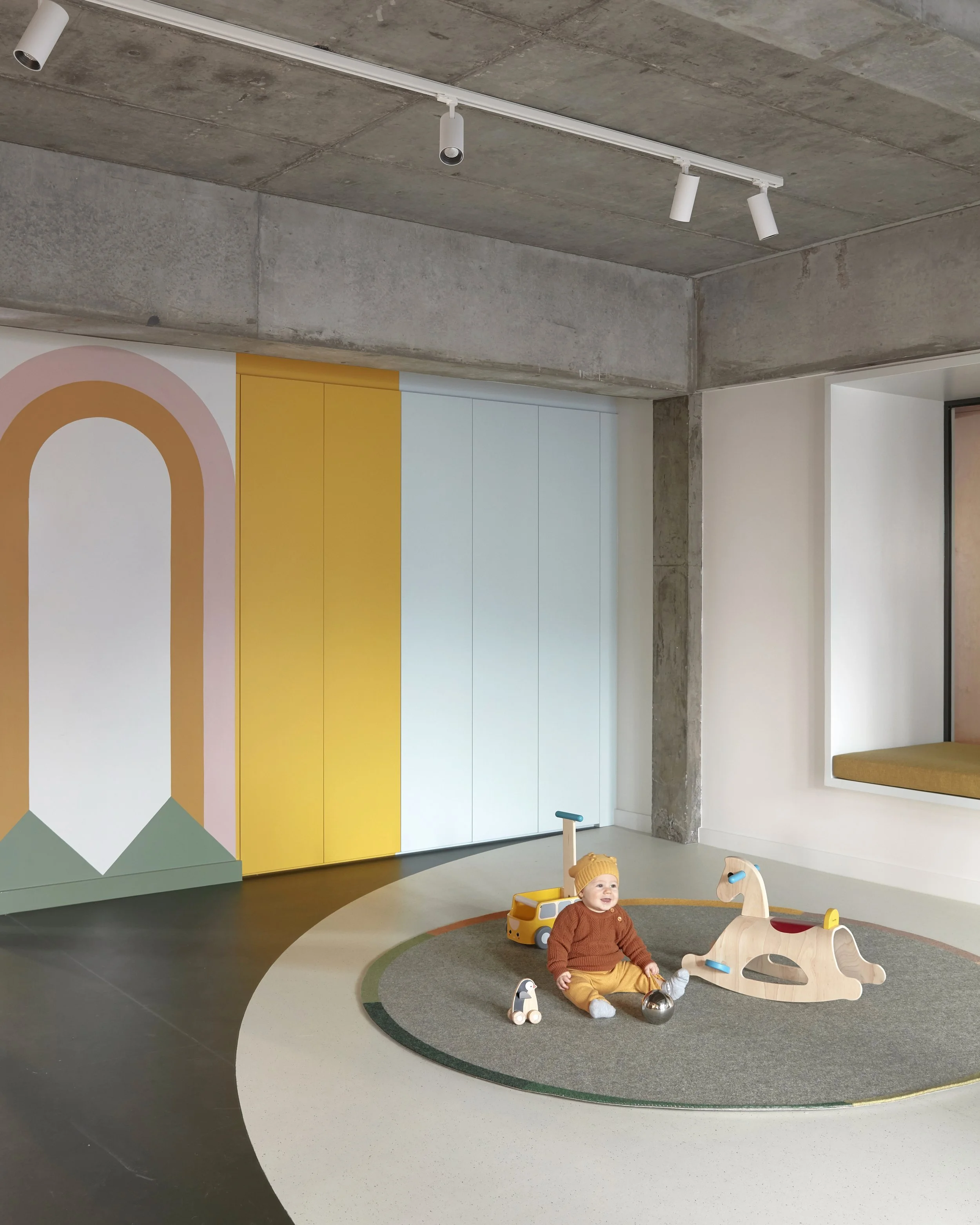
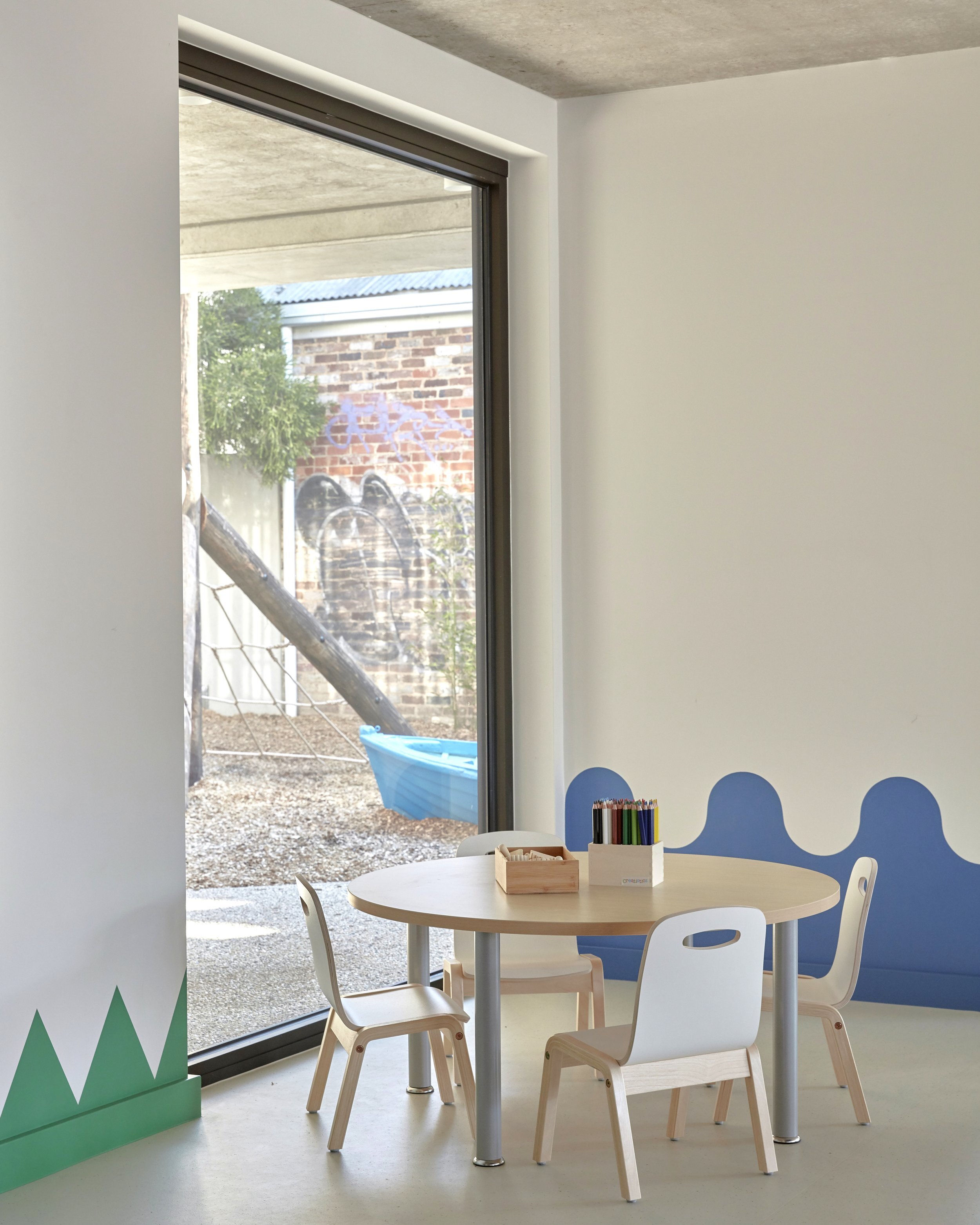
In the reimagining of the brutalist interior, each wall, surface and material was treated with a new range of colour blends of varying hue and materiality. Each space shows off its own delicately hand-painted murals by artist Ben Maitland, with every playroom following its own motif as a source of inspiration and creativity for the kids, including river, lake, meadow, forest, star, sun and cloud room.
Danielle used these playful themes to inform a narrative, palette and treatment for each unique space. ‘It was important that the rooms had their own character and feel. It was also important that the flow between the spaces was cohesive.’ There are also seasonal references throughout the spaces, this added a further uniqueness of feel to each room.
To contrast, some of the original interior concrete bones of the brutalist building remain exposed. ‘There is something lovely and unexpected about the intersection between these original raw building elements and the softer, more colourful material surfaces.’
Danielle worked in close collaboration with IBUILD M on this project, describing it as a very hands on and fluid process. ‘What made this project so rewarding and successful I think was the level of consultation, trust and communication between us,’ says Danielle.
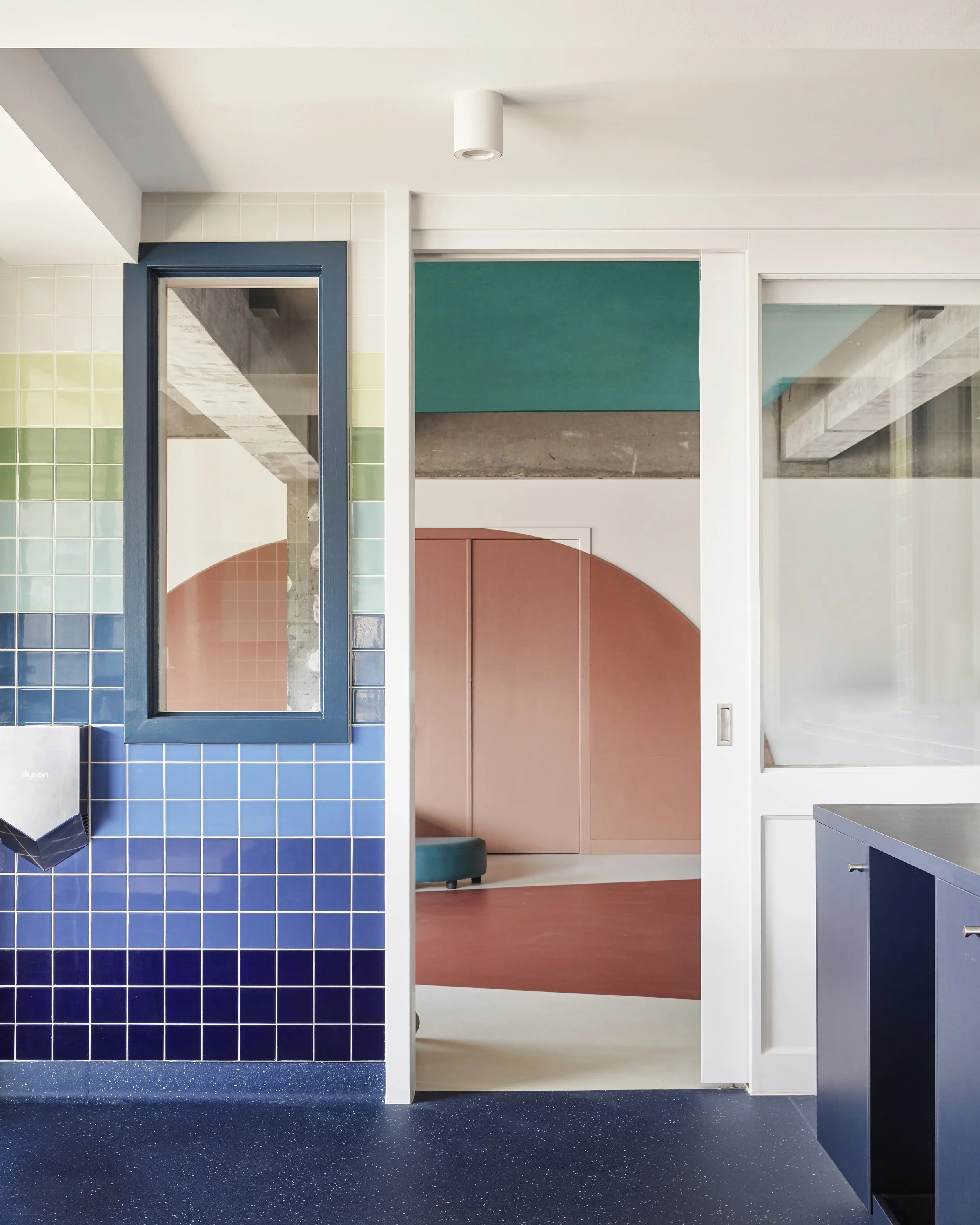
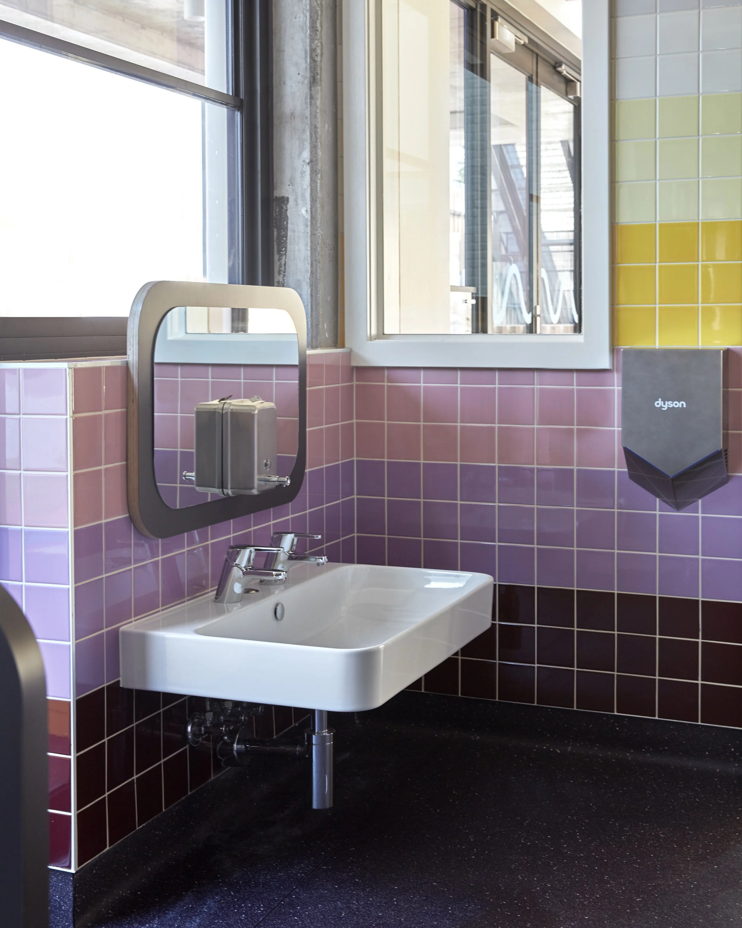
‘The bathroom tiles are laid in gradated spectrums of colour,’ says Danielle Brustman. Photo: Sean Fennessey
‘The focus on using natural and durable materials was an integral part of the specification and design process,’ says Danielle Brustman. Photo: Sean Fennessey
“I wanted to push the colour palette to its limits; I wanted it to be complex and colourful whilst still adhering to a level of sophistication, gentleness and balance.”
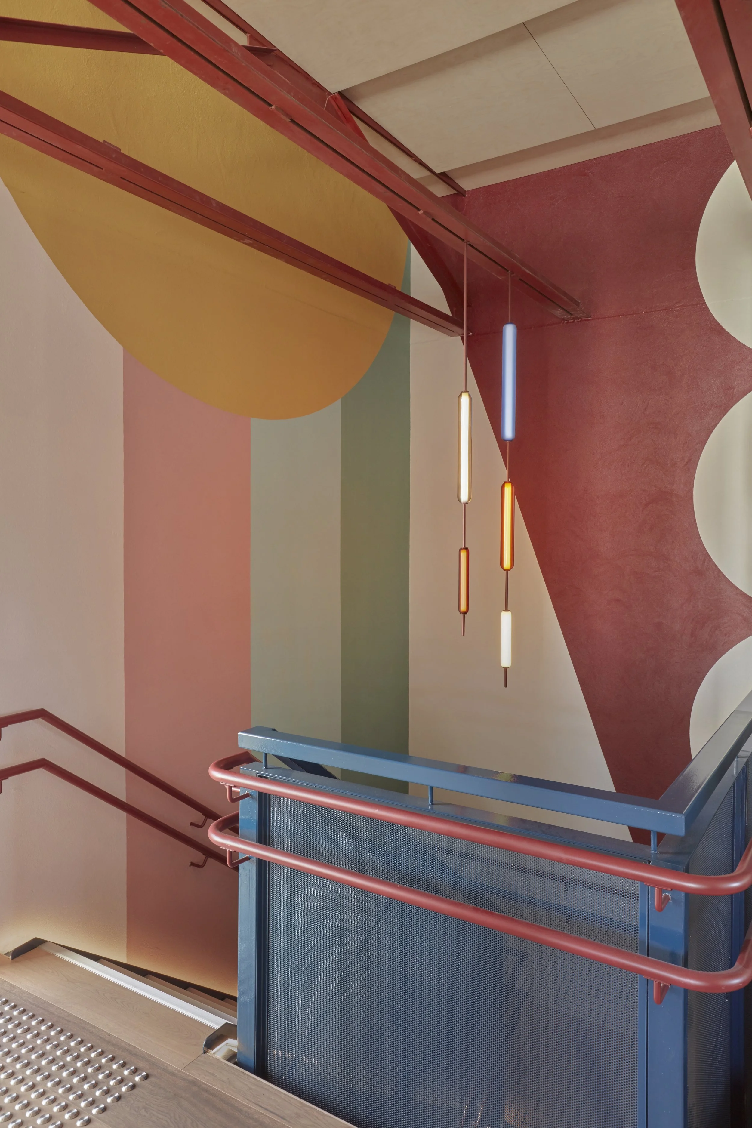
‘We invited Edward Linacre Studio to create several feature coloured pendants for the reception and stairwell made from toughened glass,’ says Danielle Brustman. Photo: Sean Fennessey
‘Acoustics were an important consideration for the centre. Kids make a lot of noise. Each playroom is fitted out with a floating acoustic ceiling as well as soft wool and vinyl furnishings,’ says Danielle Brustman. Photo: Sean Fennessey
In the reimagining of the brutalist interior, each wall, surface and material was treated with a new range of colour blends of varying hue and materiality.
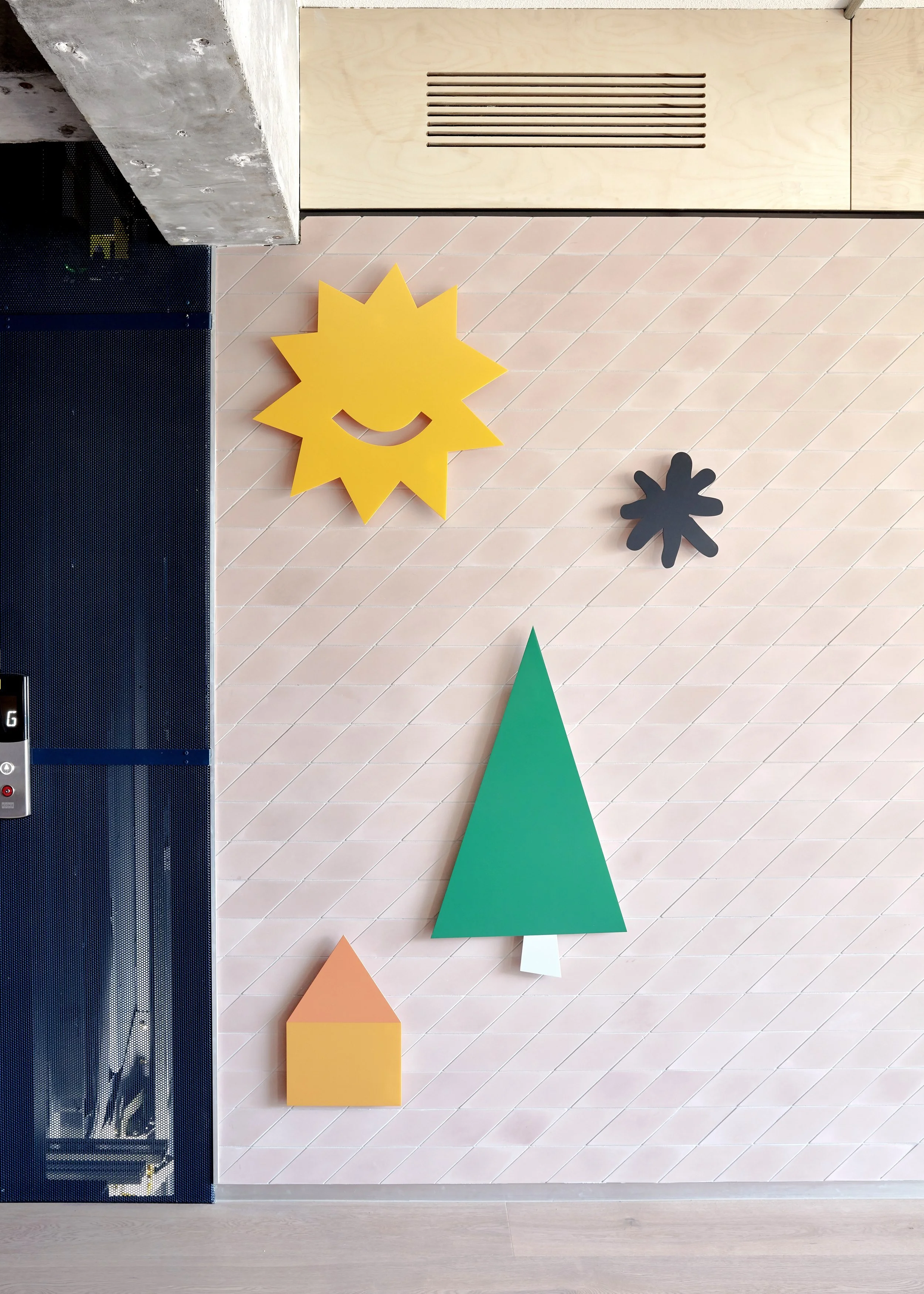
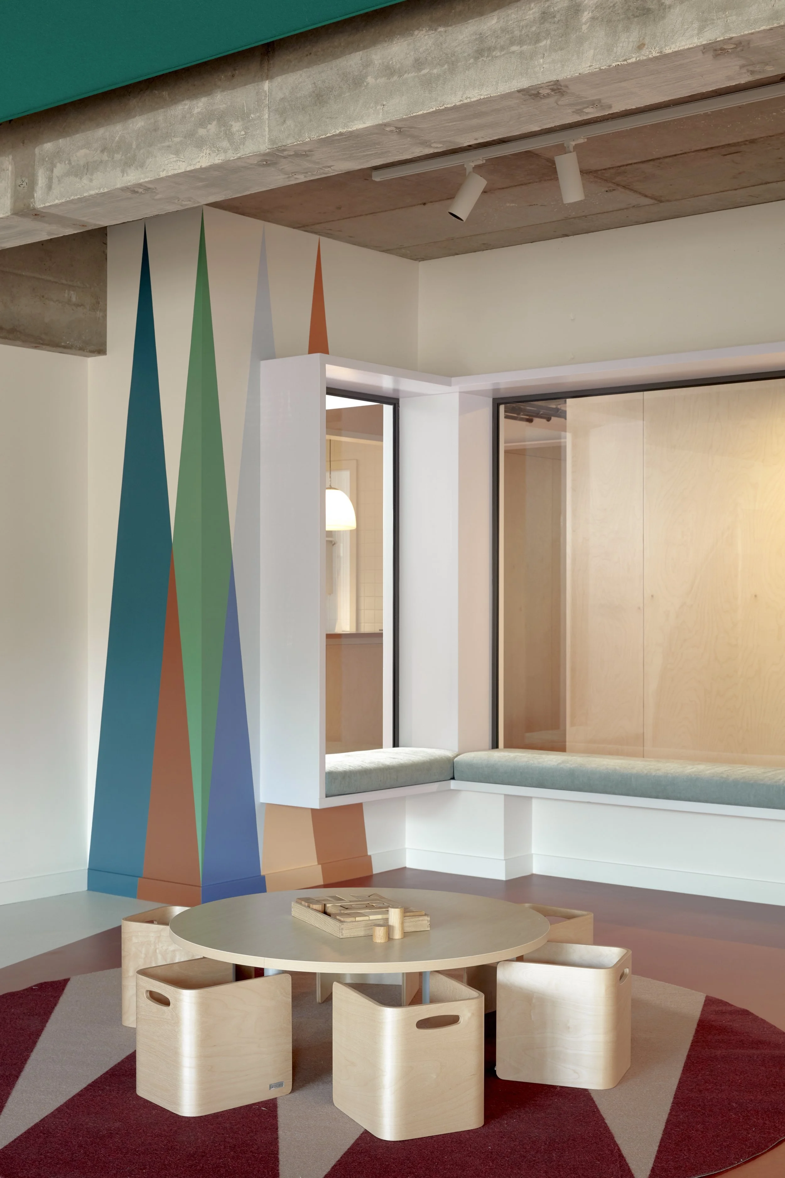
‘The interior scheme included several graphic mural walls, made up of block shapes, squares, triangles and circles that created boats, star bursts, clouds rainbows, waves and trees,’ says Danielle Brustman. Photo: Sean Fennessey
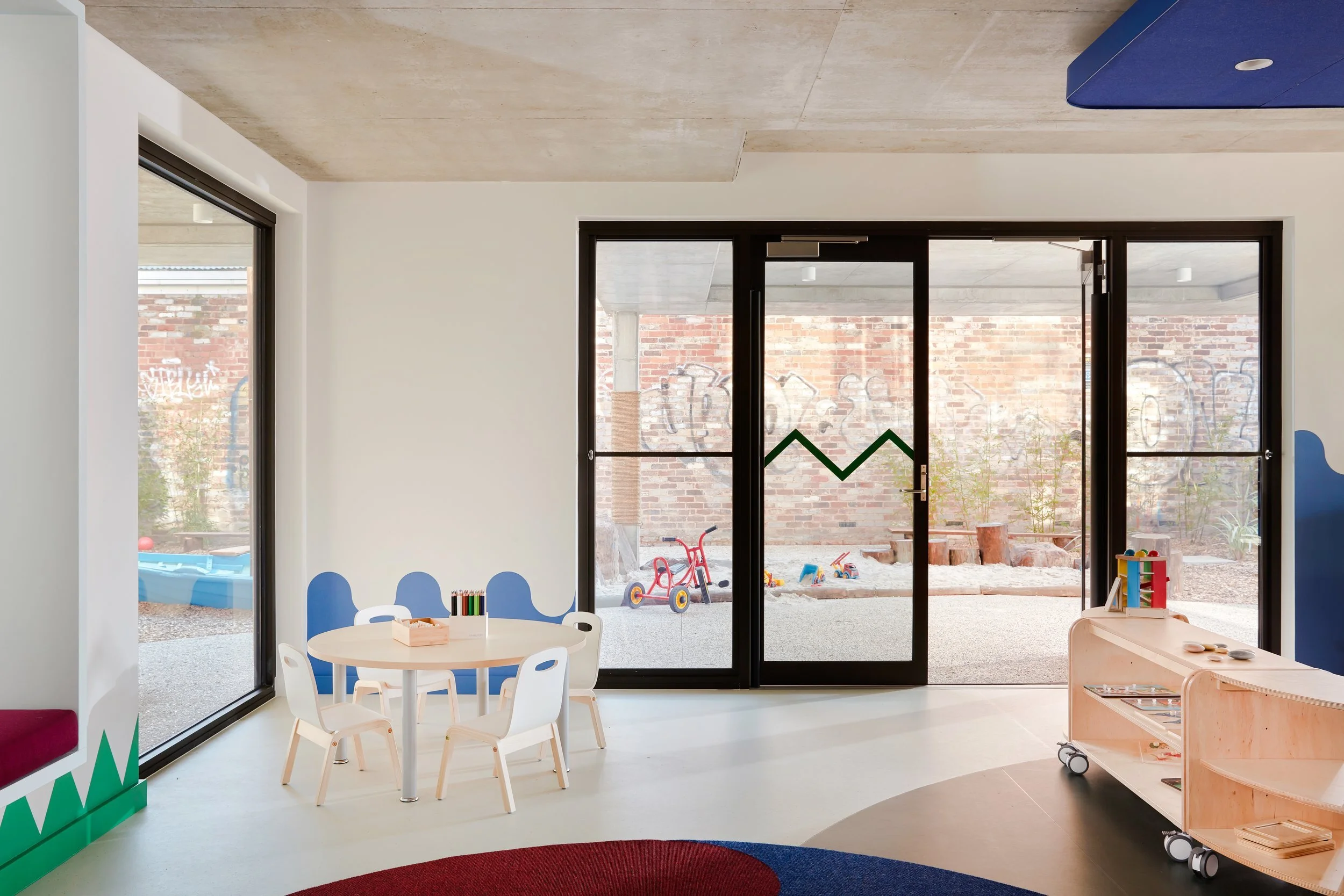
The centre is entirely Marmoleum flooring, a natural and durable material made from a combination of natural fibre and recycled materials. The Marmoleum flooring is inlayed with funky graphic shapes and adorned with several customised rugs that align with the room’s theme.
The bathroom is also a space of colourful creativity, where the tiles have been laid in a graduated spectrum of colour. ‘Children are so imaginative and less inhibited than we adults. It made complete sense to me that these spaces ought to be filled with both stimulating and inspiring visuals.’
Danielle’s vision for the project steered away from conventional colours and materials that are often used in education, which she believes to be slightly crude and institutional. ‘I wanted to completely break away from the model and present child-friendly spaces that felt more personalised and fun to be in.’ Making the most out of the rainbow, the project totalled 47 different interior paint colours!