Camp Cove House by Tobias Partners
Architect Nick Tobias worked on his dream job as the architect, interior designer and client of his own home in Sydney’s Eastern suburbs—we step inside his magical beachside sanctuary.
WORDS: Hande Renshaw I PHOTOGRAPHY: Anson Smart I ARCHITECTURE & INTERIOR DESIGN: Tobias Partners I STYLING: Claire Delmar I LANDSCAPE DESIGN: Myles Baldwin Design BUILD: Bear the Builder
The connection to street life, sun, and vistas on Cove St was particularly important, as was visual connection to Camp Cove Reserve and Gap Bluff.
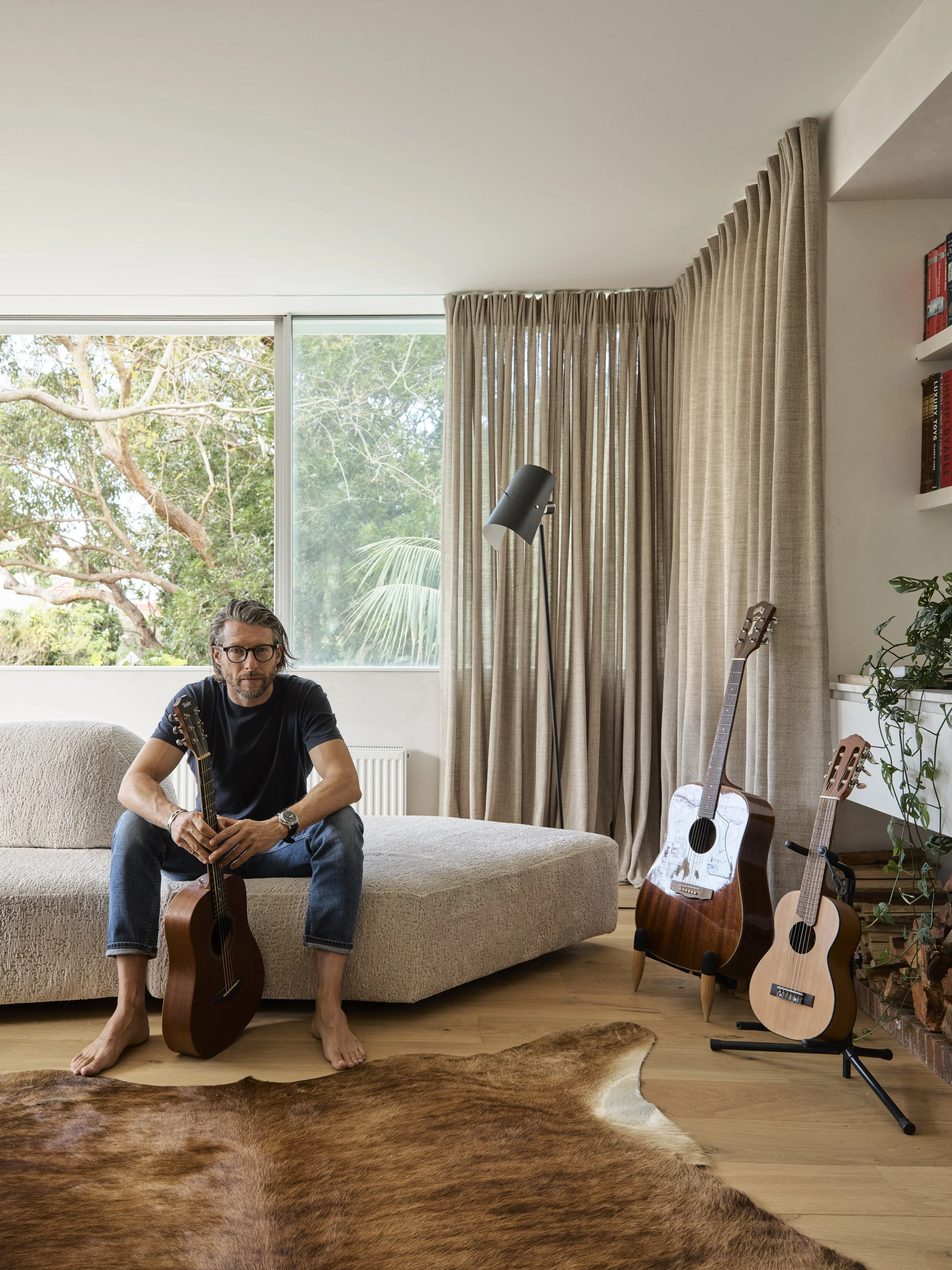
Nick Tobias, Tobias Partners founding principal in is beachside home in Sydney’s east.
The personal project allowed for a highly intuitive, collaborative and fluid design process between Nick Tobias, his studio, and builder, suppliers, and consultants he had worked with for many years.
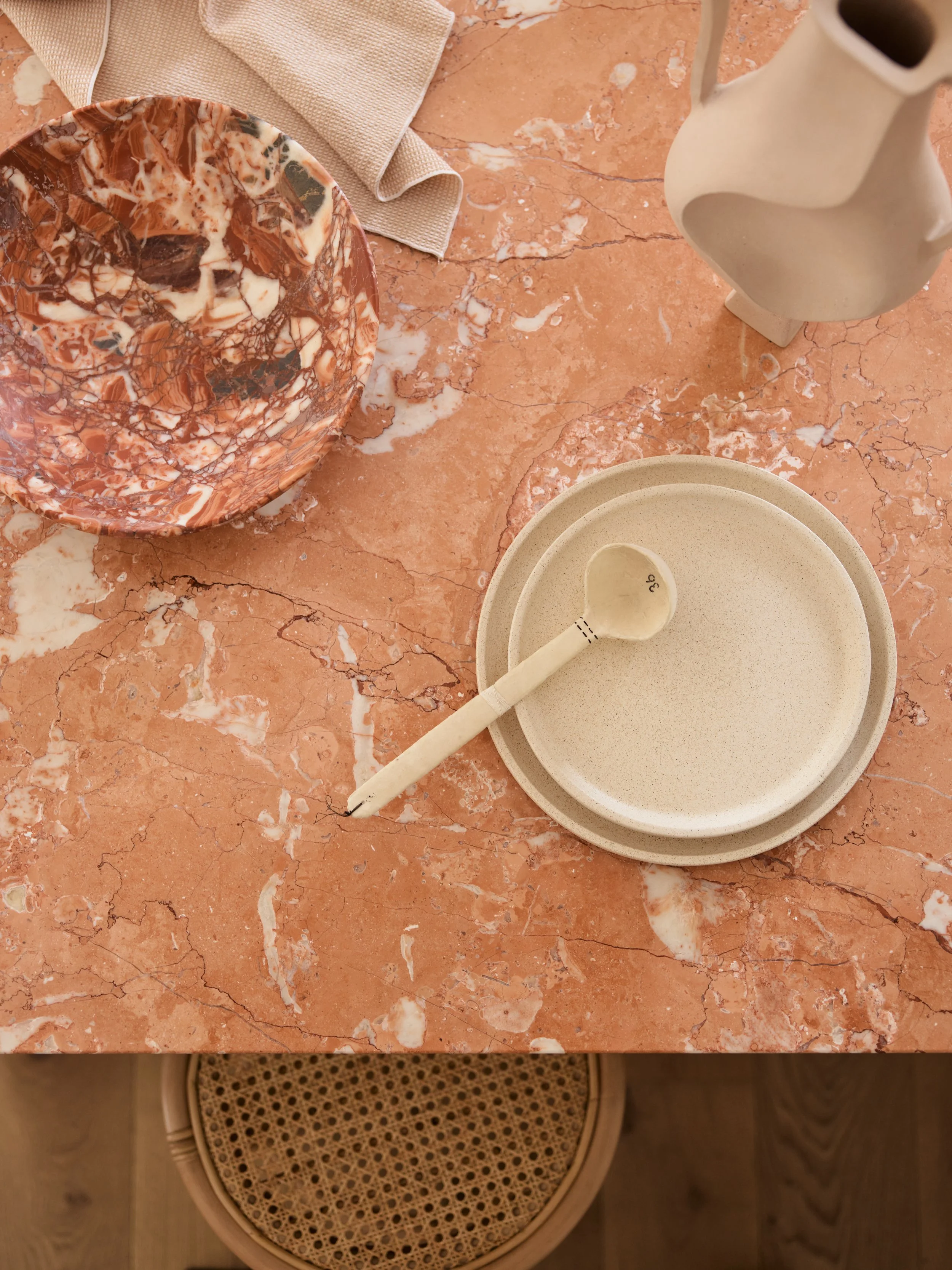
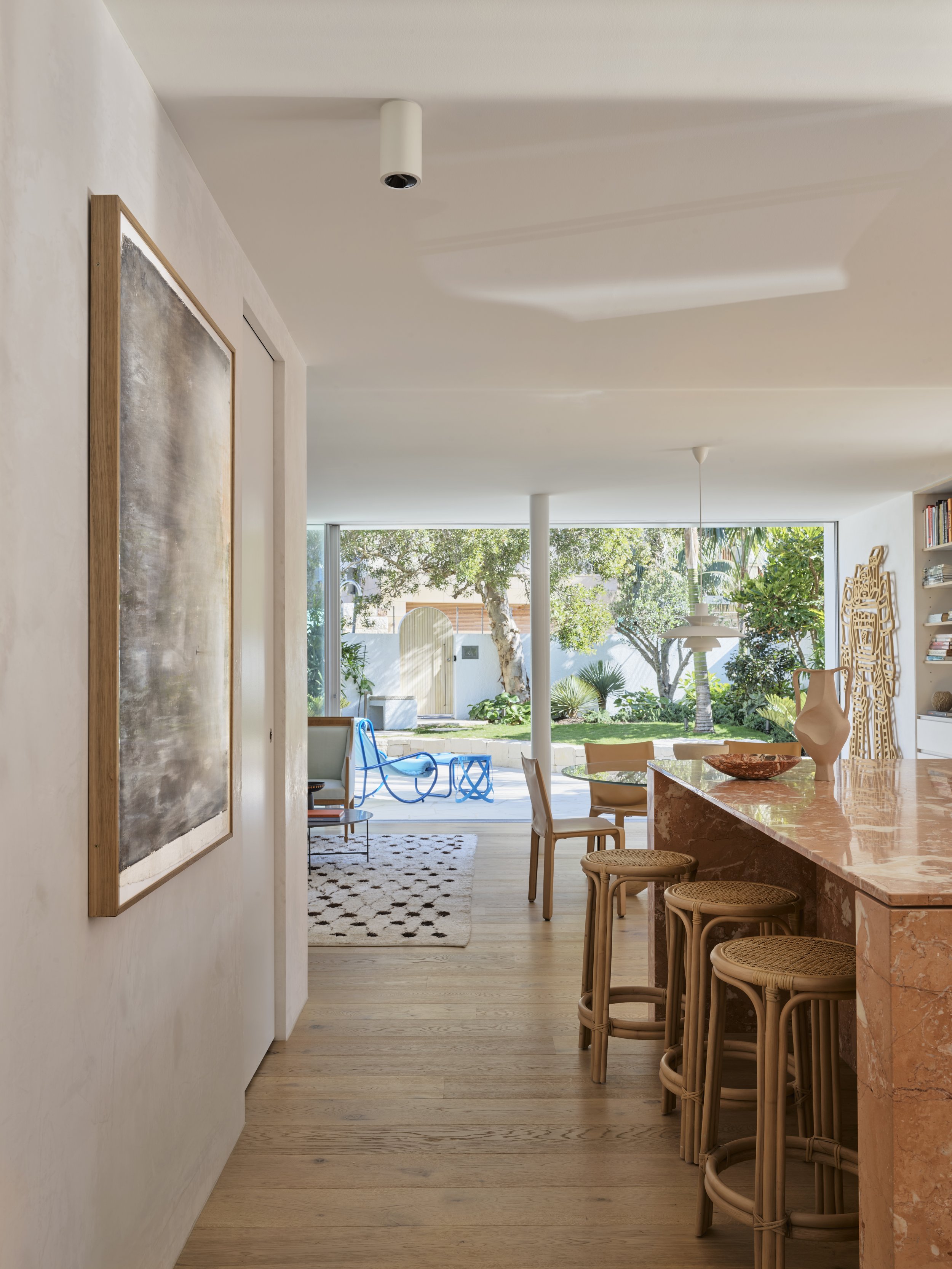
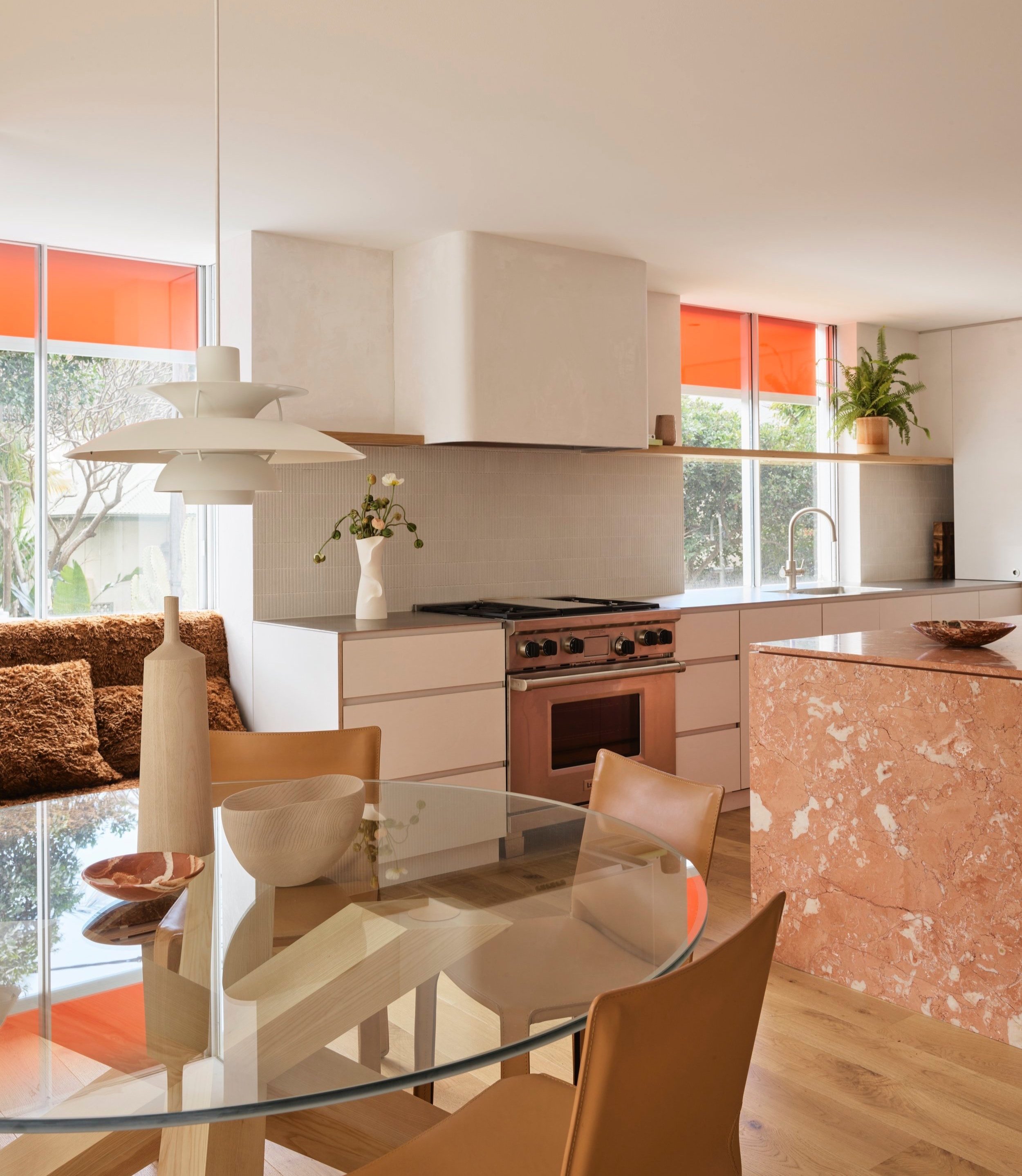
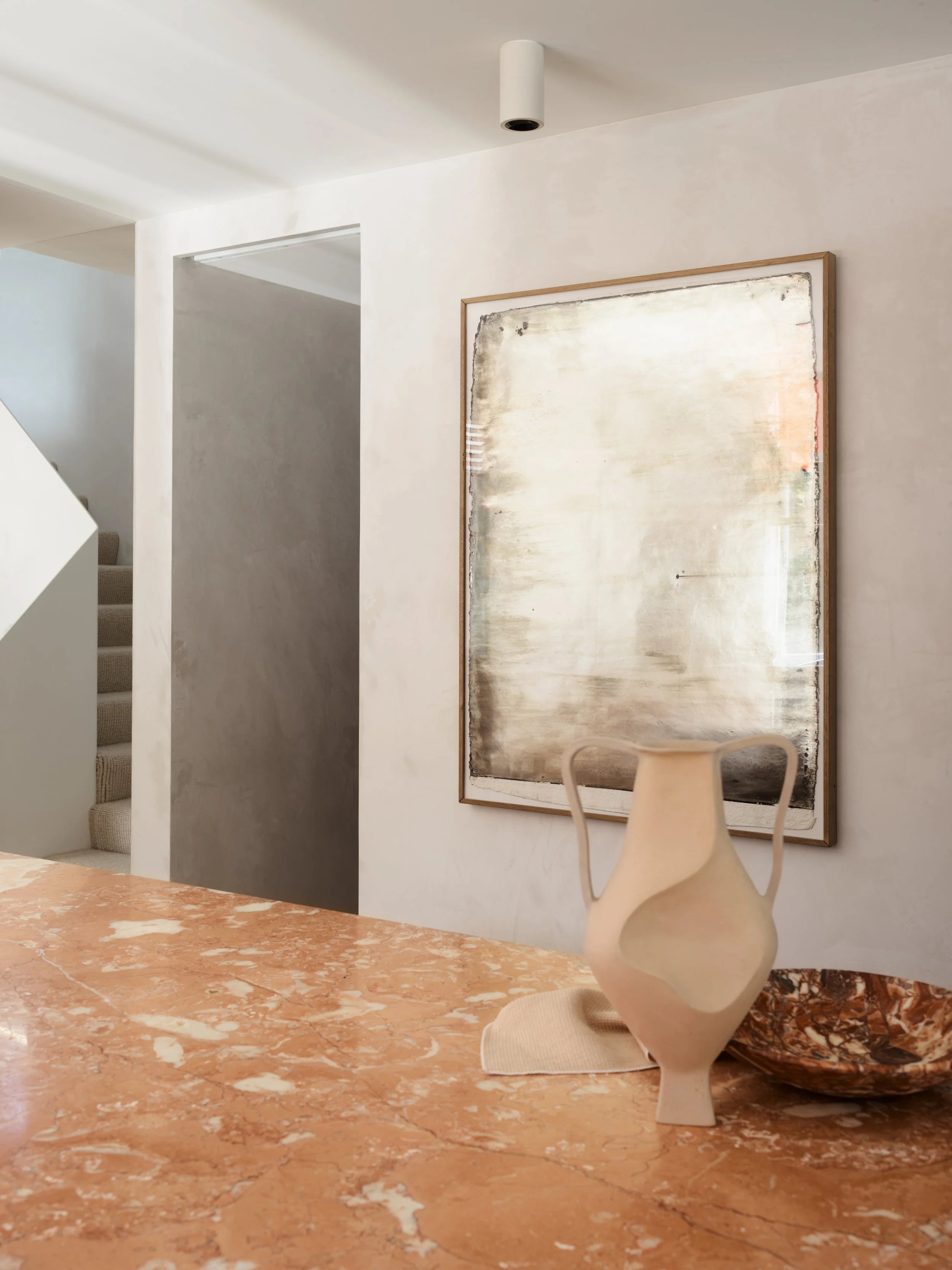
The open-plan kitchen and dining space—island in Rosa Nuvola marble from Artedomus and splashback tiles from Academy Tiles.
Daybed upholstered in Argo fabric by Raf Simons for Kvadrat Maharam, Cab dining chairs and La Rotonda dining table by Mario Bellini for Cassina from Mobilia.
Study for a Mirror #9 (2014) artwork by Coen Young, vessel from Ignem Terrae Ceramics and marble bowl from Greg Natale.
The view out to the backyard, featuring Locus Solus armchairs by Gae Aulenti for Exteta and Ribbon Stool by Nendo for Cappellini from Cult, orange Helioscreen external blinds from Simple Studio.
The design transformed dark and disconnected spaces into light, well ventilated and connected rooms.
Formerly a dark 1970s brick dwelling, Camp Cove House has been transformed into a contemporary beachside home for Nick Tobias, Tobias Partners founding principal, and his two sons.
For any architect or interior designer, the opportunity to design their own home is the ultimate dream project. For Nick, it was no exception, seizing the opportunity to create a modern yet timeless interior that was inviting, functional, durable and well-designed.
The personal project allowed Nick to tune into a highly intuitive, collaborative and fluid design process between his studio, builder, suppliers and consultants he had worked with for many years.
Mere moments from the golden harbourside beach Camp Cove, the connection to street life, sun, and vistas on Cove Street was important, as was visual connection to Camp Cove Reserve and Gap Bluff.
The transformation of the two-level corner home took the interior from dark and pokey, to a series of spaces that are light and calming, working synergistically with its aspect, surroundings and the local community.
The interior is a balance between traditional planning and open-plan living—the removal of walls within has opened up the spaces, making the heart of the home feel incredibly light and bright. Whether it’s through a window or a skylight, you’re never too far from a natural light source within the home. ‘It was a dark house when I started the design—I looked for every way I could open the house to natural light at all times of the day. This continues to give daily pleasure,’ shares Nick.
The home works in alignment with nature, it’s mainly naturally lit, heated and cooled. Bringing the light in, by opening up the house with big contemporary glazing from long-time collaborator, Vitrocsa was a priority. Design tools include orientation, positioning of glazing, external blinds and awnings by Simple Studio.
Having now lived in the home for a few years, there are spaces in the house that Nick has come to enjoy the most, one such space is the light-filled and incredibly tranquil main living space. The room’s corner location, which is wrapped in seamless glass, hovers over the garden, like a modern tree house—the foliage and trees outside flood the view and interior with vibrant tones of green. ‘The main lounge room is a space I enjoy most, whether it’s reading, watching TV, playing music or having a nap, it’s an incredibly peaceful room. It’s generous yet intimate, light yet softly lit, and wrapped in landscaping,’ Nick says.
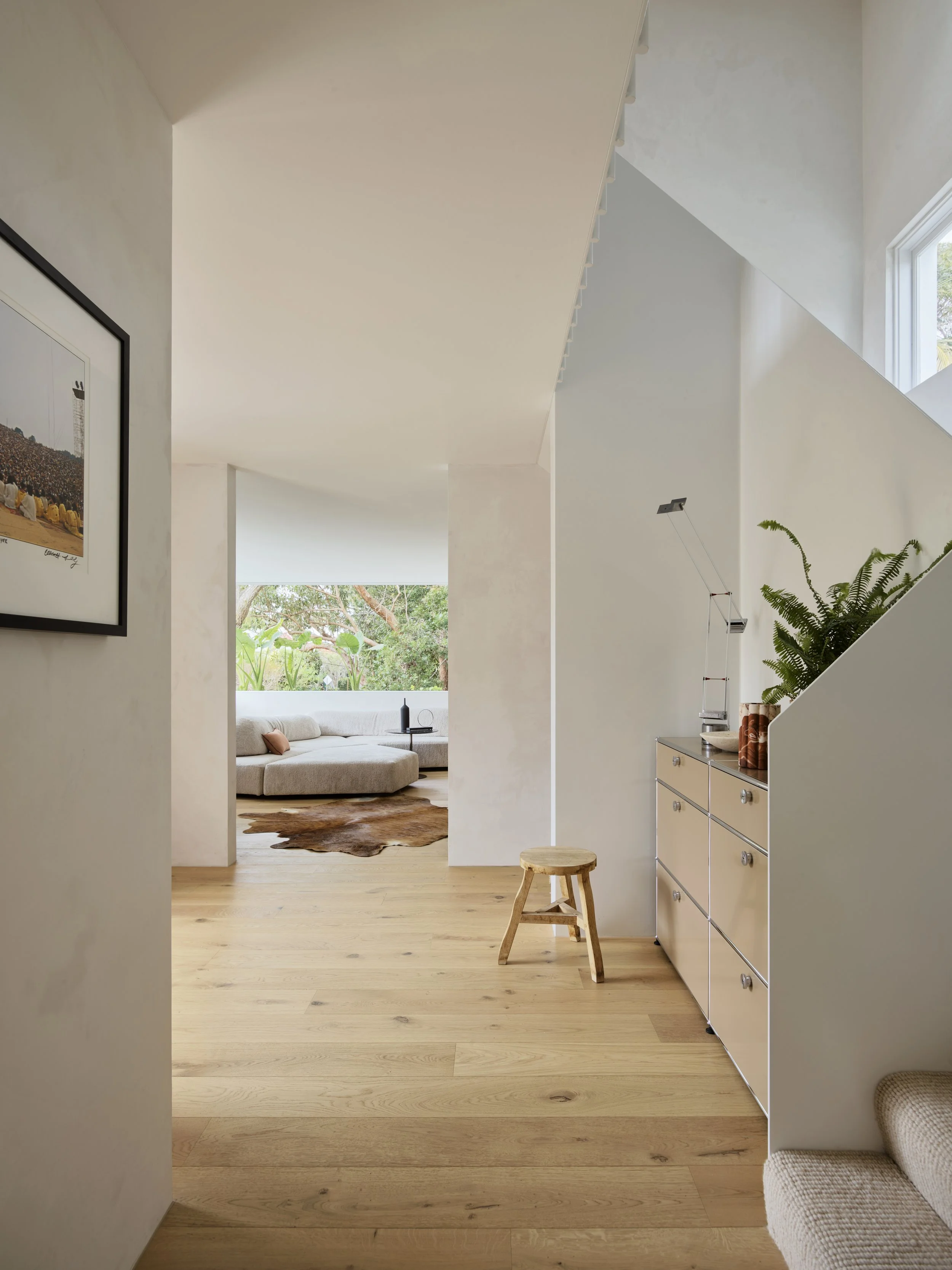
The entry features USM Haller storage unit from Anibou, Tizio lamp by Richard Sapper from Artemide and Woodstock 1969 photographic artwork by Elliott Landy from Blender Gallery.
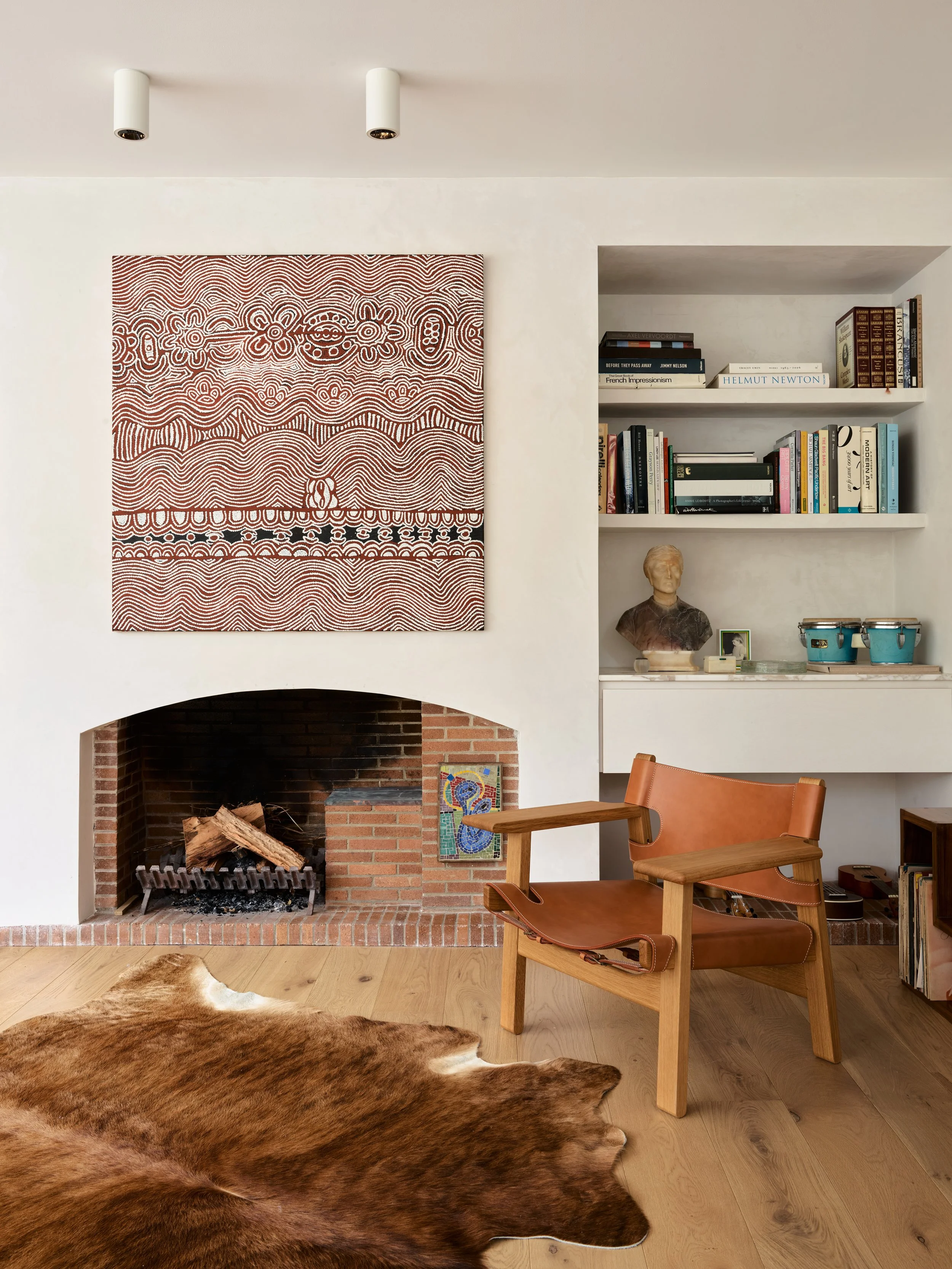
The brick fireplace was the only feature kept from the original home. Spanish chair by Børge Bogensen for Fredericia.
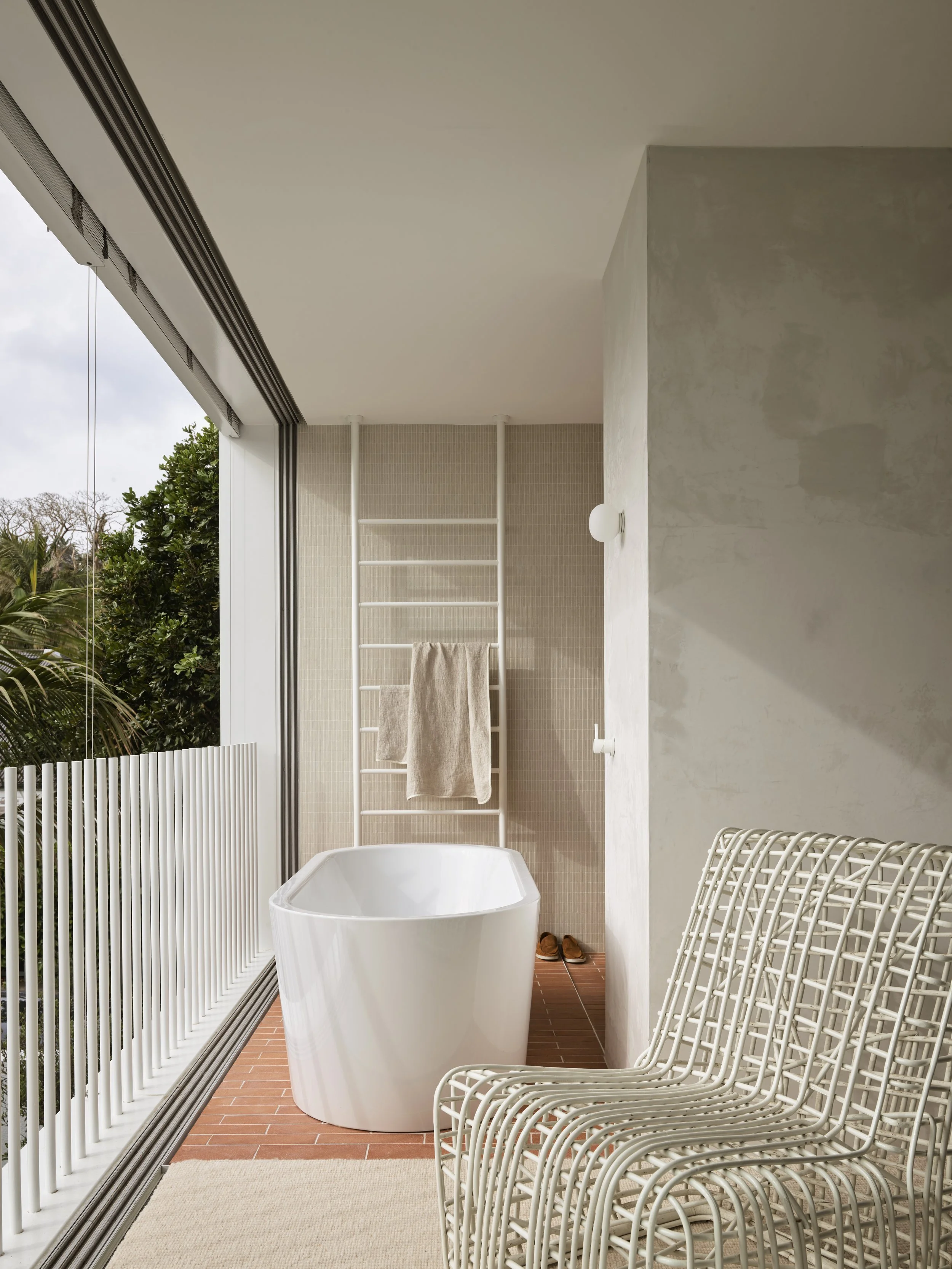
The main ensuite, featuring Kaldewei bath from Bathe, terracotta tiles from Artedomus, SuperElastica chair from Bonacina 1889; towel rail from Hydrotherm
In the master bedroom, USM Haller storage unit from Anibou and bed linen from CULTIVER.
The bathroom is incredibly immersed in the landscape so that the concept of inside and outside is blurred.
Untitled (NHC2) (2013) artwork by Daniel Boyd (left).
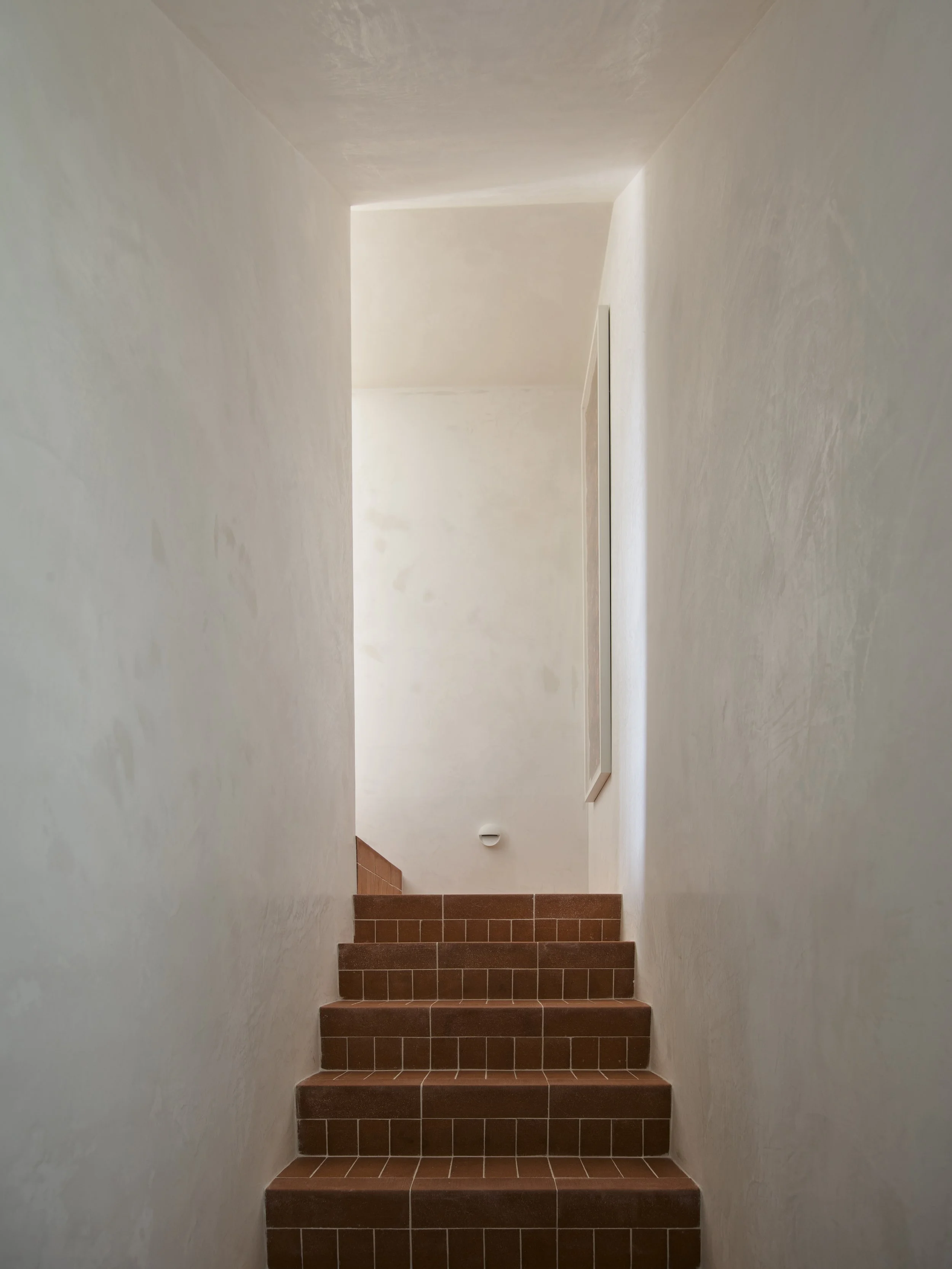
‘A design element I would repeat in a new home is terracotta floors—they are visually warm and timeless, cool in summer and lovely when heated up in winter. They have a great aesthetic and feeling underfoot.’
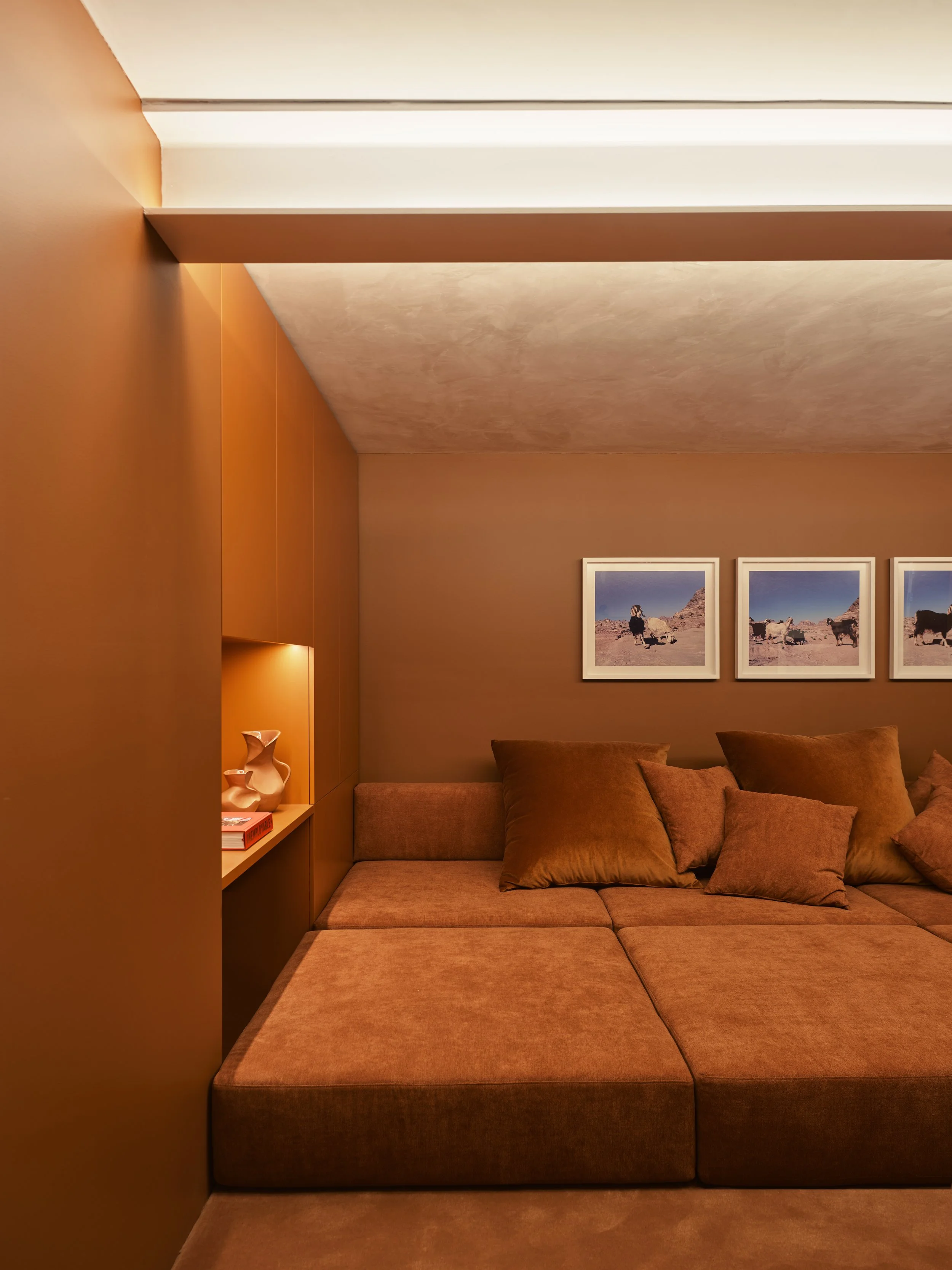
The incredible cinema room, with custom seating designed by Tobias Partners, upholstered in fabric from Elliott Clarke, Petra Goats (2004) photographic artwork by Lynne Roberts-Goodwin.


