Gable Clerestory House by Sonelo Architects
Gable Clerestory House, designed by Sonelo Architects, is a mid-century inspired family home with dynamic ceiling heights, beautiful sky views and a blush toned earthy palette throughout.
Words: Hande Renshaw I Photography: Pier Carthew I Styling: Jess Kneebone
Photo: Pier Carthew. Styling: Jess Kneebone
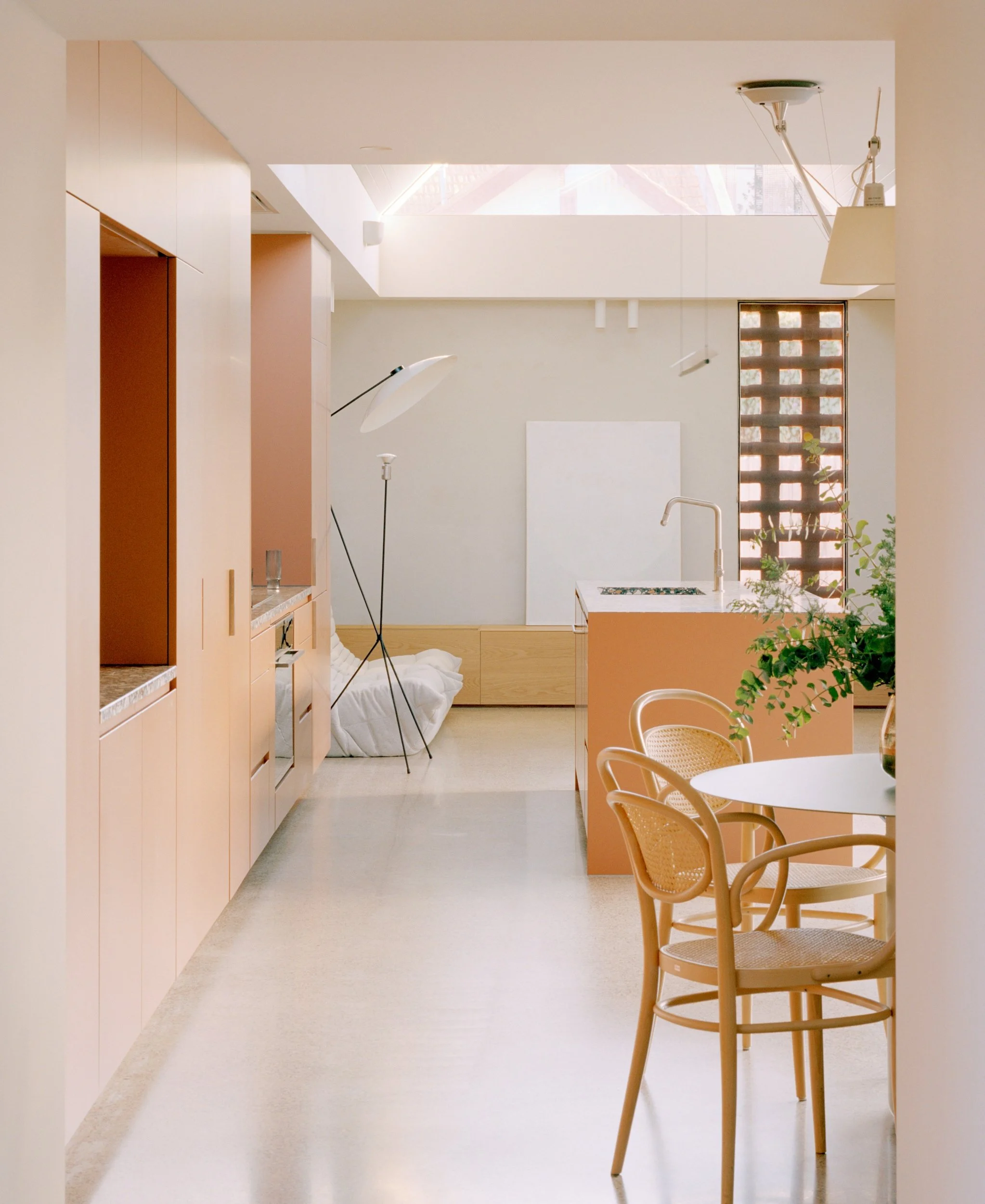
The dining space features vintage Charlotte Perriand dining chairs and an Atelier Vime wicker pendant. Photo: Anson Smart
Gable Clerestory House is a thoughtfully designed renovation and extension that seamlessly integrates with the original home, while introducing a modern and subtly coloured aesthetic. Sonelo Architects skillfully incorporates elements that pay homage to the existing Federation era context, approaching it with a thoughtful and feminine perspective.
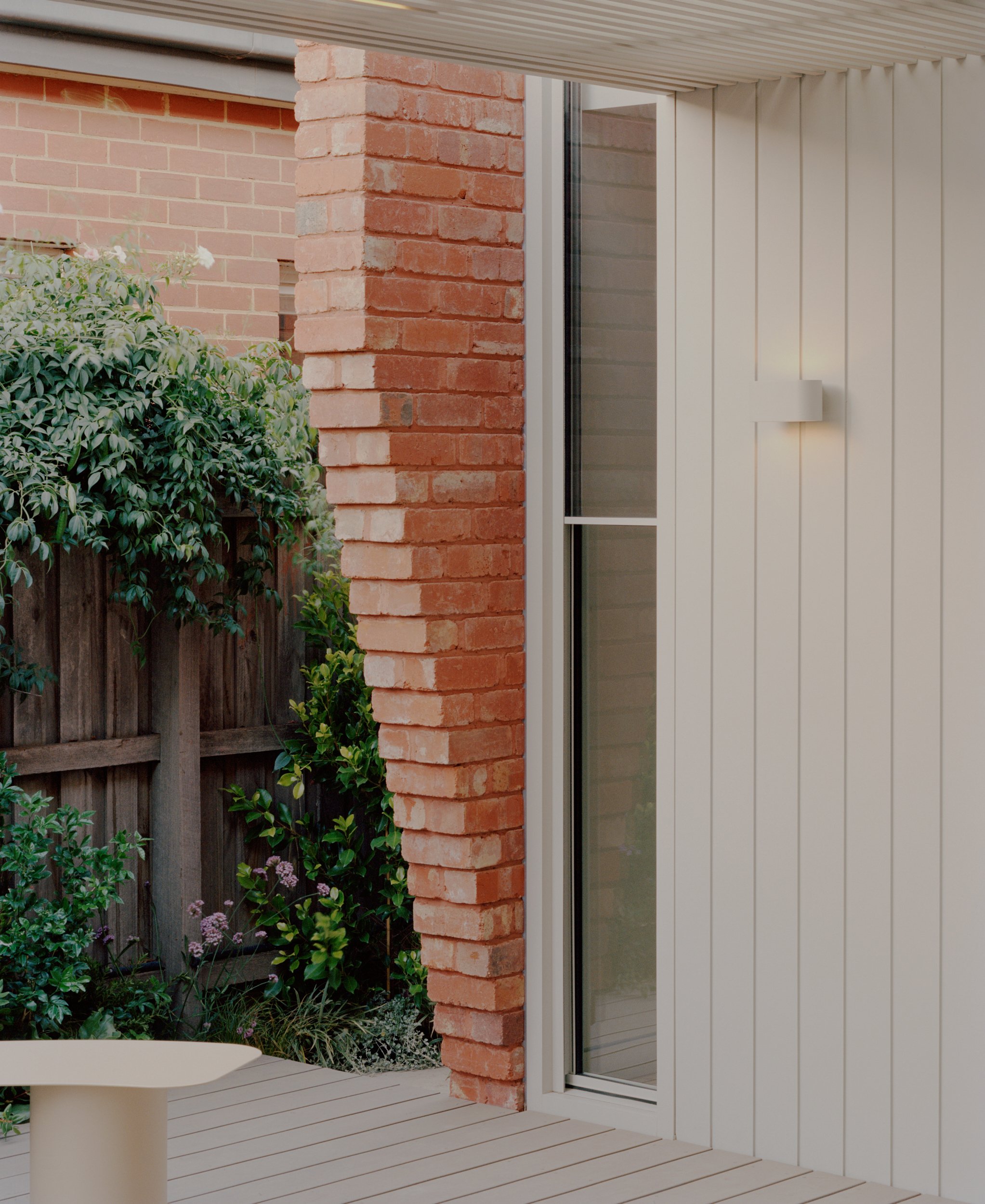
The home stands amidst a series of heritage buildings in Ascot Vale, Melbourne, serving as a contemporary reinterpretation of the home's past. The redesign of the residence tailored to reflect the preferences of its current owners, respects and preserves the original details while discreetly extending towards the rear, maintaining the existing silhouette. This approach ensures that the streetscape retains its original character.
Once inside, the home undergoes a remarkable transformation, with new additions shaping the internal spaces in a way that is both familiar and innovative. Sonelo Architects has applied a vibrant and unconventional palette of elements to create a dynamic and modern structure that exudes a sense of playfulness.
The use of soft blush hues throughout the spaces creates a surprising and joyful atmosphere, while other areas are balanced with green and grey tones. This combination of colours adds a sense of harmony and visual interest throughout the different areas of the home.
By blending a midcentury design approach with a respectful integration of the home's existing elements, Gable Clerestory House achieves a harmonious fusion of styles. This design emphasises the importance of light, creating a welcoming atmosphere. As the name suggests, the house draws attention upward, utilising expressive internal forms that optimise the gable formation to enhance the sense of height and scale. In response to the original home's lack of natural light and enclosed spaces, the new design flips the script and creates a focus on connection and openness.
The mindful curation of terrazzo materials and the incorporation of earthy colours such as clay, green and grey create captivating focal points within the interior spaces. The soft grey tones, along with the natural elements of concrete, timber, and external galvanised steel, are harmoniously juxtaposed against the vibrant colors and the traditional red bricks that reflect the heritage of the building. The addition of clay-coloured accents adds warmth to the living area and complements the recycled red bricks used on the exterior.
A primary focus of the design was to establish a strong connection between the interior and exterior spaces, ensuring a harmonious integration of natural elements with the core functions of the home. The addition was carefully defined, incorporating a thoughtfully selected arrangement of skylights above and windows at ground level, resulting in a grand and distinctive structure.
Despite the limited size of the site, the strategic use of light and colour creates an optimised and spacious feel. The incorporation of soft blush tones throughout the spaces add an unexpected touch, while the use of green and grey tones in other areas provide a balanced aesthetic.
“Faced with the challenges of a compact site, heritage overlay, and restrained budget, the design approach focuses on meaningful gestures that elevate the quality of the spaces.”
Photo: Pier Carthew. Styling: Jess Kneebone


