Garden House by Maike Design
Maike Design has remained sympathetic to a heritage Californian bungalow by creating calm and open spaces while making the garden an integral part of the design.
Words: Hande Renshaw | Photography: Tess Kelly
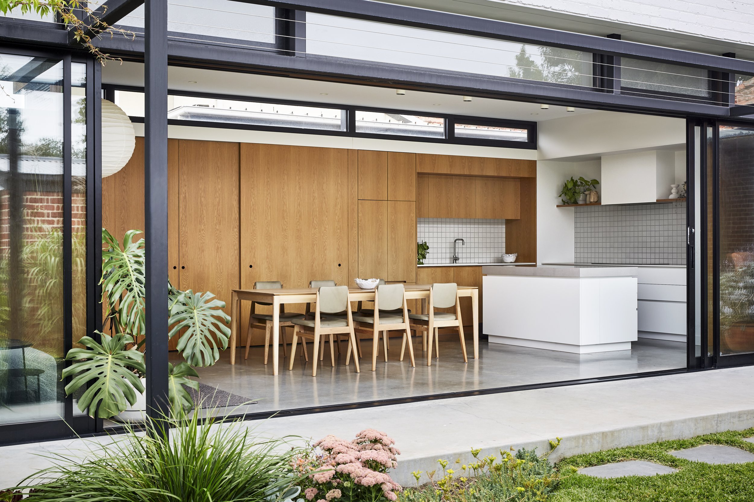
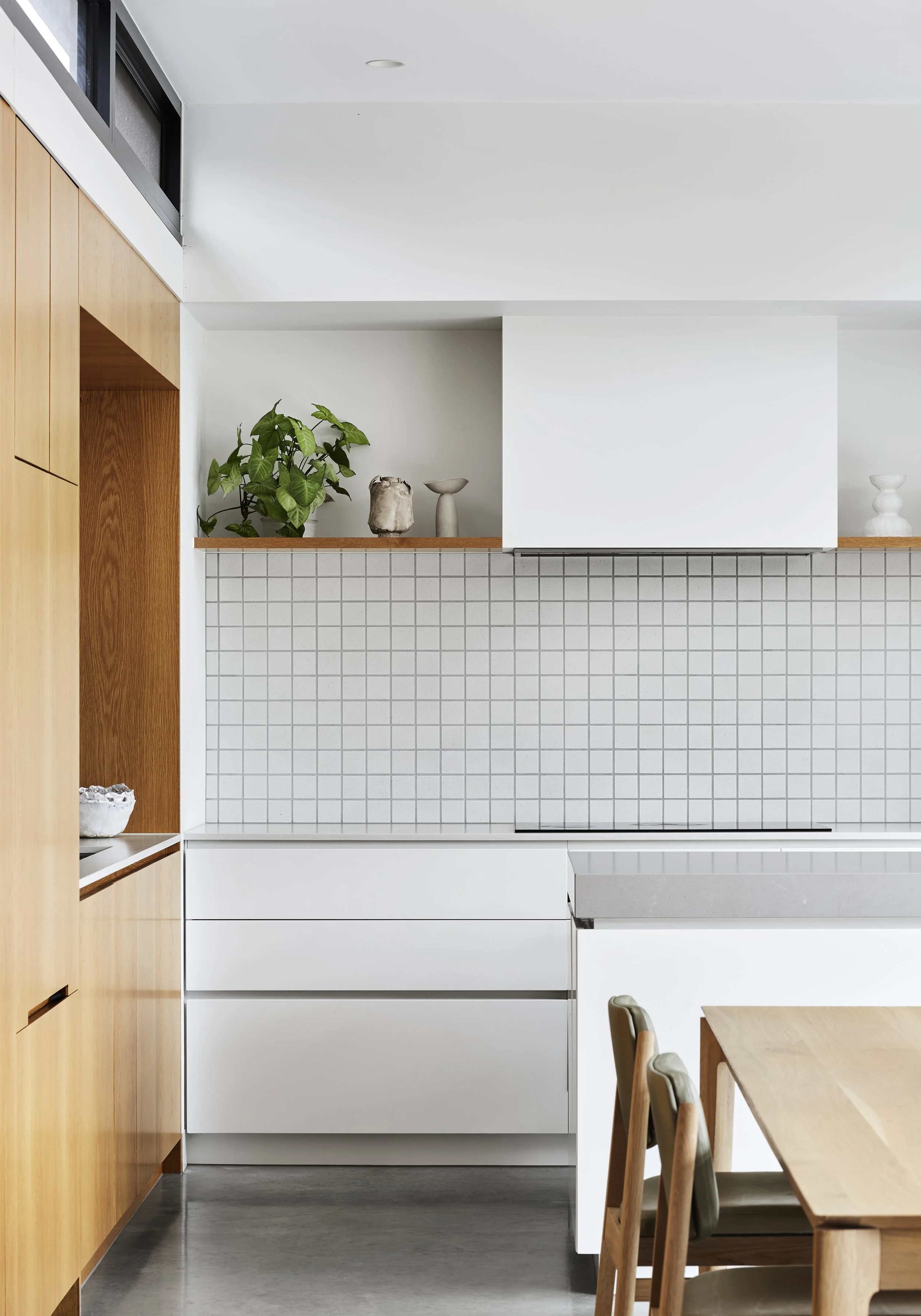
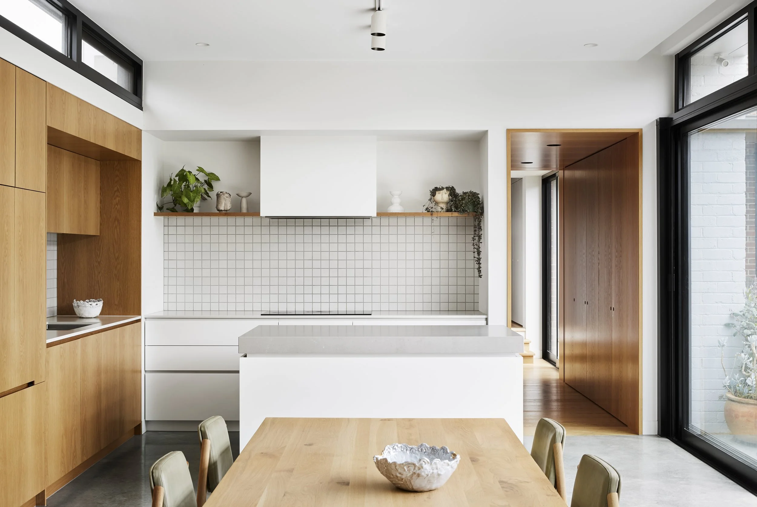
The bright and open kitchen space looks out to the garden. Styling: Beck Simon. Photo: Tess Kelly
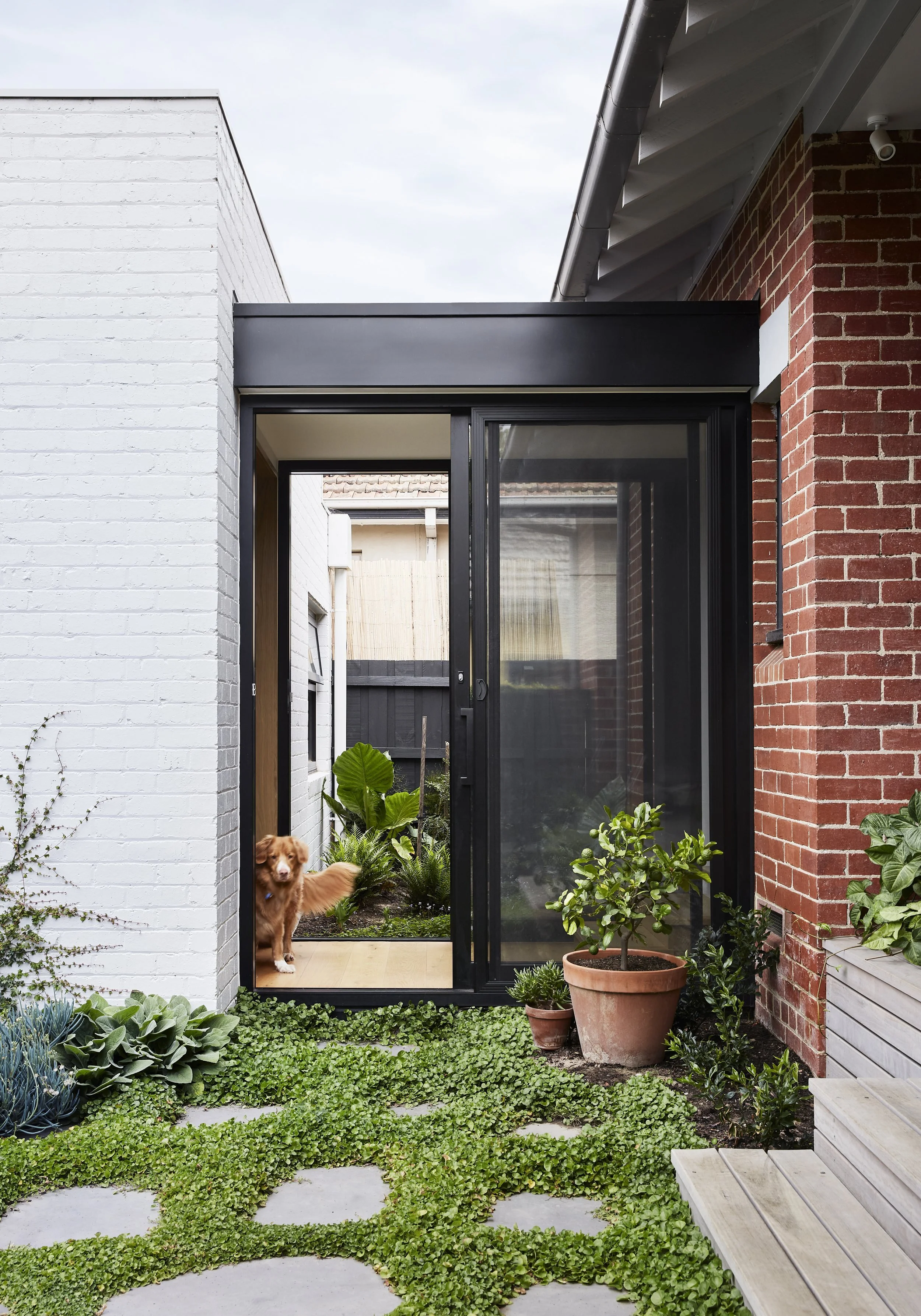
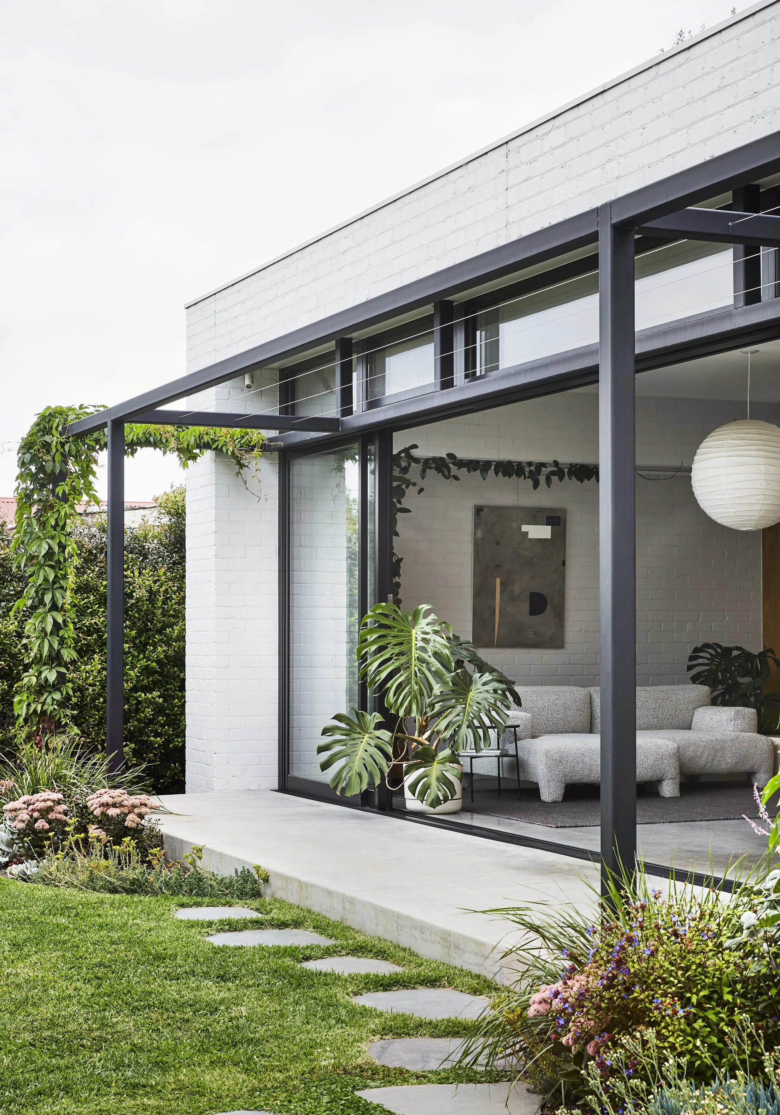
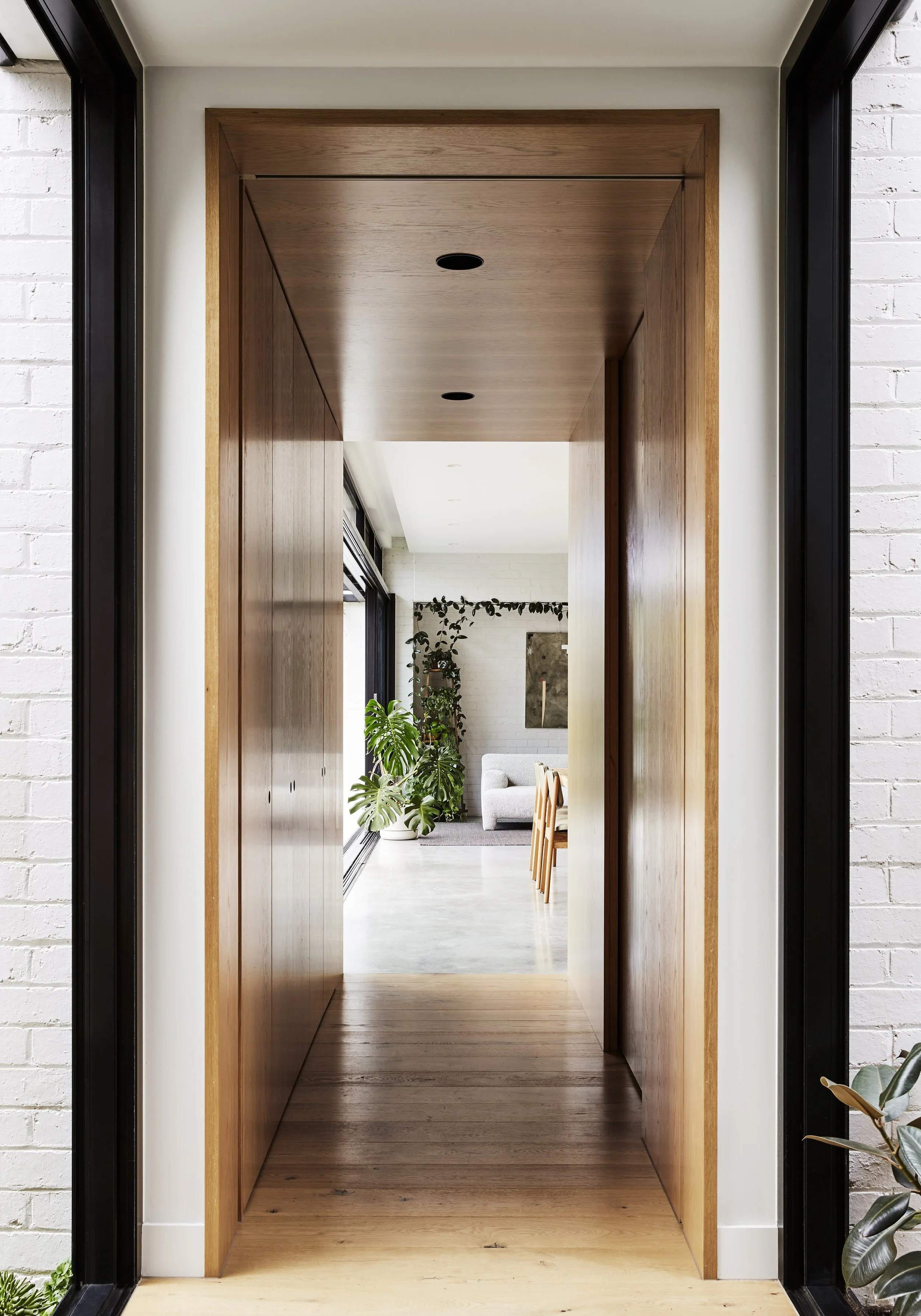
A stand-out element of the project is the glass walkway – the single point where these two structures meet. Garden design: Amanda Oliver Gardens. Styling: Beck Simon. Photo: Tess Kelly
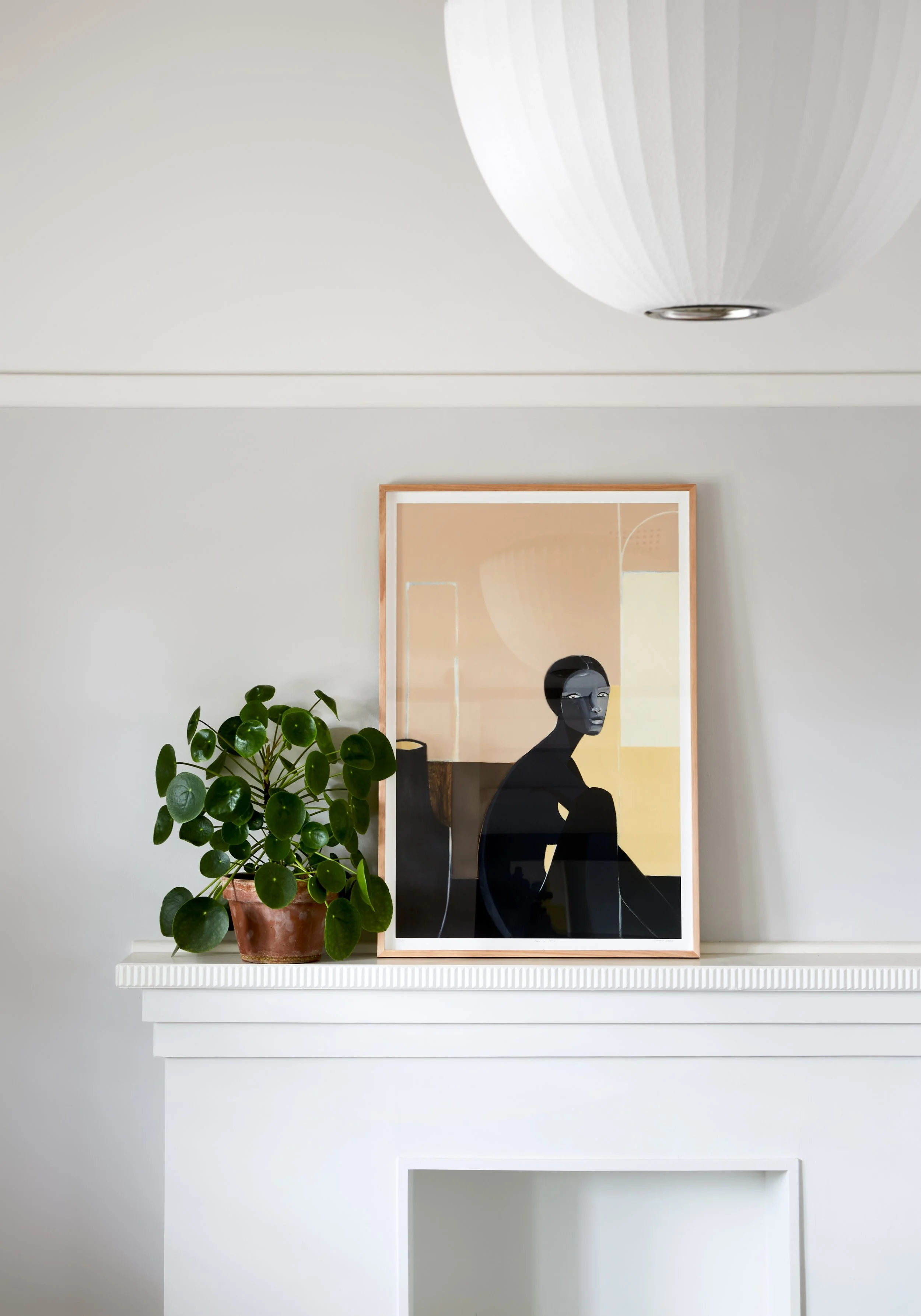
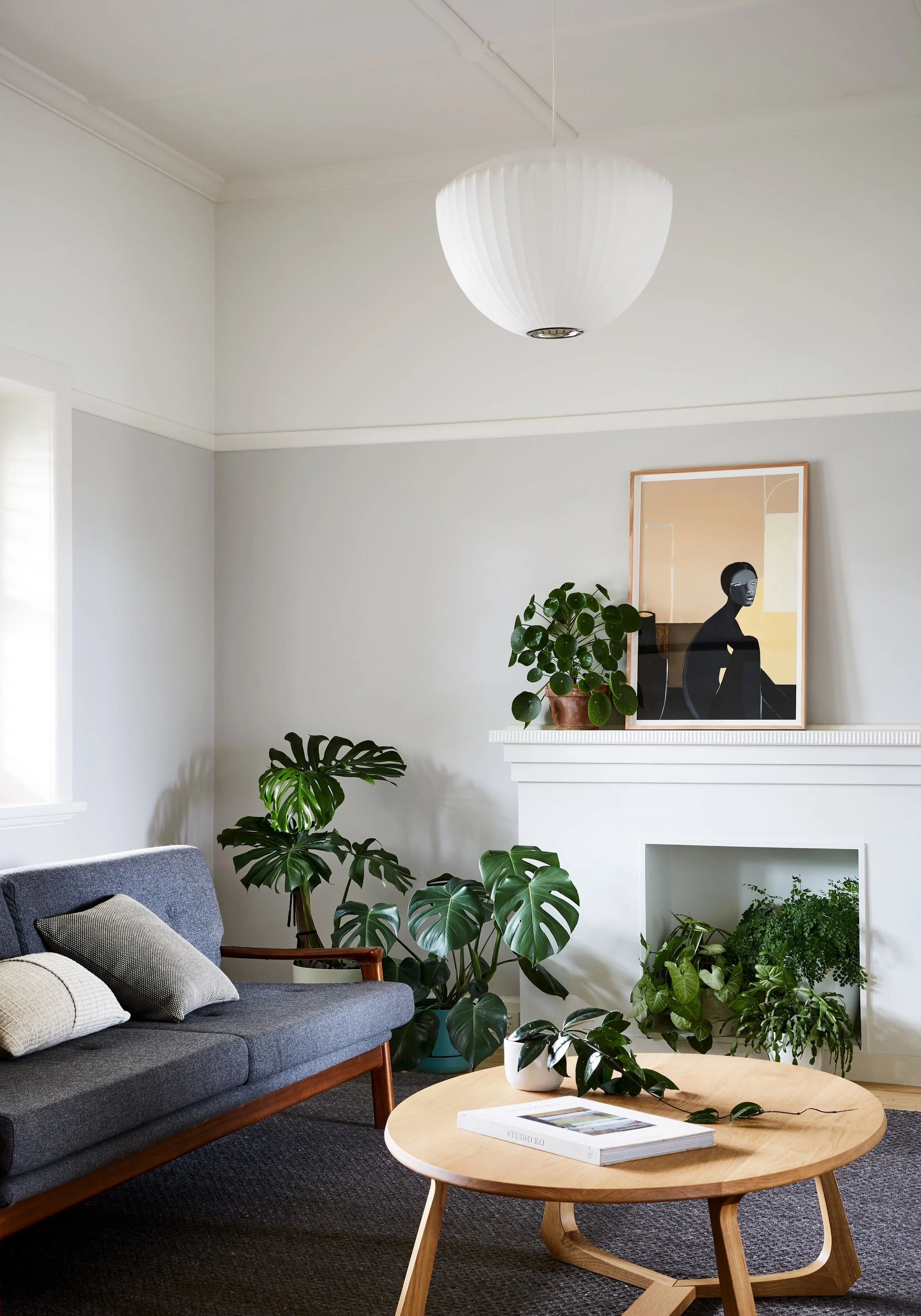
Maike Design replanned the existing house to feature quiet and simple spaces. Artwork by Stacey Rees via Modern Times. Styling: Beck Simon. Photo: Tess Kelly
Styling: Beck Simon. Photo: Tess Kelly
Melbourne design studio Maike Design has gained a reputation for their clever approach to heritage home renovations, creating bright and functional spaces tailored to each individual site.
Their latest project, Garden House, in Malvern East, Victoria, is no exception. The original heritage Californian bungalow house has been renovated and reworked using its inherent solidity and darkness to create gentle, calm and enclosed private spaces.
The brief called to accommodate the growing family’s needs, including the provision of spaces for working from home.
‘This design is quiet, restrained and responds to the needs of our clients. It envelops the rituals of their lives and has prompted new ones, such as the owner’s daughters spending summer evenings together on their back deck,’ says Mairead Murphy, director of Maike Design
The interior results in a contrast with bright and open shared spaces of the new pavilion, which is as much a part of the garden as it is the house. The strong exterior connection sees the light and atmosphere of the rooms shift through the day, creating ever-changing moments of delight and picking up the natural properties of the interior finishes.
The design relies on subtle texture, careful material choices and a complete integration of interior design and architecture to create a sense of balance between all its elements. While the building is visually calm and simple, careful use of spatial volume, natural light, materiality, and beautiful craftsmanship provide a tactile and engaging home.
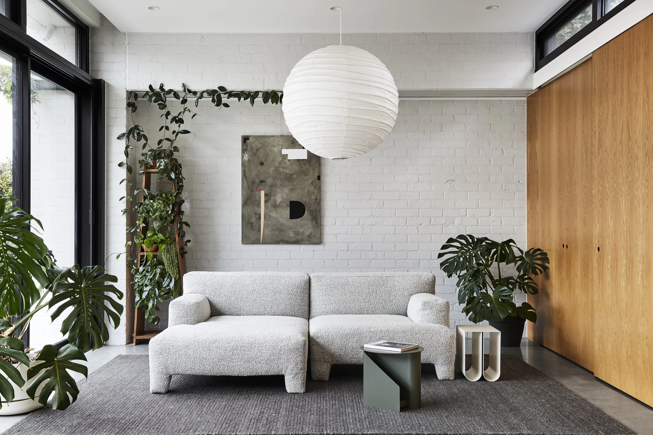
Materiality for the project is inspired by the original brick and timber construction but differs in colour selection to differentiate old from new. The restrained palette is a backdrop to the lives of the client and the beautiful plants inside and outside the building.
A previously dark and inward facing brick bungalow is transformed into a bright and functional home. Styling: Beck Simon. Photo: Tess Kelly
The texture filled living space with artwork by Saxon Quinn from Modern Times. Styling: Beck Simon. Photo: Tess Kelly
“We chose to treat the existing heritage listed house lightly by creating a simple, separate living pavilion in the garden.”
Maike Design replanned the existing house to feature quiet and simple spaces. Artwork by Stacey Rees via Modern Times. Styling: Beck Simon. Photo: Tess Kelly
The old part of the house meets the new. Styling: Beck Simon. Photo: Tess Kelly
The light-filled bedroom space with artwork by Jennifer Tarry-Smith via Modern Times. Styling: Beck Simon. Photo: Tess Kelly
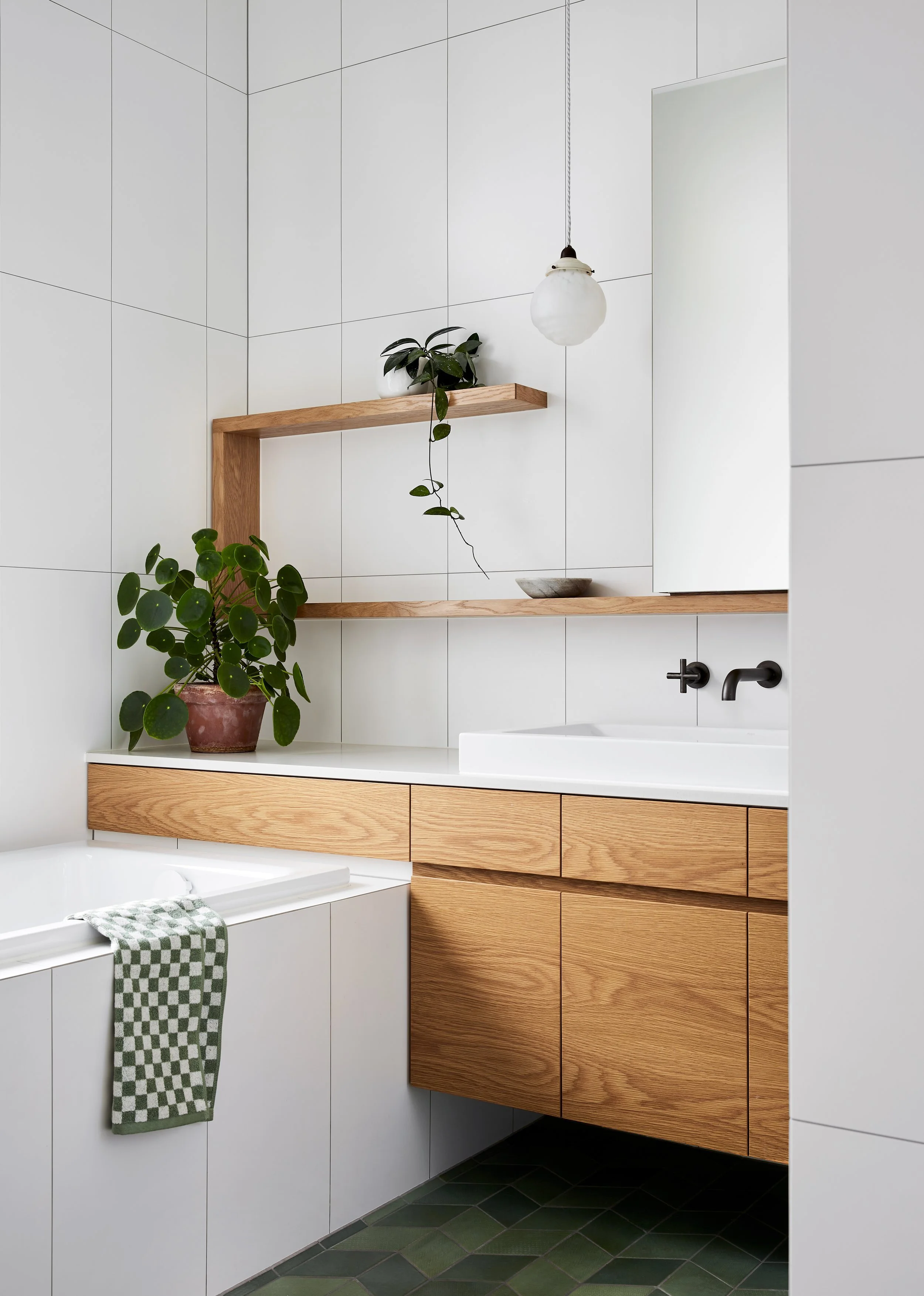
Simple and clean design extends to to all areas of the interior. Styling: Beck Simon. Photo: Tess Kelly
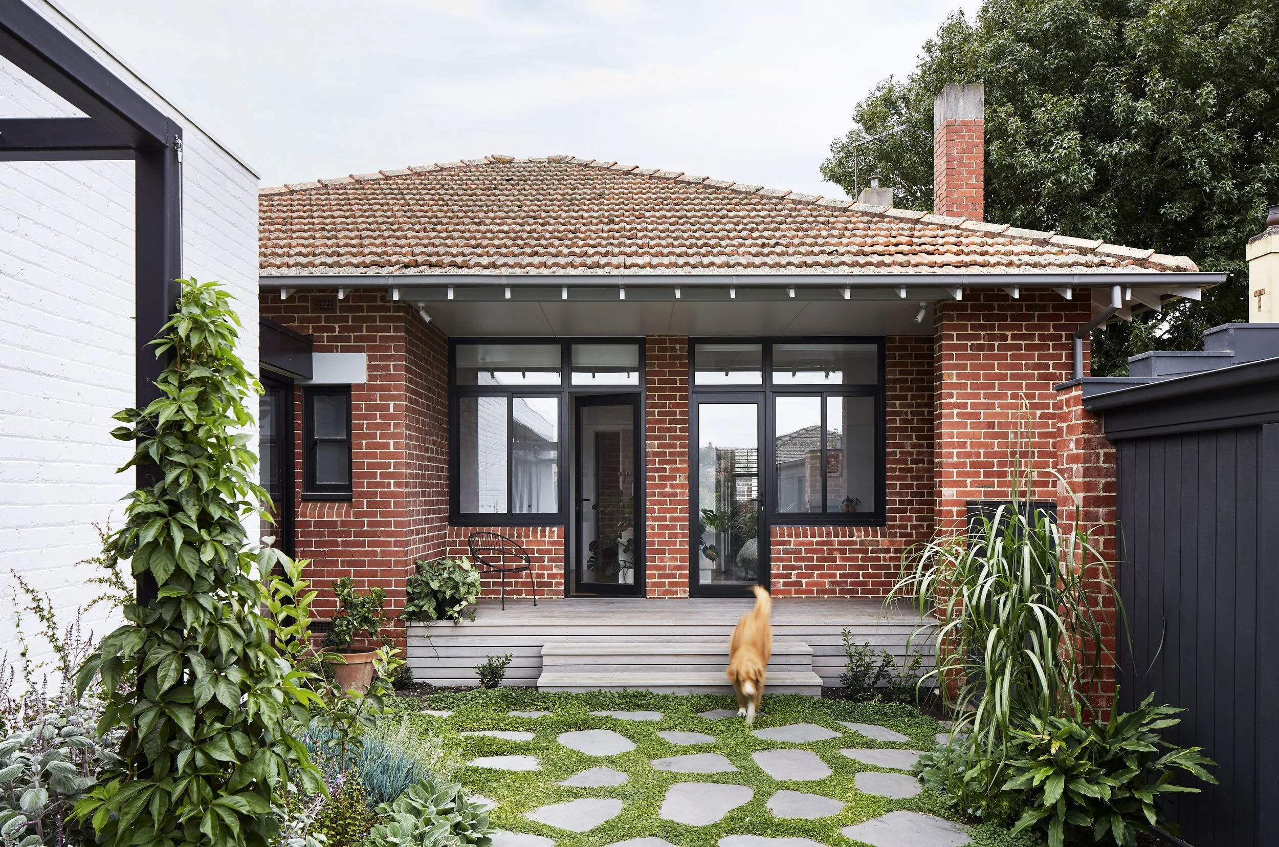
The back of the original house was opened up to the garden. Styling: Beck Simon. Photo: Tess Kelly


