Kew Residence by Doherty Design Studio
We step inside Kew Residence, from Penny Craswell’s new book, Design Lives Here.
Words: Penny Craswell | Photography: Derek Swalwell & Alex Reinders
The design of this house in the Melbourne suburb of Kew, for a family who loves to entertain up to eighty people at a time, its oversized proportions through the use of geometric and overlapping and contrasting materials, resulting in a home with balanced proportions that is harmonious, but also has character. The owners invited Doherty Design Studio to design the interiors after admiring another of their projects. They also asked them to design the house itself, which Doherty Design Studio did in consultation with a drafter. The resulting house offers a variety of different living spaces, both inside and out, with carefully curated design details creating a distinctive look and feel.
The exterior facade is broken up into two forms on the left and right, each one featuring white brick cladding surrounding floor-to-ceiling glazing. Slatted timber cladding has been used to break up any sense of a monumental presence. On the left, the garage is entirely clad in timber slats, while the centre of the house is in introverted black with a black decorative mesh screen entry door. This is the first of many geometric decorative moments throughout the house. Inside this entry door, the white brick of the exterior wraps inside and a second front door creates a vestibule. This is clad in timber, with fluted glass and a large square green onyx-and-brass door handle. For Mardi Doherty, these details were selected to add a 1930s ‘almost Hollywood architecture’ resonance.
Inside, a long, wide hallway runs from the front door to the kitchen and dining space at the back, with sunken living rooms to the right at the front and rear of the house, and an outdoor courtyard in-between. To the left of the hall, the garage sits at the front. In the middle is a staircase that leads to the bedrooms upstairs. The staircase is enclosed in a black screen with fluted glass, playing on some of the same design features as the entryway.
Underneath the stair area is a bar that makes the hallway part of the entertaining space – it is twice as wide as a regular hallway, creating a sense of generous space to the house. Everything is generous, which meets the needs of a Greek family who entertains once a month or so. The courtyard forms the centre of the space, capturing the northern light, with three sliding doors that can be opened up to the front and rear living spaces and the hallway to create a huge indoor–outdoor room. ‘It really revolved around this amazingly vast entertainment area,’ explains Doherty. ‘Generally, hallways are for moving people from one area to the next, whereas this was part of an expandable entertaining area.’
“The house offers a variety of different living spaces, both inside and out, with carefully curated design details creating a distinctive look and feel.”
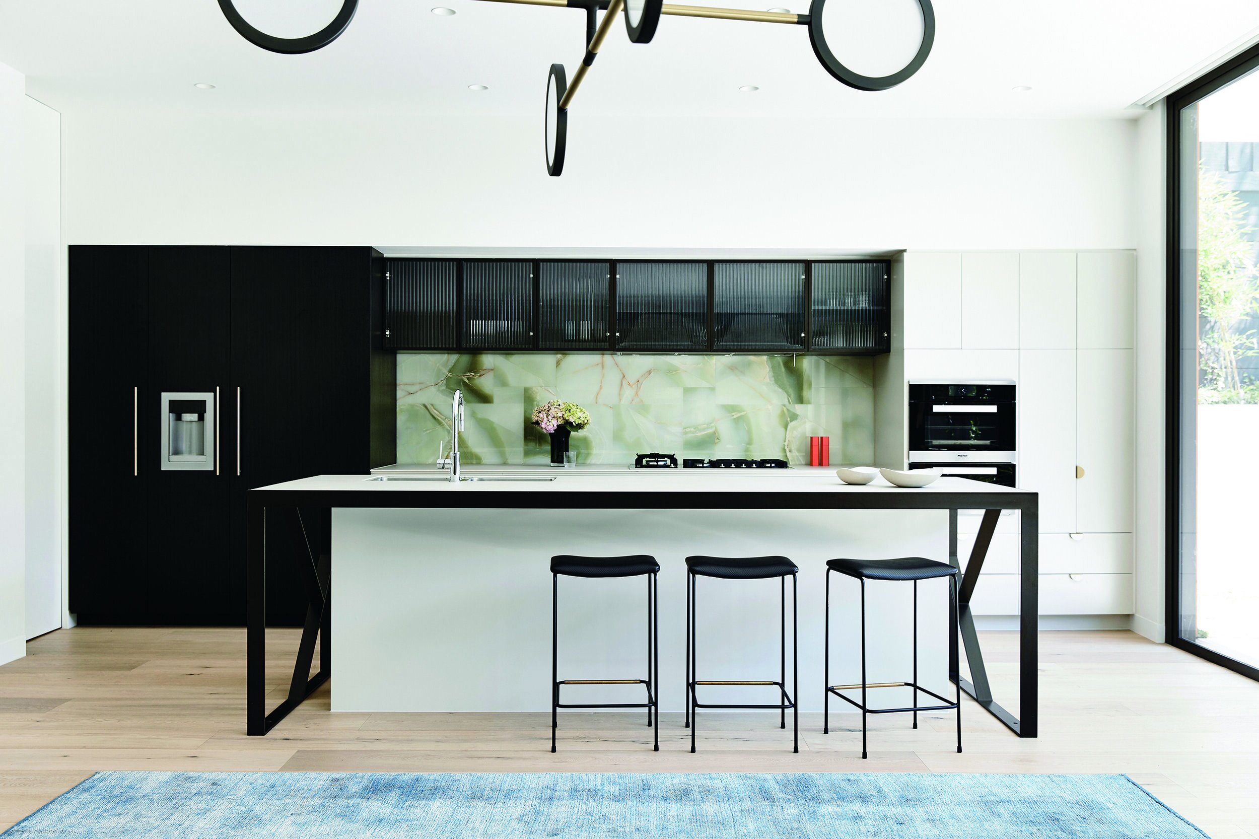
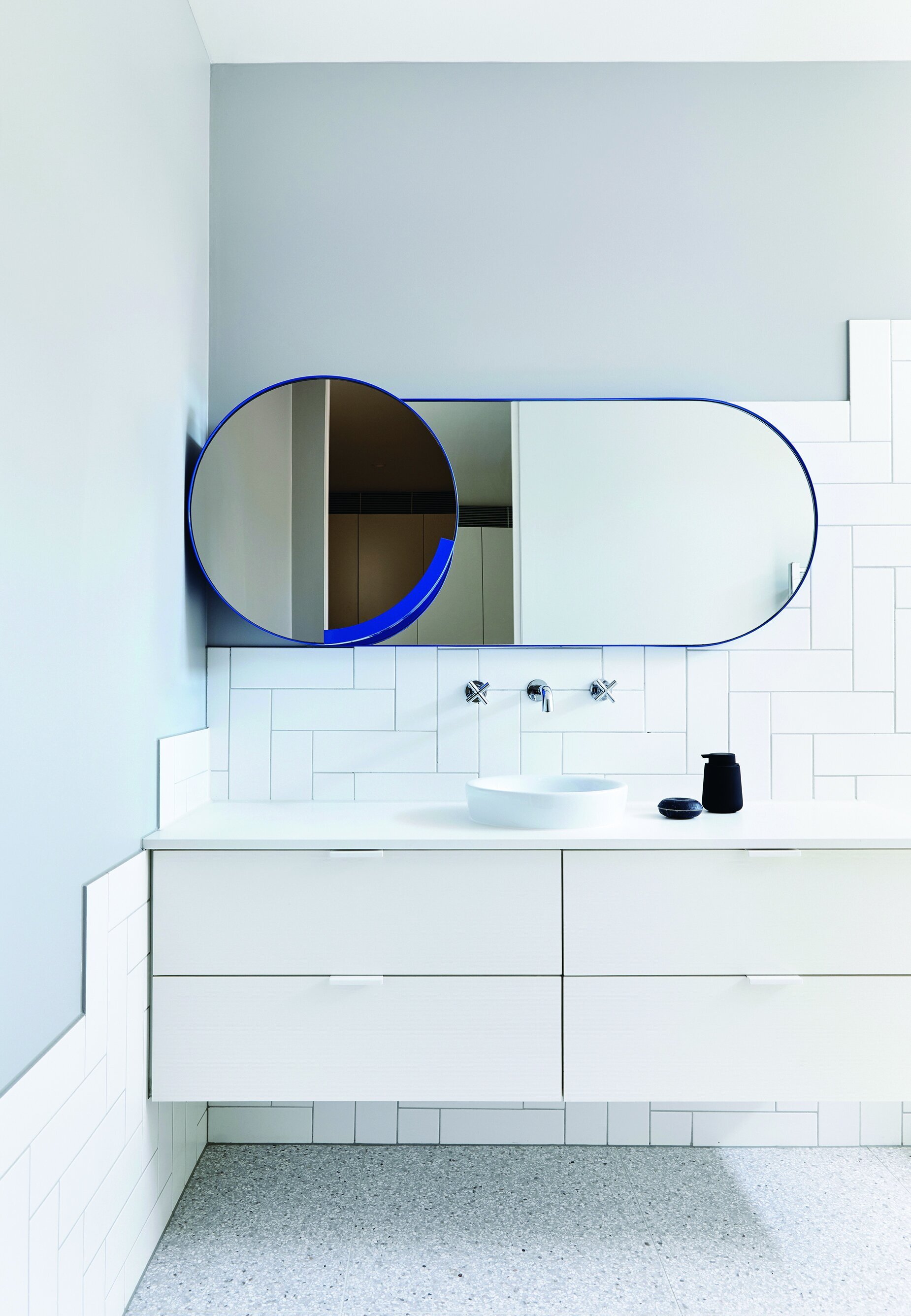
The green onyx of the front doorhandle carries through to the splashback of the kitchen and to the bathroom, representing another nod to the 1930s. Built-in joinery, part of the client’s brief, adds a sense of refined detail to the finishes. This includes not only the kitchen, bathrooms and bedroom joinery, but also a built-in sofa in the sunken living room that adjoins the kitchen and dining space. This was a custom design that was difficult to get right. It had to work in tandem with a mesh screen from the upper level that separates the living areas, and also allows views through from one room to the next.
The design team selected much of the furniture and lighting. Ross Didier’s Liqueur table is one of the most important pieces of furniture in the whole house. It is positioned at a focal point within the kitchen, dining and living space at the rear of the house, and it can be viewed for about 30 metres as you walk down the hallway from the front entrance. With even its hallway being double the width of a standard Victorian house, this property feels generous without losing elegance. The colours and materials centre on a basic palette of neutrals, adding splashes of muted colour in soft furnishings and interest via geometric design elements throughout.
This is an extract from Design Lives Here by Penny Craswell, published by Thames & Hudson and available where all good books are sold.


