Kirribilli Apartment—A Compact & Stylish 1950s Apartment
Tsai Design & Amandine Simonetti Architecture and Interiors reimagine a 1950s Sydney apartment—offering a refined response to minimal living, where downsizing meets thoughtful function.
Words HANDE RENSHAW Photos CLINTON WEAVER Architecture & Interior Design TSAI DESIGN & AMANDINE SIMONETTI ARCHITECTURE & INTERIORS Stylist COFFEY HALLET Builder NEXT LEVEL BULIDING
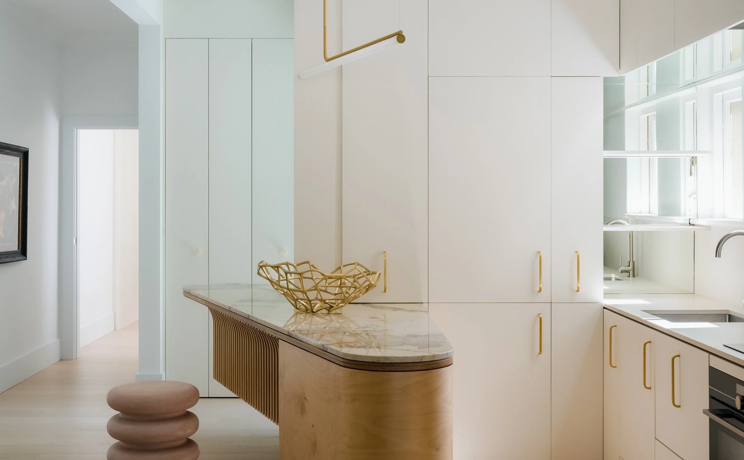
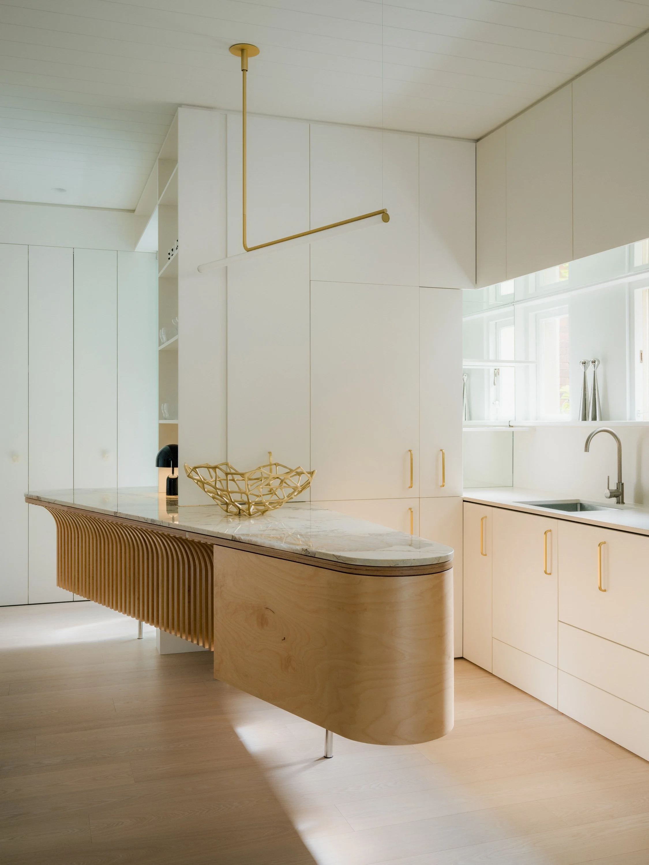
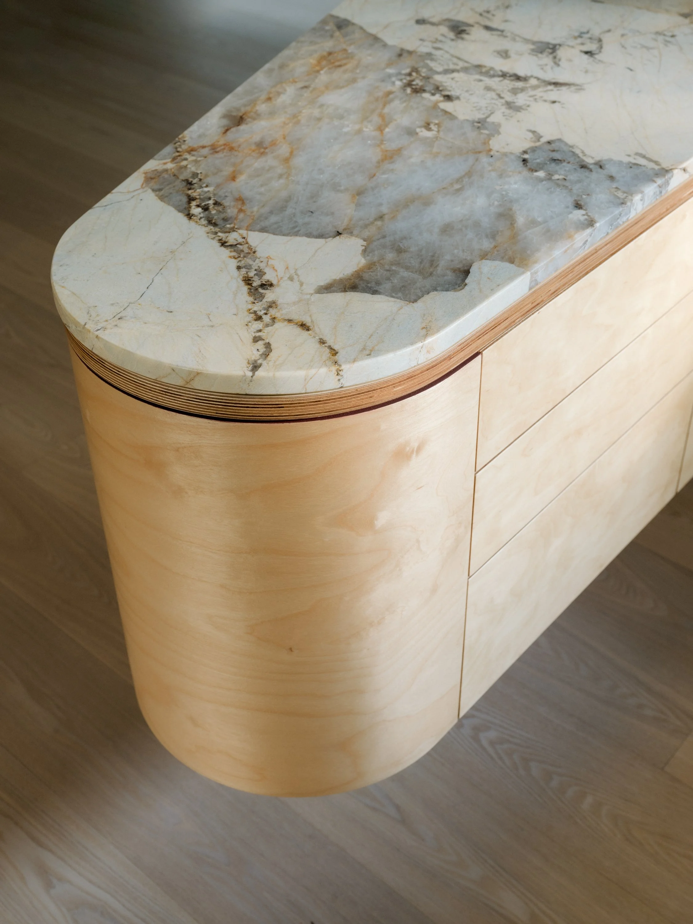
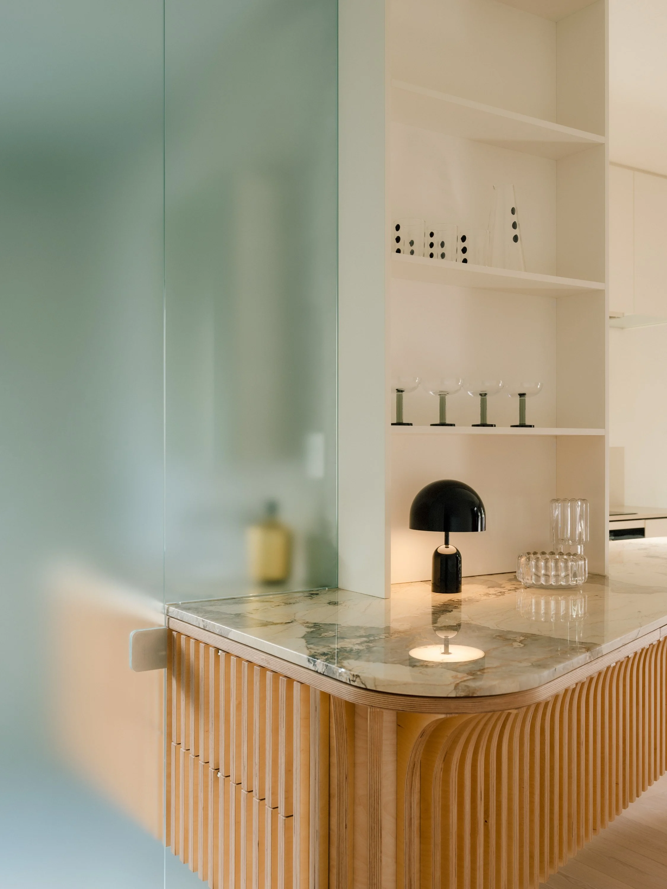
The incredible Patagonia Quartzite floating kitchen island.
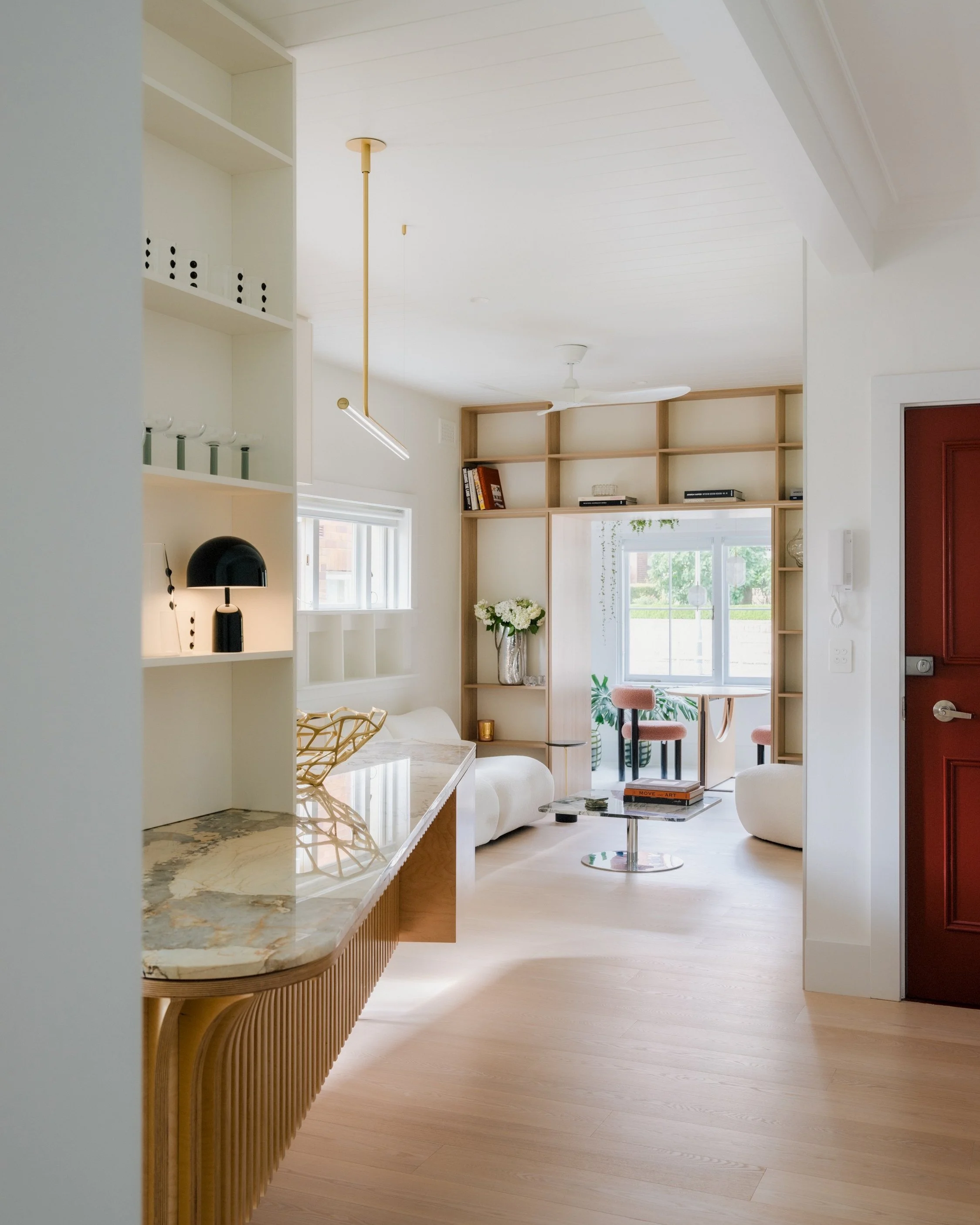
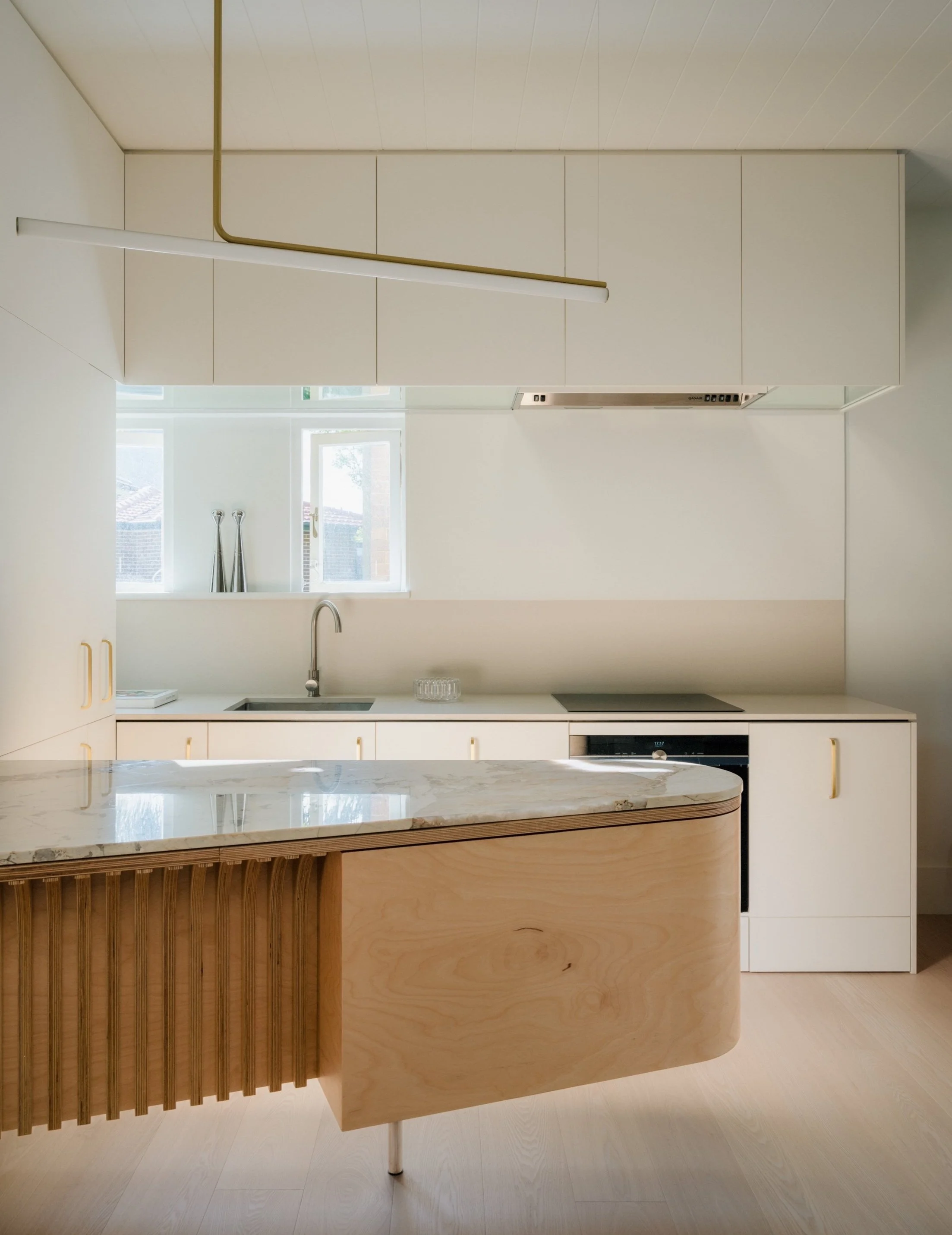
‘The kitchen floating island is quite a feature – it spans between three spaces, from the kitchen to the entry and into the bathroom,’ says Jack Chen.
The floating kitchen island features Patagonia Quartzite benchtop.
Creating a floating kitchen island opened up the solid form, giving the illusion of more space.
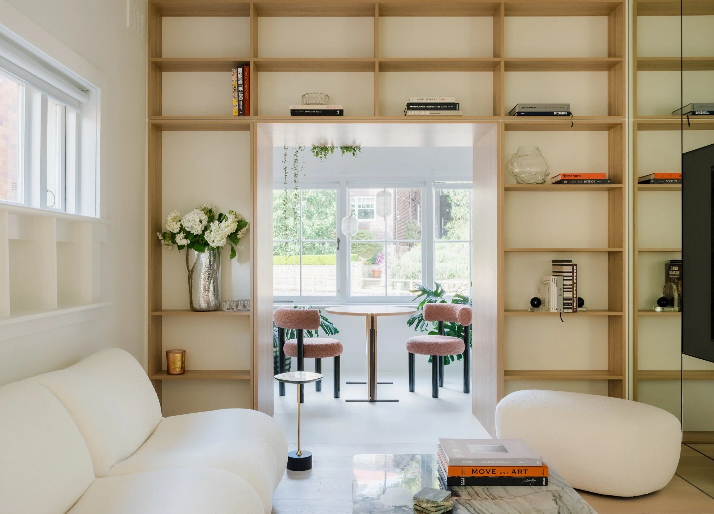
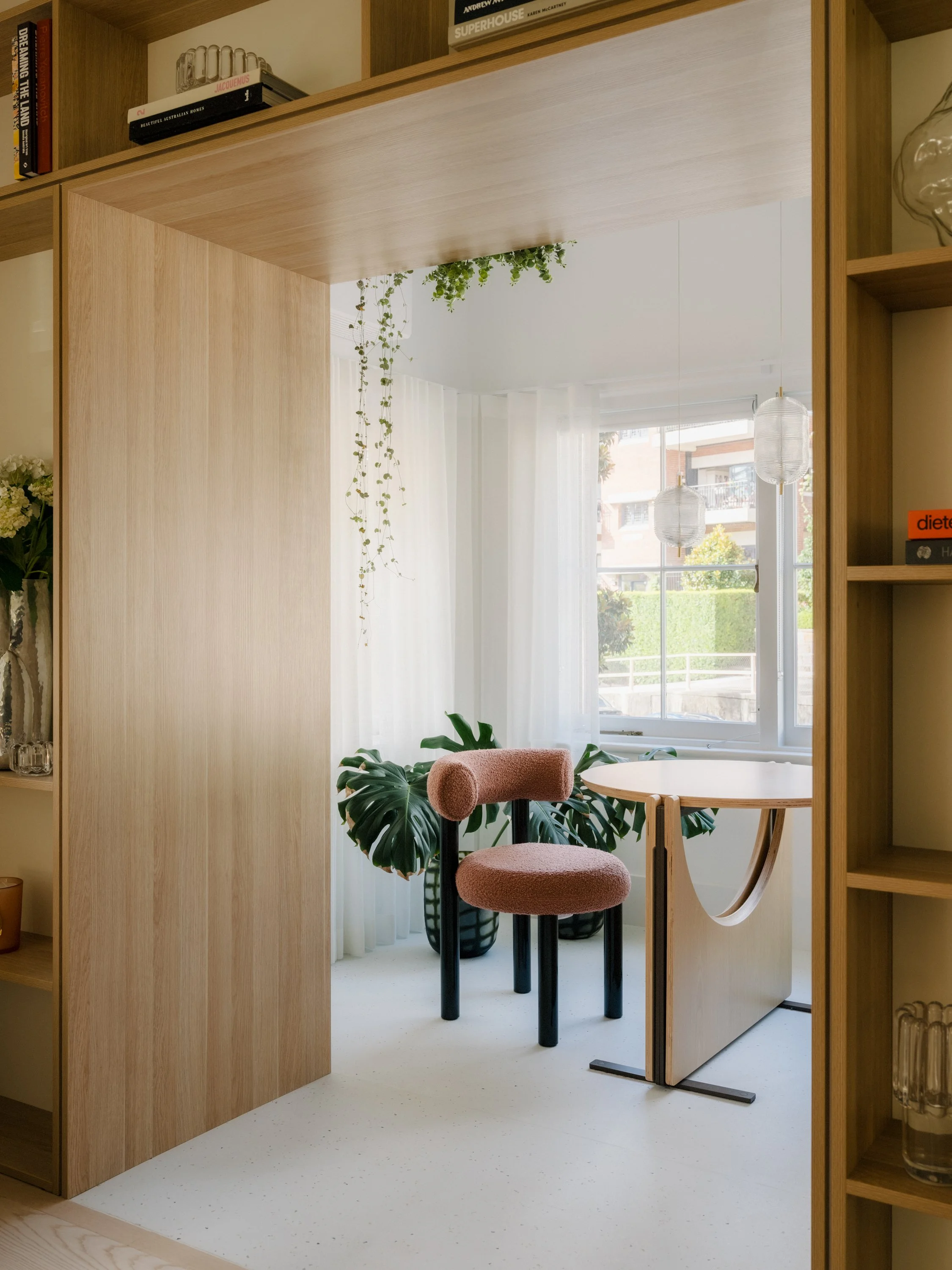
The view from the open-plan kitchen through to the dining space.
Shelving divides the living space from the sun flooded dining space.
When it comes to downsizing from a large suburban home to a small apartment, the transition can be tricky. For the owner’s of Kirribilli Apartment, the brief was clear for the renovation of their 70-square-metre apartment—they wanted a functional and minimal apartment to suit their recently changing needs as empty nesters.
Tsai Design collaborated with Amandine Simonetti Architecture and Interiors and Next Level Building, to bring the homeowner’s needs to life.
‘The brief was quite flexible, the clients wanted to make sure that the apartment had a good flow, and a good balance between design and functionality’ says Jack Chen from Tsai Design.
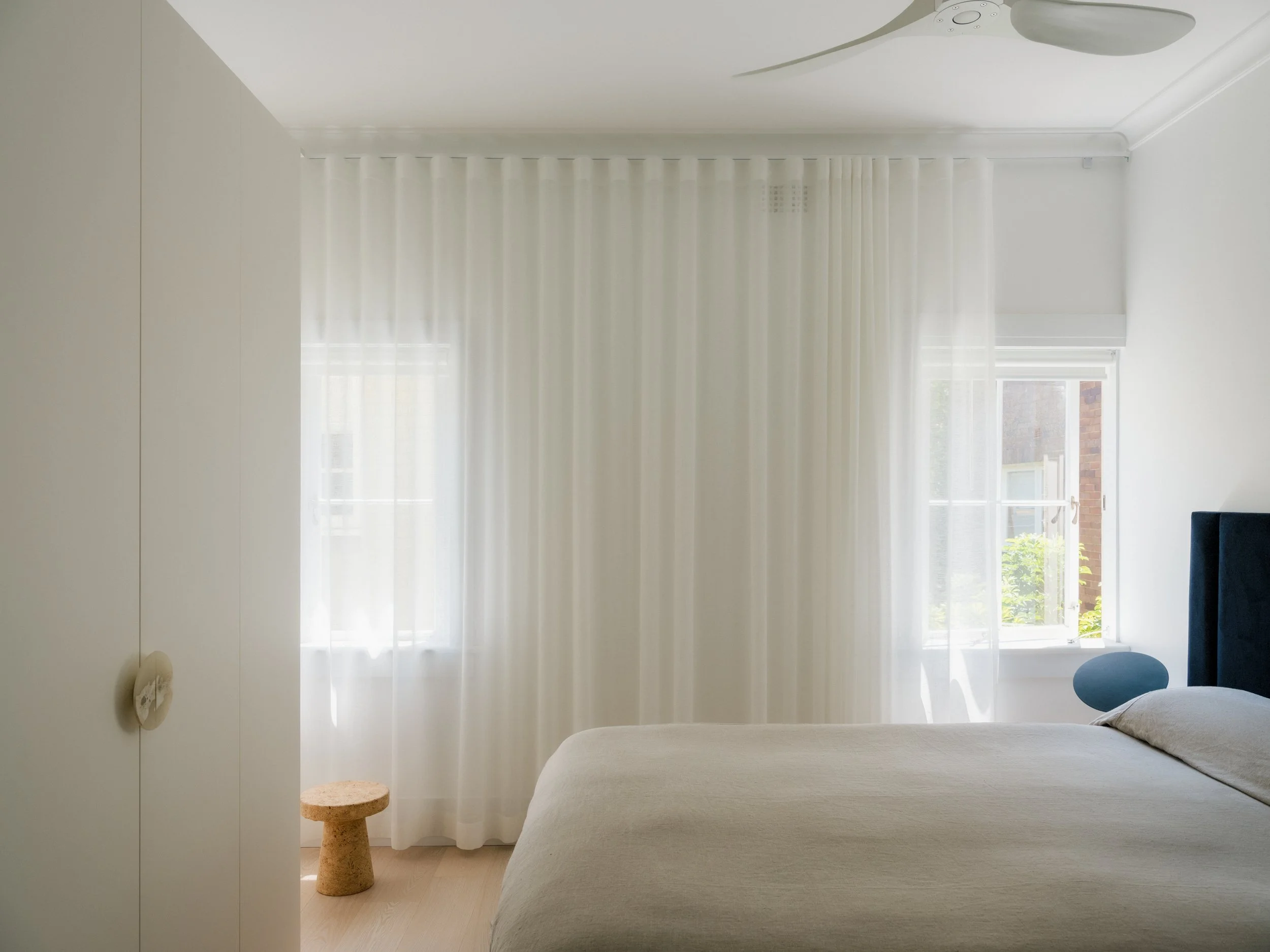
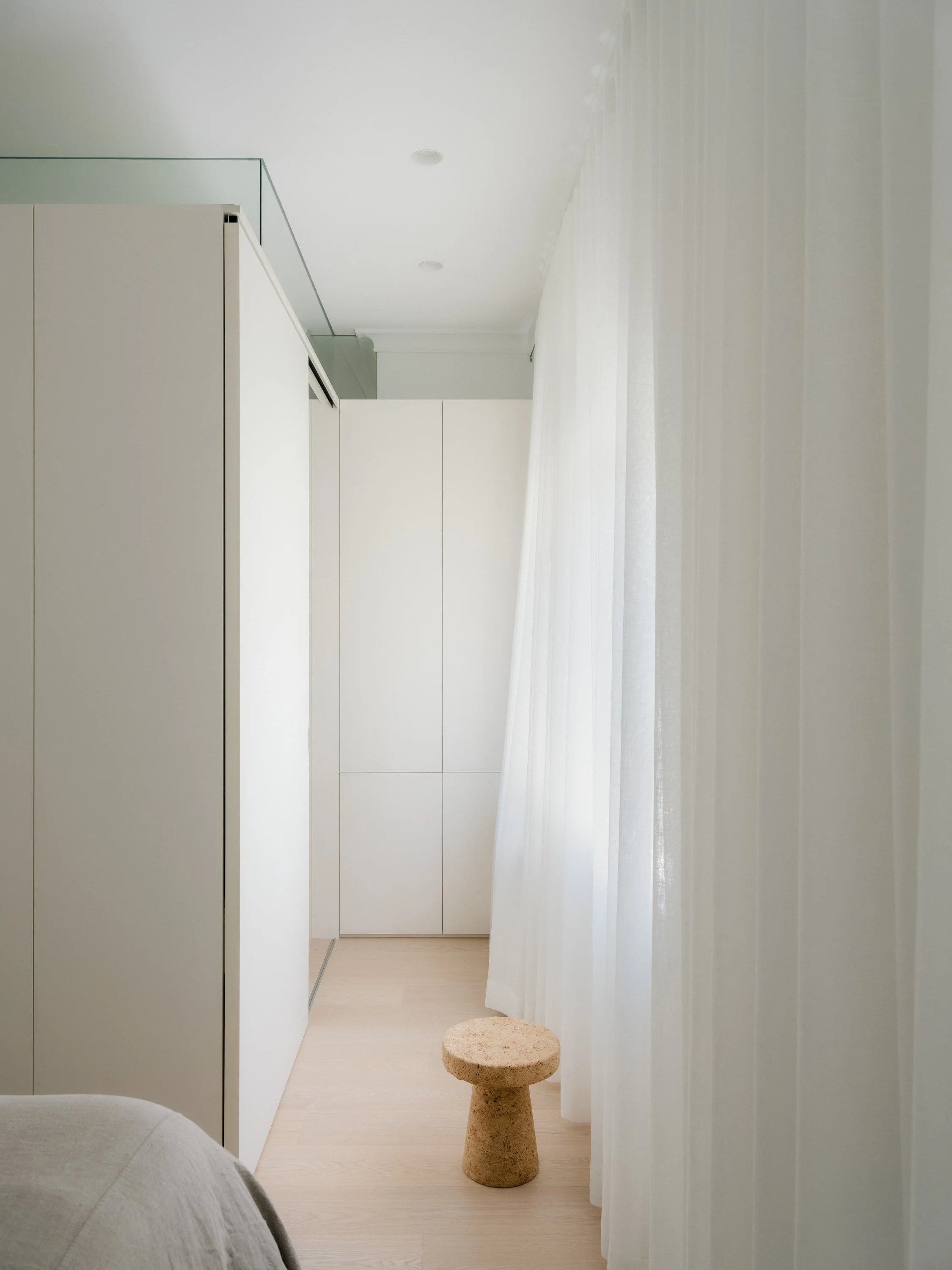
Renovation challenges to overcome included opening up the very compartmentalised apartment, which was previously incredibly dark due to poorly used windows that allowed limited sunlight to enter the spaces. ‘The solution we adopted was to remove the internal dividing walls in the living and bedroom space and in the bedrooms we replaced the wall with a wardrobe unit, which is not full height – this allows the homeowners to see the ceiling plane and gives the illusion of a larger space,’ shares Jack.
The renovation was divided into two parts: the front half, which is made up of the living space, kitchen and bathroom, and the back half, including a bedroom, a ‘versatile’ room, a central wardrobe and a study nook. The redesign prioritised the living spaces and removed existing walls in favour of creating an open-plan layout that allowed sunlight to flood into each room.
A standout feature within the home is the incredible floating kitchen island, complete with a Patagonia Quartzite benchtop. The island extends through the kitchen, living and hallway space and finally into the bathroom. ‘The design blurs the boundaries between the spaces, and in doing so makes them feel bigger,’ Jack says.
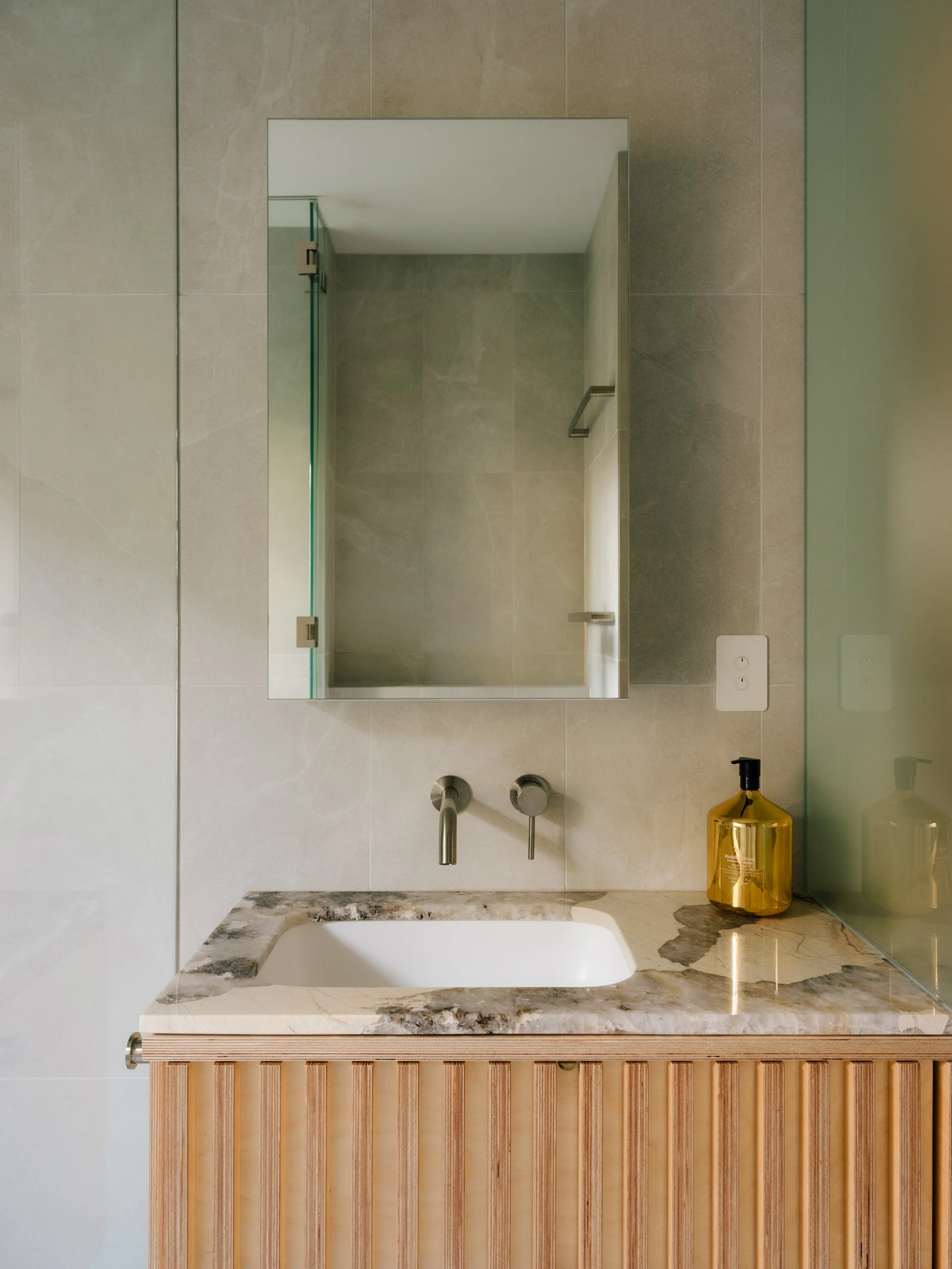
The bathroom wall was replaced with frosted glass dividers, and full-height mirrors were installed, running the length of the living room to create an added sense of spaciousness. ‘In the north-facing dining space, the brightest area in the house, we've utilised white flooring to enhance light reflection, creating a winter garden ambiance since there is no outdoor space with the apartment.’
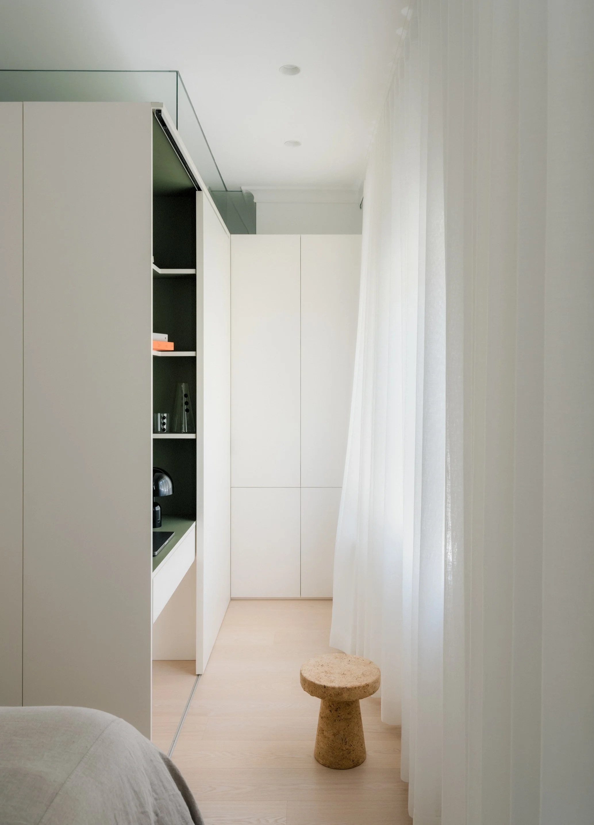
The palette within the apartment is calming and muted – blonde timber floorboards feature against a stone plywood in the kitchen, mirrors open up the space and highlight the neutral tones throughout. The only exception is a pop of colour in the study nook–where a furniture grade lino in olive was applied, ‘to give a bit of drama to the nook,’ explains Jack.
The compact apartment is a big hit with its owners, a new home where they can experience togetherness and also separateness whenever needed. ‘I like to think we created space for them to be together, as well as a place for them to have individual space—in a bigger house you’re always able to find nooks and places to yourself, in an apartment this is not prioritised, and is mostly overlooked due to the size limitations,’ says Jack.
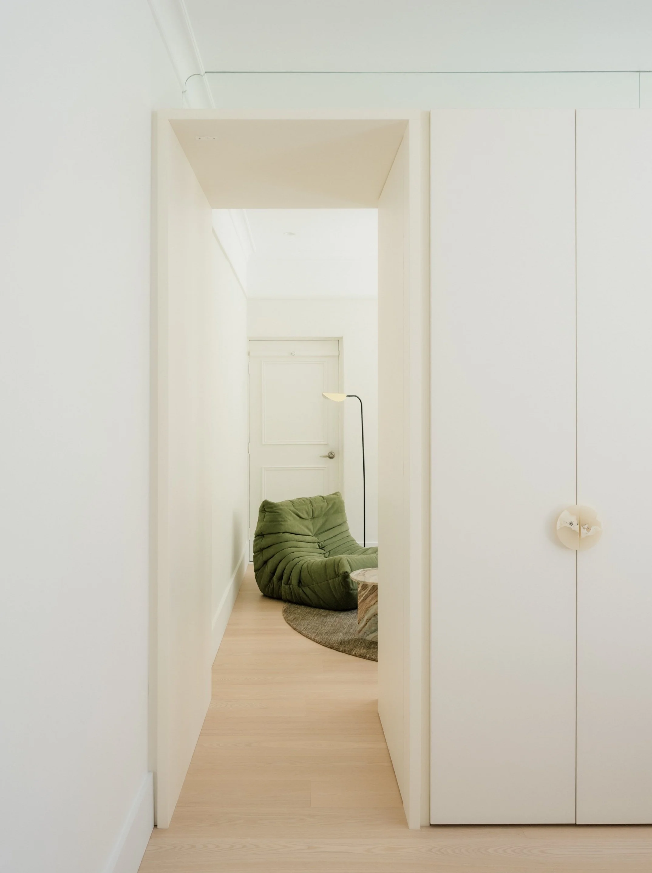
A wardrobe operates the living space from the bedroom and ‘versatile’ room.
The versatile room serves multiple purposes, functioning as a reading nook, a piano area, and a guest bedroom for visiting family and friends.
The minimal and streamlined bedroom features large built-in wardrobe.
“We always approach our designs with a problem-solving mentality—its about first identifying the problems, then finding the most efficient way to addressing the problem, and hopefully turning it on its head.”
The study nook in the bedroom can be completely concealed when not in use.
The study nook in the bedroom can be completely concealed when not in use.
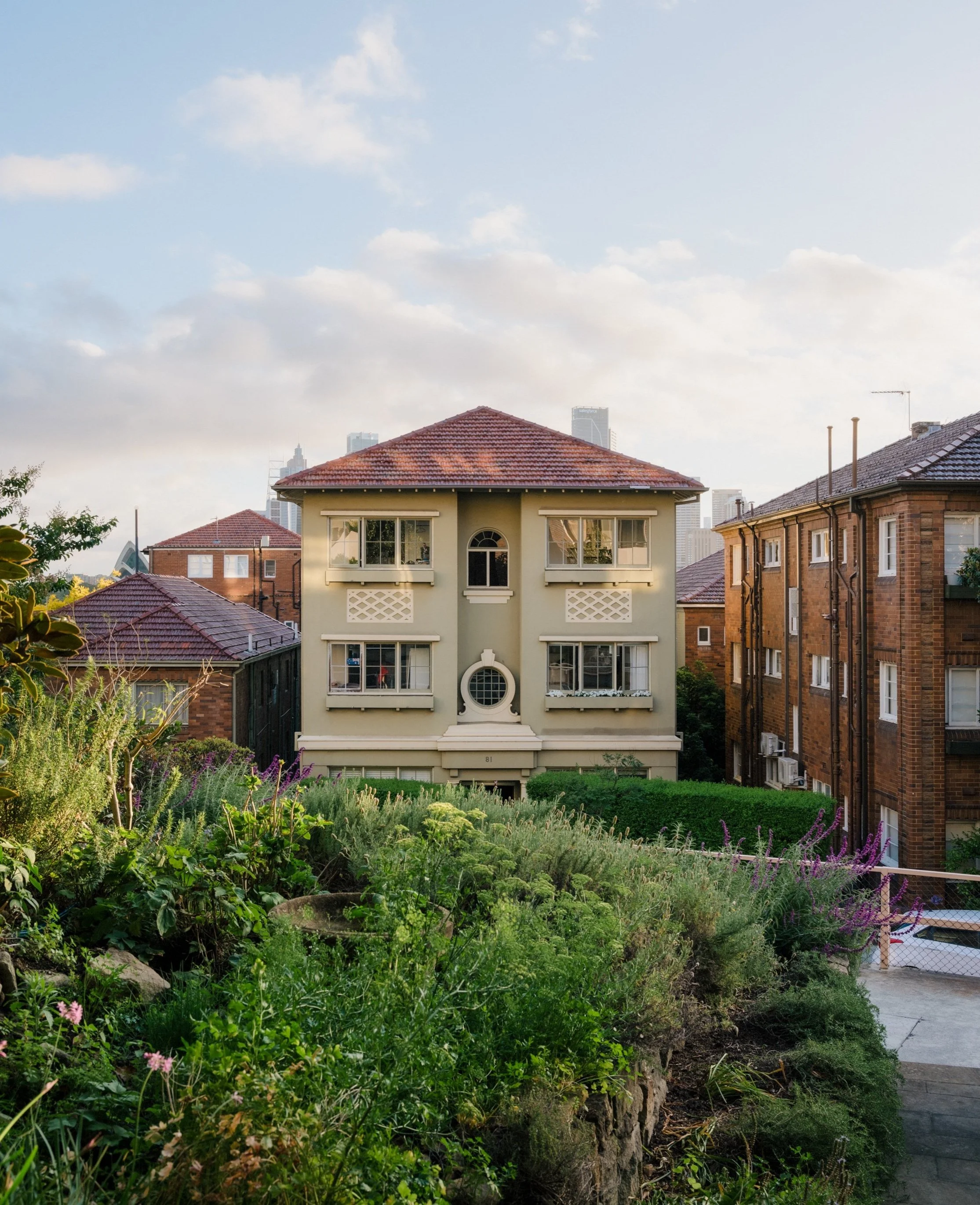
The 1950s apartment’s Kirrilbilli location was ideal choice for the couple, who both work in the city.
A frosted glass divider separates the bathroom space without forsaking natural light.


