Neville Street Residence by Doherty Design Studio & Chan Architecture
A single-fronted Victorian terrace in Melbourne’s bayside suburb of Middle Park is transformed by Doherty Design Studio and Chan Architecture into a functional home that encourages connection.
Words: Hande Renshaw | Photography: Dave Kulesza
Styling: Bea Lambos. Photo: Dave Kulesza
Styling: Bea Lambos. Photo: Dave Kulesza
Neville Street Residence in Melbourne’s bayside suburb of Middle Park, designed by Doherty Design Studio and Chan Architecture, shows how considered orientation, materiality and clever spatial planning can enhance liveability.
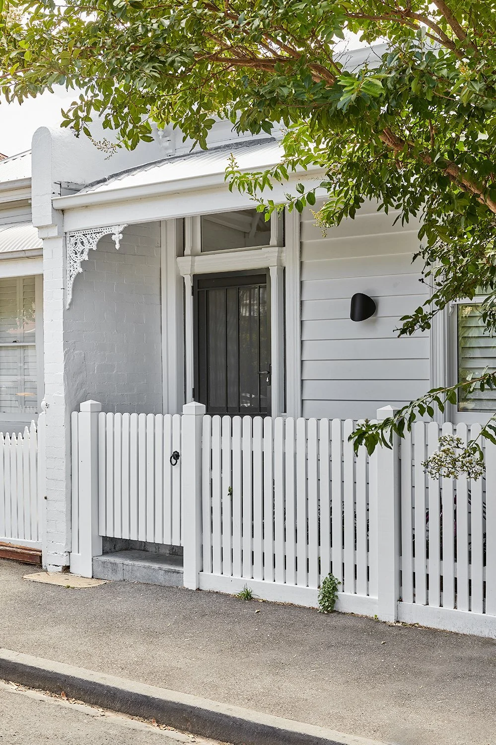
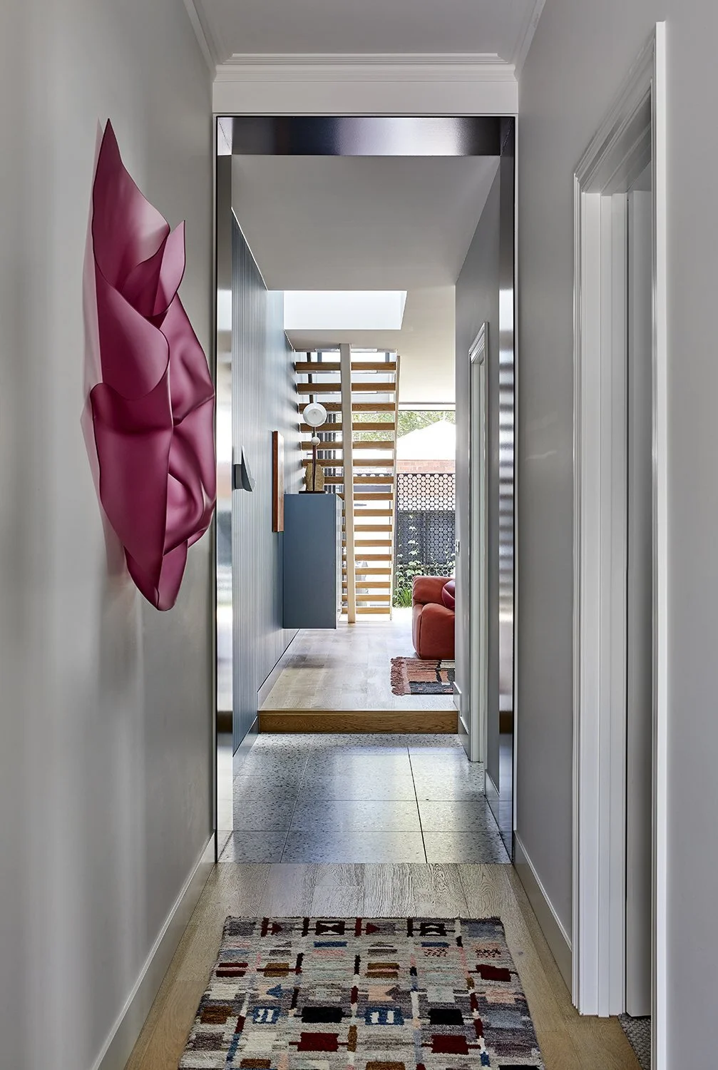
Common for renovations to heritage buildings, the façade, front two bedrooms and hallway have all been retained and restored, while the extension and the addition of a second storey are set back from the street to minimise visibility from the front of the house.
‘Large parts of the City of Port Phillip have heritage overlays, which requires owners to retain the front façade and minimise the visibility of rear extensions,’ says Anthony Chan from Chan Architecture.
Home to a young family, the spaces had to deliver within a relatively small footprint, not only needing to be aesthetically interesting, but also be functional.
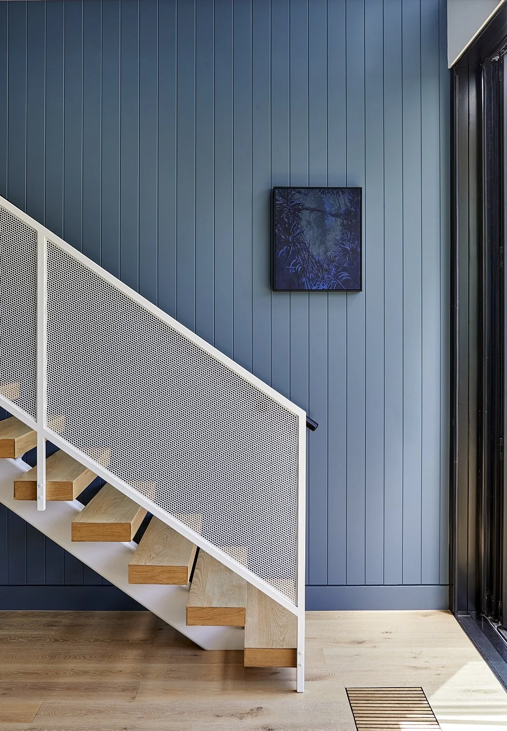
The new living, dining and kitchen spaces are opened up to the courtyard to the rear – by designing the main family space with high ceilings and spanning the full width of the site, the sense of space in this room is unexpected. The white metal feature stairs takes you to the first floor which houses the master bedroom, ensuite and parent’s retreat.
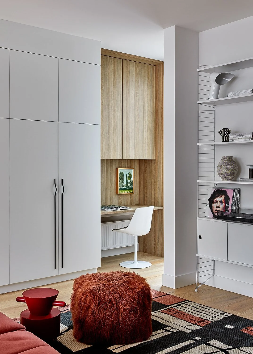
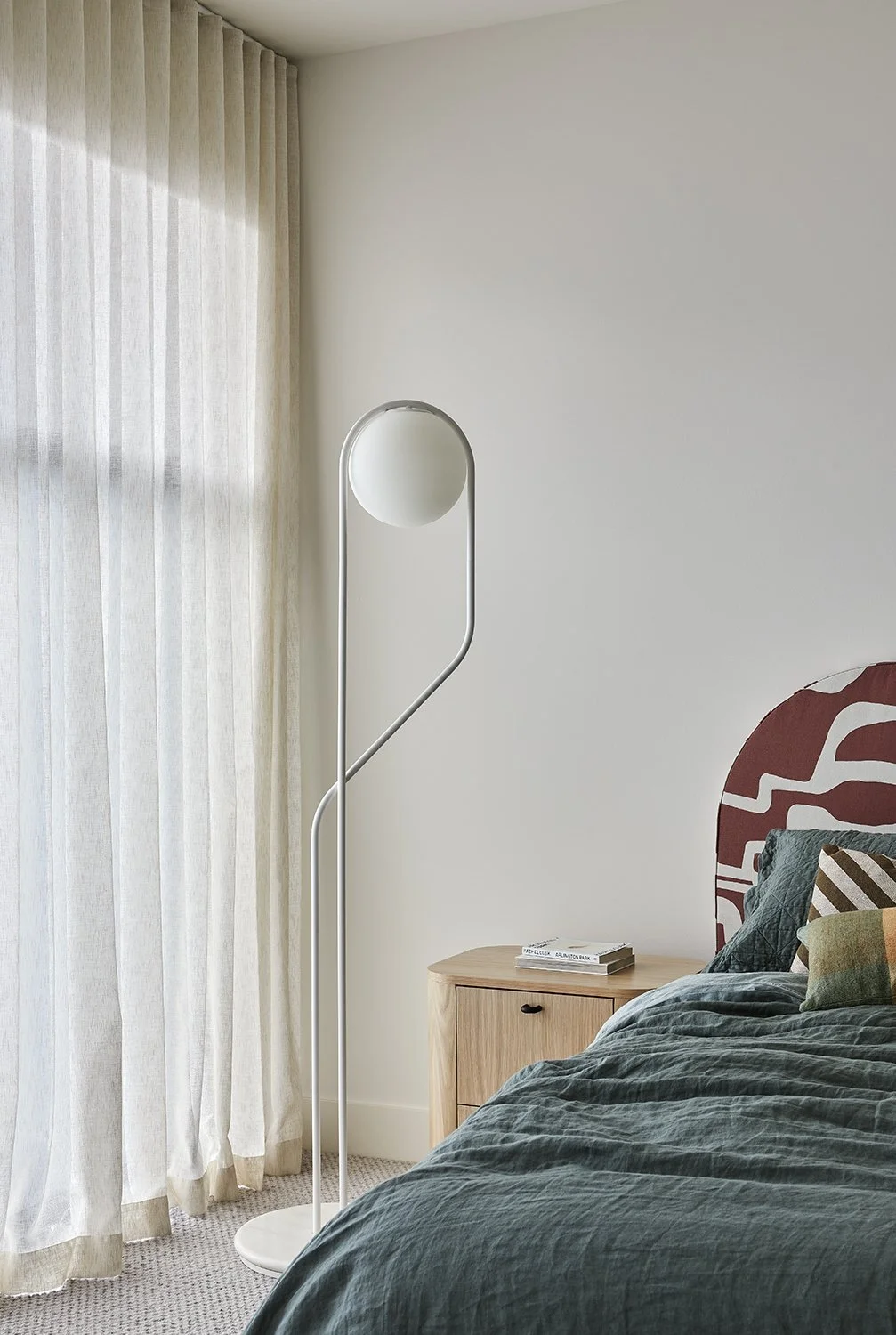
A durable, tactile palette of materials of metal and timber add warmth and texture to the external façade whilst internally the selection of materials and fixtures add character and individuality to each space.
The pared-back approach of complementary forms and blocks of colour epitomises the design of the entire home.
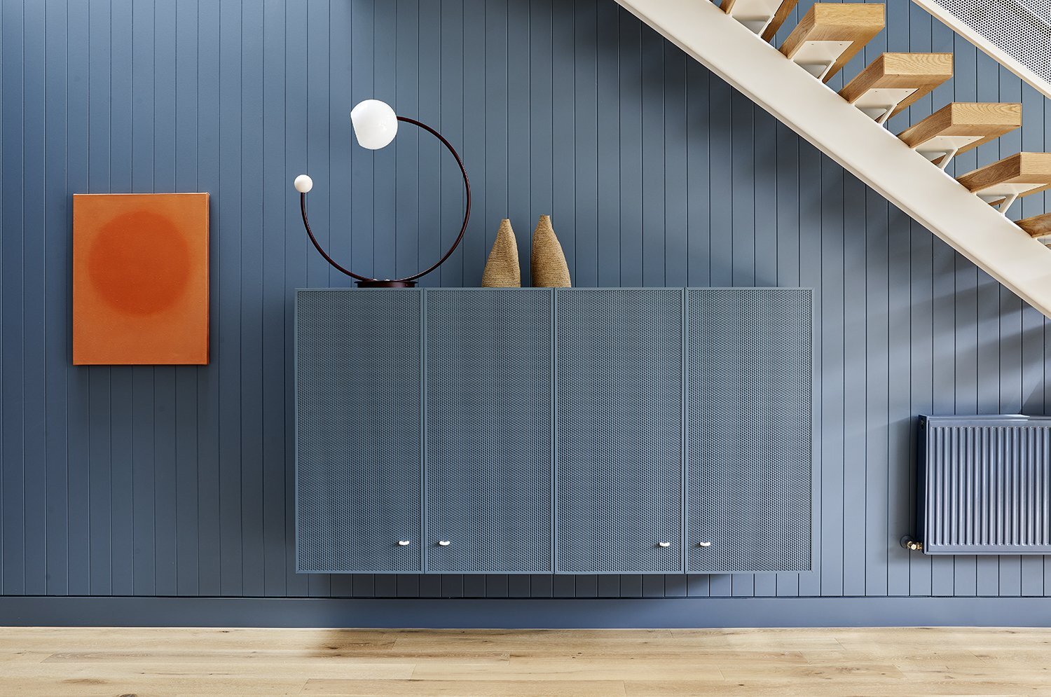
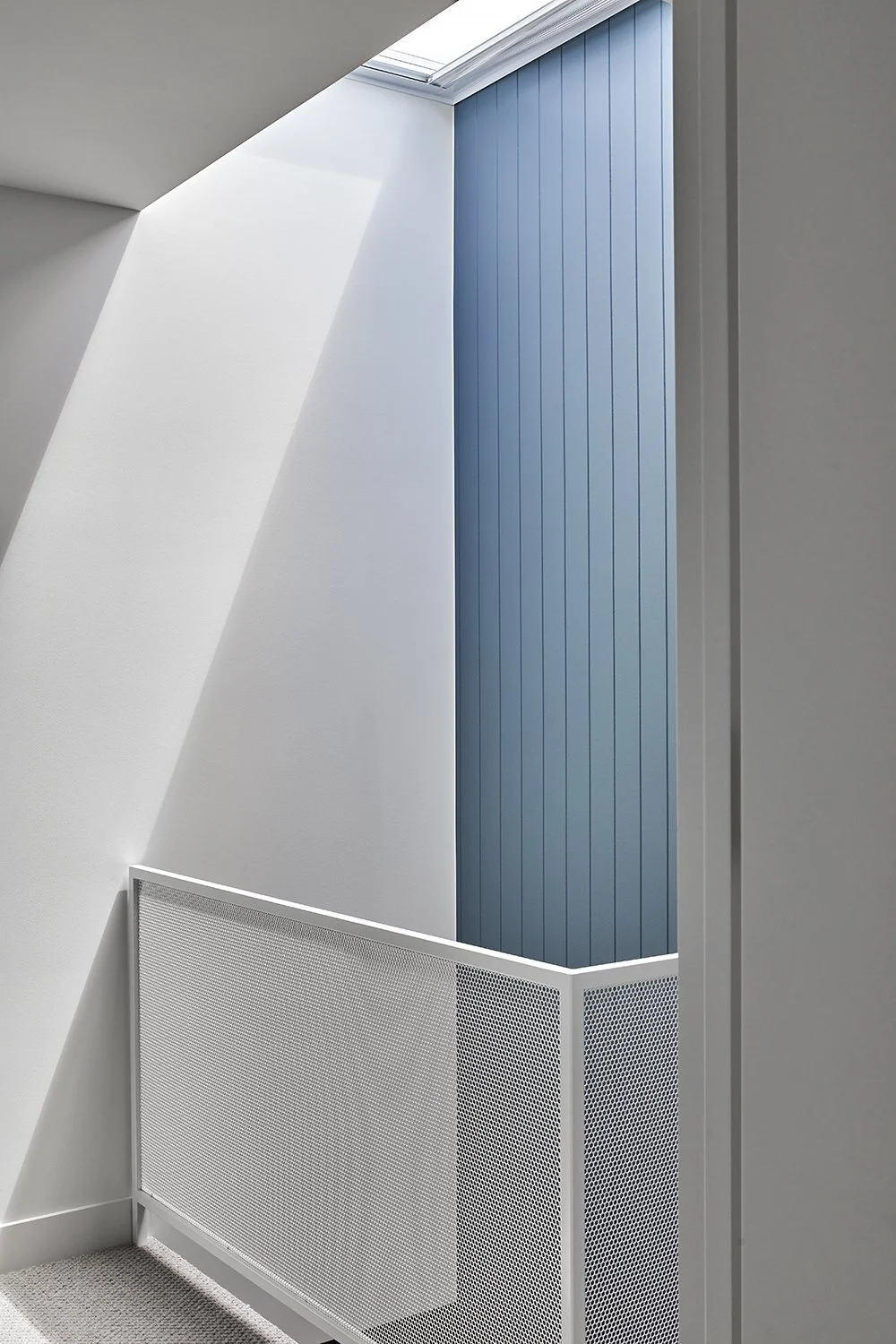
‘A palette of durable and tactile materials runs consistently throughout the home, with pops of steely blues in the kitchen and living areas and soft greens in the bathrooms – the wall behind the staircase had a blue painted V-groove wall panelling that would encourage people to look up, thus punctuating the connection between the ground and first floors,’ says Anthony.
Materiality and colour work to create visual interest and depth in the home. Styling: Bea Lambos. Photo: Dave Kulesza
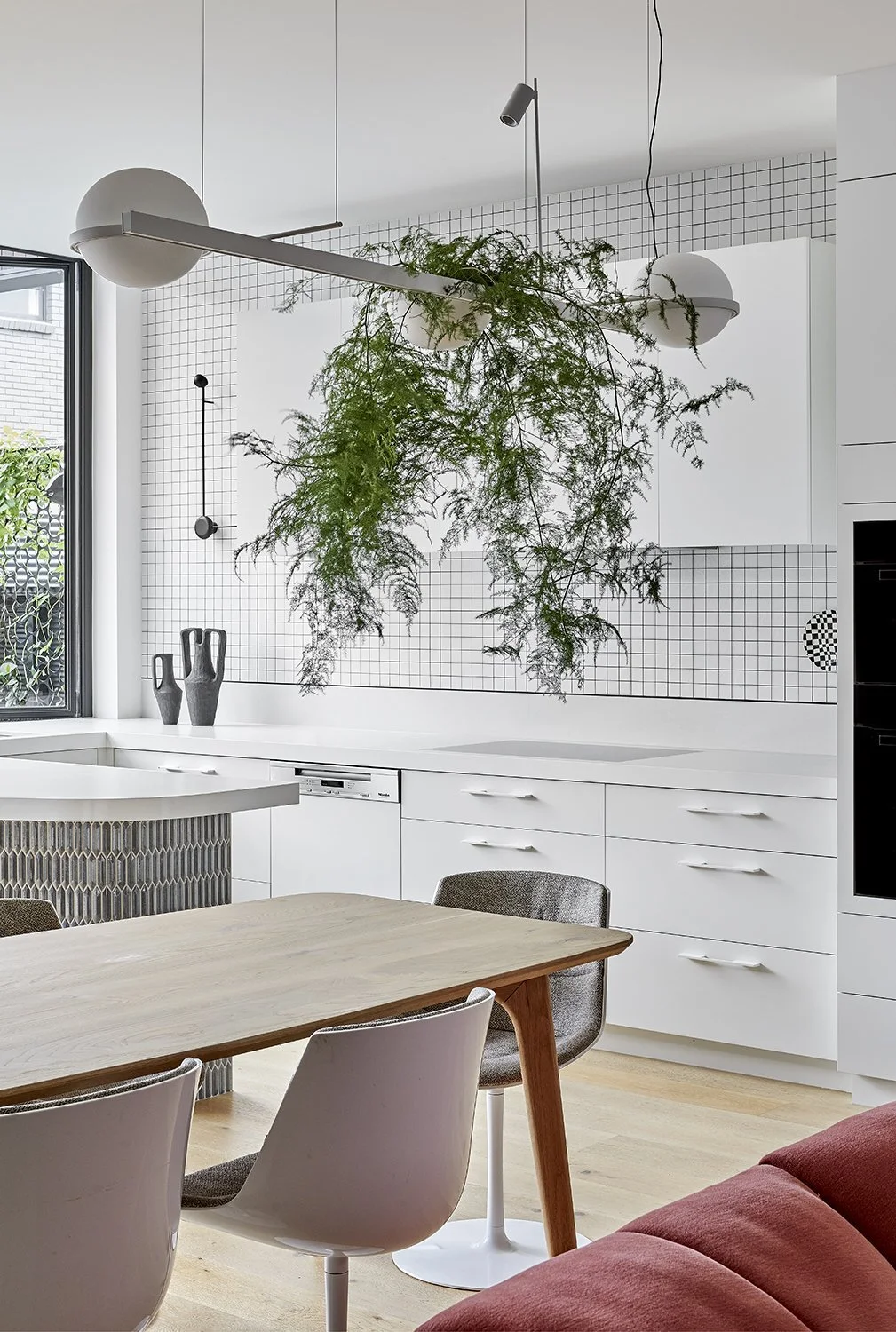
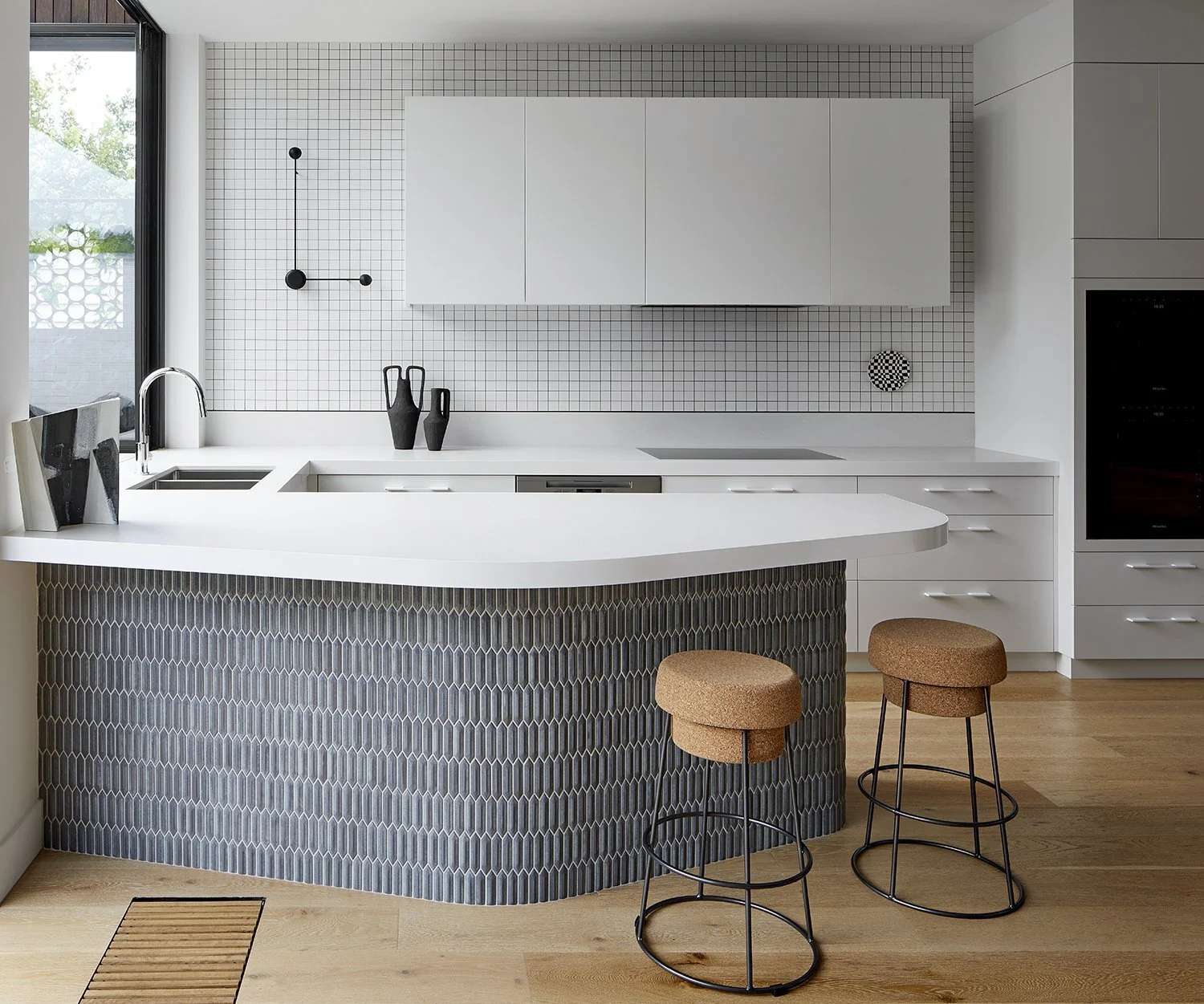
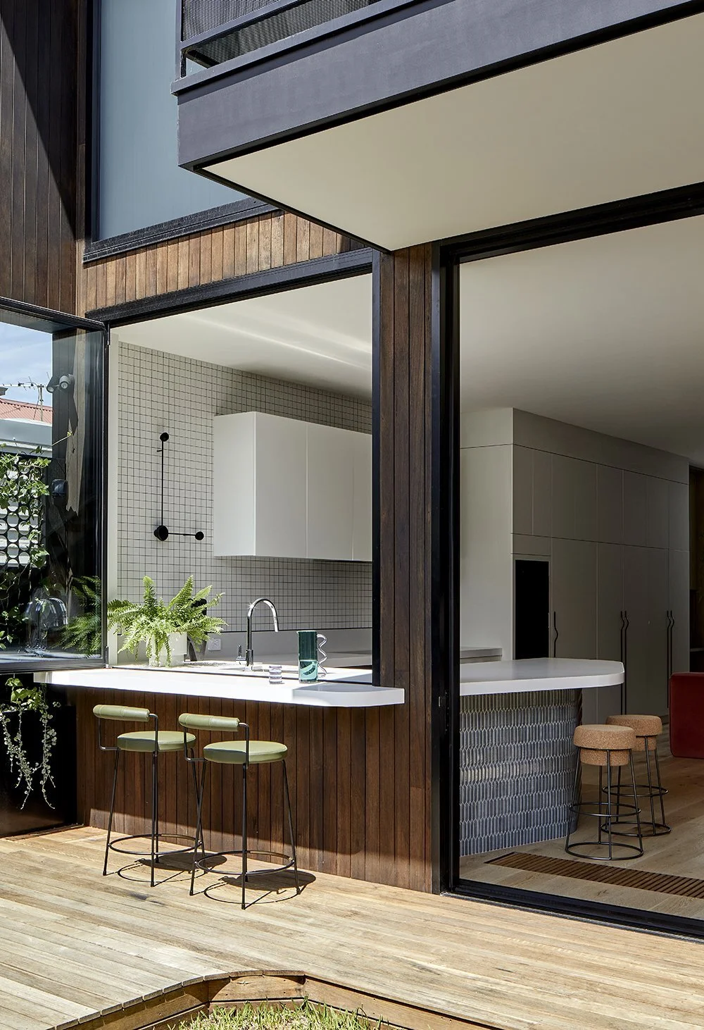
The U-shaped kitchen is tucked into the building and overlooks the backyard. Styling: Bea Lambos. Photo: Dave Kulesza
“One of the biggest challenges of the project was to maximise space and natural light with the constraints of a very small lot size.”
‘A feature of the project is the curved, organic kitchen island bench, which carved out an intimate pocket within an open planned space. The diamond-shaped handmade finger tiles add texture and character to the space,’ says Anthony Chan. Styling: Bea Lambos. Photo: Dave Kulesza
The U-shaped kitchen is tucked into the building and overlooks the backyard. Styling: Bea Lambos. Photo: Dave Kulesza
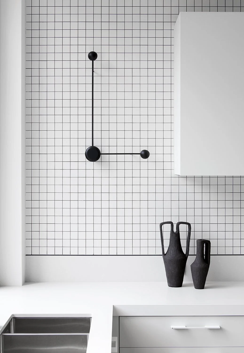
Kitchen details. Styling: Bea Lambos. Photo: Dave Kulesza
The space beneath the stairs houses a custom wall-mounted unit with perforated metal doors. Photo: Dave Kulesza
A sky light filters light below the levels and punctuates the connection between the ground and first floors. Styling: Bea Lambos. Photo: Dave Kulesza
The sculptural stair explores the concept of translucency through powder coated steelwork and open timber treads. Styling: Bea Lambos. Photo: Dave Kulesza
Doherty Design Studio focused on creating translucency and lightness through simple forms and uncluttered spaces. Styling: Bea Lambos. Photo: Dave Kulesza
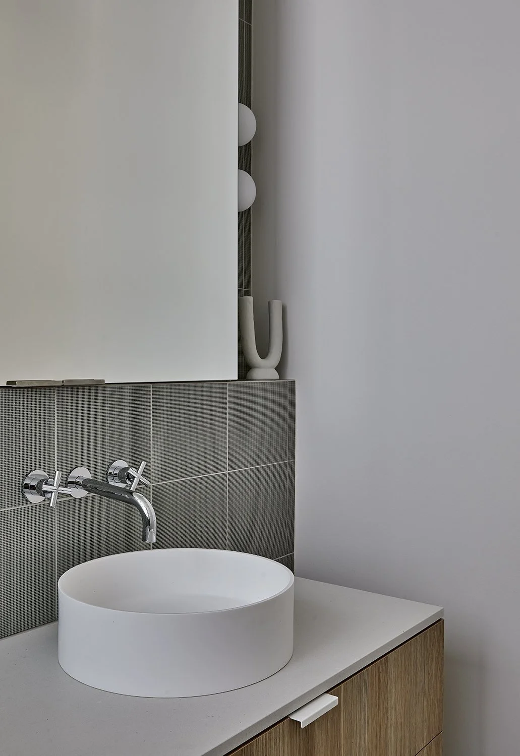
Simplicity in design extends to the bathroom details. Styling: Bea Lambos. Photo: Dave Kulesza


