Pompei by Carter Williamson Architects
A former B&B located in Sydney’s inner-west is transformed into a modern dream home featuring and organic colour and material palette.
Words: Emma-Kate Wilson | Photography: Kat Lu
Pompei, designed by Sydney-based Carter Williamson Architects, is a resistance to a ‘knock down and rebuild’ approach—instead, the firm consider both the sustainability impact and magic of transforming older homes for modern living.
As a former B&B in Sydney’s inner-west, a quirk of the home meant it had a series of lockable rear rooms that created ‘tight rabbit-warren’ like spaces. The architects were tasked with turning this idiosyncratic Victorian terrace into a home that welcomed open-plan family living.
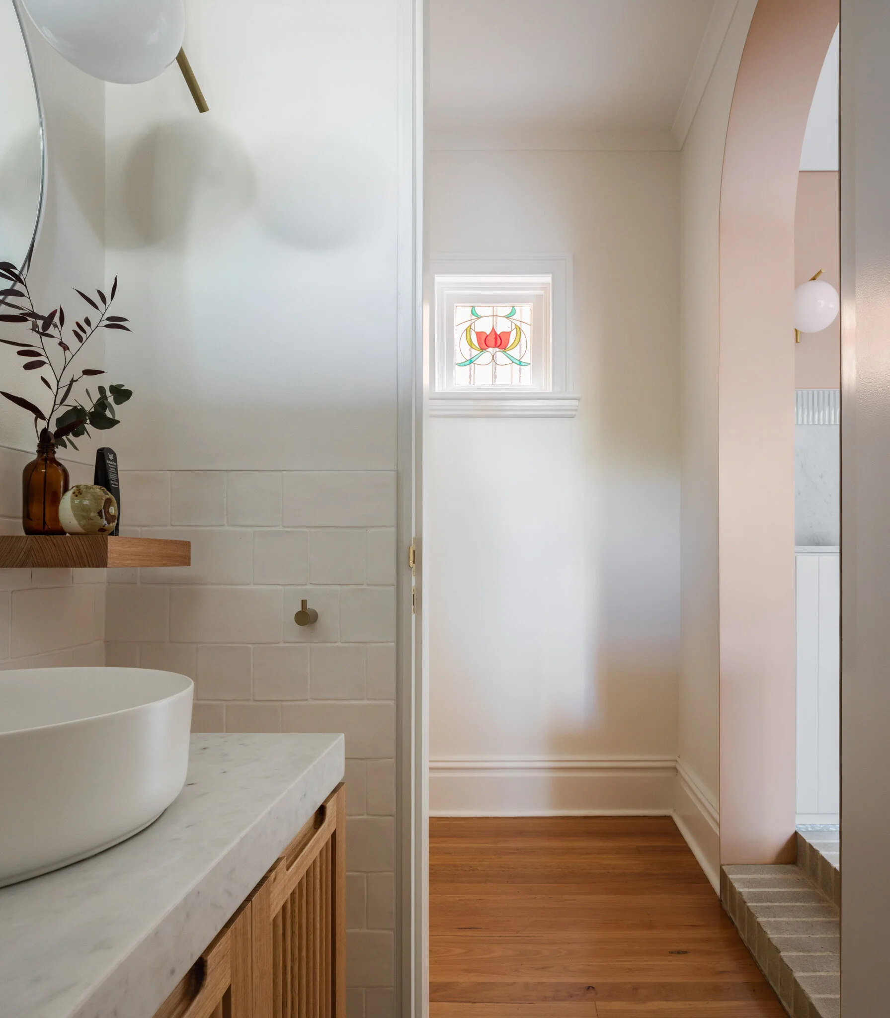
Carter Williamson Architects employed natural materiality to ensure easy flow between the large yard and interior rooms. Ofteninspired by the terrace’s Victorian-origins with curves and detail for the new design, original features remain, like stained-glass windows and high ceilings.
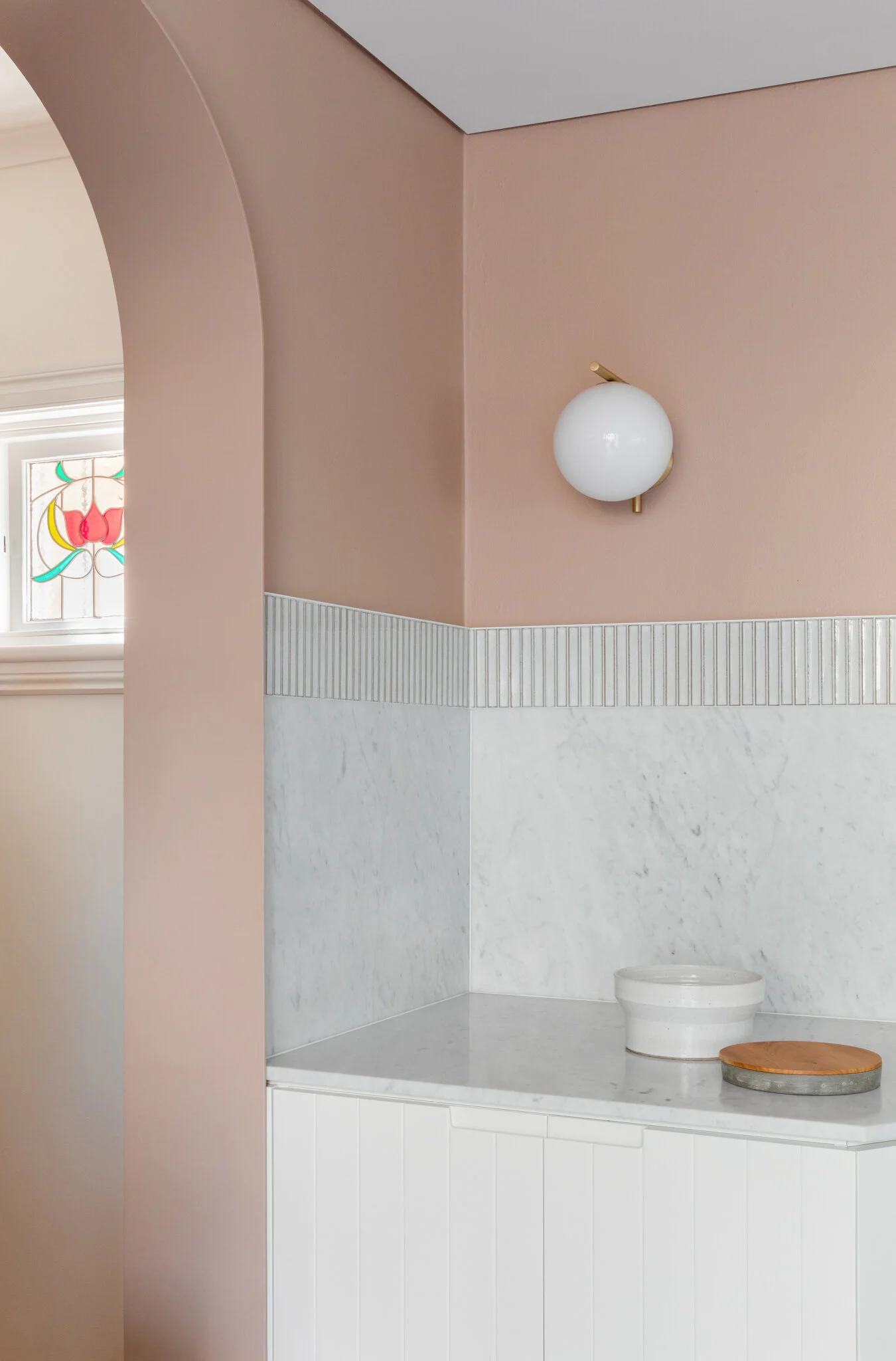
The clients brief, alongside the continuation of easy-liveable spaces, was a warm, yet light, colour palette. “Pompei’s colour is complimented by healthy swathes of Dulux’s Kangaroo Pouch, a pastel ochre pink that not only compliments the clients want for a warm, inviting colour palette, but retains the homes natural, organic feel,” Carter Williamson Architects director, Shaun Carter explains.
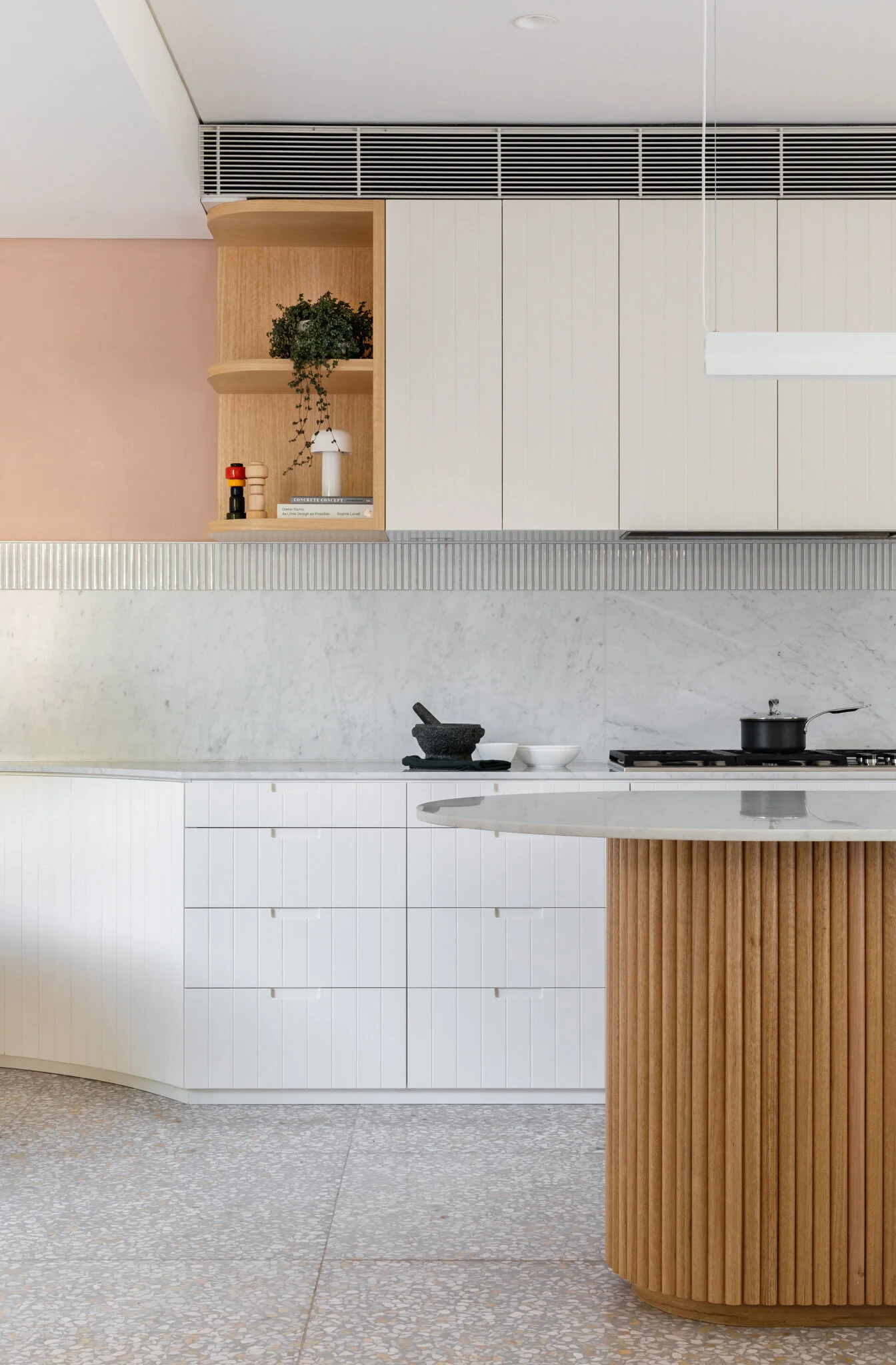
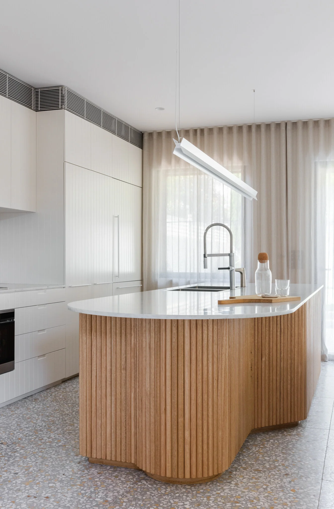
Organic shapes continue in the open plan kitchen’s scalloped bench, while also offering practicality and usability. The architects also brought in ample storage for the modern family, tucked away behind white-grey timber cabinetry that curves around the dining area.
“Pompei’s living space is reinvigorated through a cleaner logical circulation of rooms, making the home whole again,” says Carter Williamson Architects. Photo - Katherine Lu.
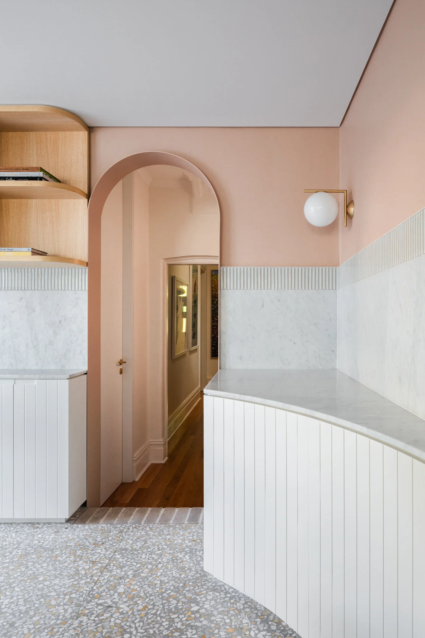
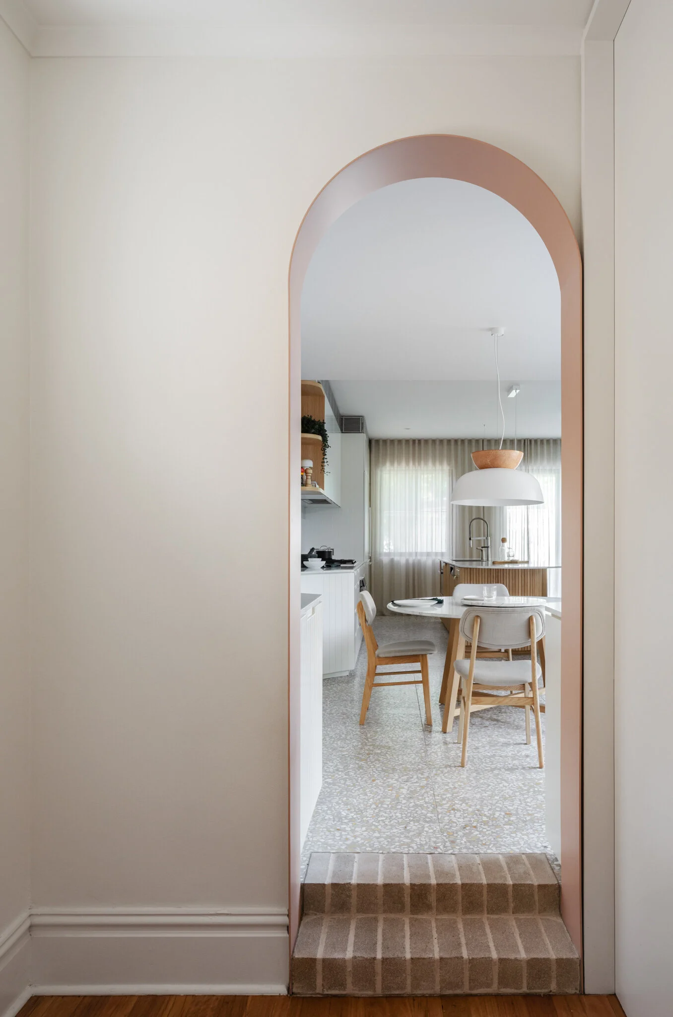
A painted steel archway marks the threshold between the old and new areas of the house. Photo - Katherine Lu.
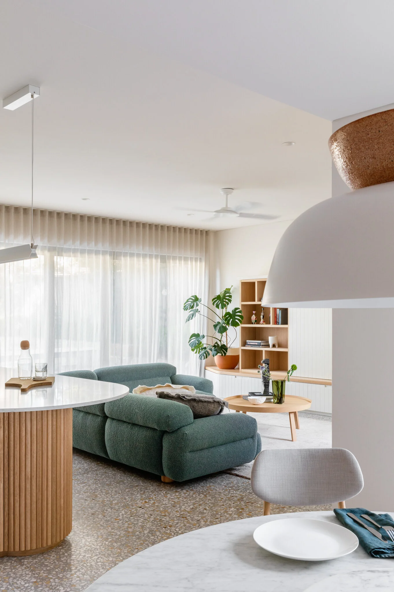
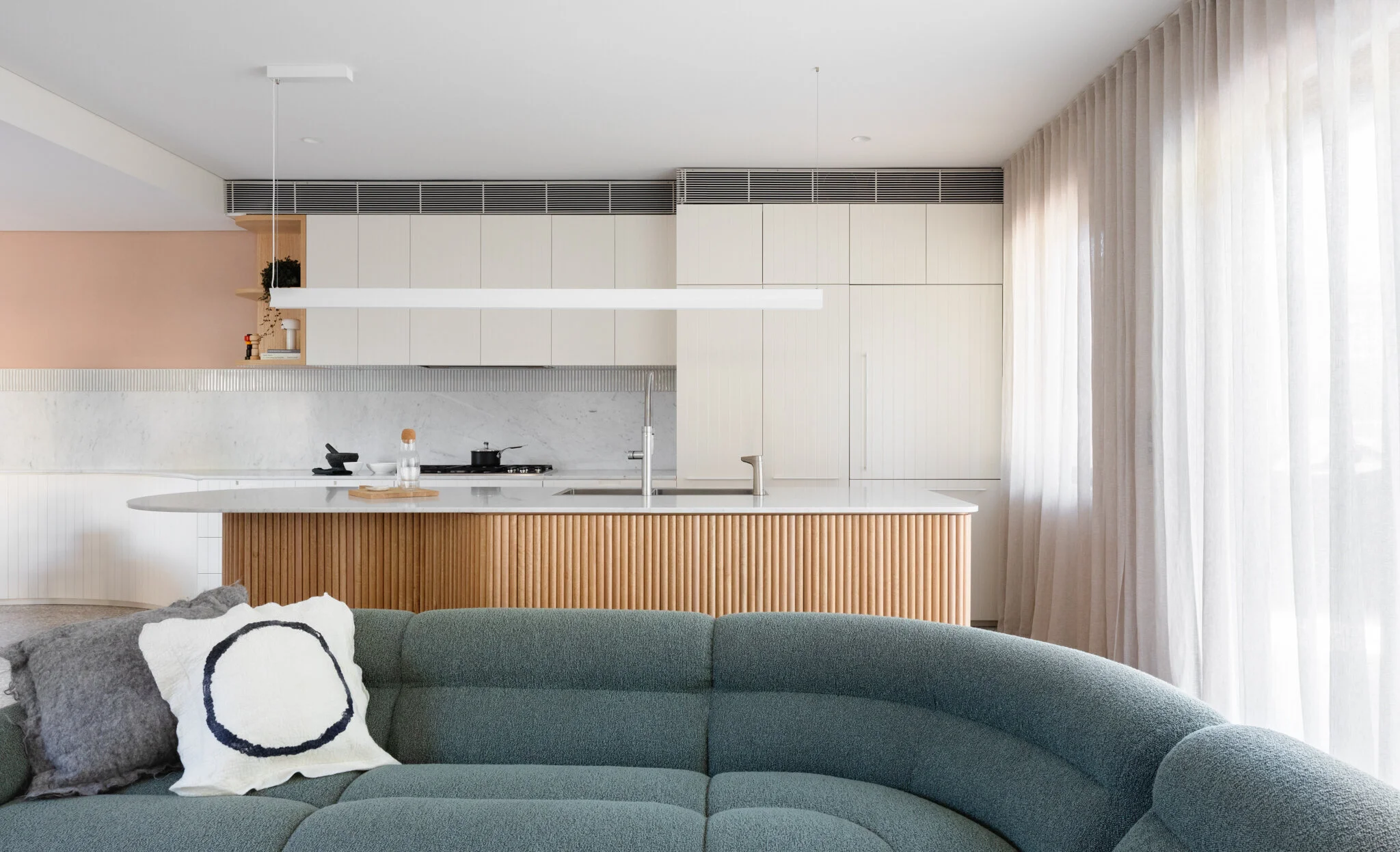
The new open-plan living area features curved elements including the island bench, and the half-round dowel joinery. Photo - Katherine Lu.
“The removal of a selection of walls opens the house to enable spacious living where rooms flow; gone are the tight rabbit warren-like spaces.”
A must for the owners was for the design to incorporate a large amount of storage space into the renovation.Photo - Katherine Lu.
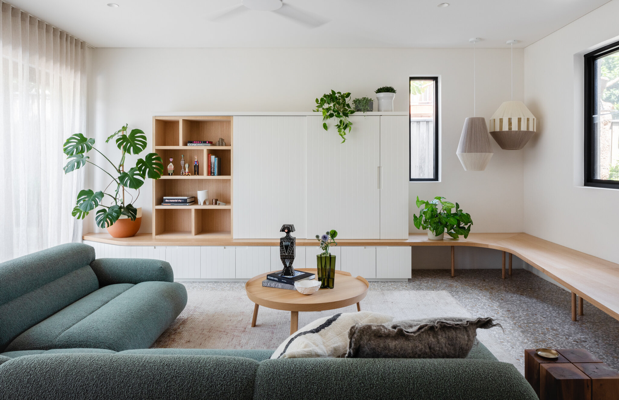
Terrazzo flooring anchors the palette, with features in timber, marble, brass and linen curtains accentuating the design. Photo - Katherine Lu.
A painted steel archway marks the threshold between the old and new areas of the house. Photo - Katherine Lu.
“The open-plan kitchen and living area is composed through the kitchens scalloped bench, which is used from each space, shaped to allow free passage through the home,” says Carter Williamson Architects. Photo - Katherine Lu.
The pale pink colour dining walls are painted in Dulux’s Kangaroo Punch. Photo - Katherine Lu.
The bathroom in the existing front area of the home. Photo - Katherine Lu.
Modern furniture sits alongside custom built-ins, both continuing the organic feel in soft curves. The green Valley sofa by Jardan sits in the living room while spherical Flos wall lights designed by Michael Anastassiades offers ambient lighting.
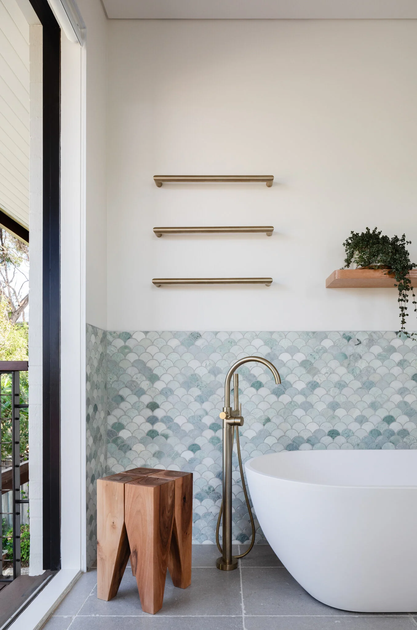
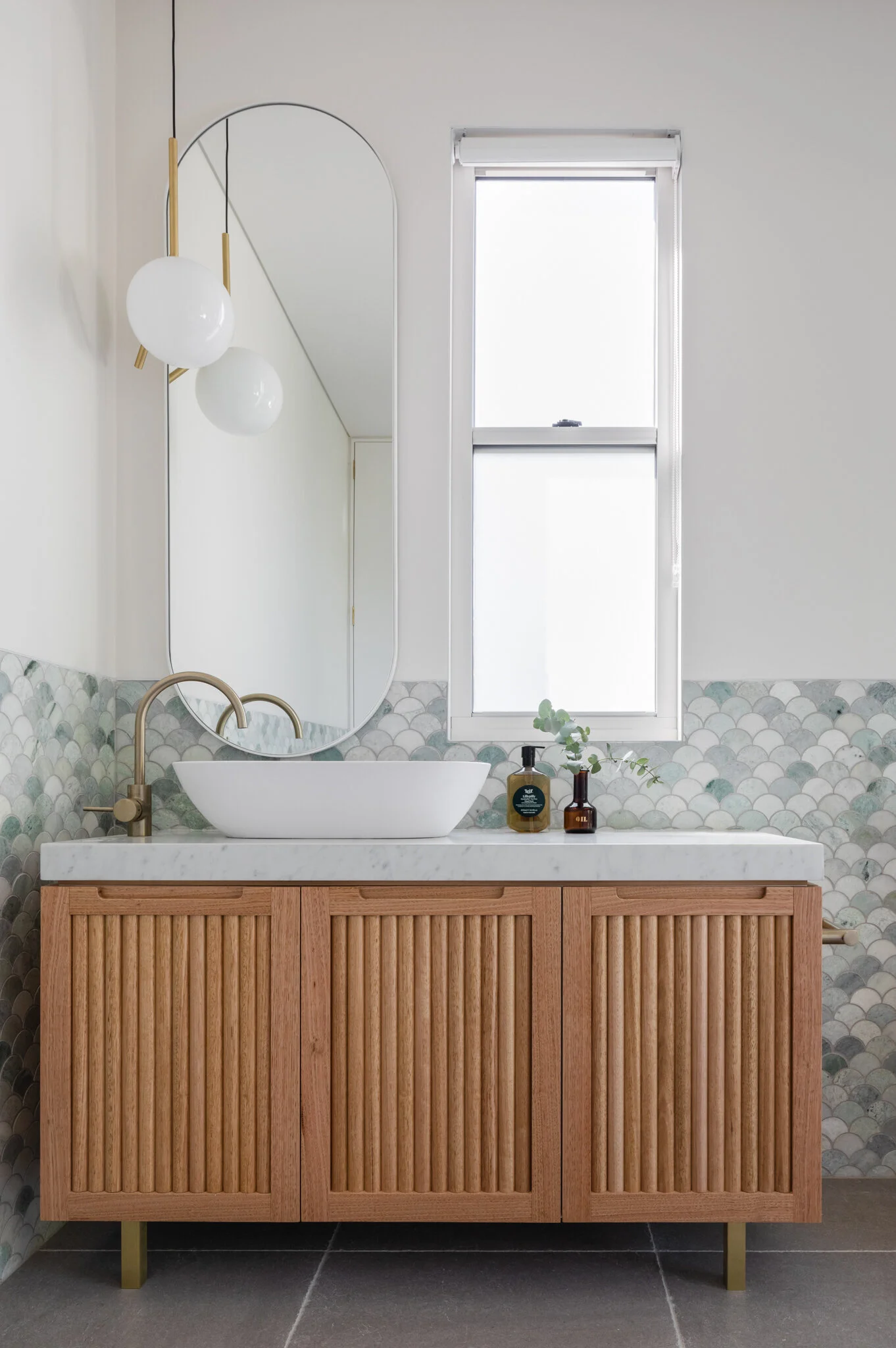
Feeding from the pink, 50’s style, walls, Terrazzo flooring anchors the palette and defines the new section of the terrace. The balance of textures continues with features accentuated in raw materials: timber cabinetry, marble countertops, brass taps, and linen curtains. In the bathrooms, the architects turned to Ming green marble fan tiles evoking the grand Victorian’s terrace’s former days.
The existing large garden —a major drawcard for the clients— needed significant alterations, removing the curved terrace garden beds and instead, transforming it into a multi-use zone for the whole family. “We freed up this space by splitting the garden into three distinct parts, a patio for outdoor dining, and equal parts lawn and pool, the client’s ideal backyard for their needs,” Shaun adds.
Pompei’s result is a home that welcomes intimate spaces for each of the family members, but also quality time together. The harmonious colour and material palette invites comfortable living and reveals the magic in renovation.
The light and bright upstairs bathroom with its feature mosaic tiling. Photo - Katherine Lu.
The upstairs room was updated for light and functionality. Photo - Katherine Lu.


