The Tropical Spanish by BYRDDESIGN
The Tropical Spanish by Byrd Design is a retro bungalow situated in Venice Beach in California – embracing its surfer surroundings, the restored home imbues a chill and coastal vibe.
Words: Georgie Ward I Photography: Heidi’s Bridge
Photo: Heidi’s Bridge
Photo: Heidi’s Bridge
Tropical modernism takes centre stage in this petite Spanish bungalow, located in Venice Beach California.
The owner of the home, a surf enthusiast himself, saw the potential of restoring this 1920s Spanish bungalow back to its roots, after much of its character was lost in a remodel a couple decades prior.
The home is a sun-lit series of cosy spaces that invites a deep exhale. The light and breezy atmosphere of the home creates a soothing, relaxing, by-the-beach feel. With a perfected balance of bright with light, the plain white walls gives a minimalist backdrop for the colour accents of the home to stand out and add character to every space.
With the help of Los Angeles-based interior design studio, BYRDDESIGN, the restoration began with the re-configuration of the floor plan to improve the circulation of the home, adding storage spaces in the form of a master walk-in closet and charming, of-the-era built-ins.
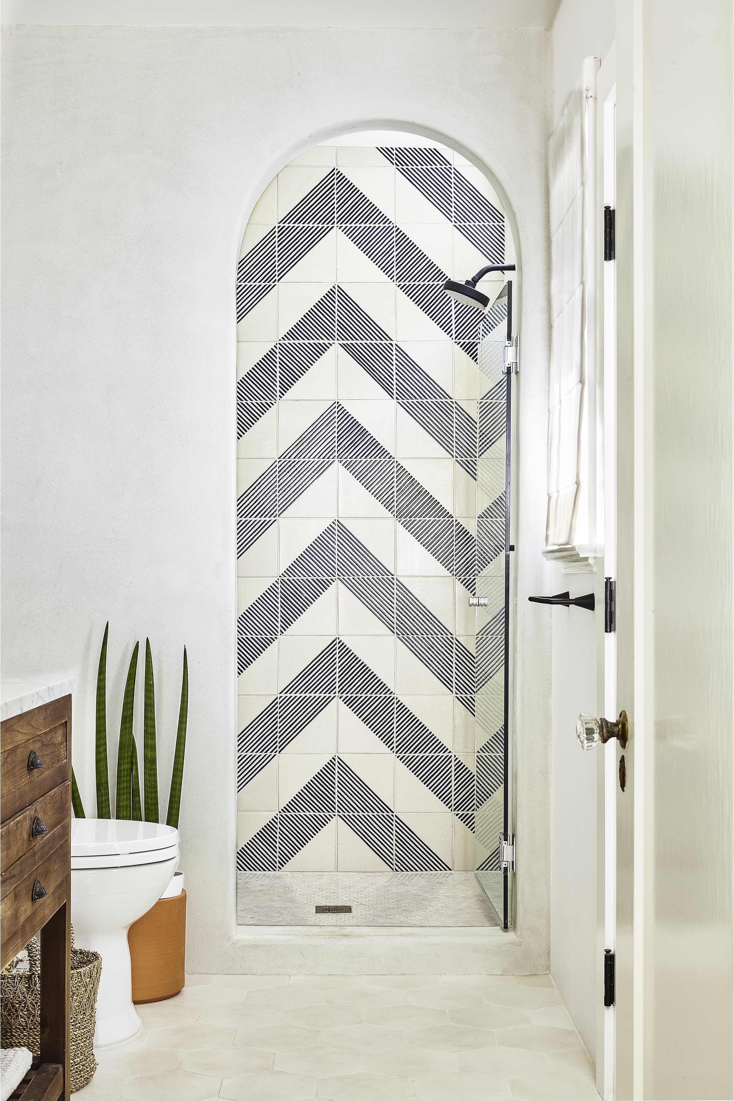
Historic details such as the Spanish arches, exposed wood ceiling beams, niched bookcases, arched fireplace, stucco walls and a variety of colourful tiles were reintroduced to the home.
A galley kitchen and separate dining room was re-imagined to create a large, less compartmentalised space with a new wide folding glass wall connecting to the outdoors. The new layout made way for a bespoke light-filled dining nook, a spacious island, a charming built-in pantry and all new kitchen cabinetry.
The interior materials and furnishings are kept simple and organic to reflect both a practical mid-century modern approach and a relaxed well-travelled tropical vibe.
With a nod to the past while fully embracing its new coastal vibe, the home is truly a surfer’s paradise.
“I tend to like quirky spaces and feel that historical homes have a lot of those moments, which newer homes seem to lack.”
The renovation was so carefully considered and designed, that everything looks as though it has always belonged. From the arched plastered shower, and bookcase nooks, to the breakfast bar hideaway, the house feels like an authentic blast from the past.
BYRDESIGN sought after a base colour, to sprinkle throughout the home, that was masculine yet warm and happy. They chose a muddy dark blue colour that grounds each space, creating a calm, coolness within the home.
‘The blue worked really well, especially with the colourful tiled floor in the dining nook and worked nicely against all the white furnishings around the house,’ says BYRDESIGN director, Beatriz Rose.
‘I typically design with great consideration of the history of the home and its architectural context, even if it's been once or twice removed. I think homes with elements of nostalgia, uncommon yet classic details and textures, and patina are quite charming and welcoming,’ she adds.
With an emphasis on history, BYRDESIGN created a blend of old and new materials, finishes and textures to create a forgiving and welcoming base to the home, whilst simultaneously adding personality and warmth.


