Blonde House by Studio Tom
A mid-century gem is carefully altered and curated for a family of five by Studio Tom – retaining its existing character, while also transforming a floorplan of the late 50s to early 60s into a functional home.
Words: Hande Renshaw I Photography: Eve Wilson
The welcoming and homely interior of Blonde House. Photo: Eve Wilson. Editorial Styling: Natalie James
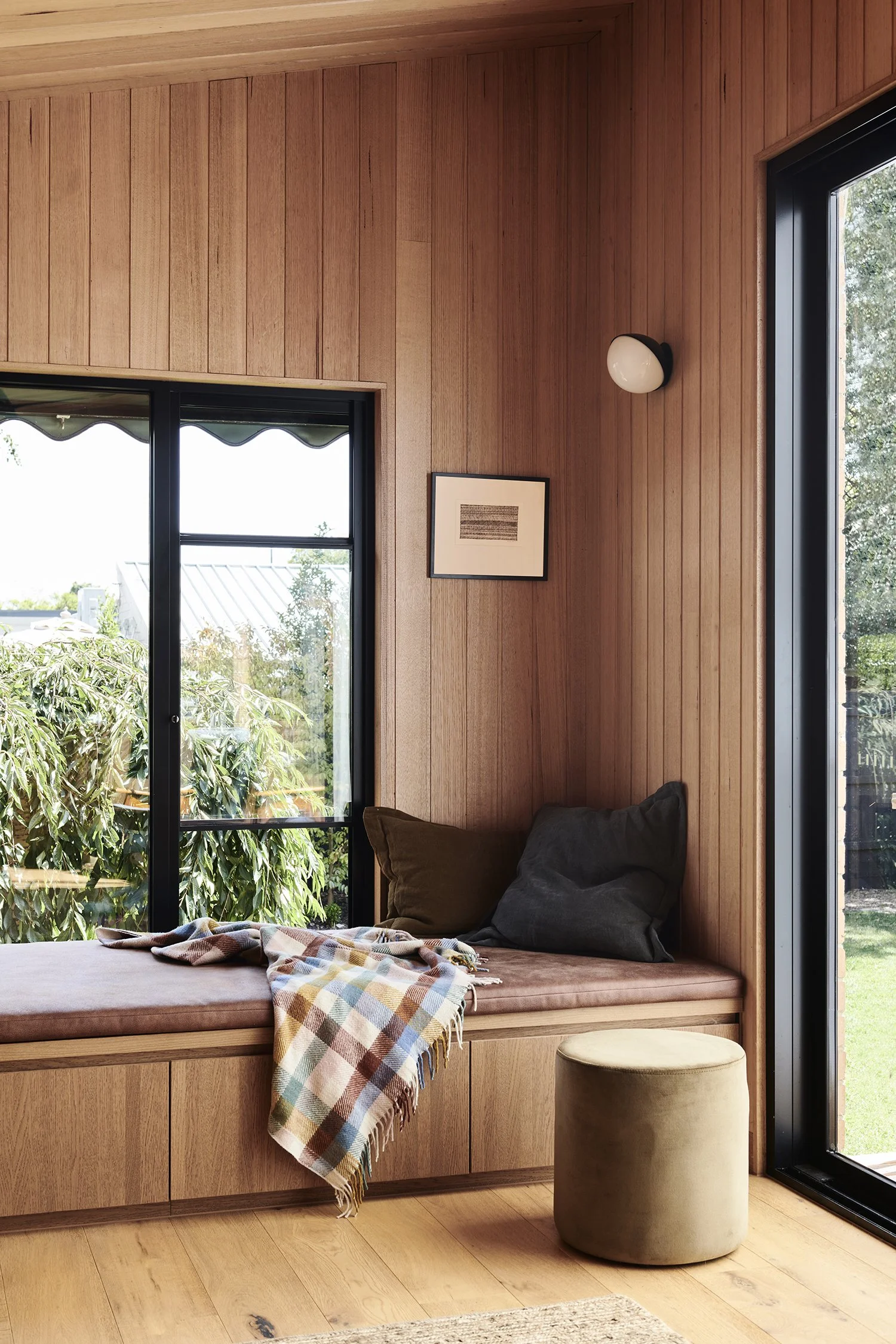
The walls and ceiling of the sunroom are lined with Silvertop Ash shiplap timber. Photo: Eve Wilson. Editorial Styling: Natalie James
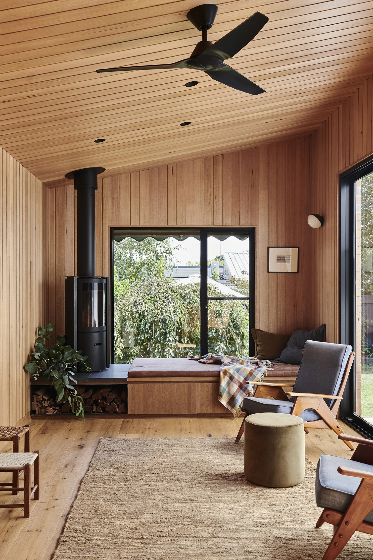
‘The Stuv fireplace that sits on the daybed was a late addition. It gave an extra level of comfort to the space, creating an appealing place to snuggle and read a book,’ says Robbie Pierce. Photo: Eve Wilson. Editorial Styling: Natalie James
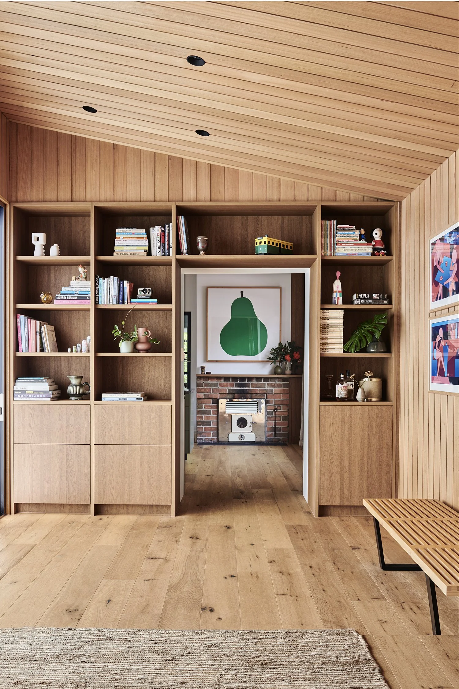
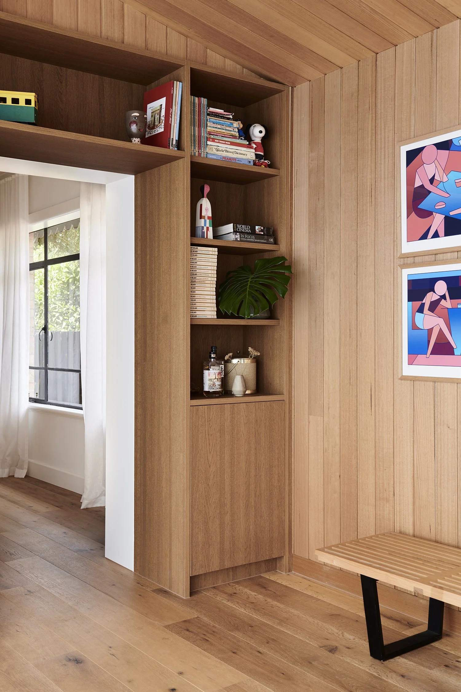
The Silvertop Ash shiplap timber applied to the walls is also used in the joinery. Photo: Eve Wilson. Editorial Styling: Natalie James
Blonde House by Studio Tom in Melbourne's southeast sees the transformation of a floorplan from the late '50s-'60s into a practical residence for a family of five. The brief called to enhance the mid-century elements and preserve the home’s original charm.
‘Although the home is now not much bigger than the original footprint, the modified spaces and considered design approach mean the family now have more room and flexibility,’ Studio Tom director Robbie Pierce says.
By implementing mindful interior modifications and incorporating a diverse range of mid-tone timber textures, Studio Tom has achieved a timeless renovation without making any changes to the fundamental structure of the house.
‘The main bones of the house were left alone and mindful internal modification provided extra spaces the family required,’ says Robbie.
Being a traditional blonde brick house from the late '50s to early '60s, both the interior and exterior had become outdated. The primary objective was to optimise the original floorplan while dealing with a limited budget and strict planning restrictions. To adhere to these limitations, Studio Tom made the decision to preserve the fundamental structure of the house and instead focus on carefully updating the internal layout.
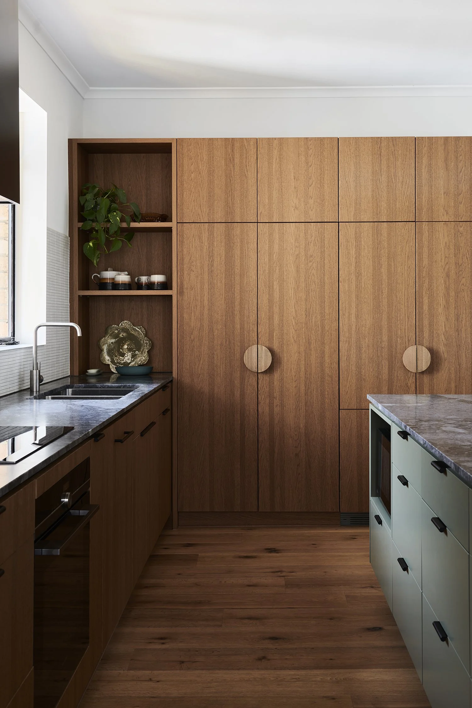
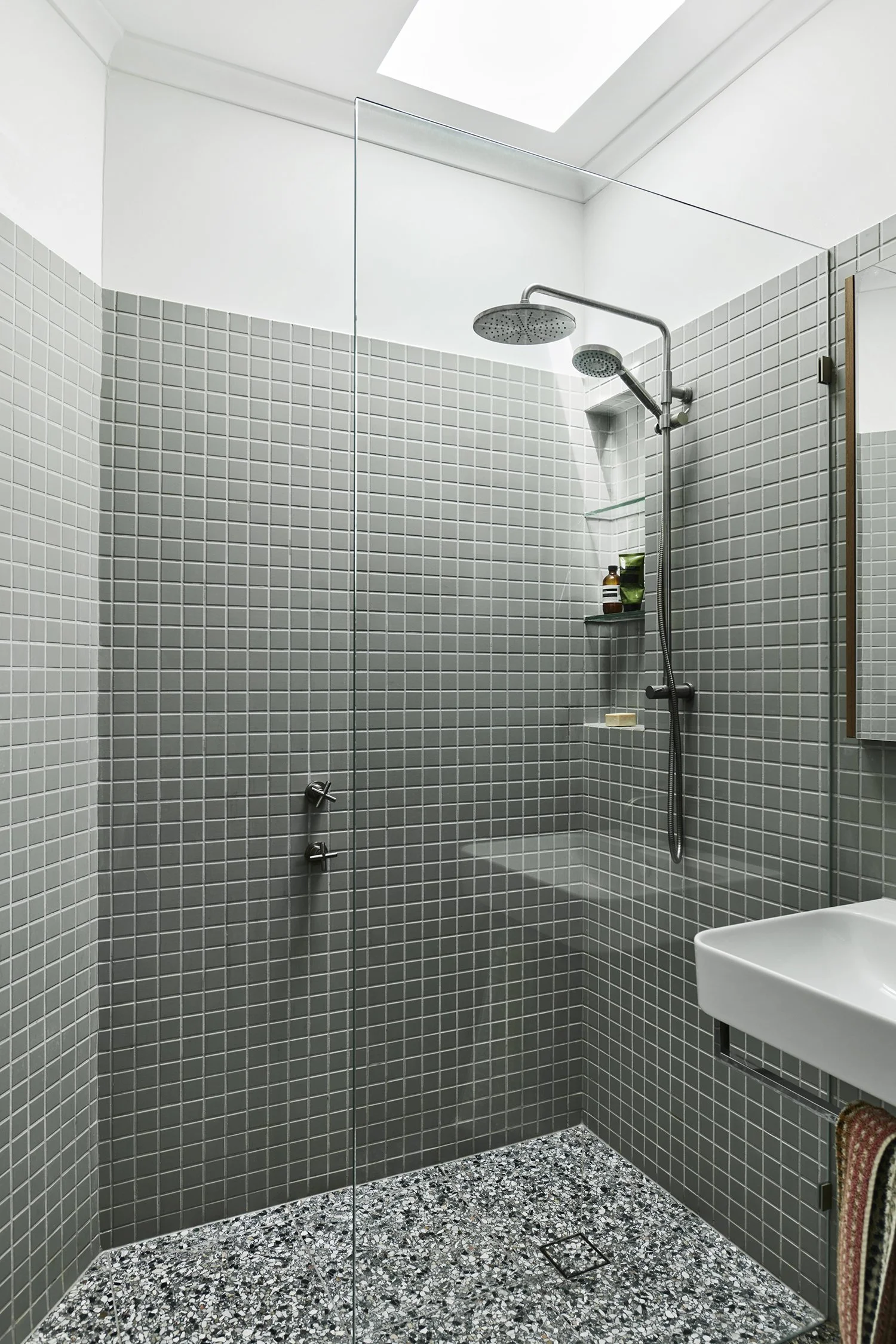
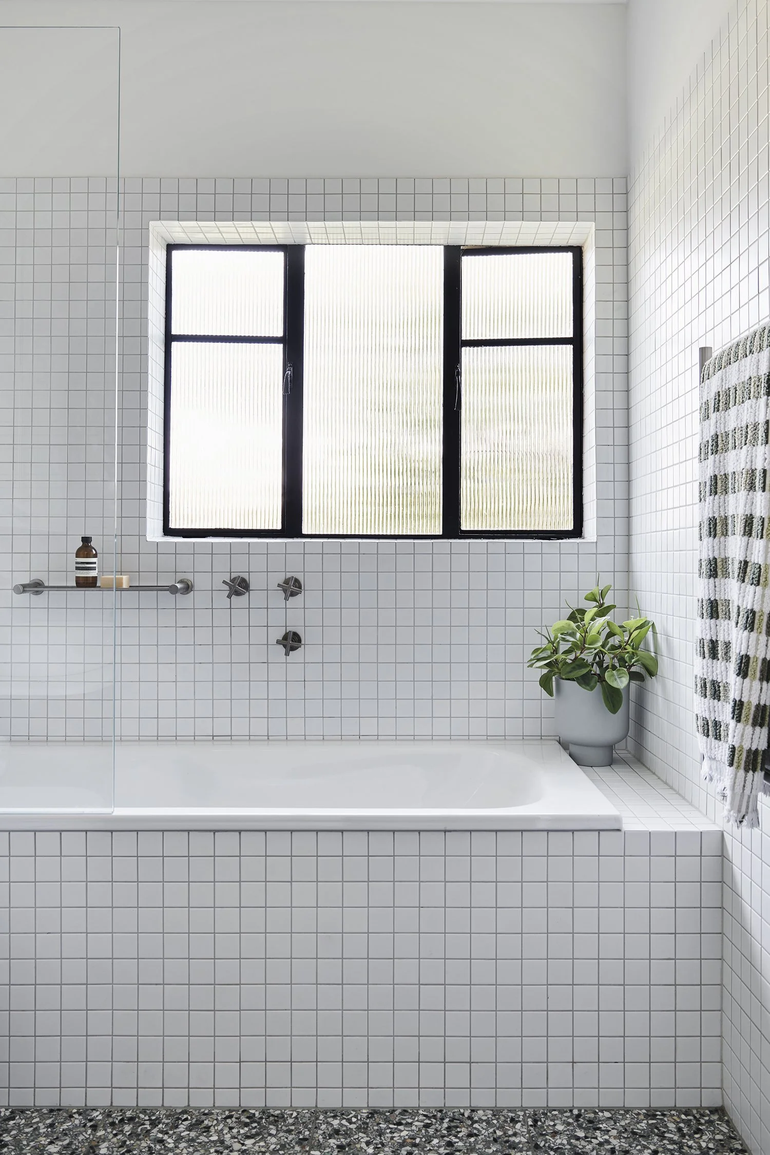
‘An existing laundry was modified to become the second bathroom – a must for the couple who had been sharing a bathroom with the kids for years,’ Robbie explains. ‘The kitchen’s new design was thoughtfully planned within the existing dated kitchen location. Pinching a touch of space from an adjacent room offered the kitchen much better flow and storage.’
One of the highlights of the transformed home is the rear sunroom, which features Silvertop Ash shiplap timber lining on the walls and ceiling. The addition of a raised, sloping ceiling and glass doors leading to the backyard allows natural light to fill the space, creating a larger sense of space. The built-in day bed, accompanied by a new fireplace, now provides an ideal spot for cozying up with a book or enjoying the view of the garden.
‘The Stuv fireplace that sits on the daybed was a late addition. It gave an extra level of comfort to the space, creating an appealing place to snuggle and read a book,’ shares Robbie.
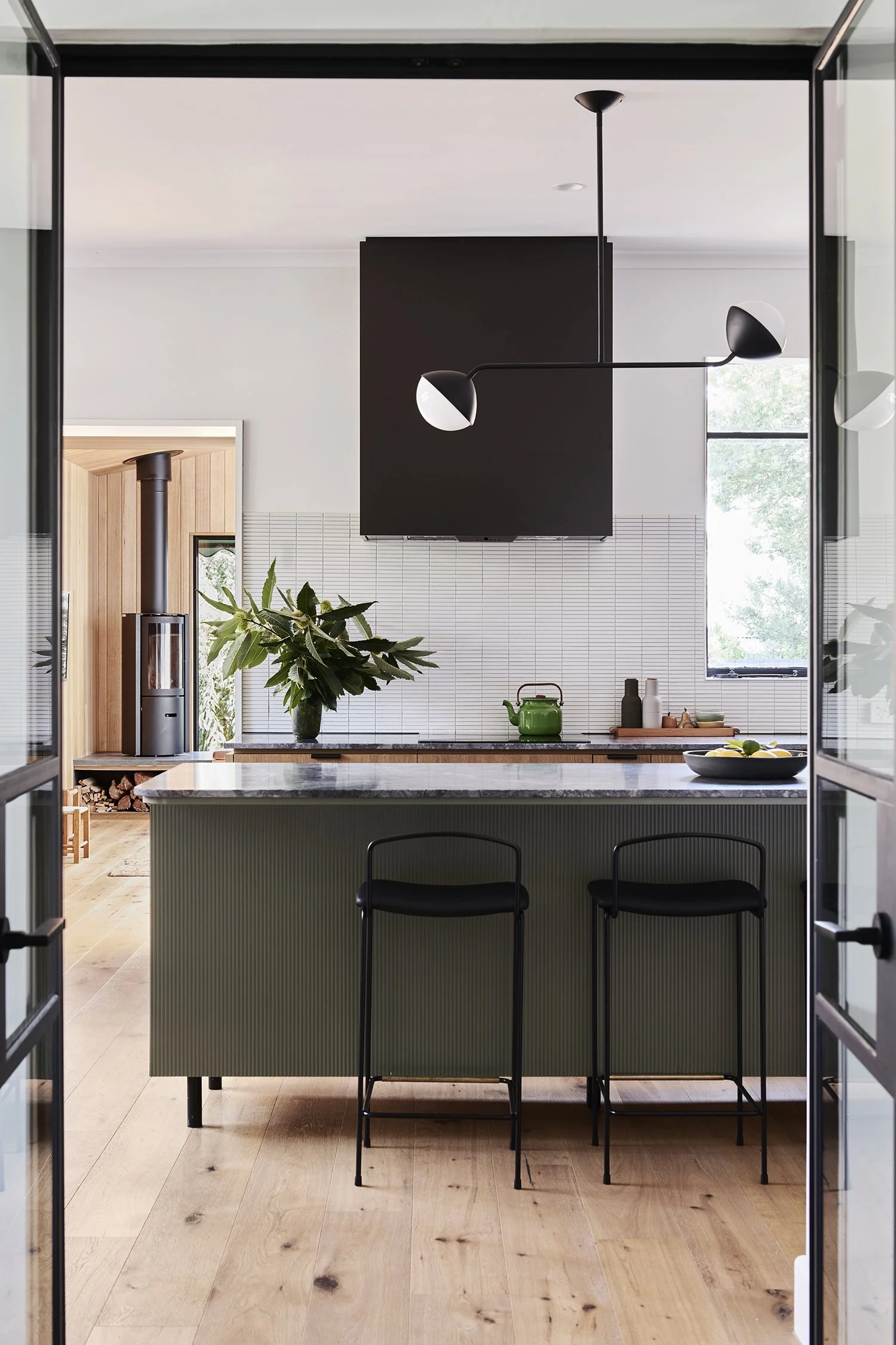
In order to create a textural and retro-inspired interior, the use of rich mid-tone timbers played a significant role. Timber was combined with sage greens and black metal accents, subtly paying homage to the existing steel windows in the property.
‘We really enjoyed the process with enthusiastic clients – they saw the value in crafting spaces from what they already had, opposed too just adding another large extension.’
Sage green tones and black metal accents in the new kitchen. Photo: Eve Wilson. Editorial Styling: Natalie James
Timber joinery in the kitchen creates additional storage. Photo: Eve Wilson. Editorial Styling: Natalie James
“The vision was to complement the midcentury vibes of the residence. It was important to retain existing character and provide a timeless design that belonged. ”
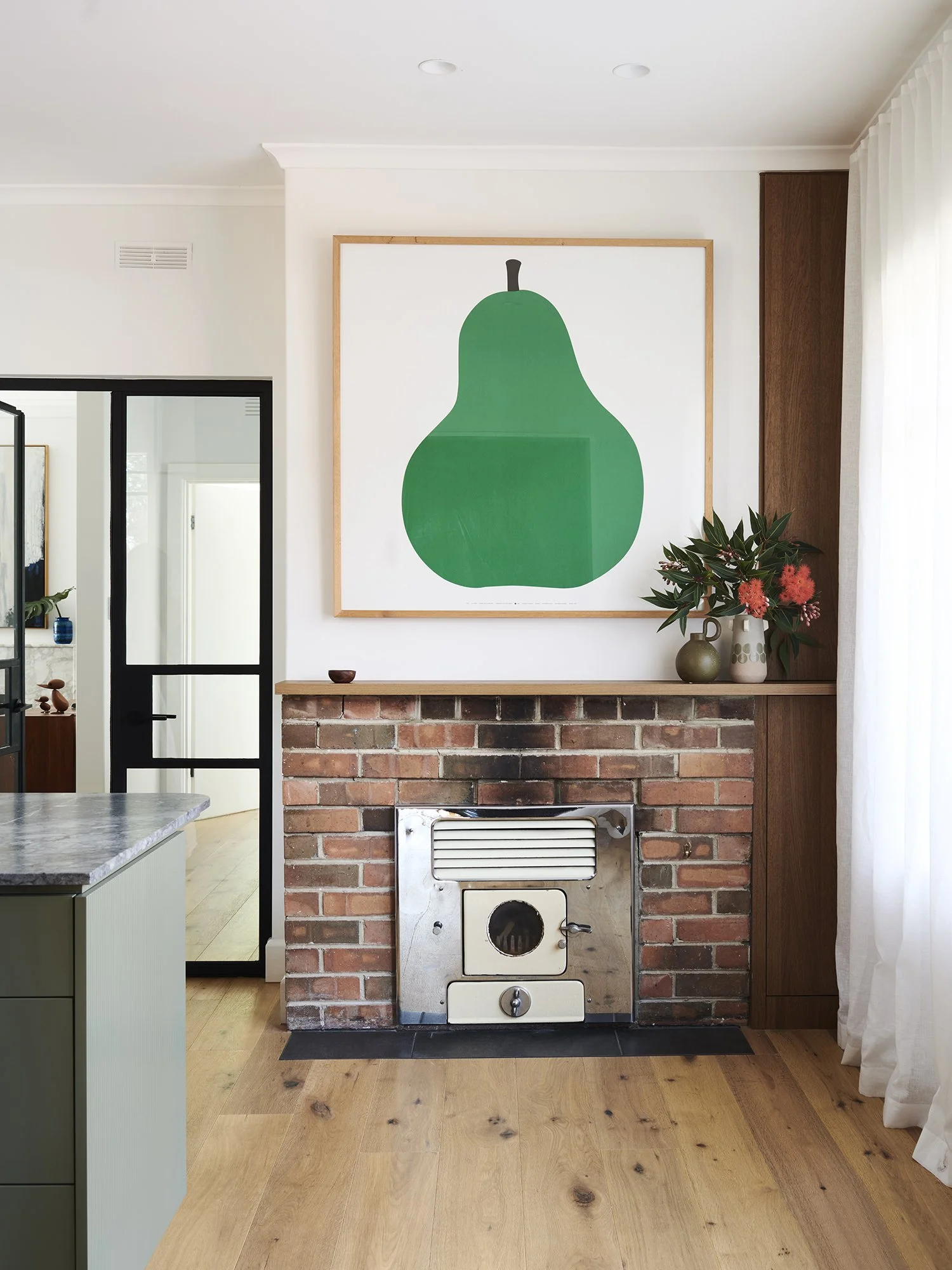
Midcentury elements shine in Blonde House by Studio Tom. Photo: Eve Wilson. Editorial Styling: Natalie James
‘Black metal accents were also selected through the light fittings, hardware and the range hood enclosure, as a nod to the wonderful existing steel windows,’ says Robbie Pierce. Photo: Eve Wilson. Editorial Styling: Natalie James
‘Although the home is now not much bigger than the original footprint, the modified spaces and considered design approach mean the family now have more room and flexibility.’ Photo: Eve Wilson. Editorial Styling: Natalie James
The Silvertop Ash shiplap timber applied to the walls is also used in the joinery. Photo: Eve Wilson. Editorial Styling: Natalie James
The ensuite features muted green sage tiles with Polarity terrazzo flooring. Photo: Eve Wilson. Editorial Styling: Natalie James
Photo: Eve Wilson. Editorial Styling: Natalie James
‘The budget was limited, and something we had to work within.’ Photo: Eve Wilson. Editorial Styling: Natalie James


