
Bower Apartment by Studio Gorman
Designed by Studio Gorman, Bower Apartment embraces 1920s heritage details by remaining sympathetic to the original character of the Art Deco building.
Words: Hande Renshaw | Photography: Prue Ruscoe

The interior palette is restrained and limited to timber finishes to maintain warmth in the space. Photo: Prue Ruscoe
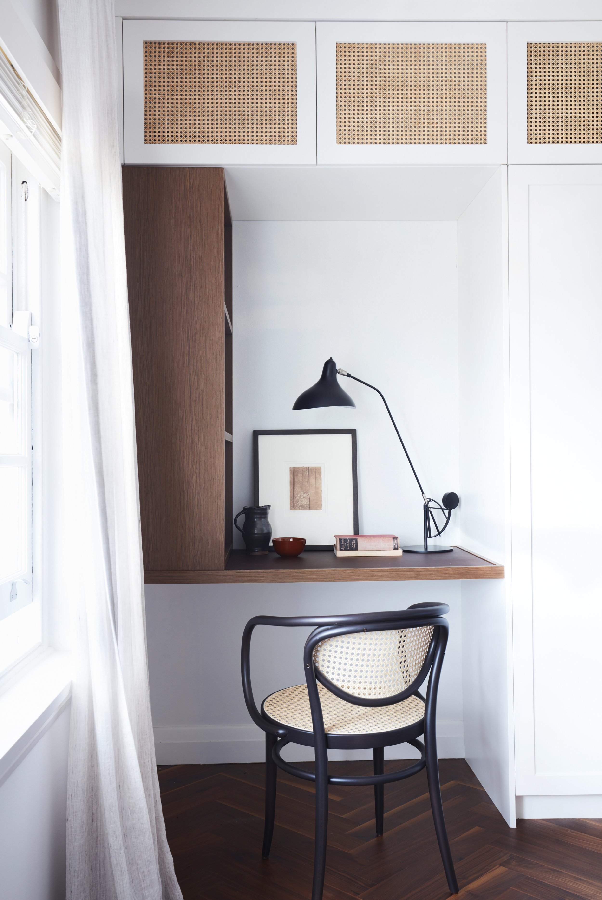
Photo: Prue Ruscoe

‘We were conscious of creating spaces that didn’t feel confined or awkward - part of the way we achieved the effect of spatial flow was to repeat colour palette and materiality throughout the apartment,’ says Jayne Windsor. Photo: Prue Ruscoe
When Louise Clark and Peter Walmsley first purchased Bower Apartment, set in a 1920s block in Manly, it had been stripped of all its original character and charm.
The couple, who live in Canberra and travel to Sydney to work every few weeks, called on Studio Gorman to revitalise the interior and inject back all the original features.
‘The apartment it had been gutted during a 1990s unimaginative renovation, with all the original 1920s charming features removed,’ says Jayne Windsor from Studio Gorman, ‘we introduced architectural elements and materials sympathetic to the original 1920s era of the apartment building, thus creating a Sydney home that would be inviting and welcoming as soon as they turned the key.’
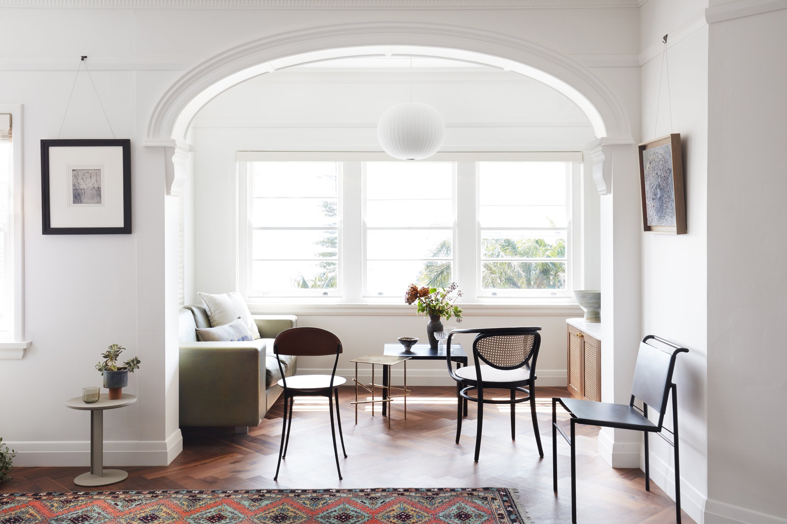
In order to move away from the minimal 1990s look the apartment had previously, Studio Gorman recommended adding a broad sweeping archway between the living area and sunroom.
‘The arch restored softness to the apartment indicative of the art deco era of the building and was also a clever solution to defining spaces within the living areas,’ says Jayne.
Inspired by Louise and Peter’s art collection, which is full of warm, rich autumnal tones, Studio Gorman applied similar tones throughout the spaces, while keeping the walls white, to enhance the natural light throughout. The addition of the rich American walnut parquetry floors are a contrast against the white walls, giving the flooring a layered feel.
‘The dining area is the only space that doesn’t have white walls - a grass cloth wallpaper in Twine from Porter’s Paints was used, it’s natural texture and herringbone weave complement and echoe the parquetry floor, creating balance in the design.’
Although the space has been completely cleverly refurbished, the brand-new apartment feels and looks as if it has always been this way.
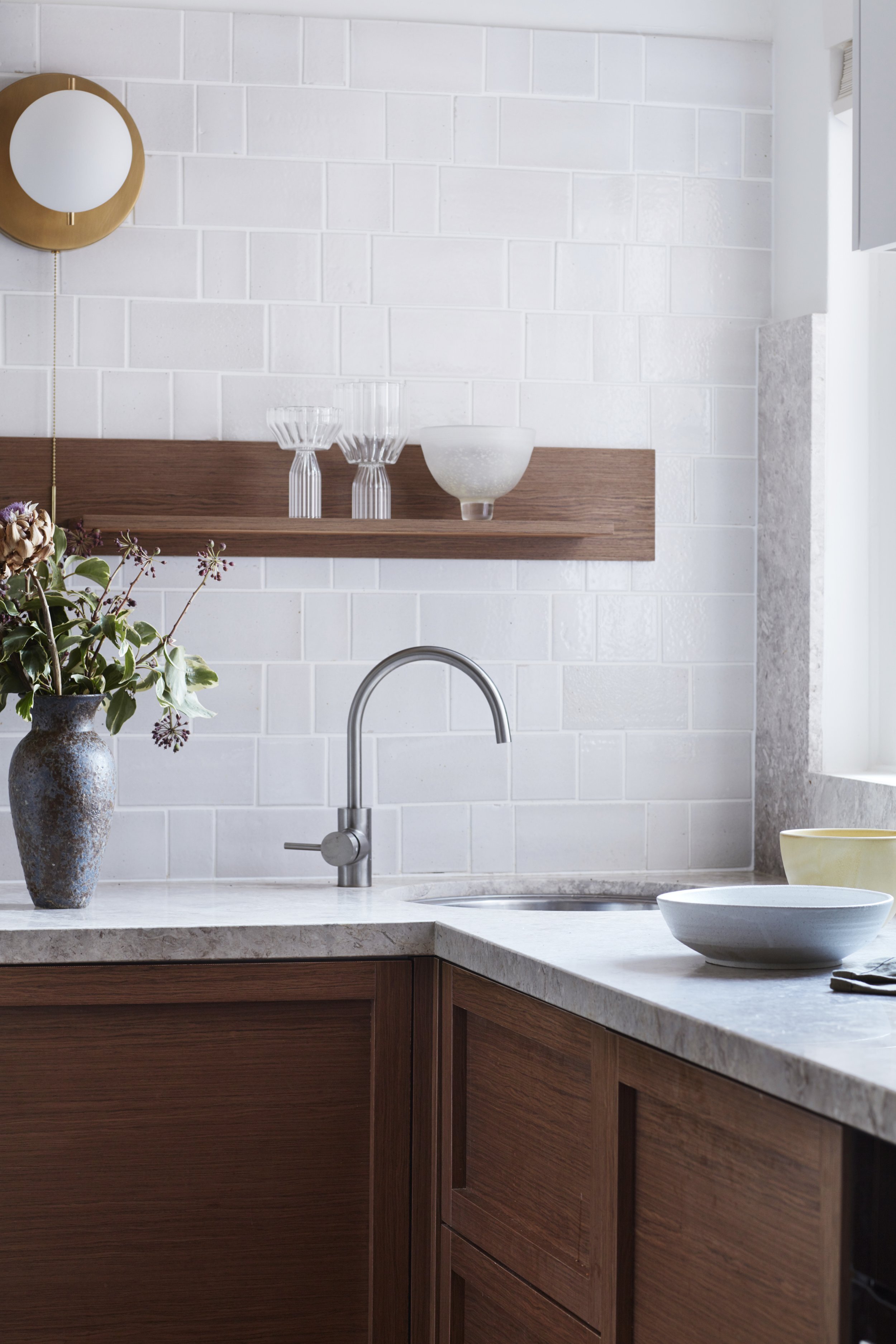
Rich and warm details in the kitchen space. Photo: Prue Ruscoe

The inviting kitchen is tonally aligned with the rest of the apartment. Photo: Prue Ruscoe
“We always endeavour to respect the architecture’s history while personalising the space our client – we believe it’s important to retain original features wherever possible.”
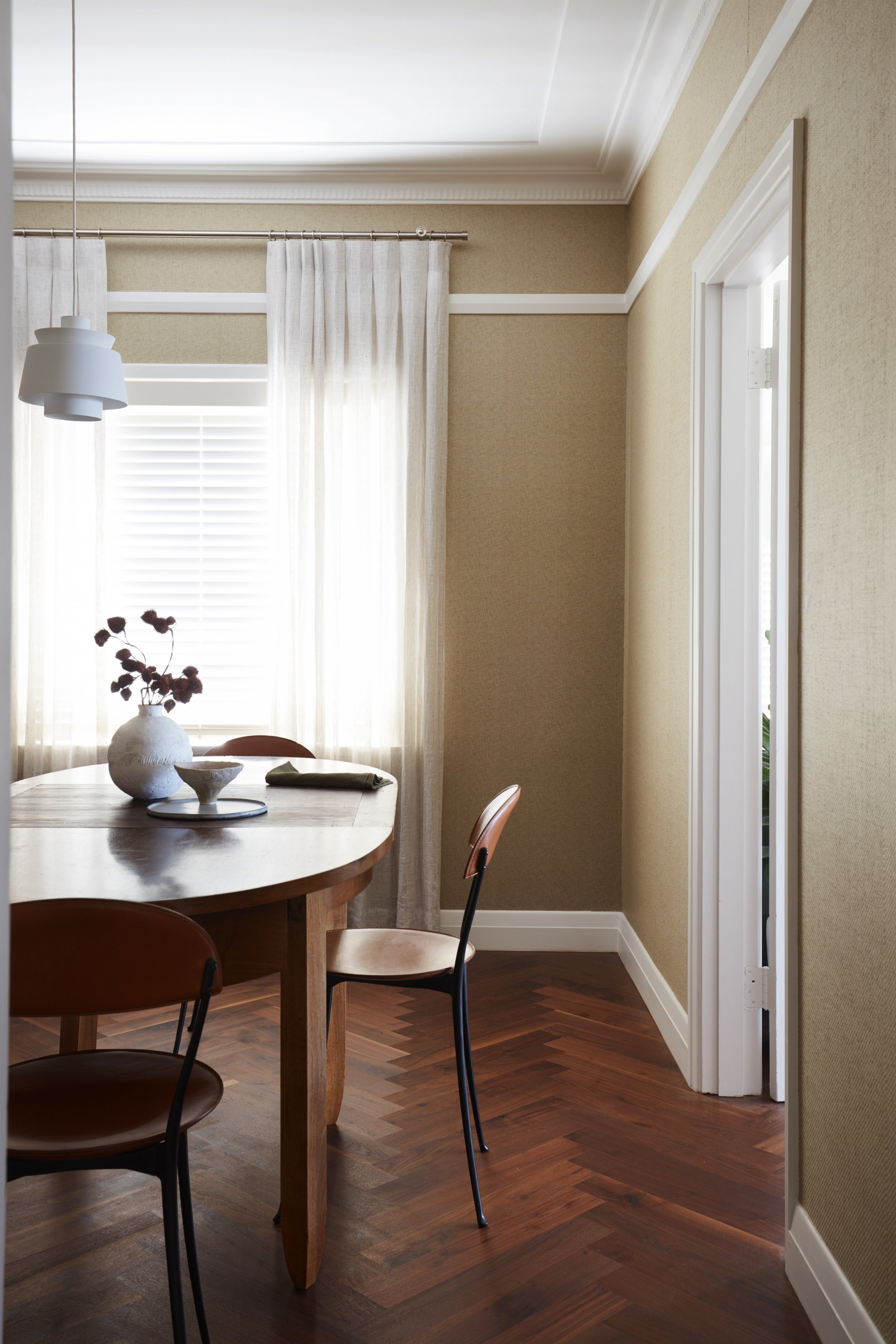
The dining area is the only space that doesn’t have white walls – it’s in the centre of the apartment and also used as a library. Photo: Prue Ruscoe

The dining space features grass cloth wallpaper in Twine from Porter’s Paints. Photo: Prue Ruscoe