Hosono House by Ryan Leidner Architecture
Nestled away from the street behind a lush garden and architectural footbridge, Ryan Leidner Architecture’s, Hosono House, offers the best of both worlds – tranquil retreat living and sweeping city views.
Words: Holly Terry I Photography: Joe Fletcher
‘I think one of the biggest successes of the project was the collaborative process we had with the clients. From the beginning, there was a real sense of openness and trust, which I think is what allowed us to take what was a rather complicated mash-up of a house and make it into something that felt well-considered and unique,’ says Ryan Leidner. Photo: Joe Fletcher
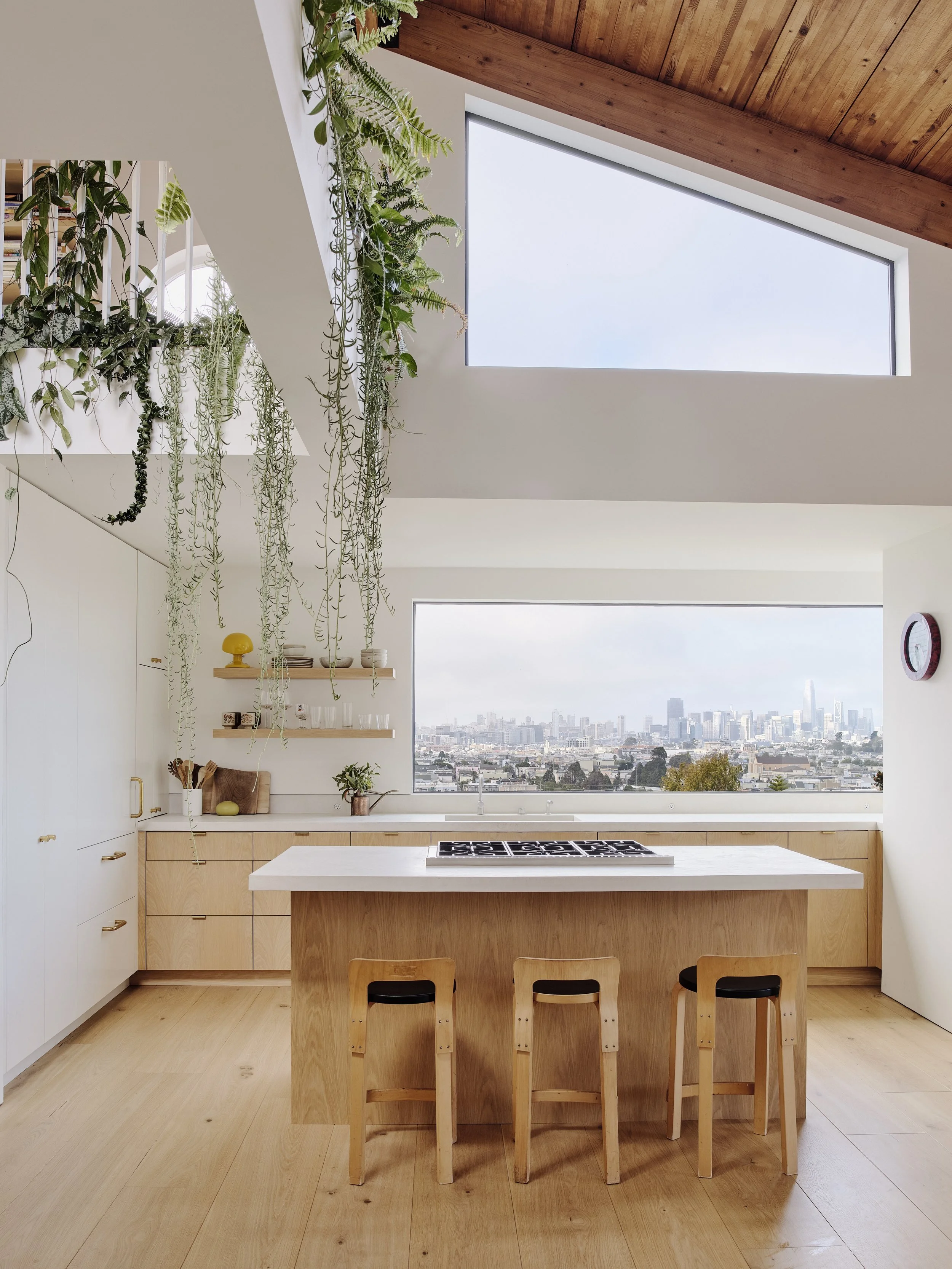
The kitchen features custom white oak cabinetry, concrete countertops and polished brass accents, enjoying sweeping views of the city skyline. Vintage counter stools by Alvar Aalto. Photo: Joe Fletcher
‘In many [of the projects from the 60’s and 70’s which we kept referencing], there is a feeling of experimentation that we thought was exciting and helped guide the overall aesthetic of the house,’ says Ryan Leidner. Photo: Joe Fletcher
Secluded yet accessible from nearby San Franscisco, Hosono House, designed by San Francisco-based firm Ryan Leidner Architecture, offers the best of both worlds – city living meets private, natural oasis. Positioned away from the street, one end of the house sits amongst dense greenery, whilst the other, boasts an open, light filled view of nearby San Francisco from the kitchen window.
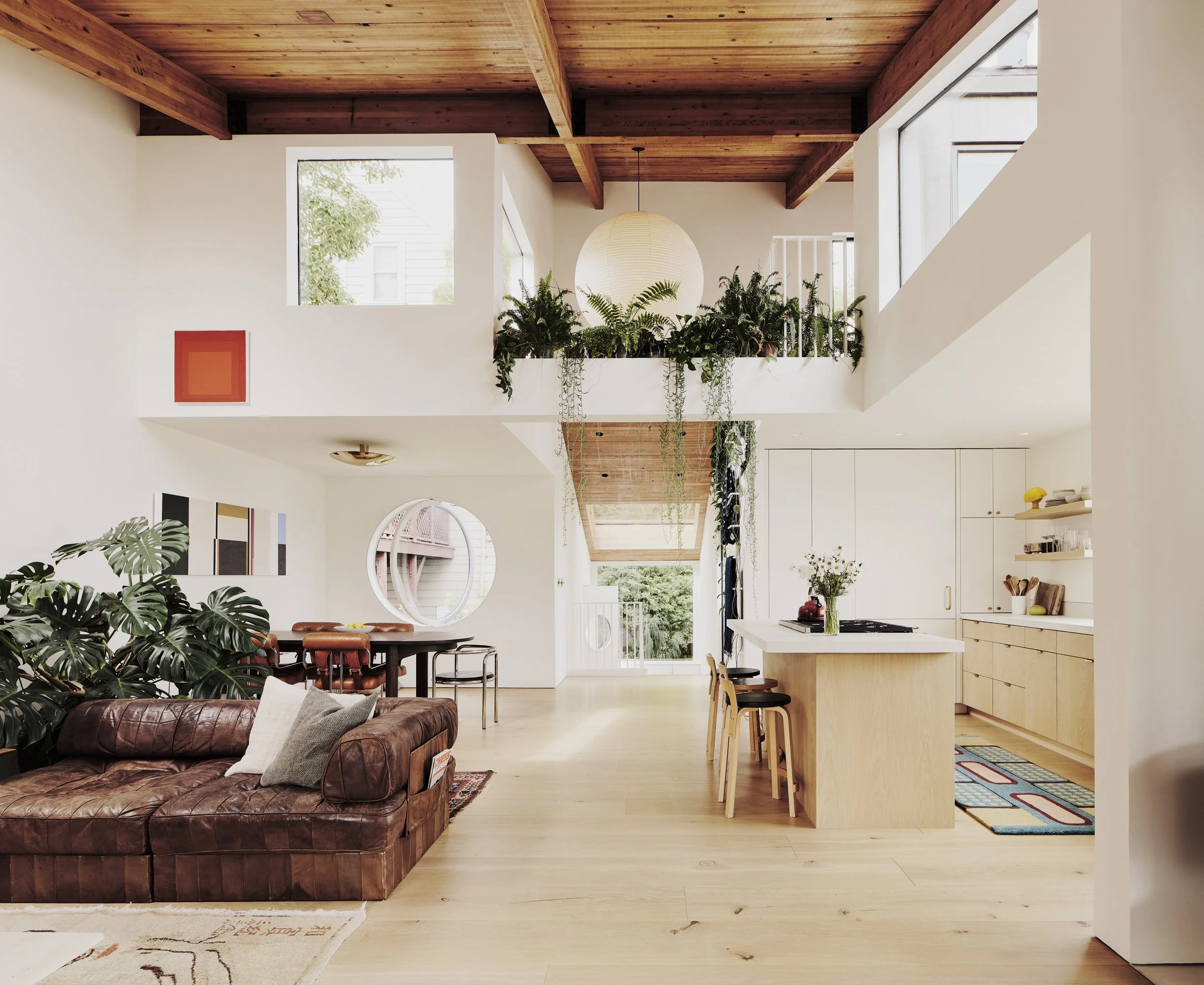
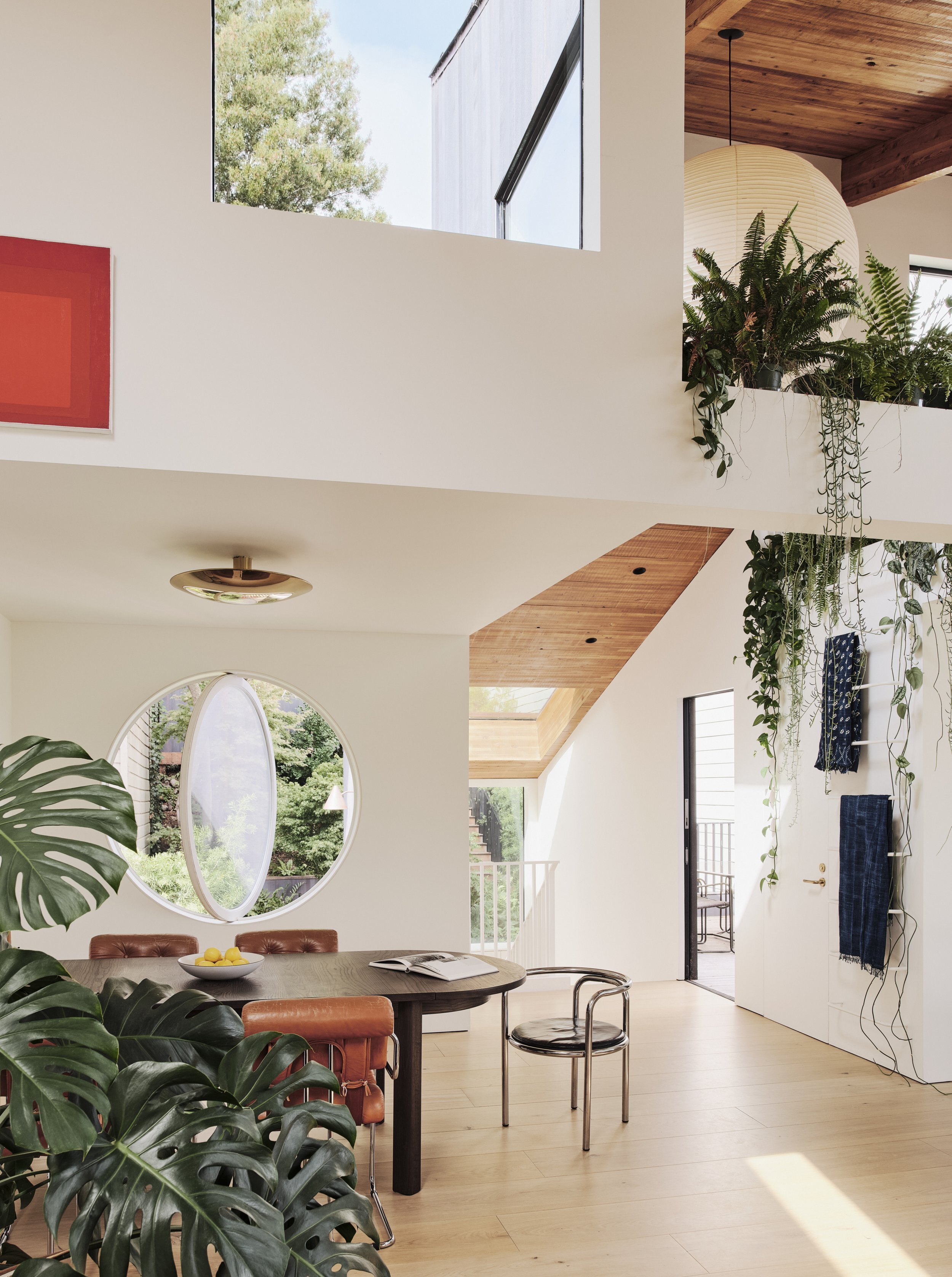
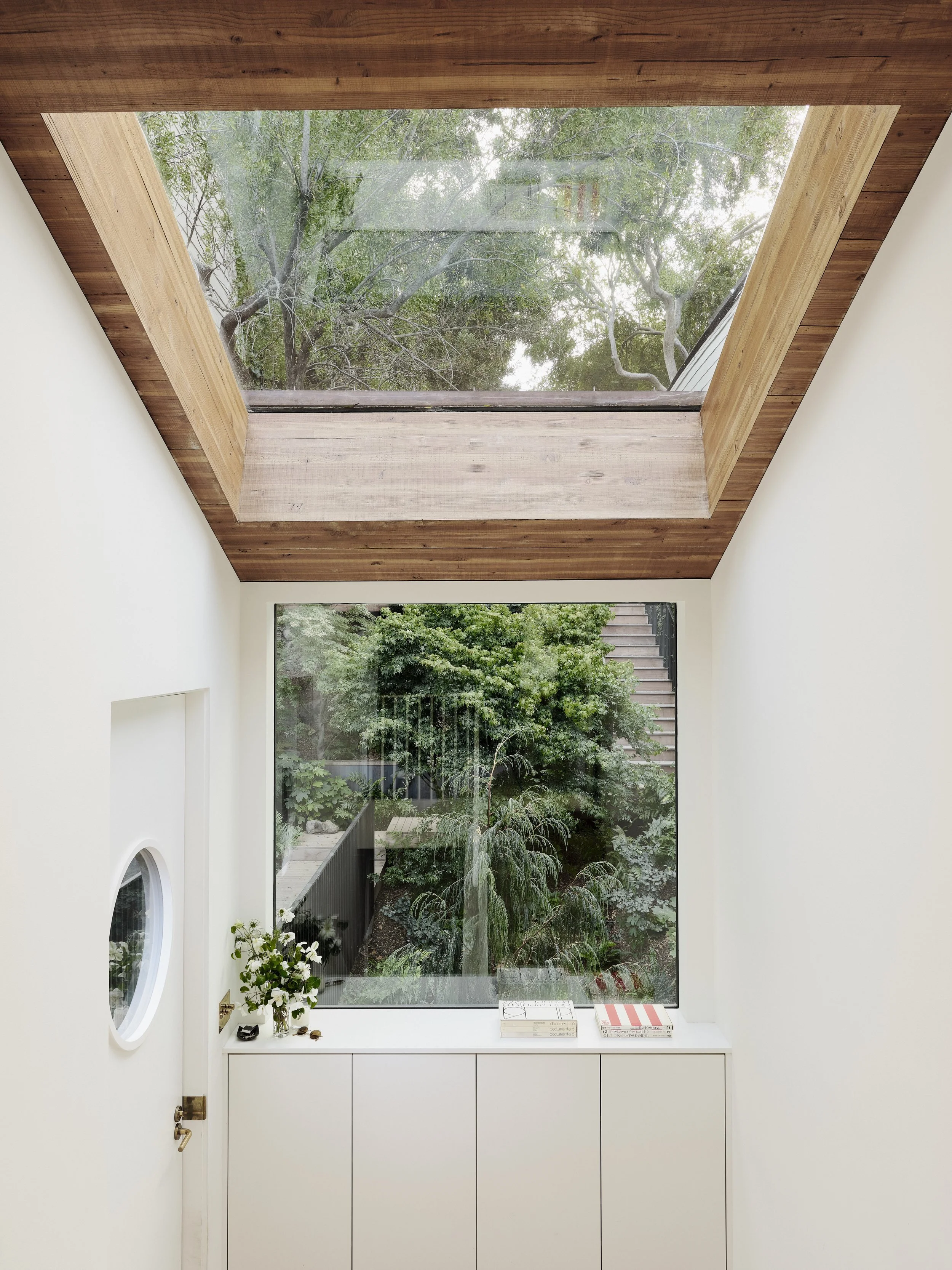
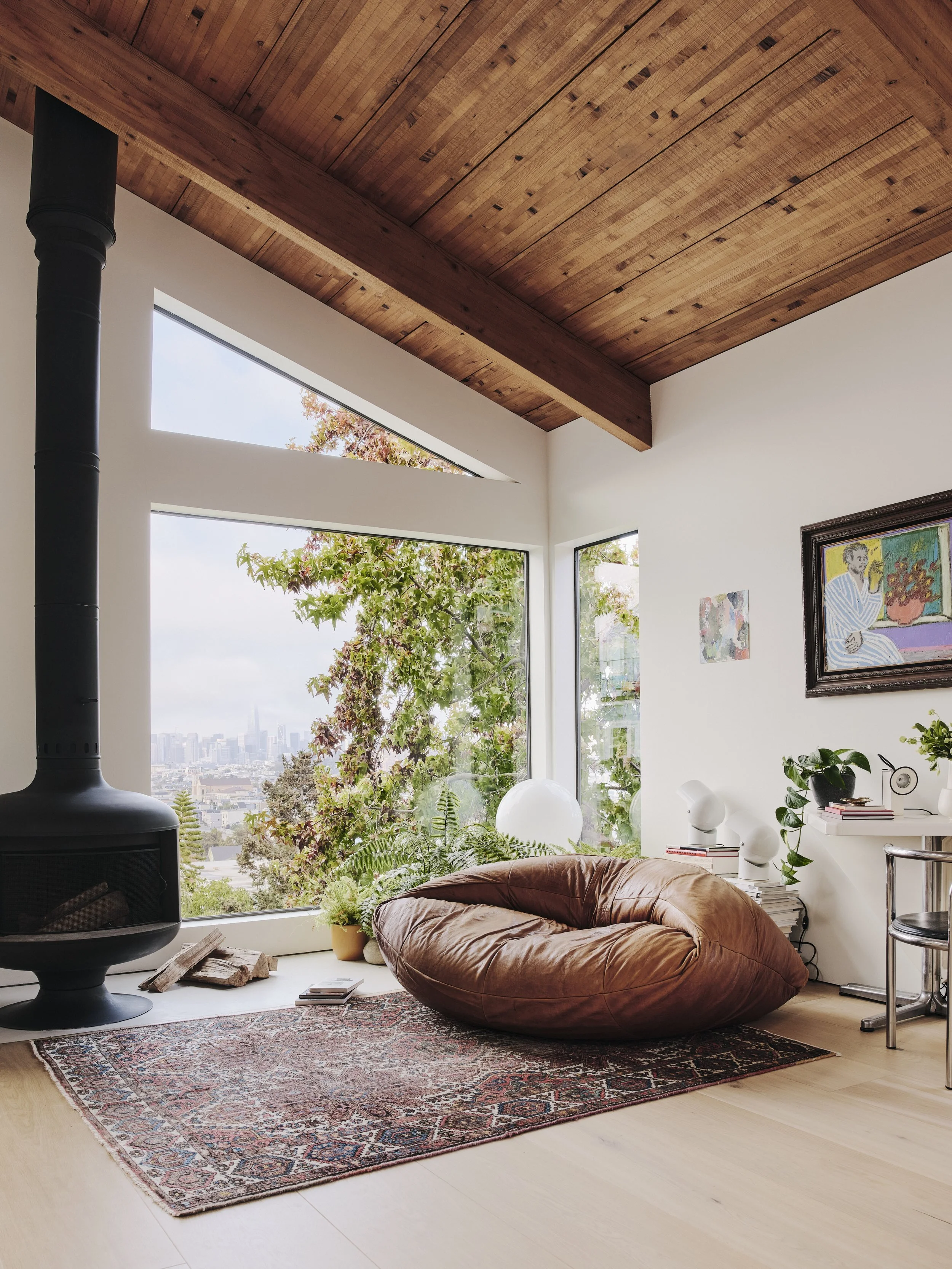
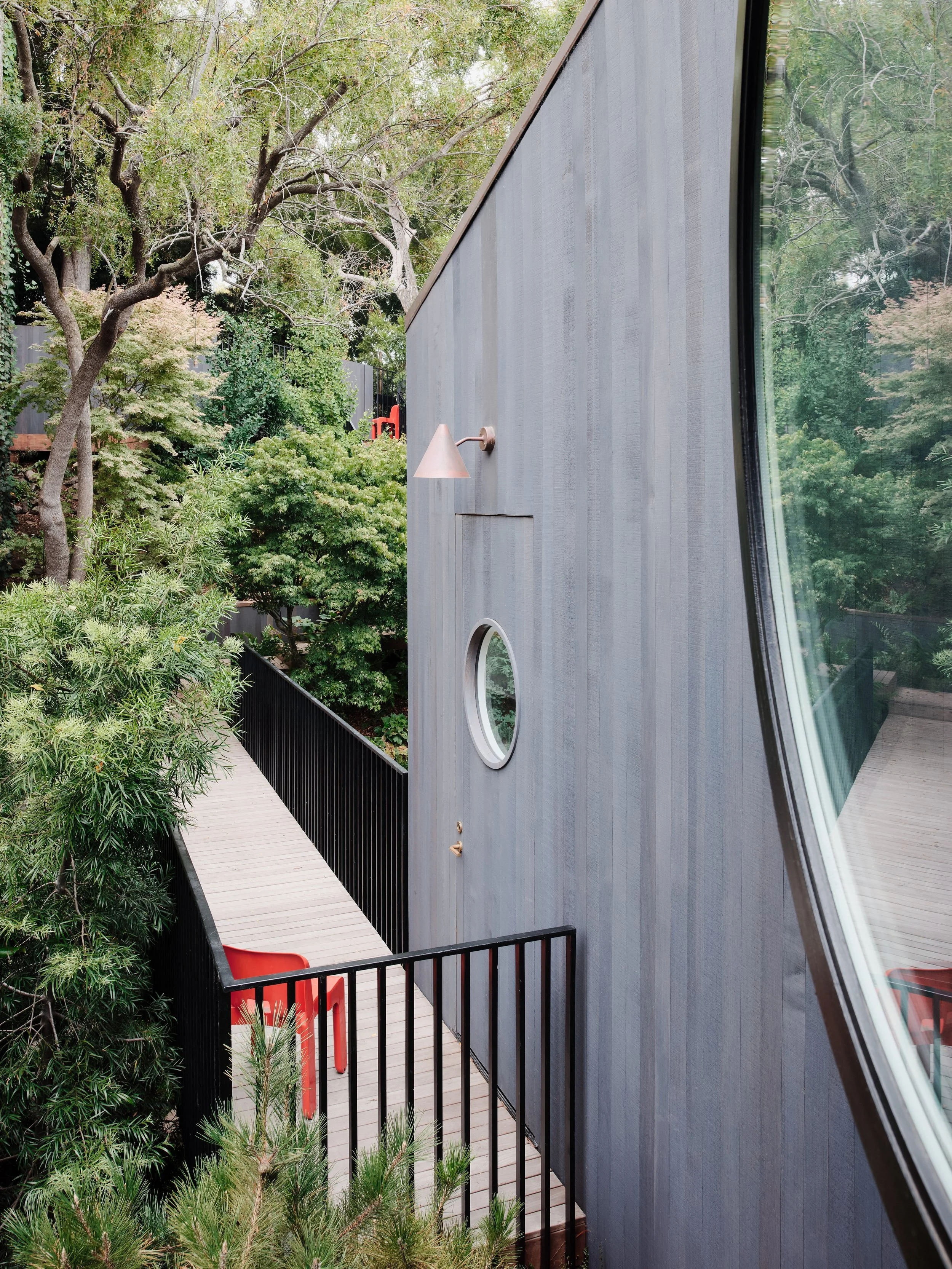
The house, a celebration of global design, juxtaposes different geometries, countering classic rectangular shapes with a large, circular window in the main living area, which became a motif that was reintroduced throughout the residence.
A homage to the client’s deep appreciation for global design, Leidner found himself often referring to Italian architectural projects from the 60’s and 70’s which prioritised experimentation as a primary focal point. For director, Ryan Leidner, working collaboratively with the client quickly revealed a mutual love for the feeling of interiors that felt lush; filled with life, plants and high design.
‘The house was truly designed to celebrate the owners’ appreciation for global design. The interior spaces are filled with a mix of vintage Italian furnishings and custom pieces, while the overall sensibility of the space was inspired by trips to Norway and Japan, and the ethos of Californian hippie modernism,’ says Ryan.
The project explores materiality in a unique way, seeking to find solutions which develop continuity within each space. Think, plaster mixed with hemp fibre, and matching floors and ceilings and walls from the same wide plank, white oak boards.
Utilising custom fabricated brass detailing throughout the house, the powder rooms and lounge bar feature brass countertops with integrated sinks. ‘I think [the brass finishes] give a luxurious feeling to the spaces, while also introducing a material that will age and patina with time,’ says Ryan.
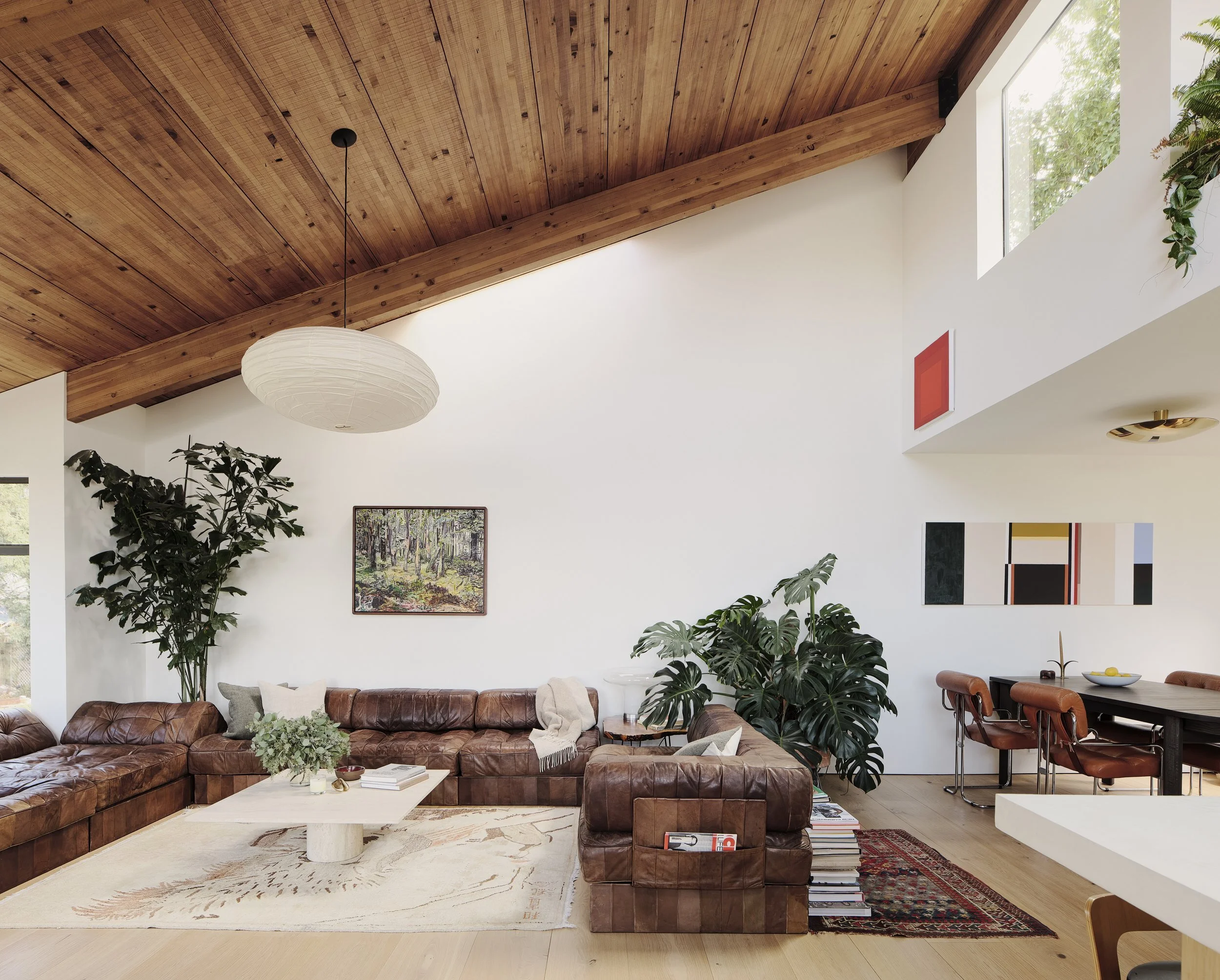
The walls, floors and ceiling are all clad in wide-plank white oak, enveloping the space in warmth. Photo: Joe Fletcher
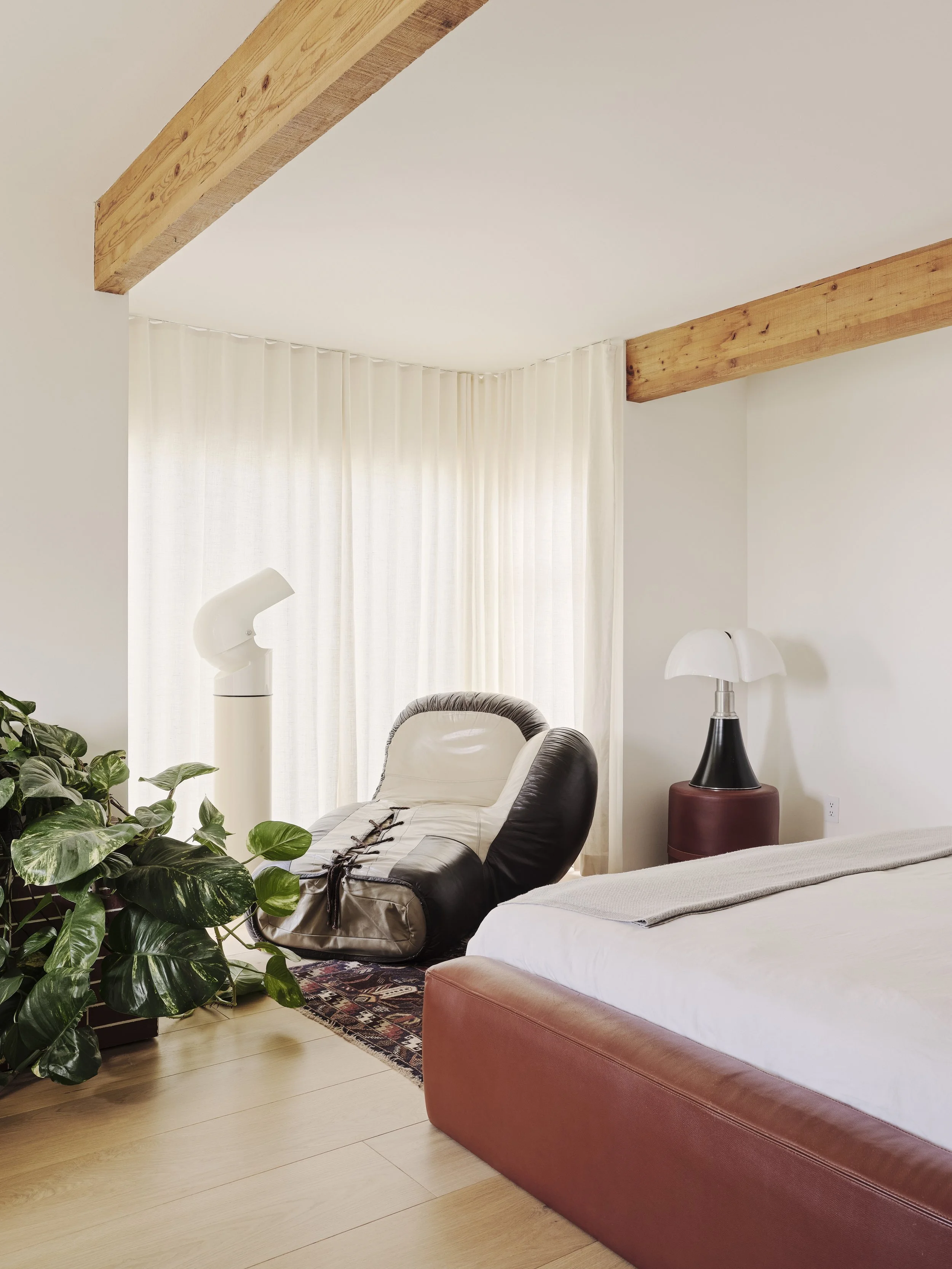
To preserve the home’s historic features, the existing timber ceilings were finished, and the beams were left exposed. Photo: Joe Fletcher
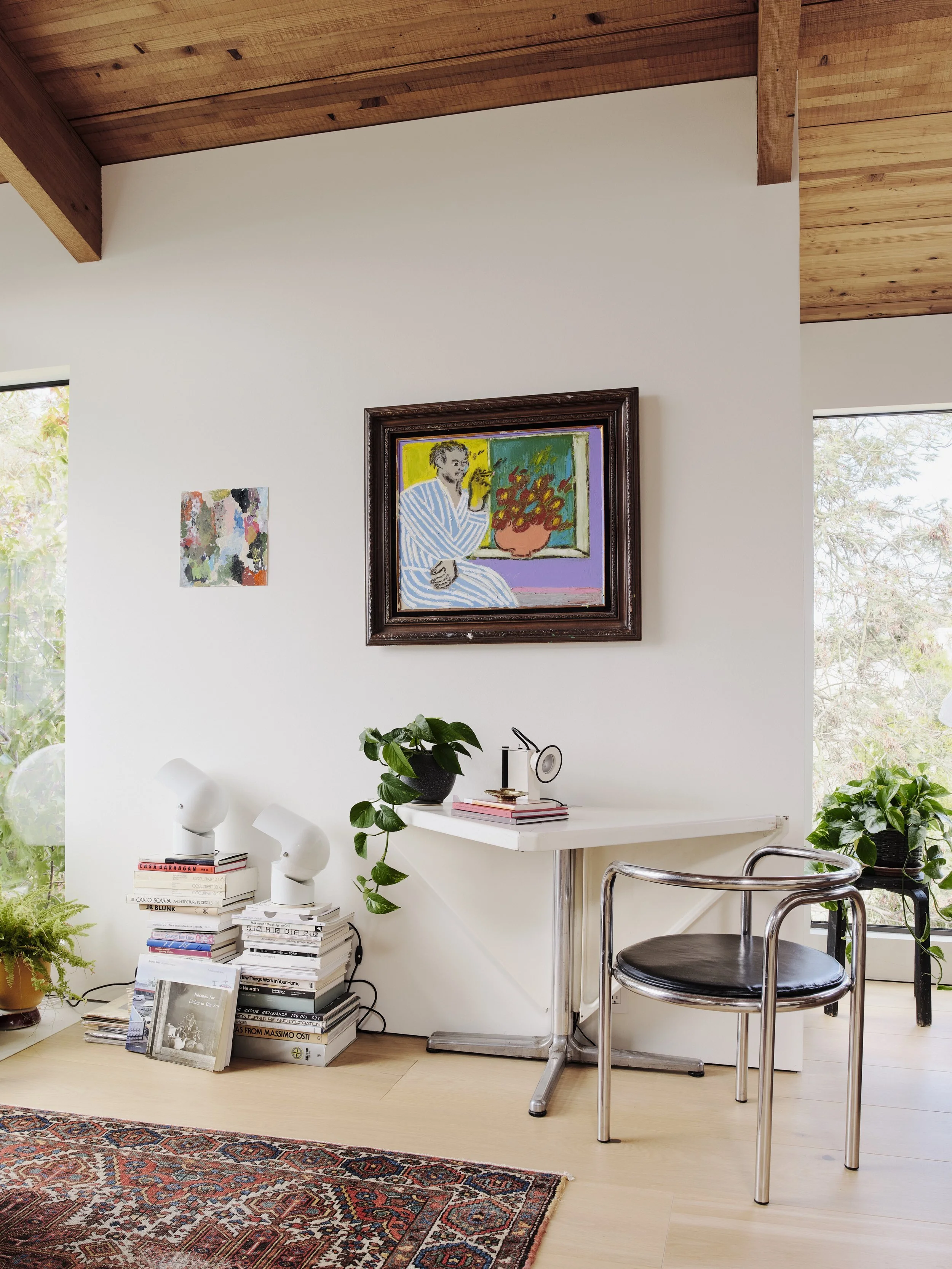
The furnishings, lighting and art reflect the owners, whose travels and life experiences have given them a deep appreciation for global design. Photo: Joe Fletcher
Traces of Japanese and Californian-modernist design can be found among a covetable collection of vintage Italian pieces. Photo: Joe Fletcher
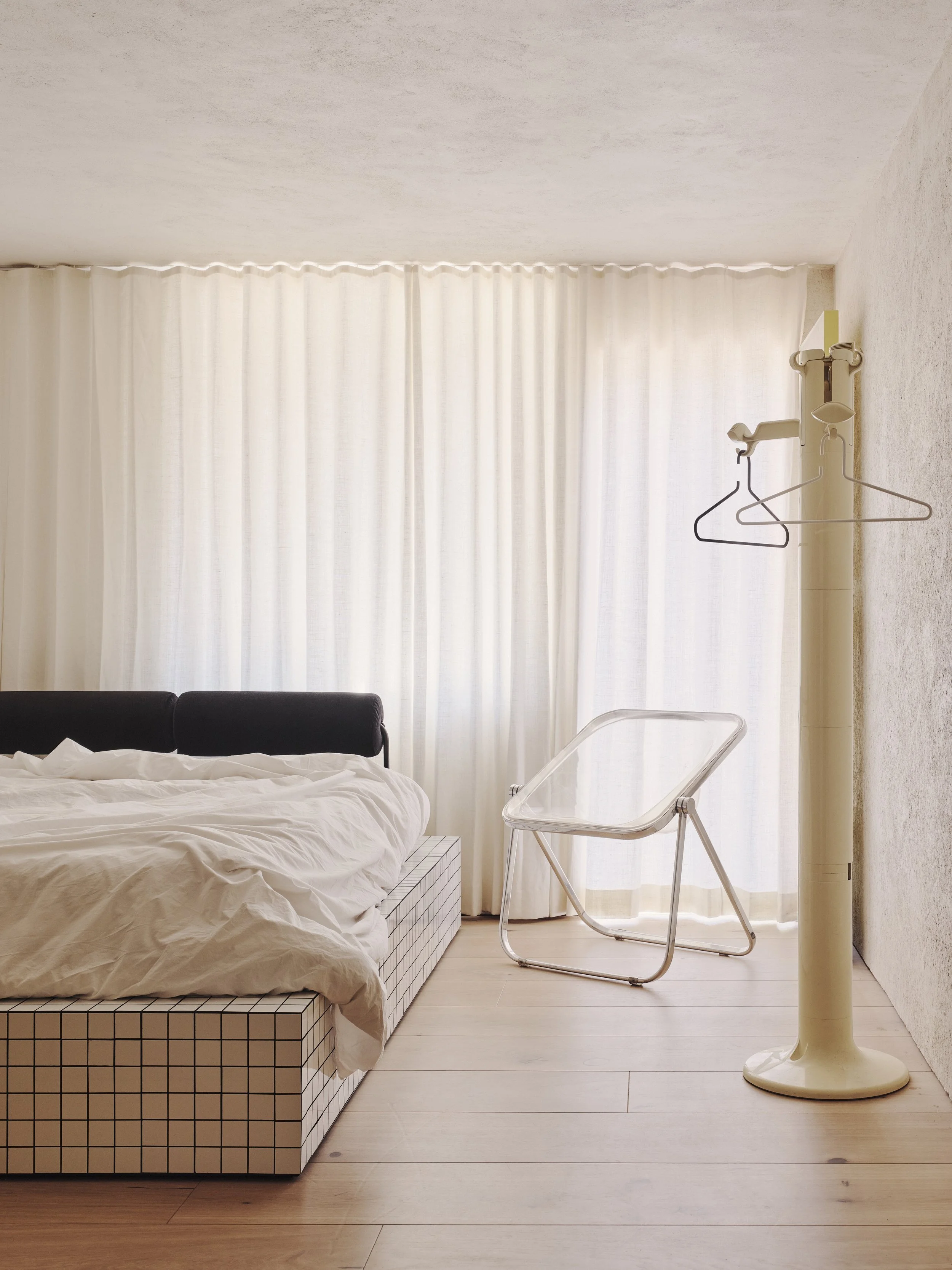
A custom tiled bed frame and vintage Castelli pieces in the guest bedroom; the Plona chair in clear and Planta coathanger and umbrella holder nodding to Italian modernist design. Photo: Joe Fletcher
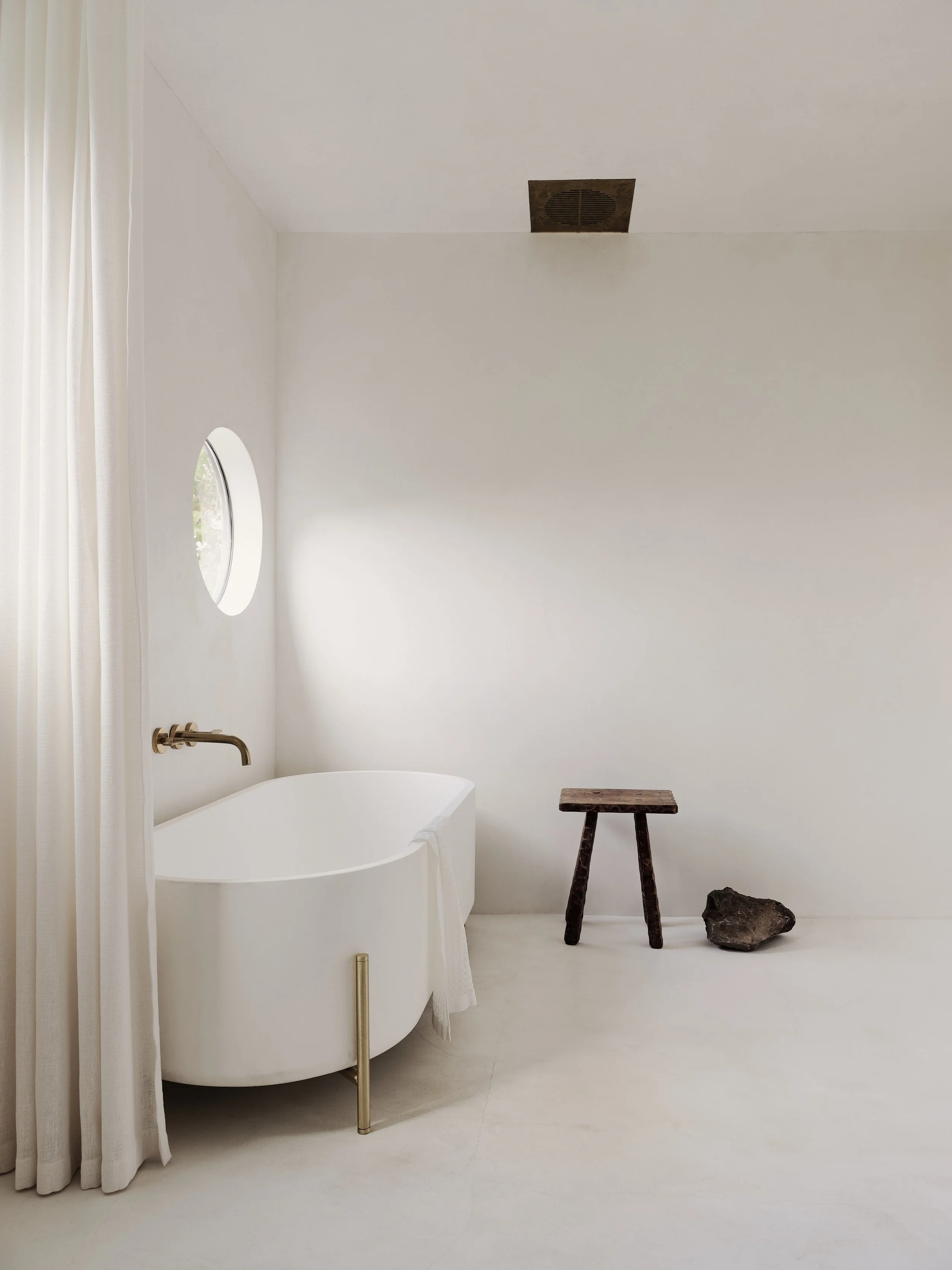
The simple and calming bathroom space featuring the Stand Bathtub by Norm Architects. Photo: Joe Fletcher
“In this project we really explored materiality in a unique way and sought solutions that gave a feeling of continuity within each space.”
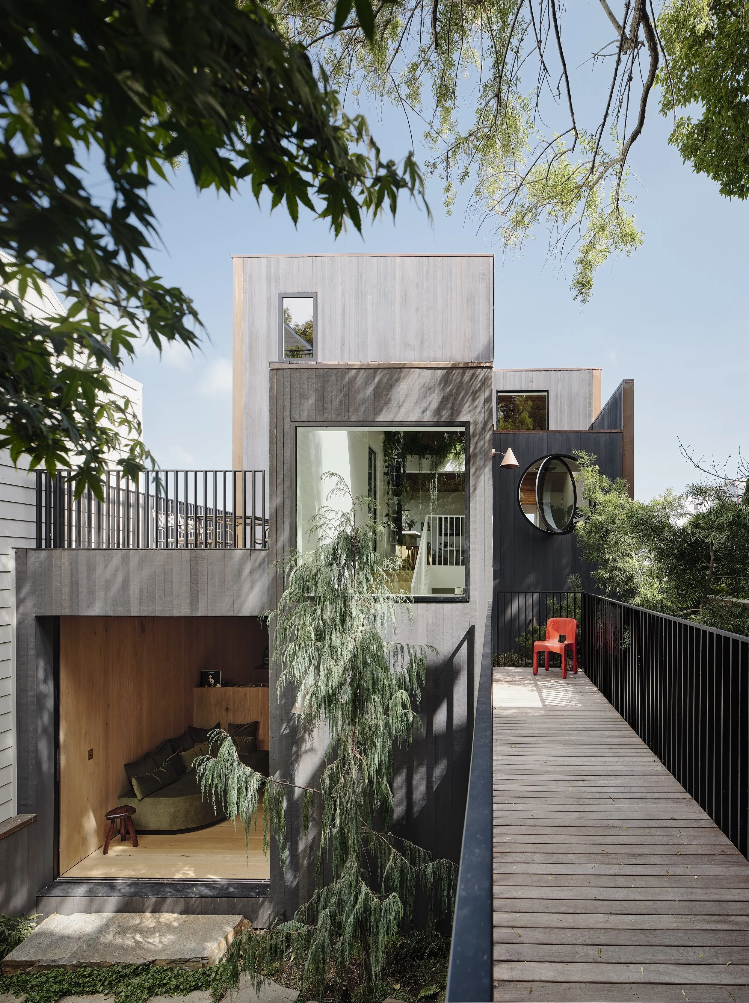
‘To resolve [the issue of circulation] we created a new entry sequence, including a bridge, which spans from the front garden, over the landscaped lower courtyard, to a new front door and entry hall,’ says Ryan Leidner. Photo: Joe Fletcher
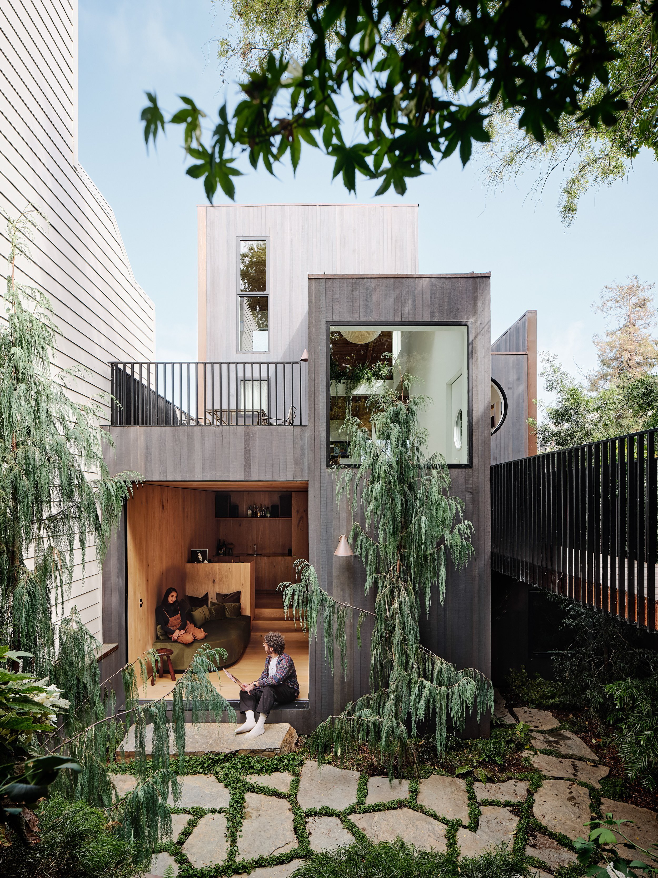
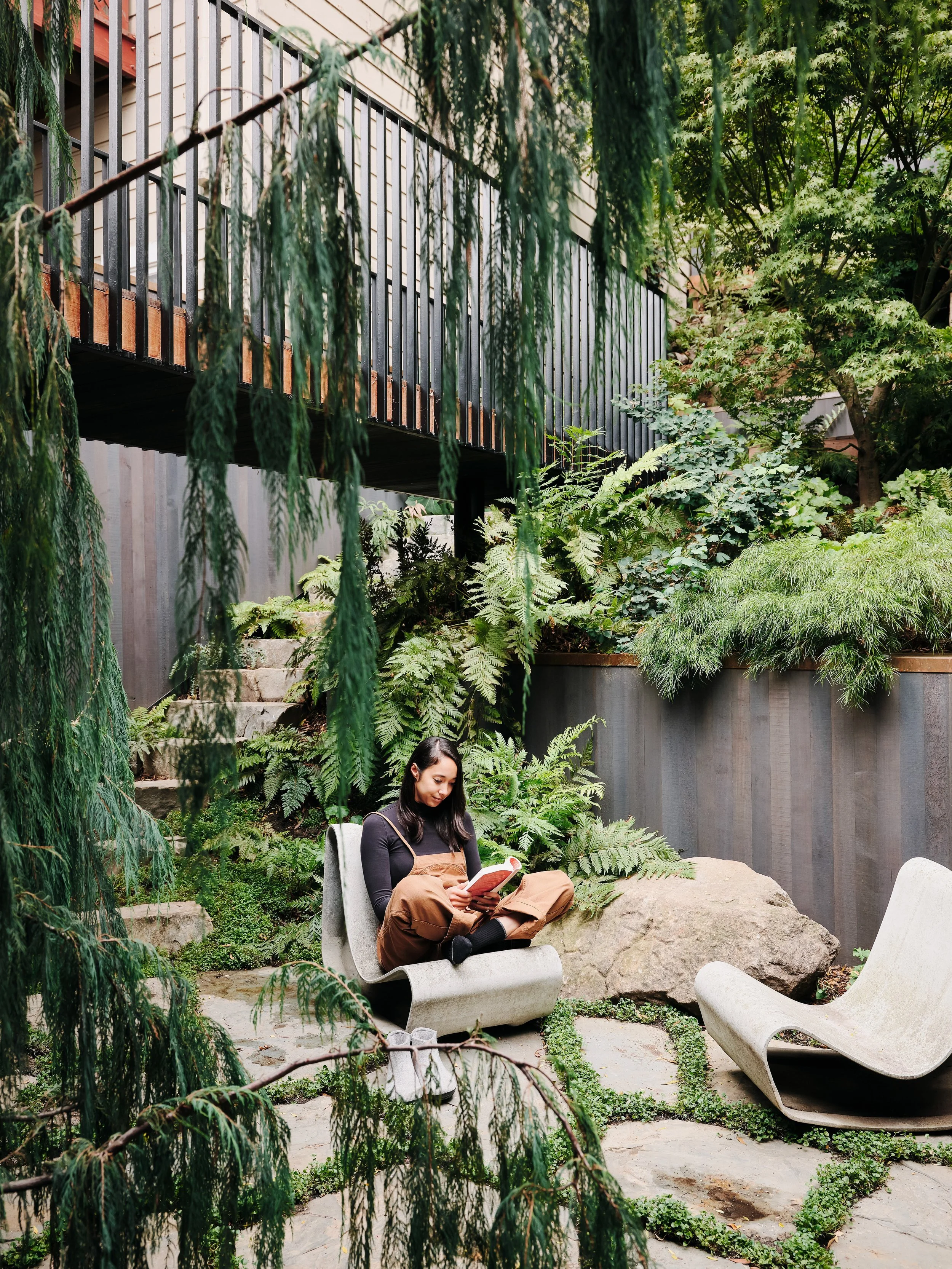
The oasis-like courtyard features the Swisspearl Willy Guhl Loop outdoor chair. Photo: Joe Fletcher
The exterior of the house is clad in charcoal-stained cedar. Photo: Joe Fletcher
As with all progressive designs, however, the original circulation of the house did present some challenges. The pre-existing house, built in the 1940’s was set at the rear of the block on a steep slope, meaning the entrance ran from the street to a long staircase leading to the ground level, requiring an ascent back up to the primary living space. ‘In terms of the flow of the house, this just felt very inefficient and had the effect of really separating the living space from the yard,’ he shares.
To counter the issue of circulation, Leidner created a new entry, and arguably the most striking feature of the house. A crossing bridge was built to run over the front garden, arriving at a half level landing and front door which opens up to the multifunctional living, dining, kitchen area, presenting sweeping views across the San Fransisco skyline.
‘The initial meeting [with the client] went well, and as they were walking me out to say goodbye, he asked me if I had any "crazy" ideas for the project. I said, "we should build a bridge!". They loved the idea, and now, looking back, it's clear to me that this was the moment the project started.’
To come, Ryan Leidner Architecture has many sure-to-be noteworthy projects on the horizon, “I think the one I’m most excited about is a new house and art studio in Joshua Tree that we recently completed for a painter and her partner”, says Ryan.


