Mary Street House: A Seamless Blend of Heritage and Contemporary Design
Mary Street House is a reimagining of a well-worn Federation-era home, transformed by Edition Office into a contemporary dwelling – taking inspiration from the original brickwork and respecting the history of the existing home.
Words: Hande Renshaw I Photography: Rory Gardiner I Architecture & Interior Design: Edition Office I Build: Format Group I Landscape: Amanda Oliver Gardens I Engineering: Measure Engineering I Joinery: Seytim Cabinets
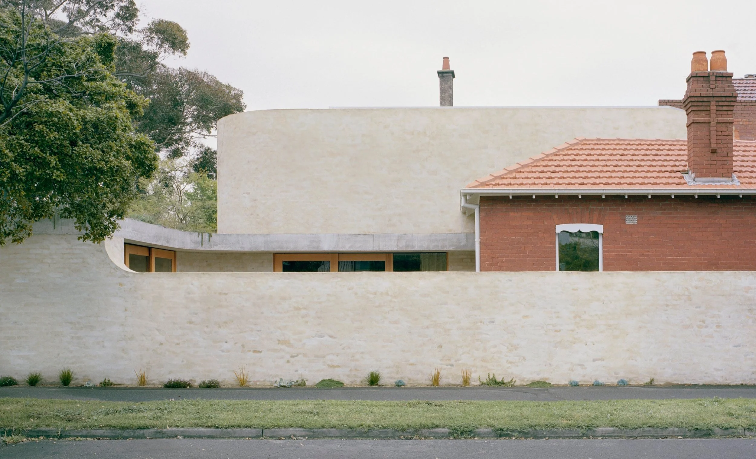
The original home was carefully restored, with a consciously layered transition between the existing home and the new addition. Photo: Rory Gardiner
The fence of the front garden was kept low, exposing a verdant social space. Photo: Rory Gardiner
‘The design connects us to each other in a very clever way – the children can have their own space yet they never feel remote,’ says the homeowner. Photo: Rory Gardiner
The dining space, held deep within the walled site is lit by a skylight within the concrete ceiling above. Photo: Rory Gardiner
‘The busy urban vibes melt away when we step inside and we are immediately calmed, grounded by the temperament of the new house,’ says the homeowner. Photo: Rory Gardiner
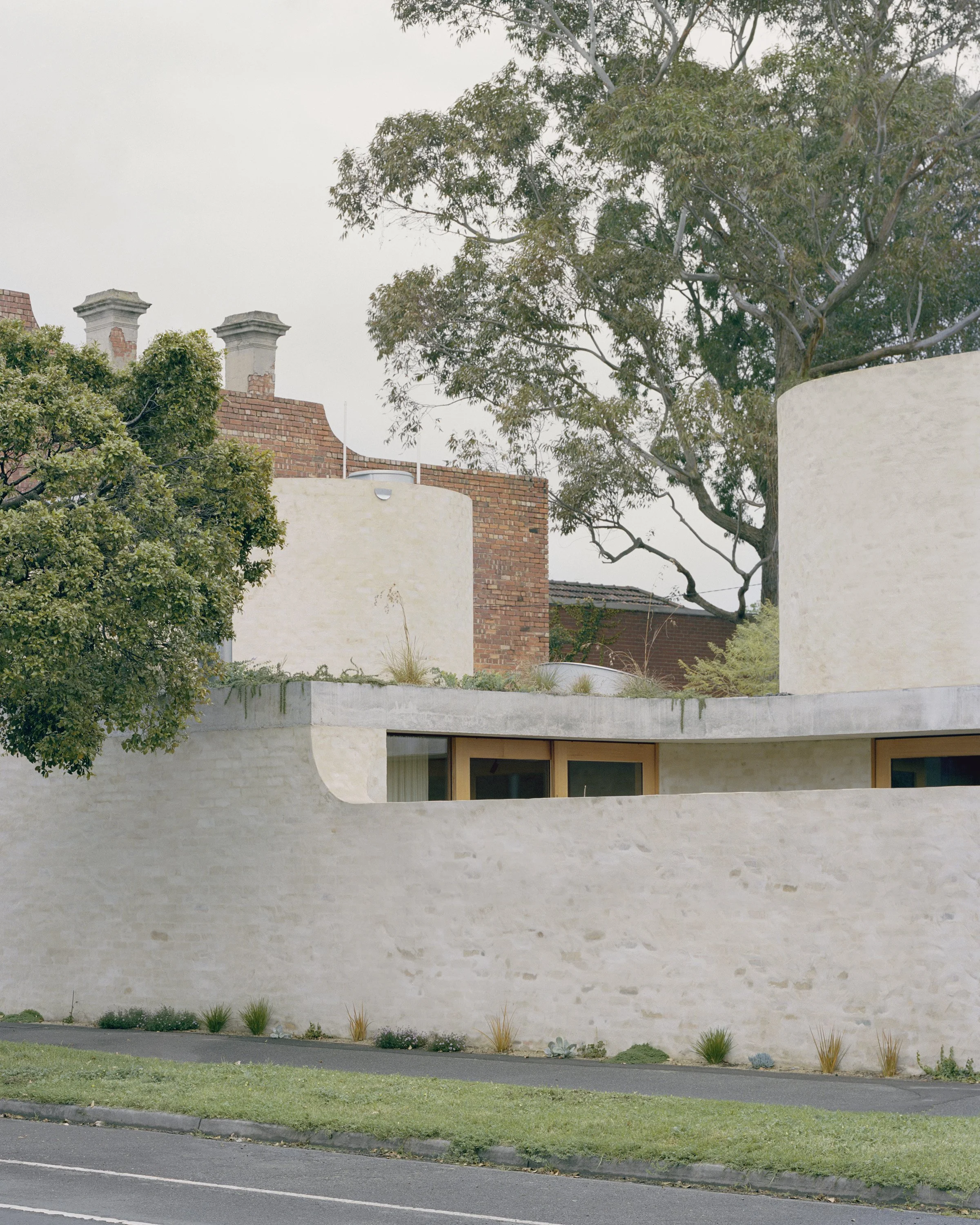
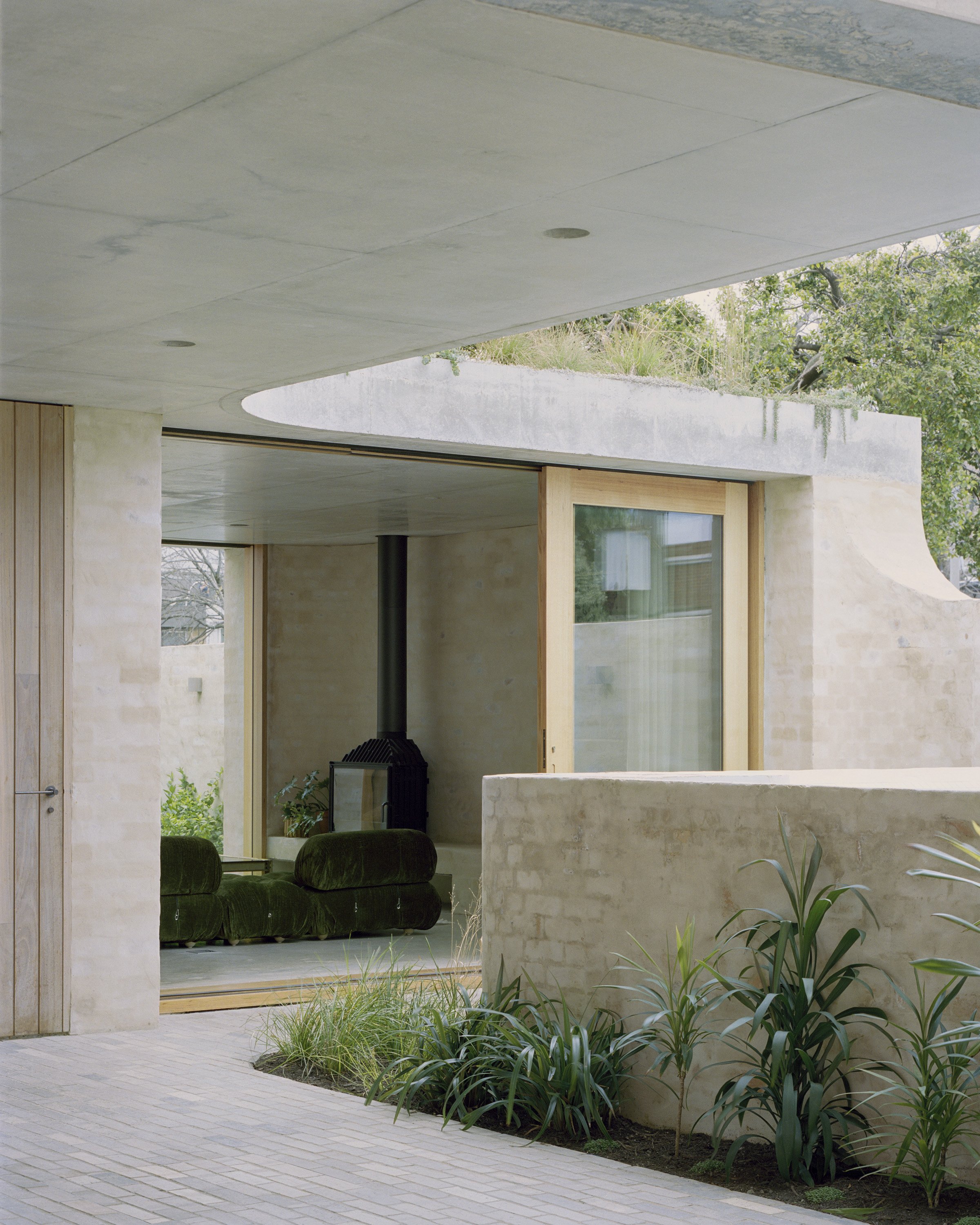
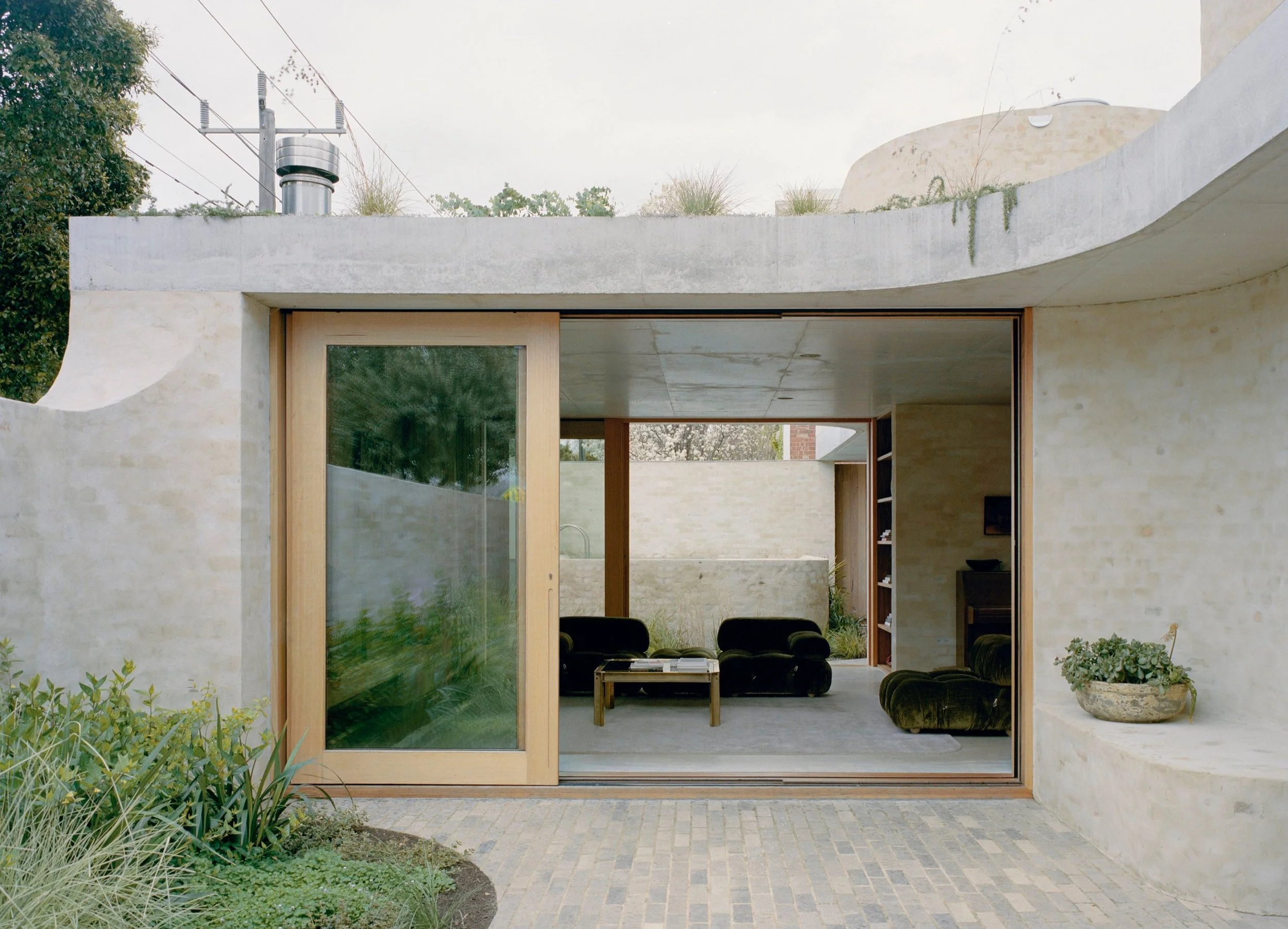
The softly finished brickwork walls shape the new social spaces of the house, creating a sequence of Indoor and outdoor rooms within the remaining boundaries of the site. Photo: Rory Gardiner
‘The living area feels generous and welcoming for informal get-togethers as a family, for three growing boys to play, while lending itself just as easily to more sophisticated gatherings,’ says the homeowner. Photo: Rory Gardiner
Nestled in the inner city suburb of Melbourne, St Kilda West, Mary Street House is a Federation-era home, which has undergone a transformation through a thoughtfully crafted addition.
Respecting the integrity and charm of the existing building, Edition Office sought to honour the heritage elements of the site while infusing it with a contemporary twist – the vision was to extend the home's legacy and enhance its character, while maintaining the identity of the corner location.
Central to the design is the solid sculptural lens that gracefully expands the rear of the house. Mimicking the original brickwork, Edition Office harmoniously blended the new and old through a delicate dance of materiality. The resulting effect is a subtle and sophisticated reinterpretation of permanence.
The home’s geometric lines, meticulously crafted with precision, create an interplay of light and shadow. The lens acts as a gateway, leading inhabitants into a seamless transition between the existing structure and the contemporary extension. The design preserves the legacy of the existing heritage home by extending the rear of the building in a way that enhances its character and identity, drawing inspiration from the original brickwork and reinterpreting its enduring quality.
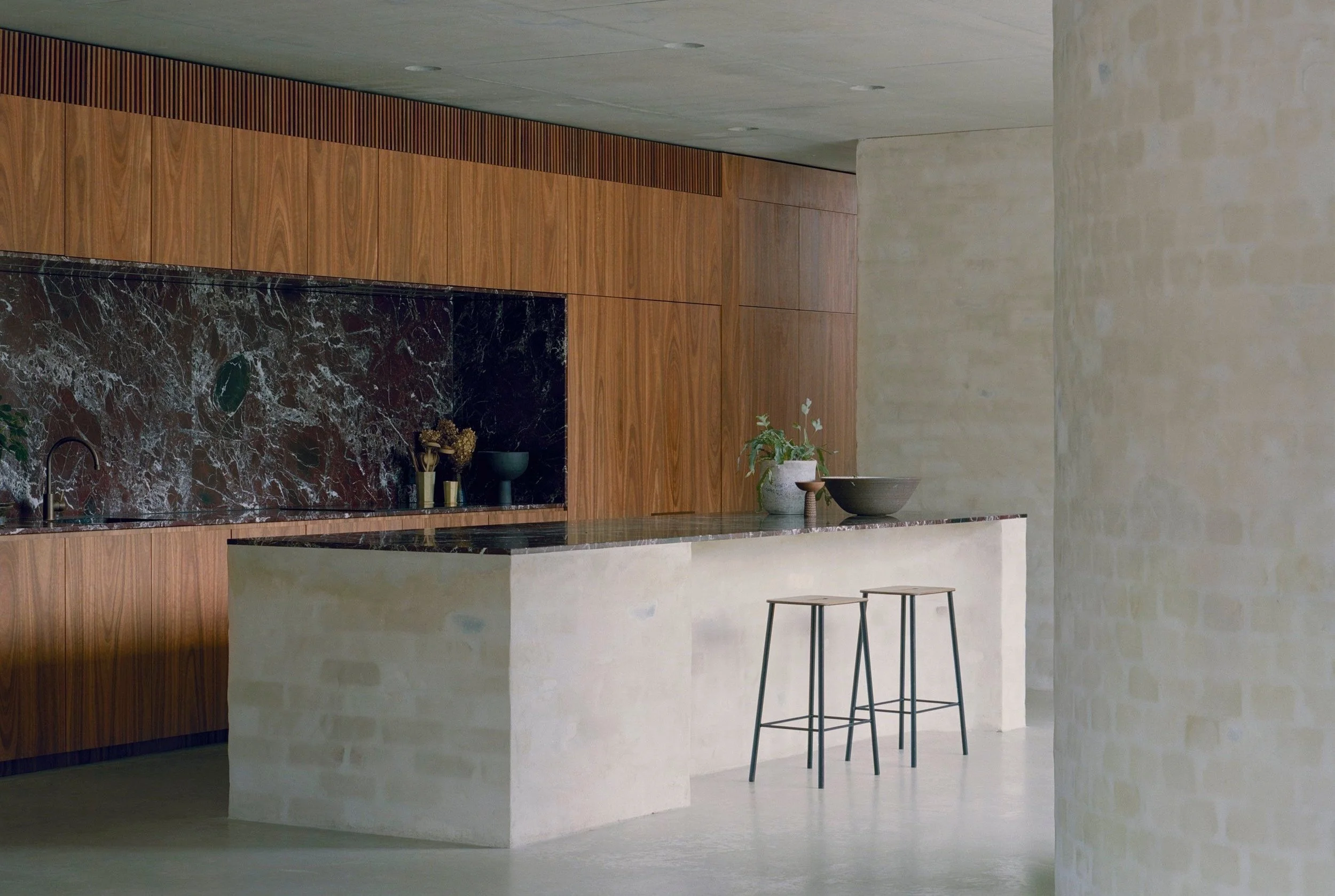
Inside, the spatial arrangement boasts a thoughtful balance between open-plan living and intimate private spaces. The extension seamlessly integrates a modern kitchen and dining area, where clean lines and minimalist aesthetics celebrate simplicity. Flooded with natural light, these spaces evoke a sense of tranquility and harmony, forging a strong connection between the indoors and the surrounding greenery.
‘The original home was carefully restored, with a consciously layered transition between the existing old bones and the new social spaces that erupt gently from within the central hall. The fence of the front garden was kept low, exposing a verdant social space, inclusive of an outdoor fire-pit, to the street and the community,’ says Edition Office.
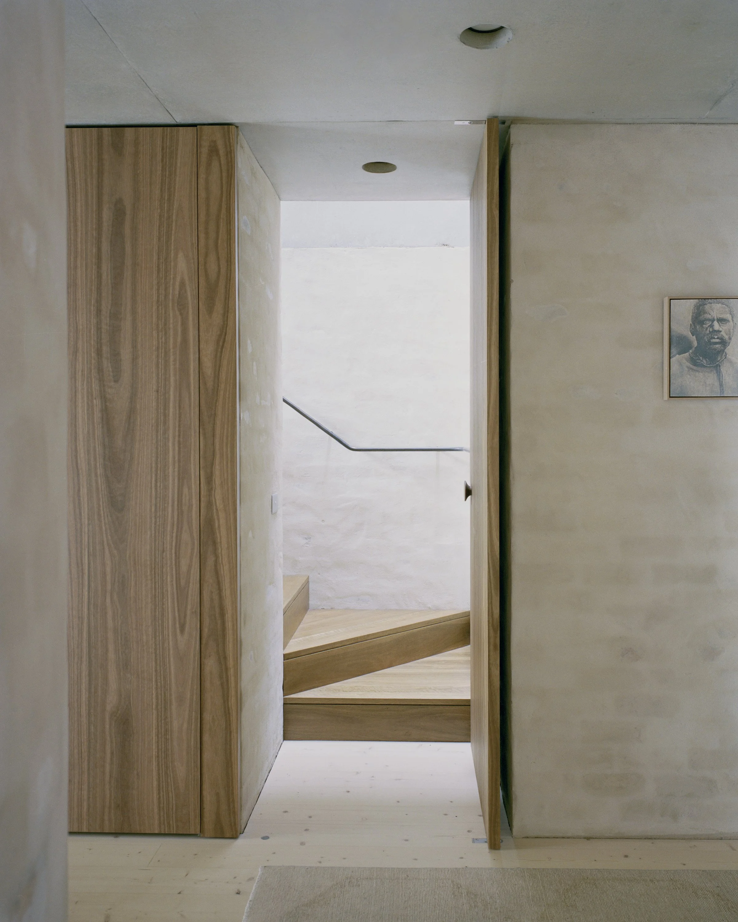
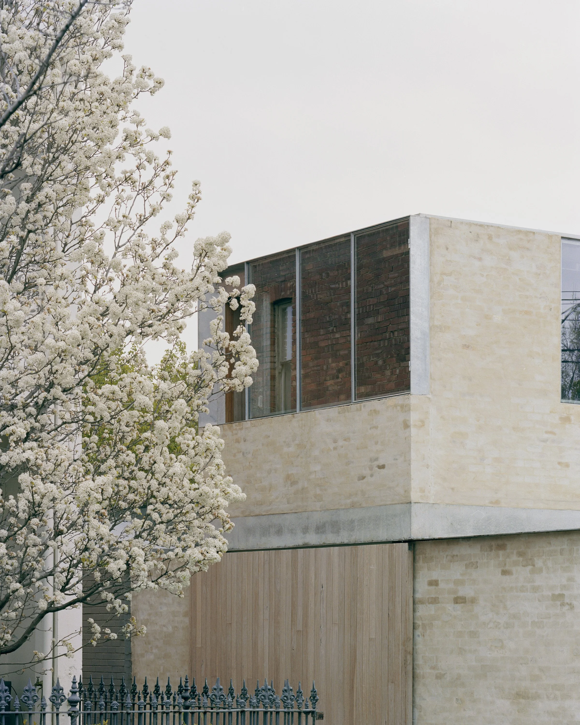
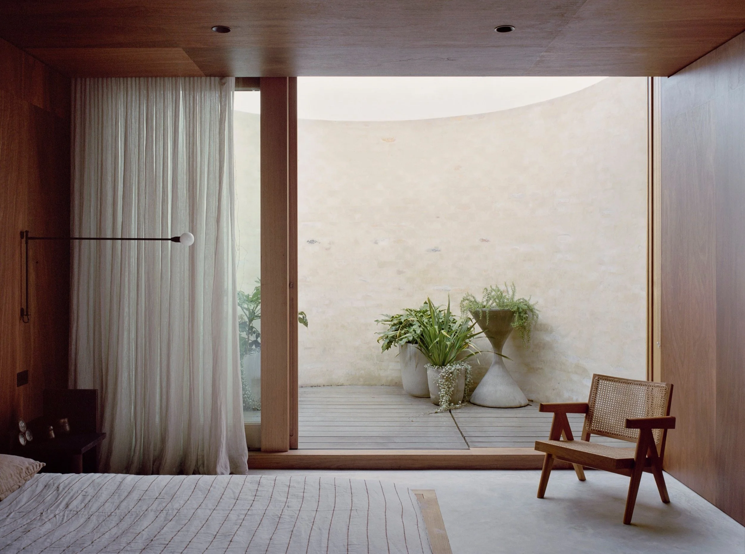
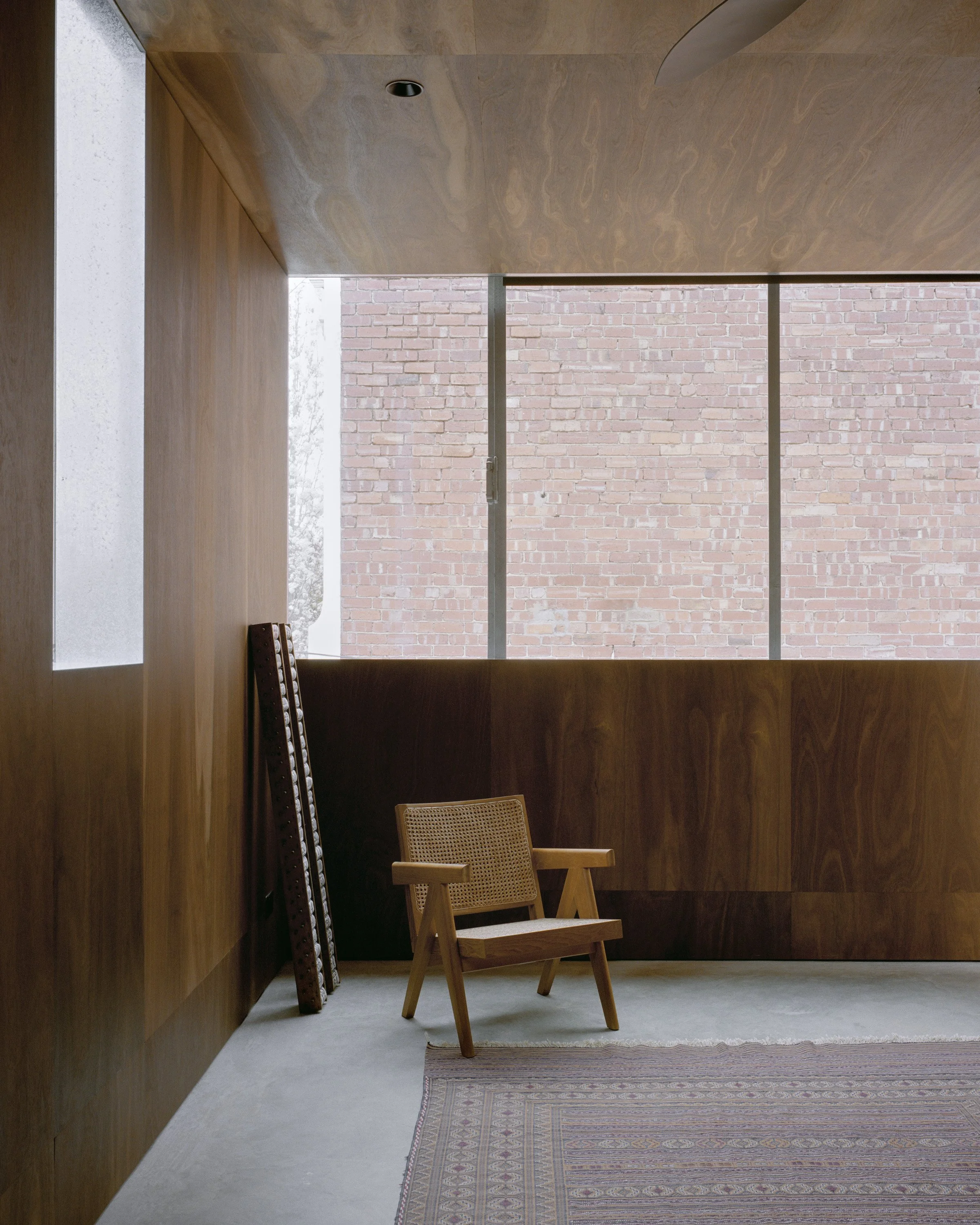
A pair of brick volumes rest atop the planted concrete roof of the new wing. One volume, extending out from the ridge of the terracotta tiles of the original roof, houses the principal bedroom suite with its own private courtyard garden, while the other holds a small studio. These private retreats are lined in deeply-toned spotted gum plywood, creating immersive spaces of quietude and sanctuary.
Low cost and naturally resilient materials were utilised throughout the project, with sustainably sourced recycled bricks were the dominant building material for the new addition. Thermal mass was heavily utilised within the project to ensure a stable internal temperature and to mitigate outside traffic noise.
‘The busy urban vibes melt away when we step inside and we are immediately calmed, grounded by the temperament of the new house. We’re still connecting to its past in the front section, yet are, still now, every day, excited with the promise of what lies beyond - glimpses of imperfect solid brick walls, robust concrete forms, curves and sculptural forms ensure our eyes travel up and around, connecting us to the elements via the skylights and the gardens,’ says the client.
The extension seamlessly integrates a modern kitchen and dining area, where clean lines and minimalist aesthetics celebrate simplicity. Photo: Rory Gardiner
The clean lines of the bathroom make for an ideal relaxation space. Photo: Rory Gardiner
Materiality restraint creates a calming and subdued ambience inside the home. Photo: Rory Gardiner
Sustainably sourced recycled bricks are the dominant building material for the new addition. Photo: Rory Gardiner
The old and the new are seamlessly blended inside the home. Photo: Rory Gardiner
Low cost and naturally resilient materials were utilised throughout the project, with sustainably sourced recycled bricks being the dominant building material for the new addition. Photo: Rory Gardiner
“The merging of the old and new has been achieved by carefully refining and paying attention to details, while still respecting the characteristics of each era.”
The private retreats are lined in deeply-toned spotted gum plywood, creating immersive spaces of quietude and sanctuary. Photo: Rory Gardiner
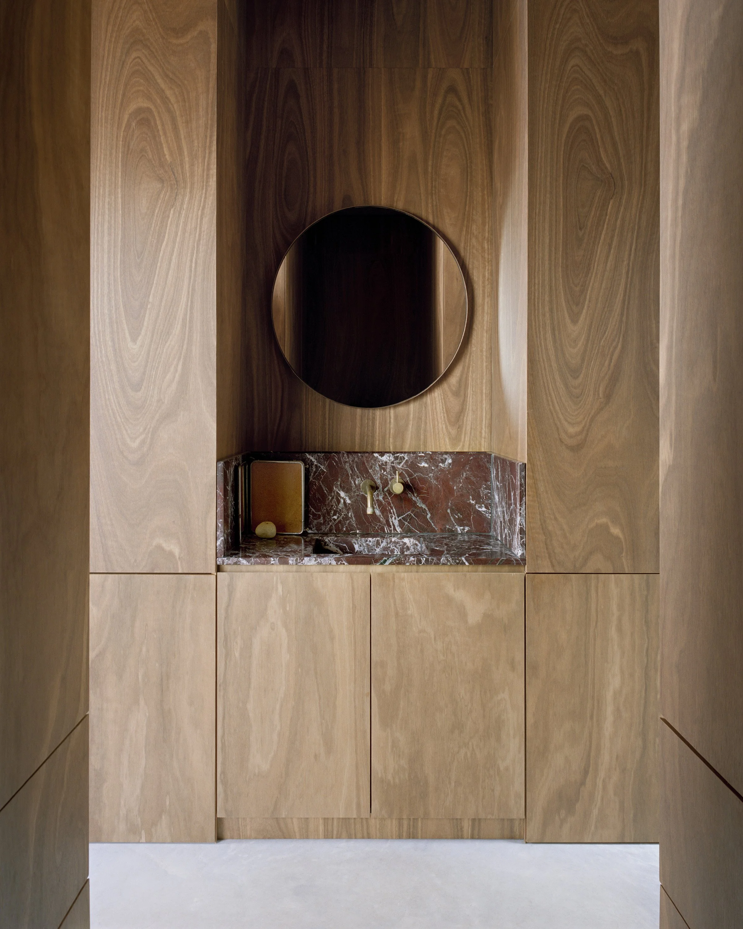
The warmth of the timber and the simplicity of bathroom materiality allows for adult drama and accentuates the sense of a haven. Photo: Rory Gardiner
Photo: Rory Gardiner


