Oak House by Kennedy Nolan
Designed around an existing oak tree, Oak House by Kennedy Nolan sees the careful reworking of a Victorian house, embracing natural elements to make the most out of the design.
Words: Hande Renshaw I Photography: Derek Swalwell
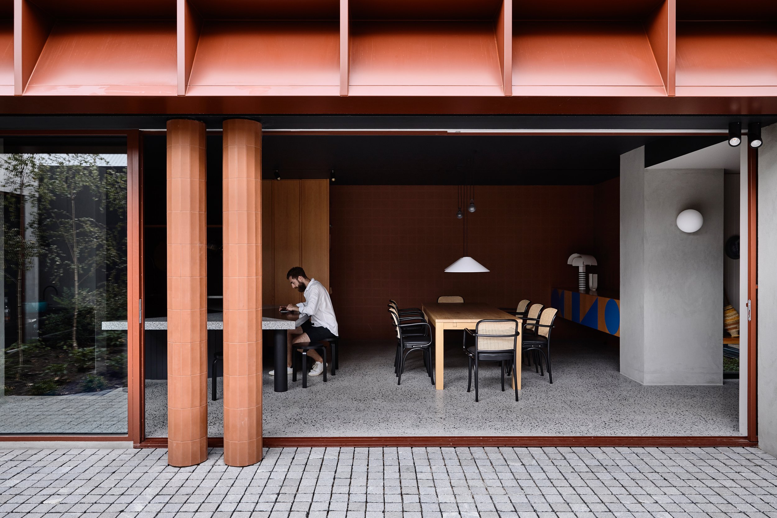
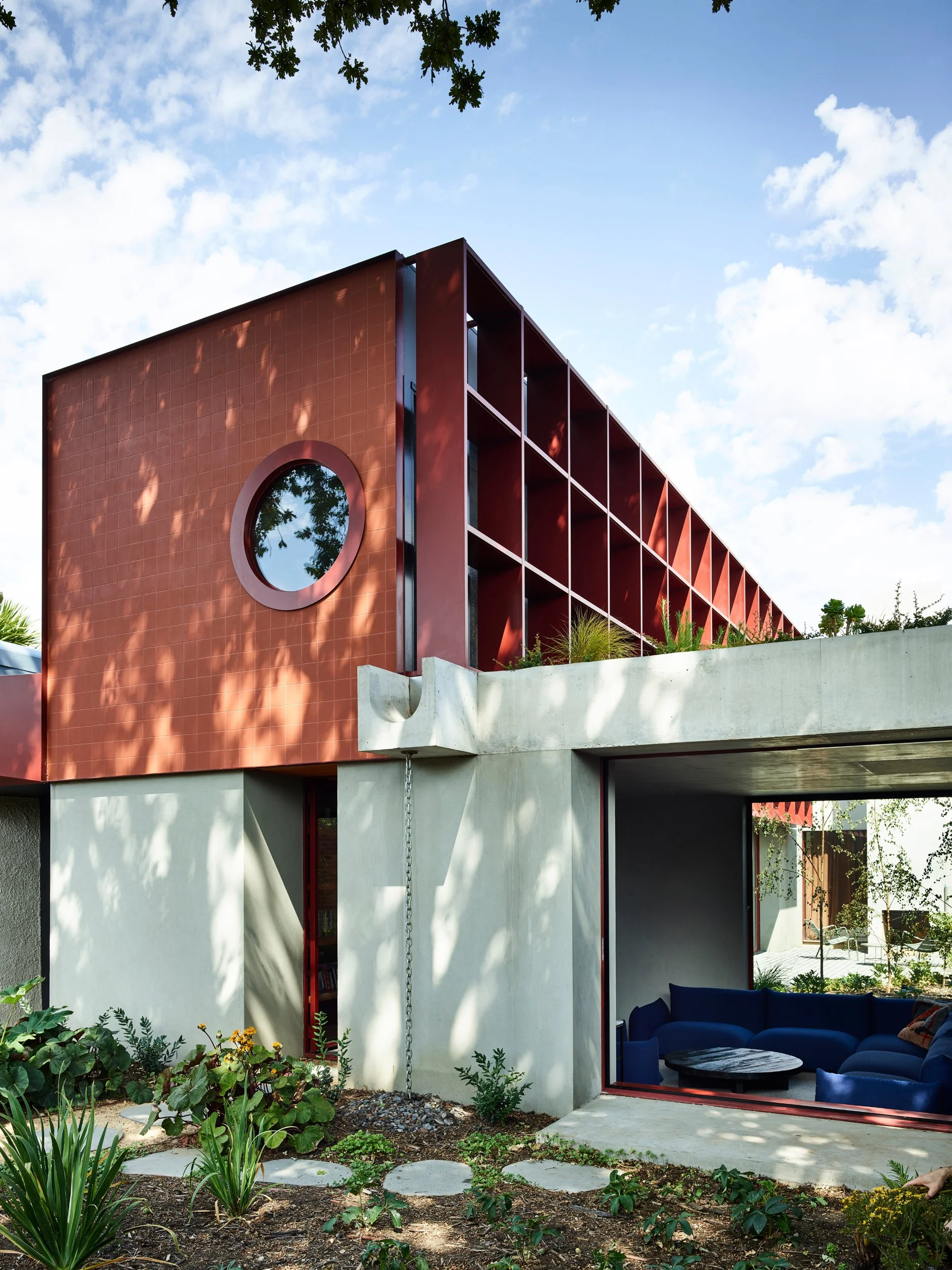
The exterior features terracotta tiles and oxidised steel. Photo: Derek Swalwell
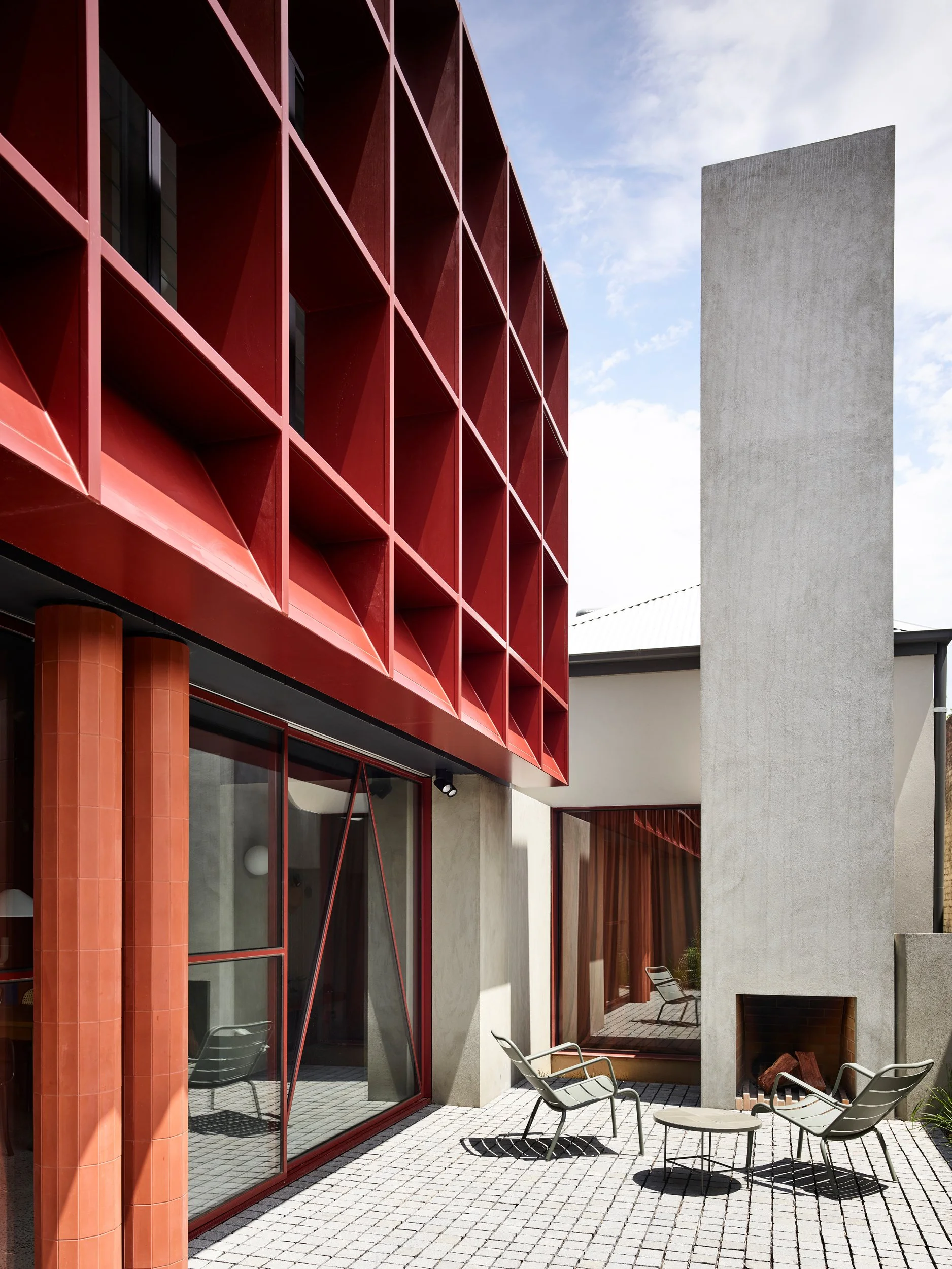
A red steel feature brise-soleil provides many functions, including sun shading. Photo: Derek Swalwell
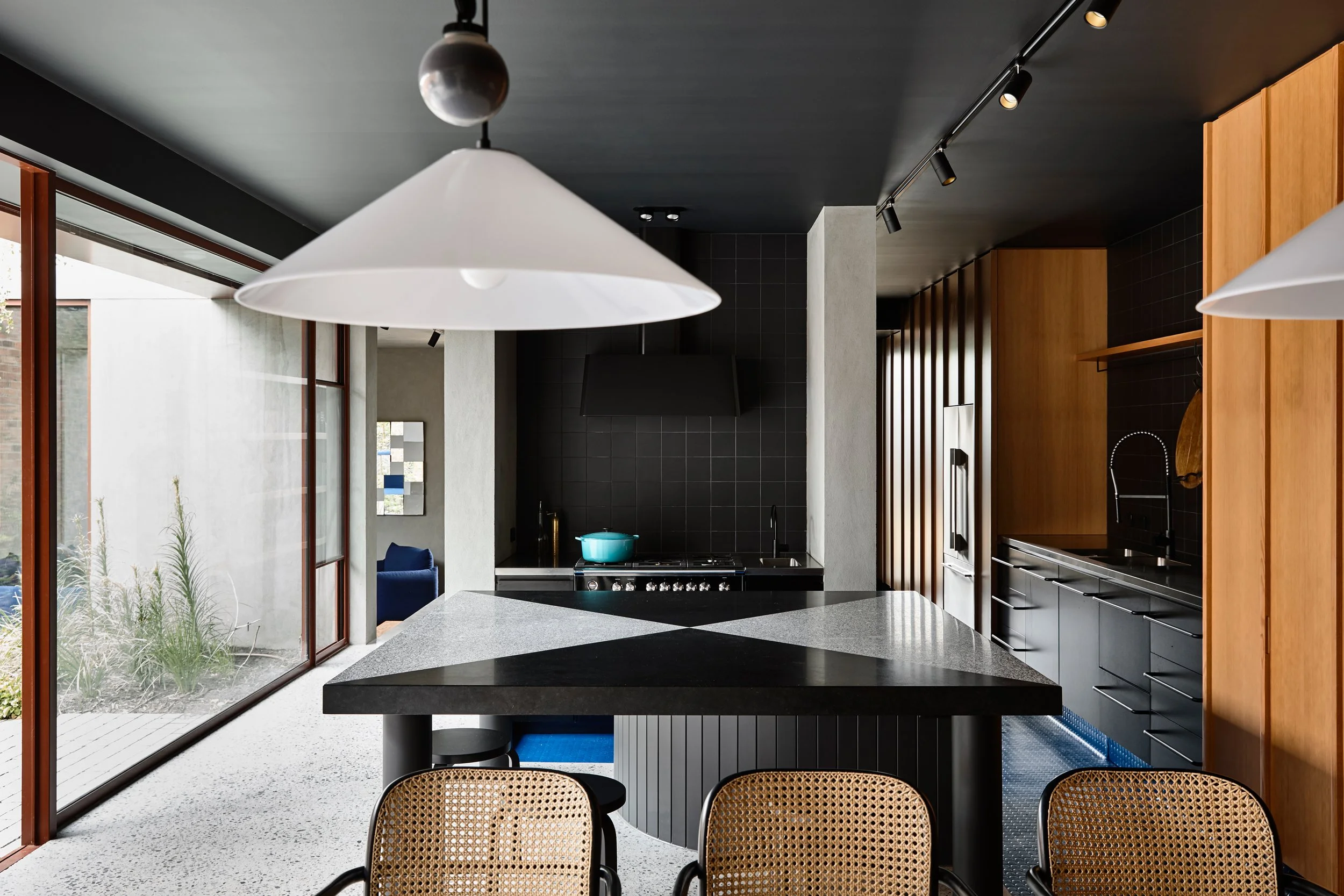
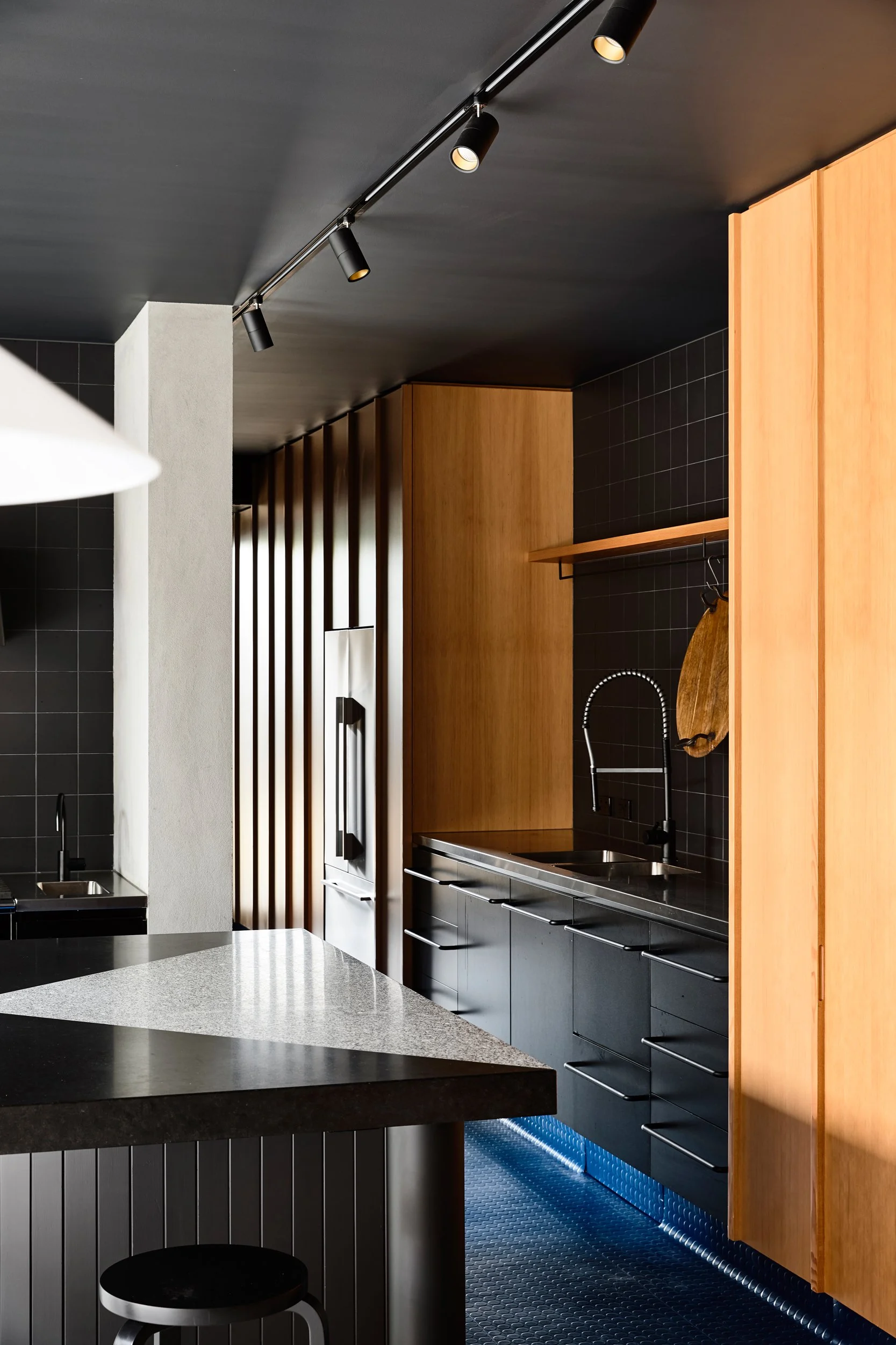
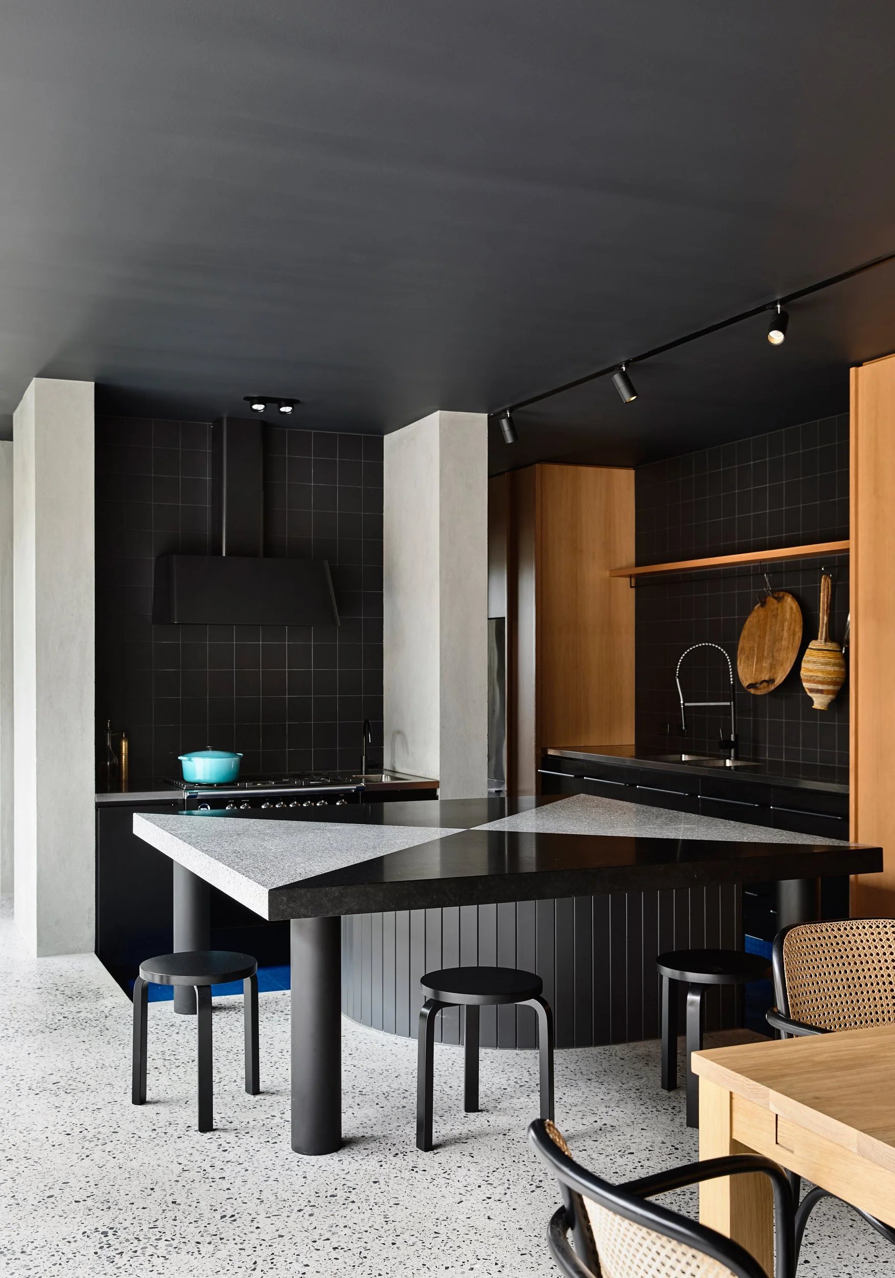
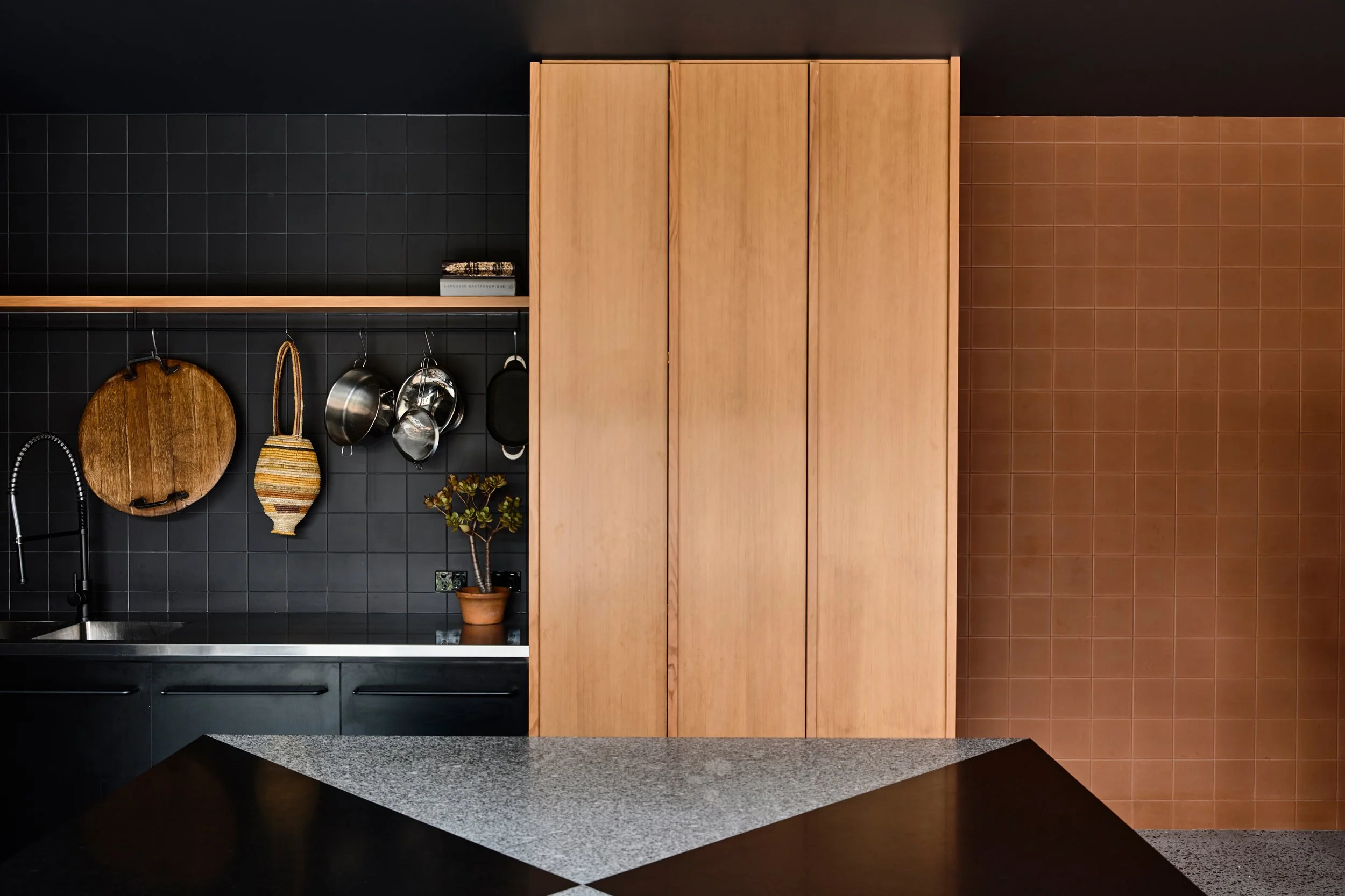
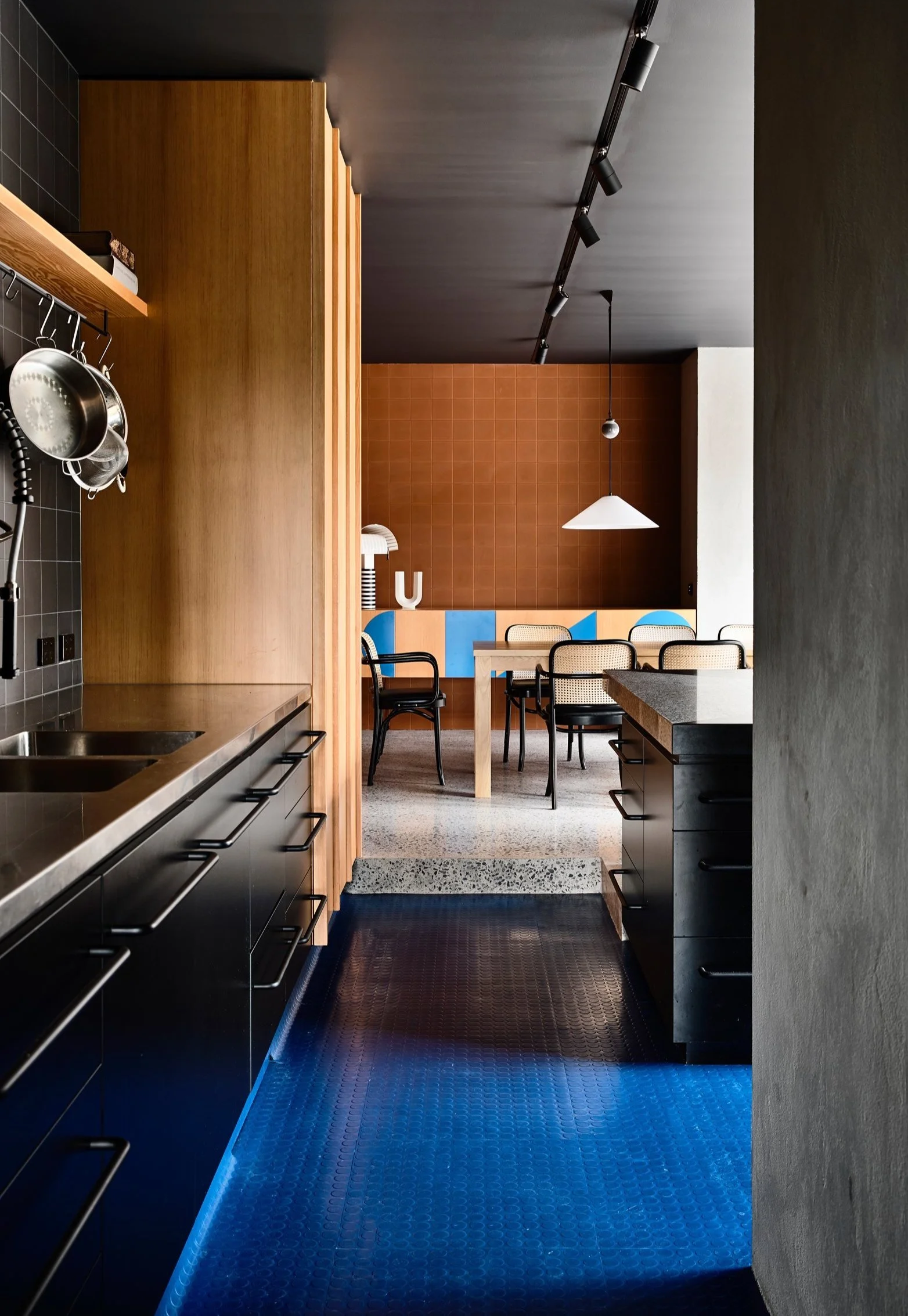
The dramatic kitchen features jet black joinery and benchtops. Photo: Derek Swalwell
The kitchen is a vital part of the home, a place for gathering and cooking together. Photo: Derek Swalwell
Jet black joinery and splashback tiles are a contrast against the oak cupboards and terracotta tiles. Photo: Derek Swalwell
Designed by Kennedy Nolan, Oak House, named after the mature oak tree which sits on the property, is an example of how design can be utilised to mould and function around elements which are hard to let go.
As beautiful as the oak tree is, the home owners were not getting the best out of it – it was a struggle to grow anything underneath it and although their neighbours could view the tree, the owners could only see glimpses.
Kennedy Nolan returned to the initial stages of planning in order to tackle the issue for the Fitzroy North home, reworking the elements that make a domestic environment functional and dignified: zoning, acoustics, privacy, aspect and comfort.
In response, they decided to restructure the original double-fronted Victorian house by incorporating a new pavilion that would create a central courtyard, along with a garage and workshop building at the rear laneway. To accommodate the client's two boys, an upper storey was introduced, facing north and providing private living space and also including a new small swimming pool.
The newly added upper storey offers increased space and improved views of the oak tree and its elevation, featuring red steel brise-soleil, also serves as a scenic backdrop to the central courtyard. ‘The brise-soleil was able to effectively perform all these duties whilst also having visual depth and providing texture and complexity,’ says Kennedy Nolan.
The use of the oxidised red colour on the steel element of the house creates a distinct visual character, complementing the terracotta tiles and contributing to the overall aesthetic of the home.
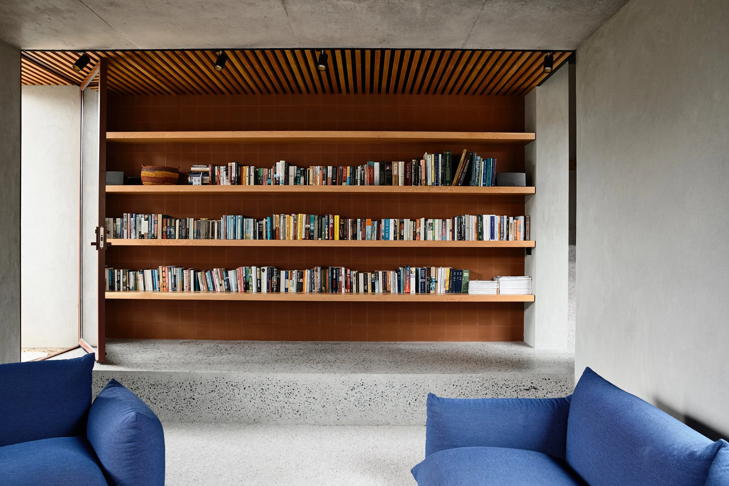
‘We chose an oxidised red colour for the steel elements, including the large format sliding doors and fixed glazing, accompanying this are terracotta tiles and Douglas Fir, both of which complement the warm, earthy red of the steel,’ says Kennedy Nolan.
Unexpected visual variety can be found throughout the home, from the floor finishes to the joinery. ‘There is a concerted effort to restrain expressive excess, maintain formal and material cohesion throughout the house, resist conventional lifestyle architecture blandness and amplify a sense of joyousness and delight.’
Landscape designer, Amanda Oliver, created a garden design which incorporates various sections surrounding the house, including both front and rear areas, as well as a courtyard and a rooftop garden above the living room, ensuring that there is always living space available, creating a continuous connection to nature.
“We investigated how the familiar spatial arrangements of the back yard addition could be enlivened without falling into an uncomfortably over-expressive architecture, or mullet architecture (business in the front with a party out the back).”
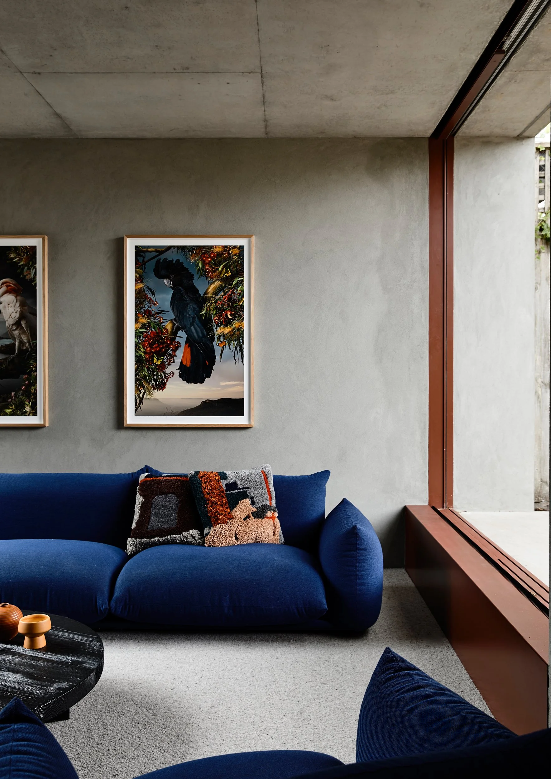
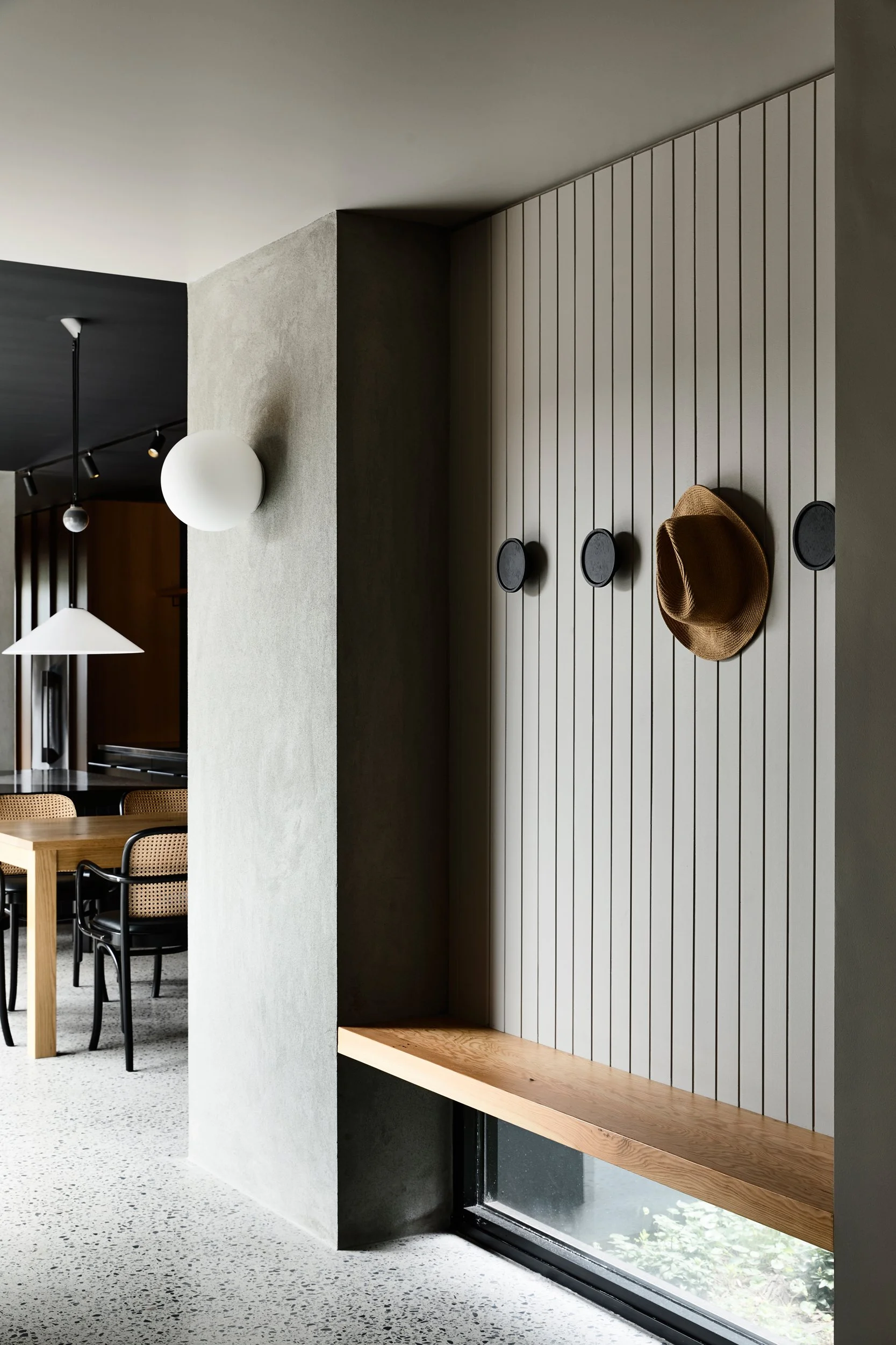
Soft furnishing details are a contrast against the heavy materials such as concrete used throughout. Photo: Derek Swalwell
‘Our clients were enthusiastic about colour and so we developed a palette which could inform all of our design decisions,’ says Kennedy Nolan. Photo: Derek Swalwell
‘There is a concerted effort to restrain expressive excess, maintain formal and material cohesion throughout the house, resist conventional lifestyle architecture blandness and amplify a sense of joyousness and delight,’ says Kennedy Nolan. Photo: Derek Swalwell
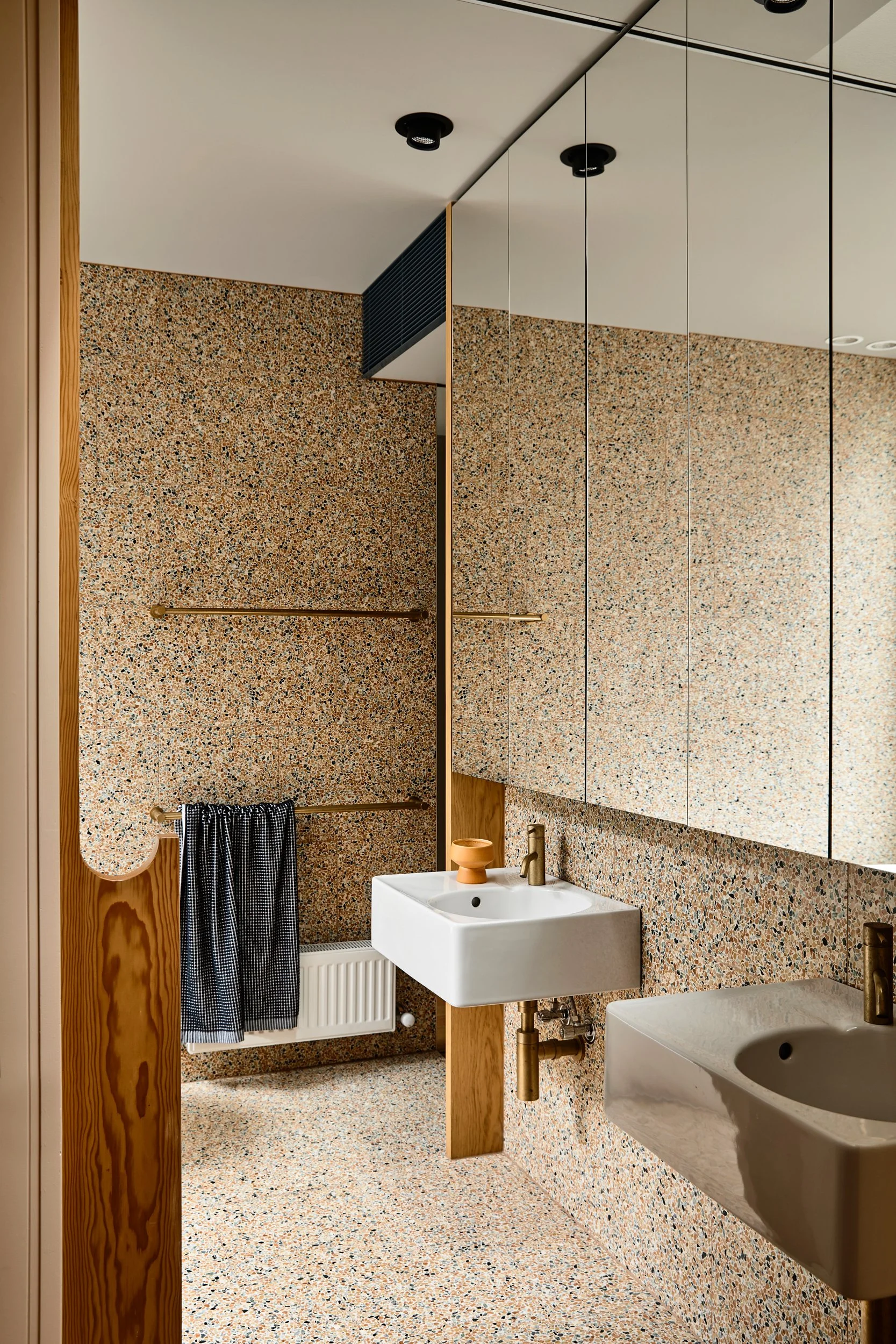
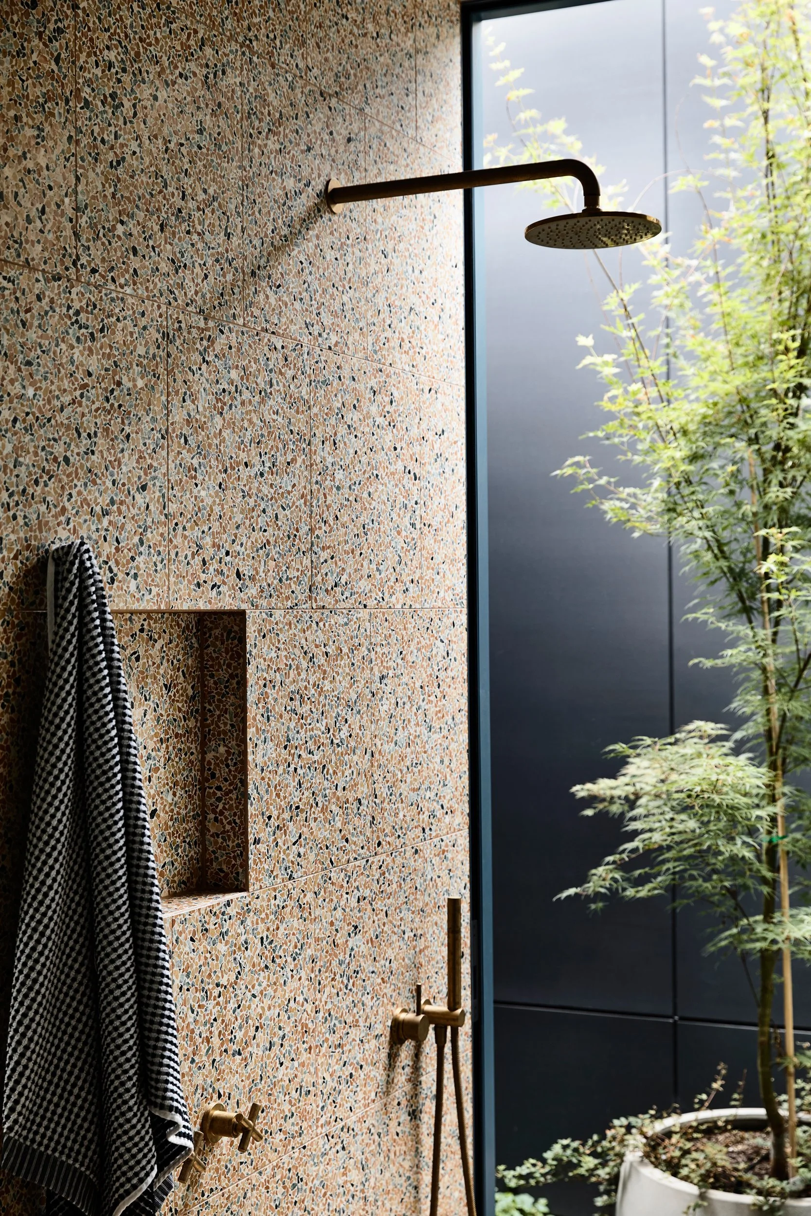
The incredible bathroom! Photo: Derek Swalwell
The bathroom has a wonderful garden aspect. Photo: Derek Swalwell
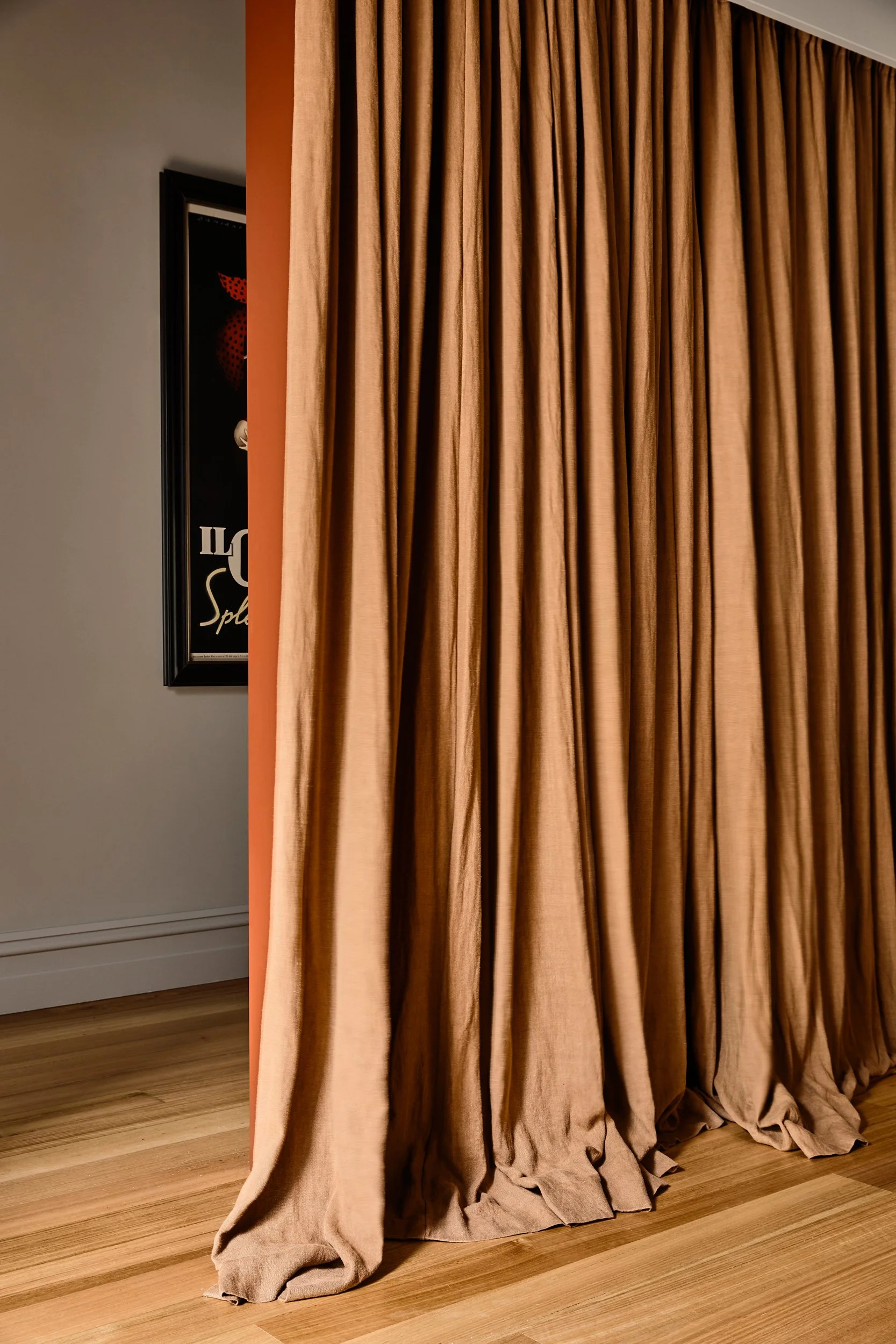
The interiors range from the dramatic to the tranquil using concentrations of colour in varying intensities. Photo: Derek Swalwell
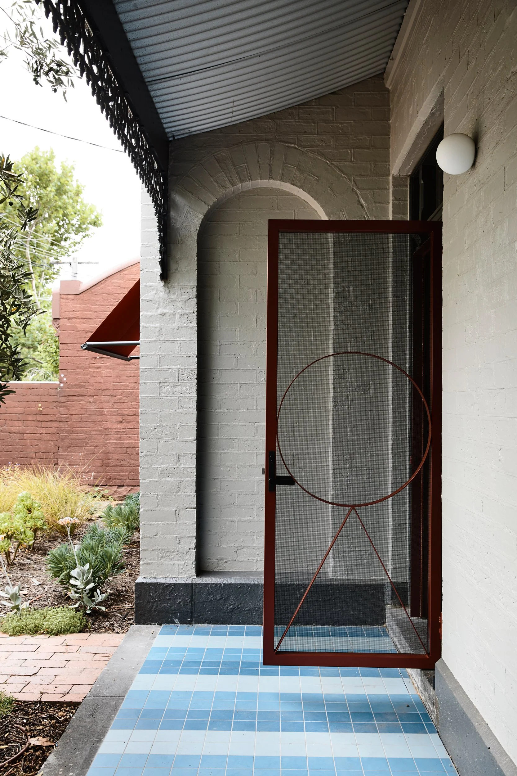
The original Victorian entry complete with feature custom screen door. Photo: Derek Swalwell


